2 The Basics
Touring the Analytics User Interface
Let’s take a look at some of the main features of the Analytics user interface: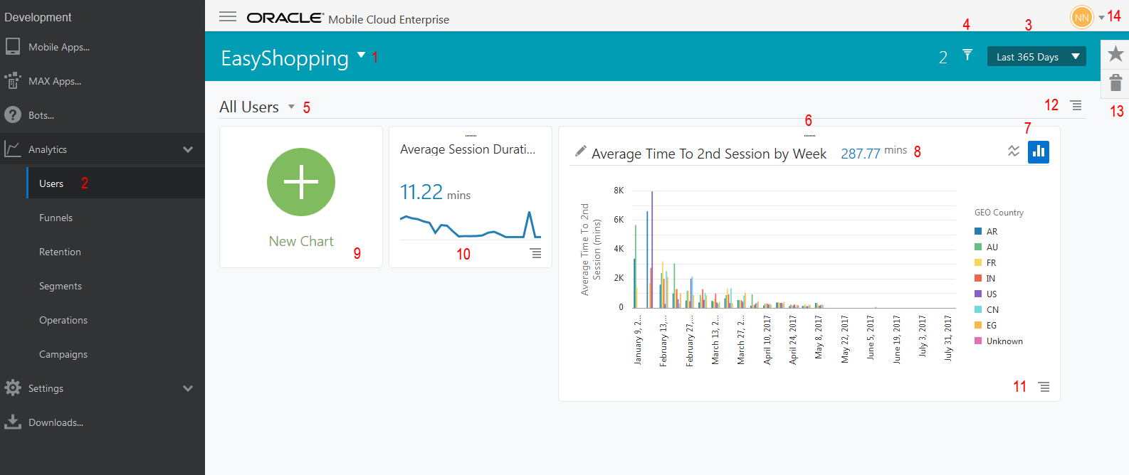
Description of the illustration ui-tour.png
| Name | Description |
|---|---|
|
1. Application Menu |
From here choose an applicaton to analyze with Analytics. |
|
2. Side Menu |
Click a category from this menu to create reports with events, steps, and filters, or open existing reports from here. |
|
3. Global Date Selector |
Use this selector to choose a date range that applies to user and retention reports. |
|
4. Global Filter Selector |
From here you can choose filters for Location, Technology, Sessions, and others to apply to user and retention reports. The number next to the selector tells you how many global filters are set for the report you’re viewing. |
|
5. User Report Type Selector |
Choose the type of user (New, Returning, or Inactive) you’d like to analyze. This selector is unique to Users. |
|
6. Drag Handle |
Click and drag with this handle to move tiles. Once you decide on their placement, they remain there the next time you open Analytics. |
|
7. Chart Type Selector |
Toggle this selector to view data results in a line graph or bar chart. |
|
8. Tile Header |
In Users, the tile header shows a summary of the measure, dimension, and grouped by filters that are set. When the tile is maximized, click the pencil icon in the header to change these metrics. |
|
9. New Chart or report selector |
In Users, this creates a default chart you edit using the pencil icon. For other categories, it opens the menus for creating a report of the user actions you want to analyze. |
|
10. Minimized Tile |
Minimized tiles show a summary of chart or report information. Click the actions menu to maximize it for a more detailed view. |
|
11. Options/Actions Menu |
This menu lists frequently used actions, like Run Report, Create Segment, Edit, Move to Trash. These actions may differ depending on the report type the tile represents. |
|
12. Global Filters Menu/Report Menu |
Frequently used actions for the displayed report or object are listed in this menu. These actions may differ depending on the report type or object that’s in use. For example, you could make a report a favorite or save it as a user segment from this menu. |
|
13. Favorites Drawer/Trash |
From here you can get easy access to reports you’ve chosen as a favorite, or those you’ve sent to the trash. |
|
14. Analyst Menu |
You can connect to additional help resources and general information from this menu. |
Actions for (Almost) Any Report
Now that you’re more familiar with the interface, let's start exploring actions you can take that apply to reports, except in some cases, funnels and campaigns:
Choosing an Application to Analyze
You always use Analytics within the context of an application you want to analyze. When you come into Analytics for the first time, you’re prompted to use an existing application, create a new application, or walk through the Getting Started.
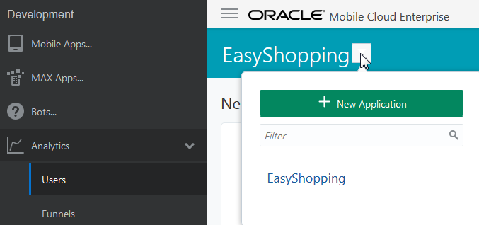
If you want to work with an existing application, click the down arrow in the Application menu and choose your application. You can start typing the app name in the field to filter the list. You don’t need to worry whether you’re using an iOS client, an Android client, or a web application. Analytics takes care of those logistics for you.
If your application isn’t listed, click New Application.
Then enter the name of your application, choose any city your time zone from the drop-down list, and click Create.
Note:
You don’t need to choose your specific city from the list, just pick one that’s in your time zone. The list isn’t comprehensive.Once you create a new application, you may have to wait for your developer to instrument the mobile app, where the important events for the app are identified for tracking.
Another option is to use the Getting Started to explore OMCe Analytics with pre-populated data. You can play around with building reports using a wide range of filters, change filter properties to see how the data changes, or dive in and make discoveries on your own.
Choosing a Global Date Range
The global date selector lets you choose a date or date range that will apply to both user and retention reports. You set a global date range from the drop-down list in the global date selector. You can change dates by choosing from the set of pre-defined intervals, like Today, Last 7 Days, Last 30 Days, and others, or you can select a specific time period using the Custom option.
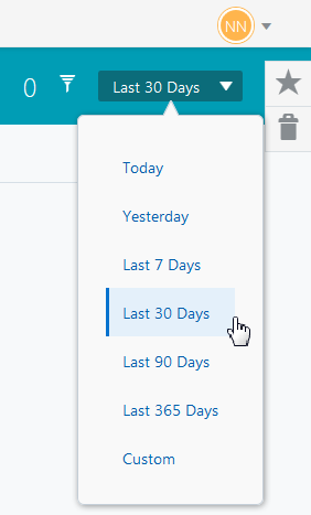
To set a custom date range, choose Custom from the drop down list, then click the start and end dates on the calendar and click apply.
Using the global date selector is a quick way to set the analysis date across reports, and it is the only way to set dates for user and retention reports. Just remember that if you change the date for one report, the date for the other report that accepts global dates will change as well. But if you made a report a favorite, that report won’t change —it’s locked in time.
Applying a Global Filter
Like global dates, global filters let you set filters once that you want to apply to both user and retention reports.
To set a global filter, click the global filter selector ![]() to open the filter summary area, then click Add Filter. You can then choose from a variety of filter types.
to open the filter summary area, then click Add Filter. You can then choose from a variety of filter types.
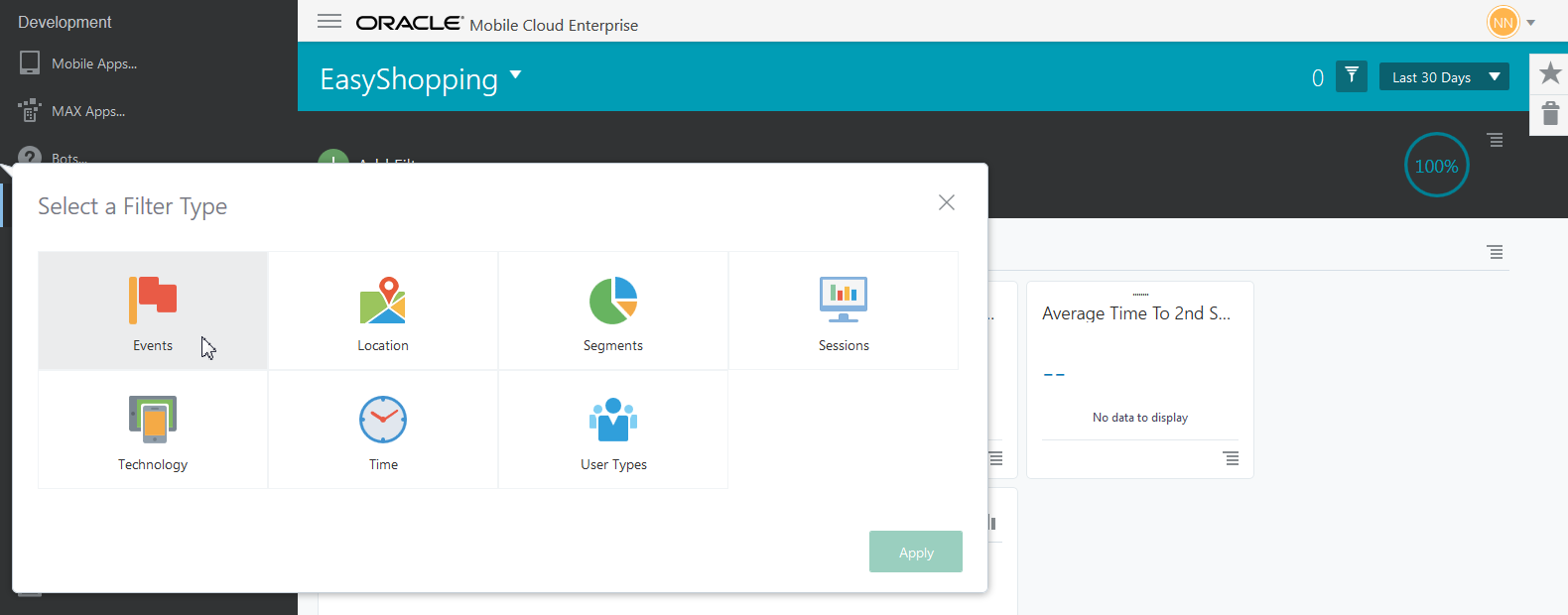
Description of the illustration global-filter-dimensions2.png
Here’s a quick look at what each of the choices mean:
-
Events: Actions a user might take, like putting an item in a cart and checking out.
-
Location: Where a user is located. This can be as general as a country or as specific as a zip code.
-
Segments: User groups with common characteristics, for example, similar product preferences, or members of a loyalty club. Segments must first be defined in Segments on the side menu before they are included in this list.
-
Sessions: How long a user stays in the app, or how often they return.
-
Technology: What technology a user is using, for example, OS version, device screen dimensions, and platform type.
-
Time: Filters for day and hour.
-
User Types: Whether a user is new, returning, or inactive based on visit history.
Once you select your filter type, choose the property and any attributes for the filter, and click Apply. For example, if you choose Events for the filter type, you might choose Checkout as a filter property and >$100 as the attribute. Because attributes are customized for your app by your developer, they will vary from app to app and you may have different attributes than described.
Note:
If you choose a segment as a global filter, you can only combine that filter with other segments. All other filter types will be removed from the global filter options.Working with the Global Filter Displays and Menus
-
Once you’ve chosen your filters you’ll see them displayed in the filter summary area, as well as a graphic showing the percentage of users that the filters match. A counter also shows the number of filters in use.
-
The global filters menu lets you choose from options to create a segment, remove all filters, or toggle filters off and on without removing them. If the filter is toggled on, the filter items in the summary area are applied to the displayed report. If the filter is toggled off, no filter items are applied to the report.
-
You can refresh the report which uses the global filters by clicking the global filter menu, then Toggle Filter On/Off.
-
To collapse or expand the filter summary area, just click the global filter selector.
While global settings are how you set filters for user and retention reports, other reports, like funnels, campaigns, and segments frequently depend on specific filter steps or dates in order for your data to be useful. So, filters and dates for these reports are set locally when you create them.
Controlling How the Tiles Look and Behave
Most reports contain one or more tiles, with charts and metrics depicting the data you’ve gathered. You can control several aspects of a tile, which vary depending on what type of report you’re viewing.
-
In User and Sessions, you can use the Options menu at the bottom of the tile to control its size by minimizing or maximizing it. You can also change the tile position with the drag handle at the top of the tile. You can also use the menu to delete a tile. If you do so, keep in mind that you won’t be able to get it back. You have to recreate the chart if you want to see it again.
-
Funnels, Segments, Retention and Campaigns all have an Actions menu on the report tiles, but the available actions vary by report. Use the actions menu for such tasks as editing or refreshing a report, making something a favorite, creating a segment from a report result, or sending the report to the trash.
Configuring the Charts on Tiles
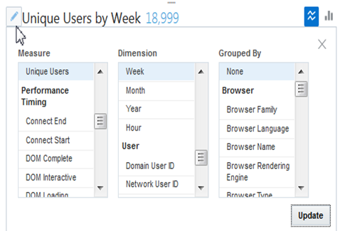
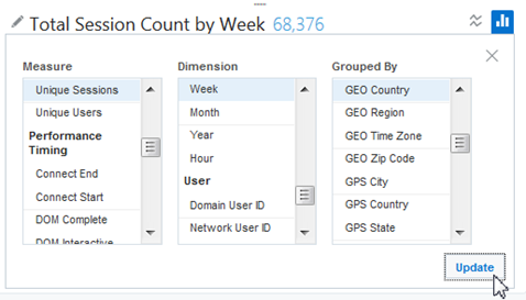
When you’re analyzing Users and Sessions data, you can change the data displayed by a chart by working with the Measure, Dimension, and Grouped By filters. To customize a chart displayed within a tile:
-
Click the Options menu to maximize the chart.
-
Click the pencil icon on the chart.
-
Choose the Measure by clicking the first menu and using the scroll bar to locate the criteria you’re interested in.
You can think of the measure as the thing you want to collect data on. On a chart, the measure is shown along the Y (vertical) axis.
-
Choose the Dimension by clicking the second menu and using the scroll bar to locate the criteria you’re interested in. The dimension indicates what you’re interested in about the measure. If you chose Events, for example, you might want to see those events by week, or maybe you want to know the location where those events occurred. Dimensions are mapped along the X (horizontal) axis of a chart.
-
Choose the Grouped By criteria by clicking the third menu and using the scroll bar.
-
When you’ve selected your new criteria for Measure, Dimension, and Grouped By, click Update.
-
Once the chart is configured, you can choose how data is displayed by toggling between the line and bar chart icons.

Viewing a Report Across Time Zones
Analytics converts all time zones to your application’s time zone. So, if you’re in the Pacific time zone and you want to send a SMS that will reach someone in the Eastern time zone at 5 pm, just choose 5 pm as the time to send the message. Analytics does the conversion to get it to your East Coast customers at 5 pm EST. If that time has passed, Analytics sends the message the next day. As another example, suppose you want to find out when your app activity peaks. Analytics converts the time users are most active to your application’s time zone to avoid confusion. You can be sure if your data shows users are most active on Saturday at 10 am, that’s true no matter what time zone your user is in.
Adding a Favorite
If you create a report in Analytics that you’d like to return to later, you can save it by making it a favorite. To make something a favorite, click the Report menu, then click Add Favorite.
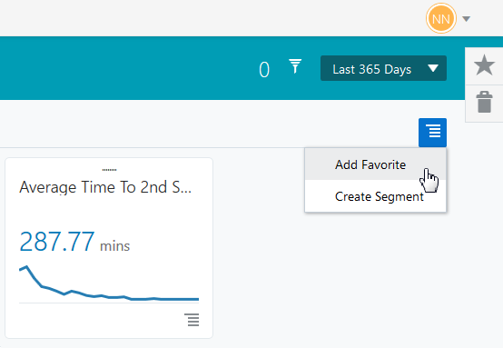
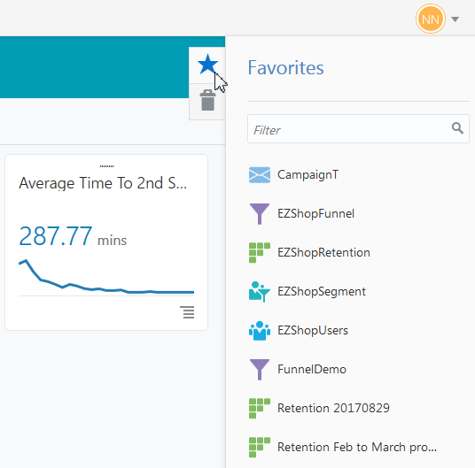
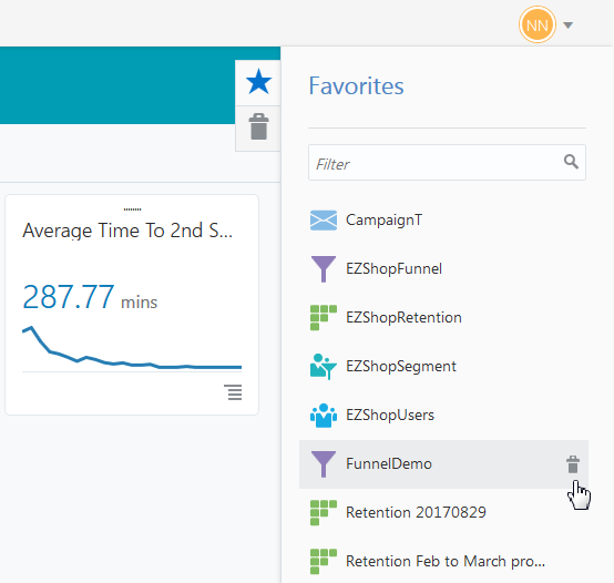
To see all your favorites, click the star icon on the right to open the Favorites drawer:
When you use favorites, here are useful things to know:
-
A favorited report is like a bookmark of the report, not a copy of it. If you trash or delete the report from its landing page, it will also be removed from Favorites. There is not an option to copy a report and save it.
-
The Favorites drawer is for all Analytics users, so everyone sees the reports you favorite, and you can see other people’s favorites. This means that you can also open someone else’s favorited report, change what you’d like, and save it as a favorite under a new name. If you choose the same name as the original, this overwrites someone else’s work, so it’s best to avoid that.
-
When you view a report from the Favorites drawer, it reflects both the criteria and the customizations that were in effect when it was saved, including global filters, global dates, chart configurations, and any layout customizations.
-
A favorited campaign becomes temporarily unavailable in Favorites if you’ve re-scheduled its launch date or have saved it as a draft. Once it has launched, the campaign will again be available in Favorites.
-
You can quickly get to your favorite report by typing its name in the filter field. As seen above, each report type has an identifying icon you can use to visually scan the list for the report you’re looking for. For example, campaigns has an envelope icon, and funnels has a funnel.
Sending a Favorite and Other Reports to the Trash
To trash a favorite, click the star icon to open the Favorites drawer. Click the report you want to send to the trash, then click the trash can icon and click Trash. Your report is now listed in the trashed reports.
Keep in mind that only the creator of a favorited report can send it to the trash.
To trash a report that’s not a favorite, go to the report’s landing page, click the Actions menu on the report’s tile, and choose Move to trash
Note:
Sending something to the trash is not the same as deleting it. Items in the trash can be restored. Deleted items cannot be restored. They are gone forever.Restoring a Favorite and Other Reports from the Trash
To restore a favorite or any report from the trash, click the trash can icon to open the trash. Click the report icon next to the report you want to restore, then click Restore from Trash. If your report was a favorite when you trashed it, it is once again listed in Favorites. Otherwise, it will be restored to the report’s landing page.
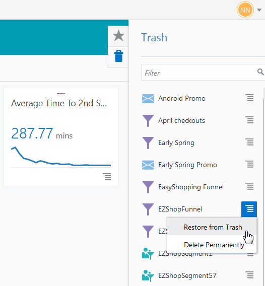
Description of the illustration restore-favorite-trash-png.png
