13 Instant Apps
Natural language conversations are, by their very nature, free-flowing. But they may not always be the best way for your bot to collect information from its users. For example, some situations, like entering credit card or passport details, require users to enter specific information (and enter it precisely). To help your bot’s users to enter this type of information easily, your bot can call an instant app, which provides forms with labels, options, choices, check boxes, data fields, and other UI elements.
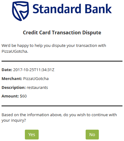
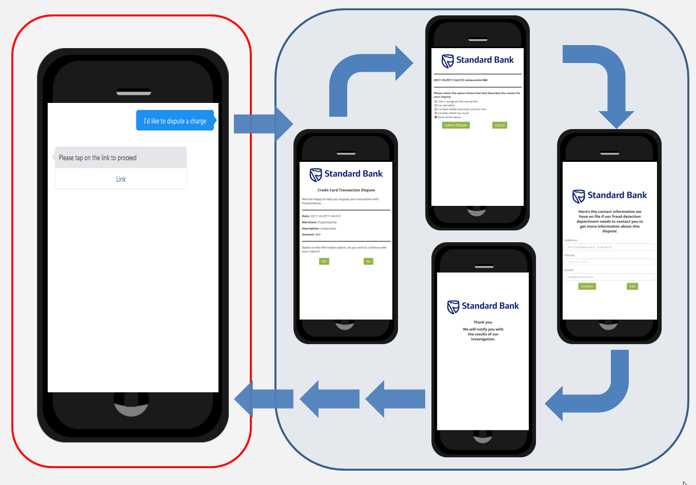
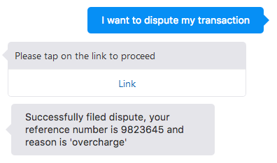
The instant app itself provides a wizard-like experience. When you’ve finished with it, the instant app executes a callback to relocate you from the webview to your bot, where it displays a confirmation message detailing your transaction. The confirmation message includes the reason for the dispute and the dispute number, both of which are values returned from the instant app.
The Instant App Builder
You can build these apps using the Instant App Builder, which you access by clicking Instant Apps in the Bots landing page.
Instant apps are made up of sets of panes, which display one at a time. You populate these panes with various elements that can display charts or images and collect customer data using widgets like checkboxes, radio buttons, and file upload functions. 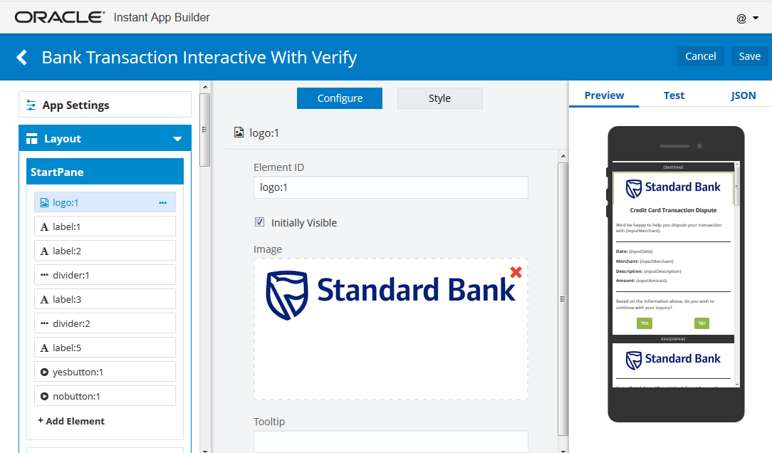
To get you started, you can customize the templates that display in the landing page. You can also use the Standard Bank instant app, which is invoked by the FinancialBot, as a reference. You can also start from scratch by clicking the New Instant App tile. See System.Interactive to find out how to integrate your instant app into the OBotML definition.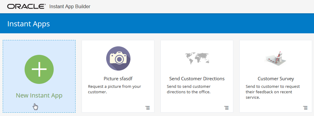
Creating an Instant App from Scratch
App Settings
App Settings is where you manage general information about your instant app.
Name
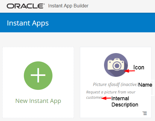
The instant app name is your internal way of identifying this instant app among all your others on the instant apps main page. The name can include letters, numbers, and special characters. The name is not exposed to the end user, as you can see in the image Internal Description below.
ID
The instant app ID is how you reference the instant app if you need to call it from somewhere, like from a bot, an API, or a JavaScript Snippet. When you create a new instant app, the ID itself is derived from the instant app name that you enter. The ID cannot contain special characters or spaces. You can edit the ID at any point, but if you do change it, you will need to update any references to the previous ID.
Icon
An icon is the image that shows up on the instant app tile on the main instant apps page. Remove unwanted icons by clicking on the red X in the top right corner. Then you can drag and drop an icon, add an icon via regular file lookup, or input a URL.
Internal Description
The internal description is what shows up on the instant app’s tile on the main instant apps page as a reminder of the particular instant app’s function.
Initially Active
When you create a new instant app, you can set the instant app to be Initially Active before you save it. If you set it to active, the instant app can be activated from the bot. If you do not set it to Initially Active, then you can always set it to Active from the instant app tile on the main menu. You can see which apps are inactive by the Inactive display next to the instant app name.
Invite Message and Link
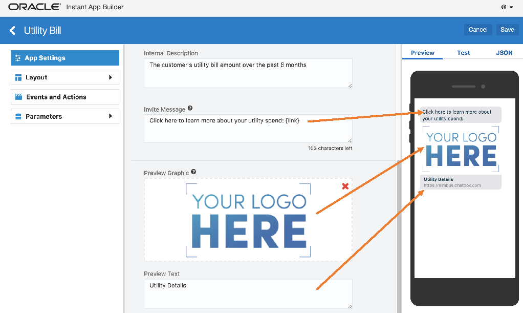
The Invite Message is a preconfigured message that is sent to customers inviting them to use the instant app, and it is the first thing a customer sees. Include the {link} in the position where you want the instant app link, and do not change anything else. The message, including the link, cannot exceed 160 characters.
Laying Out an Instant App
Laying out an instant app includes selecting panes, elements, and adding identifying information such as Pane IDs with the instant app builder. Instant app layouts are highly customizable to suit your business needs.
Panes
Panes are essentially the pages of your instant app. Some scenarios require just a single pane experience, where a customer clicks into the instant app, engages, and then is taken back to the bot conversation. More complex instant apps will have multiple panes to minimize the amount of information on a single screen. Panes are flexible and allow you to optimize your customers’ experience based on the content you’re delivering
Note:
Pane IDs can only contain letters and numbers. No spaces or special characters are allowed.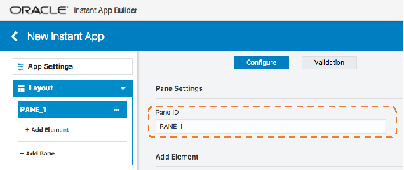
Elements
Elements are the components within each pane that make up your instant app. Element types are essentially templates for the types of components in an instant app.
All elements and functions are highly configurable with JSON. Element types are really just templated JSON. They can capture everything from text inputs and labels, to image galleries, photo uploads, and signature captures. This section includes tips on using elements followed by a look into each element type.
Adding, Moving, and Deleting Elements
To add a single element, click on the element. When you add a single element, you are taken into the configuration menu options for that element.
To move an element, click on it and drag and drop to the desired location. Elements can be moved within a pane or across panes
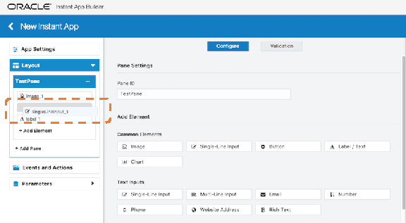
There are two ways to delete an element. When you click on an element and drag it, you will notice a Delete bar on the bottom of your screen. Drag and drop the element to the Delete bar to delete it.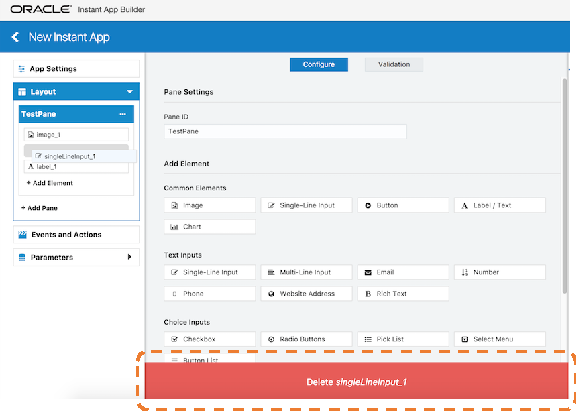
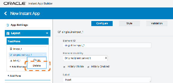
OR, click on the ellipsis next to the element name and click Delete.
Cloning Elements
Note:
When an element is cloned, all associated configuration, style, and validation is cloned to the new element, but any associated events and actions are not cloned.Shortkey for Adding Multiple Elements
While building your Instant App, there may be times when you know what Elements you want to include and want to add them quickly in bulk. To do this, use Command + Shift and click on each Element you want to add. This will add Elements to your active Pane in the order they’re clicked. From there, you can go through each Element to configure it as needed.
Common Configuration
Many elements have some common configurations. Here are the commonalities between elements, followed by specifics for each element type.
Element ID
The Element ID is the name on the left list of elements. This ID is referenced anywhere you are using JavaScript to affect this element.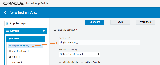
Initially Visible
You can make each element visible or invisible when the instant app pane loads. If it’s invisible when loaded, then a user would not see it unless you create an action to make it visible.
Initially Enabled
You can make an element enabled or disabled when the instant app pane loads. If it’s not enabled when loaded, then a user could not input anything into or affect the element. If you would like a user to be able to interact with it, then you would need to set up an action to enable the element.
Label
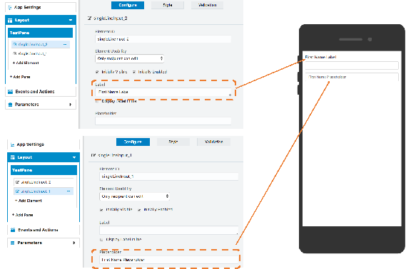
Generally, a label is what you would see above an element that describes what it is or its function. A few elements have unique label behavior which are called out in the specific element. Labels can use HTML.
Display Label Inline
For Elements where the label is listed above it, you can select Display label inline, to make the label appear on the same line as the element.
Placeholder
You will see a configuration for placeholder in a few different elements, primarily the text input elements. Any text configured here will show in gray, inside the text input box. Once a customer inputs any text into the field, the placeholder will disappear. A common use for placeholders is to configure an empty label, but be sure to set a label/description as the placeholder.
Tool Tip
Tool tips can be used to show help text. The tool tip will show when users interact with the element.
Styles
Styles are fairly similar across elements, with only a few variations.
Font
-
Size: In Pixels
-
Weight: Normal, Bold, Light
-
Style: Normal, Italic, Oblique
-
Alignment: Left, Center, Right, Justified
Layout
The Layout section of the Style Tab varies between elements. Input for the following options can be given in pixels or as a percent
-
Element Width: This is the width of the entire element. Different elements have different defaults. For example, a label defaults to 100%. Setting the element width to a smaller number allows for more than one element to show up on the same line.
-
Top Margin: The distance between the previous element and the element you are editing.
-
Left Margin: The space between the left edge of the instant app and where the element begins.
-
Right Margin: The space between the right edge of the instant app and where the element ends.
-
Bottom Margin: The distance between the element you are editing and the element which follows.
The Inner Dimensions control the used portion of the width of an element, given the constraints you’ve created on element width, left and right margins, and the height of the element. For example, if you set the element width of a button to 75 percent and then set the Inner Dimension width to 100 percent, the button will expand to fill the entire 75 percent. As another example, if you set the element width of a Label to be 50 percent the left margin to be 20 px, and the Inner Dimension width to be 50 percent it would result in the label starting 20 px to the right, and only filling up half of the text box, or 25 percent of the width of the instant app since the element width had already been set to 50 percent (50 percent of 50 percent = 25 percent).
Foreground Color and Background Color
The Foreground Color generally controls the text in an element and the Background Color generally controls the area of the element behind the text. They can differ somewhat between elements because of the variety of element types, so specifics are called out in each element. However, for any of the elements that have buttons embedded in them (like Upload, Location, Signature), the button color can’t be changed.
Border
For most elements, you can control whether there is a border around the element or not, and how the border looks. You can adjust the width, whether it is solid, dotted, or dashed, the shape of the corners, and the color. In some element types, for example Images, if you increase the corners sufficiently and adjust the Layout, you can create oval and round shapes.
Element Types
Element types influence validation options described here:
Text Inputs
Single Line Input
-
These elements have a maximum length of 256 characters.
-
They can have several forms of validation. They can be required, have min/max character validations, match a regular expression, or have JavaScript validation. If you want to match a regular expression, add it in the Regular Expression field, and if it fails, the user will receive the failure message. You can find more help with Regular Expressions at https://regex101.com/
Multi-line Input
Use a Multi-line Input element for lengthier text. This element is similar to the Single Line Input but with a few different configurations:
-
Multi-line Input elements have a maximum input character length of 1000.
-
You can specify how many rows are shown in the display of this element.
-
These elements can have several forms of validation. They can be required, have min/max character validations, match a regular expression, or have JavaScript validation. If you want to match a regular expression, add it in the Regular Expression field. If it fails, the user will receive a failure message.
Use this element to capture an email address. A customer must include @ and a completed domain to avoid an error message. Email elements can have several forms of validation. They can be required, match a regular expression, or have JavaScript validation. If you want to match a regular expression, add it in the regular expression field.
Number
Use this element to collect integers, currency values, percentages, or decimals. Phone numbers have their own element, described below. The type of number you choose affects the element display in the Instant App and enforces the number type during text input. You can include, or exclude, a common separator for the thousands’ place. Number elements can have several forms of validation. They can be required, match a regular expression, or have JavaScript validation. 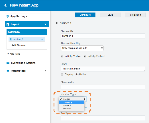
Phone
This element provides a stylized input field for phone numbers. Customers can use the drop-down menu to set the default country code before entering their phone number. Phone number elements can have several forms of validation. They can be required, match a regular expression, or have JavaScript validation.
Website Address
Use this element when you need to collect website information from your customers. Website inputs must begin with http:// or https:// to be valid, otherwise users will see a malformed url error message. Website address elements can have several forms of validation. They can be required, match a regular expression, or have JavaScript validation.
Rich Text
The Rich Text Element is similar to the Multi-Line Input element, but it allows agents and customers to add HTML formatting inside the text field. Below the element are three icons: the edit, preview, and help icons.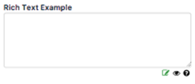
The help icon displays supported formats and samples. These formats include:
-
<br /> line break
-
<b>bold text</b>
-
<i>italic text</i>
-
<u>underlined text</u>
-
<center>centered text</center>
-
<h1>header text</h1>
Rich Text Elements can have several forms of validation. They can be required, have min/max character validations, match a regular expression, or have JavaScript validation.
Choice Inputs
Checkbox
The Checkbox Element is typically used for acknowledgement and offer a way for the user to provide confirmation. For multiple confirmations, you can add multiple checkbox elements or use the Pick List Element. The validation used is required/not required.
Radio Buttons
Radio buttons allow users to specify a choice from a list of options. Configure the options available for the user to choose from and specify the Value associated with the Option, which you can link to an action. You should have a minimum of two options, but you can add more as needed.
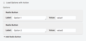
If you check the box to Load Options with Action, you need to specify the values by either adding an Execute JavaScript Snippet action in the App Sent event, or by retrieving the values from a call to an external web API. In either case, the values must be expressed as a JSON object with the following structure
{"options":
[{ "label": "Label One", "value": "value1" },
{ "label": "Label Two", "value": "value2" },
{ "label": "Label three", "value": "value3" }
]}
The validation supported is required/not required.
Picklist
A Picklist Element is used when you want a user to choose multiple options. You can configure as many items in the Picklist as needed. If you check the box to Load Options with Action, you need to specify the values by either adding an Execute JavaScript Snippet action in the App Sent event, or by retrieving the values from a call to an external web API. In either case, the values must be expressed as a JSON object with the following structure:
{"options": [
{ "label": "Label One", "value": "value1" },
{ "label": "Label Two", "value": "value2" },
{ "label": "Label three", "value": "value3" }
]}
Select Menu
Select Menu Elements allow users to choose from a drop-down menu. In addition to setting the options for the menu, you also have the ability to set a label inside of the Select Menu box.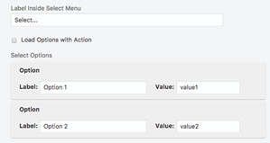
{"options": [
{ "label": "Label One", "value": "value1" },
{ "label": "Label Two", "value": "value2" },
{ "label": "Label three", "value": "value3" }
]}
The validation supported is required/not required.
Special Inputs
Buttons
Buttons are one of the most common elements in instant apps and are typically used at the end of a pane, linked with an event and/or an action. They help a user navigate within an instant app, or to end an instant app experience. You can style your button and adjust button size in style layout. The inner dimension of a button should be set to 100 percent if you want the button to be the width of the device screen. 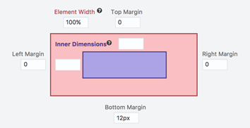
Upload Photo or File
-
Upload Label: If you enter text in the upload label, you will see it appear above the Waiting for Upload message. This message can not be changed.
-
Button Text: Set the upload text here that will appear on the button.
-
Show Filename: Select this option if you want the user to see the name of their uploaded file.
-
File Size Limit: You can set the limit of the file size you would like to accept. You must enter it in bytes and it defaults to 10000000 (10MB).
-
Show a Preview of the Uploaded Image: Select this if you would like your user to see their image after it is uploaded. Note: When you are building the Instant App and using either the preview or test mode, you aren’t able to actually upload an image. During those simulations, you will just see a placeholder for an image/file.
-
Preview Height Max and Preview Width Max: you may set the size of the preview in pixels. The default is height 200 px, width 300 px .
-
The size, weight, and style of the upload label, the message Waiting for Upload, and the button text are controlled by the size, weight, and style in the style tab. The Foreground Color controls the color of the upload label text and the Waiting for Upload message. The color of the button and button text cannot be changed. The Background Color controls the area of the upload element, behind the upload label, Waiting for Upload message, and the button.
-
The validation supported is required/not required.
Date
-
Placeholder: That is the text that will appear in the area a user would touch/click into to select the date. It will be replaced by the date when selected.
-
Get Time: Select Get Time, if you would like the user to be able to select a time as well as the date.
-
Minimum Date and Maximum Date: When these are set, a user will not be permitted to select a date earlier than the Minimum or later than the Maximum. If you are manually entering the date in the Instant App Builder instead of using the drop-down calendar, it must be in the format MM/DD/YYYY.
-
The size, alignment, weight, and style of the placeholder text is controlled on the Style Tab. Placeholder text color cannot be adjusted. The width and margins of the Date Element can be adjusted using pixels or percentage, but if you make the width too small, the user will not be able to see the full date and time. The area of the Date Element behind the placeholder text is controlled by the background color.
-
Date elements can be required/not required and you can also write a JavaScript snippet to validate the element.
Signature
The Signature element allows you to capture the user’s signature. The user can sign and then clear or confirm their signature. You can adjust the text on the Confirm button (using the Confirm Button Label), but not the Clear button. Both the Clear and Confirm buttons will always be initially disabled and are enabled when a user writes a signature. If the user clears the signature, then both buttons will become disabled again.
-
The style aspects of the Signature element that can be controlled through are the background color of the signature box and the foreground color of the signature .
-
The validation supported is required/not required.
Star Rating
The Star Rating element allows you collect a rating from your user. This element is very flexible. You are able to set the number of stars, and can change them from stars to any other Font Awesome icon. You are also able to set icons to go at the left and right of the stars; they default to frowning and smiling faces, but they can be replaced by any Font Awesome icon, or you can remove them altogether.
-
From a style perspective, the font size controls the size of the Font Awesome icon, foreground color controls the color of the Font Awesome icon, and the background color controls the color behind the icons.
-
The validation supported is required/not required.
Slider
The Slider element allows a user to move a selector along a numeric spectrum and pick a number within the range. You can set the minimum value (Min Value input field) and the maximum value (Max Value input field); both must be integers and the Max Value must be equal or greater than the Min. You may also set the amount by which the slider will increment as a user slides it along (Step input). For example, if your Min Value is set to 0, your Max Value to 10, and your Step value to 2, then as the user moves the slider along, it would increase from 2 to 4 to 6, and continuing on.
-
To change the right, left, top, and bottom margins, you can enter the value as a percentage or in number of pixels. The area behind the Slider can be adjusted by using the Background Color.
-
There is no validation for a slider.
Location
-
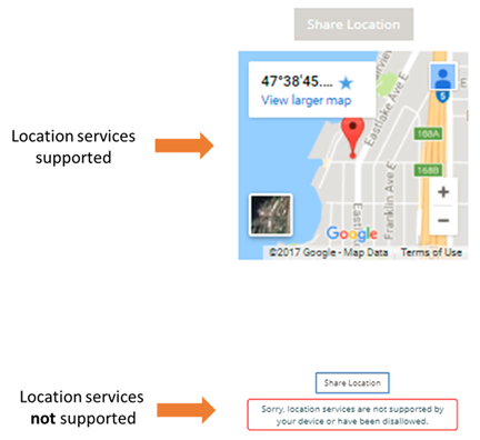
The Location element can be used to capture the location of a user. In order for the Location element to be set up, you need to have a Google Maps API Key. For it to work with a user, their device needs to support location services and be enabled.
-
The Location element can be used to capture the location of a user. To set up the Location element, you need to have a Google Maps API Key. For it to work with a user, their device needs to support location services and must be enabled.
-
Show Map: If enabled and the user’s location is received, the user will see a map of their location.
-
Google Maps API Key: If you are currently have a usable Google Maps API key, paste that key in the indicated input field. If you do not have a Google Maps API key and would like to use the location feature, you can go to the Google Maps site. Once you have the key, you can paste it in the input field.
-
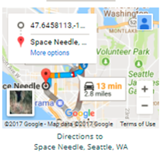
Destination: If you provide a destination in this field, then, after the location of the user has been discovered, the map will render with directions from the user’s location to the destination. For example:
-
Font Size, Foreground Color, Weight, and Style control the size, color, weight, and style of the label text on the button; Background Color controls the color of the button itself. To change the right, left, top, and bottom margins, you can enter the value as a percentage , for example 10%, or in number of pixels, for example, 20px.
-
The only supported validation for Location Elements is required.
Barcode Entry
-
Instructions: The Instructions are what displays within the barcode box, above the button. Note that the text on the button, “Select Image”, and the text beneath the button can’t be changed.
-
Allow Manual Barcode Entry and Manual Input Label: If you select Allow Manual Barcode Entry, a user could enter in the barcode number if they decide not to upload a photo of the barcode or if there are challenges in character recognition from the photo. The Manual Input Label controls the text that is seen for the input if you do want the manual entry option to be available.
-
Clear Button Label: After an image is uploaded, a “Clear” button appears. This is used to clear an exiting image if the image isn’t readable or the user wants to provide a different image. The Clear Button Label sets the text on that button. Its color cannot be changed.
-
Show Preview Image: When checked, this will show the uploaded image.
-
Error Message: Barcode Not Detected: If an image is uploaded where no barcode can be detected, this message will display. This message can be customized.
-
The Foreground Color controls the instructions text and or Drag and Drop text. The Background Color and Border control the background color and the border of the barcode box where the instruction text, Select Image button and or Drag and Drop text are.
-
Barcode elements can have several forms of validation. They can be required, the barcode entry can be set to match a regular expression, and you can also set a JavaScript validation function to validate it.
Images and Layout
Image
You can upload a static image to your instant app. Do this by dragging and dropping any image on your desktop, or by entering an image URL to upload. Styling is limited on images and is restricted to layout, where you can adjust dimensions and border color.
Image Gallery
An Image Gallery allows users to see a set of images in a carousel. You can add images by drag and drop or by looking up a file. You can control the way the carousel looks and interacts via a series of checkboxes, for example, Show Index, and Show Play Button; see image below for a complete set. You can also set the rate at which the images advance (in milliseconds) by setting the Play Interval. There are no style or validation options with the Image Gallery.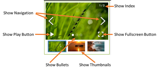
Divider
The Divider Element creates a line in the instant app. Through the Style Tab, you can control the height of the bar (in pixels only) as well as its color. The divider is a fixed length, which is the full width of the instant app. There are no validation options.
Content
Label / Text
The Label element allows you to add static text anywhere within your instant app. This element is often used to create headers for sections or to write lines of text between other elements. You can format this element using markdown.
HTML
The HTML element gives you a place to write your own HTML, using a limited subset of supported HTML:
-
<div></div>
-
<span></span>
-
<center></center>
-
<u></u>
-
<b></b>
-
<i></i>
-
<a href="link"></a>
-
<br>
-
Font Awesome icons can also be used. If you click out of the HTML box, you see your text appear in the preview.
-
The options in the style tab will not override your HTML. For instance, suppose you write this HTML:
<center> Hello !</center>
<br>
<b> How are you? </b>-
On the style tab, if you select weight light, only “Hello!” is light. If you select alignment right, only “How are you?” is aligned right. If you select italic, both are italicized, but “How are you?” remains bold.
-
There are no validations for the HTML element.
Social Buttons
-
On the Style tab, the background circle and the actual icon, for example the bird for Twitter, are controlled separately. The icon’s size and color are controlled by the font size and foreground color. The color of the circle around the icon is controlled by the background color. A circle is the default shape because the inner dimensions are set to equal numbers (50px, 50px). If those are not equal, it will result in an oval. Also, the border of the circle has rounded corners set to 50%. If that is changed, you create shapes other than a circle, depending on the percentage set and on the inner dimensions.
-
There are no validations for social buttons.
YouTube
-
Label: The label displays text above the image link to the video
-
Video URL: In the video URL field, you input the URL to the YouTube movie.
-
Show URL: If you enable show URL, the video’s URL displays below the image link.
-
For the style, you can configure the top, bottom, right, and left margins of the image of the video using pixels or percentage.
-
There are no validations for the YouTube element.
Embedded Website
The Embedded Website Element allows you to iFrame a website to your instant app with a fixed height and width. You might do this, for example, if you want to be able to process a payment for a user. You would input the URL in the website URL and if you want the URL to be visible (it renders above the iFrame), you select Display URL. For privacy or other reasons, uncheck Show the Website to Sender if the user is the only one who should be able to see the website. If the website you are embedding has data that you want to pass back to the instant app, you should select Append Callback URL. Following our example of processing a payment, if a payment succeeds, you may want the user to have one experience, and if it fails, you may want the user to have a different experience. In order to set element values and drive different instant app behaviors, select Append Callback URL. These instructions detail how callback URLs work:
-
You can set the fixed height of the iFramed website by adjusting the inner dimension height in pixels, and the width by the left margin and right margin (in pixels or percentage).
-
There are no validations for the embedded website element.
PDF Viewer
The PDF Viewer Element allows your user to read through a PDF within the instant app. You can provide the file via drag and drop or file upload, and also set the page number you want displayed first. The user can navigate to the document using the next and previous buttons. However, these buttons are not configurable.
-
You can adjust the size of the PDF display, but if you input an inner dimension greater than 100%, you risk not displaying parts of the file, because there is no horizontal scroll bar. The default inner dimension is 90%.
-
There is no validation for the PDF viewer.
Chart
The Chart Element allows you to create four different chart types (bar, pie, line, and scatter chart) that render in your user’s instant app. For each, you can manually input data in the chart element UI or dynamically pull in data from an external source using JavaScript snippets or parameters.
Note:
If you do use JavaScript or parameters, those override any static values you have entered.-
Single series only is permitted and each chart type has a specific data format and maximum number of recommended data points.
-
When you first look at the chart element, each chart type is pre-populated with static values. This allows you to switch between the different chart types to see how a chart renders. If you want to use JavaScript or parameters to create the chart, that data does not render a chart in preview or test mode. To see how your chart will look with dynamic data, configure and style it with static data and then uncheck Enter static values manually . If you change the static values of a bar, pie, or line chart, the changed values are maintained if you switch between those chart types. Scatter charts have a different data input format; any changes to the static values of bar, pie, or line charts are not preserved if you change to a scatter chart.
Bar Chart
-
Bar chart values must be entered as: Label,Value. Labels cannot contain a comma. Values are numbers that contain "+", "-", and ".", but no commas, spaces, or other special characters.
-
Bar charts support a maximum of 40 data values, but render best with 20 or fewer. The colors of the bars can be set on the style tab using the five color palette options.
-
Data labels: You can chose to whether to show or hide data labels. If you show them, the number value for each bar shows on the graph. Via the style tab, you can adjust the label placement of the data label up or down in pixels, and you can control the label color with the label fill color.
-
The chart title, horizontal (x) axis title, and vertical (y) axis title are set on the configuration tab and their size, weight, and color are controlled on the style tab via size, weight, and chart and axis title color. Their style is the same; you cannot control them separately.
-
The labels default to horizontal alignment along the horizontal (x) axis. To make them angled and permit more labels, use the style tab’s horizontal axis label angle. The angle can be entered as a positive or negative value:

-
By default, the vertical (y) axis minimum and maximum will be inferred from the data. if you want to set them yourself, you can uncheck Infer from Data and enter your own minimum and maximum values. These values can be positive or negative.
-
You can toggle to show or hide the legend using the Display Chart Legend checkbox.
Line Chart
-
Line chart values must be entered as: Label, Value. Labels cannot contain commas. Values are numbers that can contain "+", "-", and ".", but no commas, spaces, or other special characters are accepted.
-
Line charts support a maximum of 40 data values, but render best with 20 or fewer. The color of the line can be set on the style tab using the data color option.
-
Data labels: You can chose to show or hide data labels on your chart. If you show them, you see the number value for each point on the graph. Via the style tab, you can adjust the label placement of the data label in pixels, and you can control the label color with Label Fill Color.
-
The chart title, horizontal (x) axis title, and vertical (y) axis title can be set on the configuration tab and their size, weight, and color are controlled on the style tab via size, weight, and the chart and axis title color options. The title style is the same; you cannot control title styles separately.
-
the labels default to a horizontal display along the horizontal (x) axis. To make them angled and permit more labels, use the style tab’s horizontal axis label angle. As in the bar chart, the angle can be entered as a positive or negative value.
-
By default, the vertical (y) axis minimum and maximum will be inferred from the data provided. If you want to set them yourself, uncheck Infer from Data and enter your own minimum and maximum values. These can be positive or negative values.
Scatter Chart
-
Scatter chart values must be entered as: xValue,yValue. Values are numbers that can contain "+", "-", and ".", but no commas, spaces, or other special characters.
-
Scatter charts support a maximum of 200 data value pairs, but render best with 100 or fewer. The color and size of the points can be set on the style tab using the data color and scatter size options.
-
Data labels: You can chose to show or hide data labels on your chart. If you show them, the Y-value for each point shows on the graph. Via the style tab, you can adjust the label placement of the data label up or down, and you can control the label color with the label fill color.
-
The chart title, horizontal (x) axis title, and vertical (y) axis title are set on the configuration tab and their size, weight, and color are controlled on the style tab via size, weight, and chart and axis title color. Their style is the same; you cannot control them separately.
-
The labels themselves default to horizontal placement along the horizontal (x) axis. To make them angled and permit more labels, use the style tab’s horizontal axis label angle. As in the bar chart, the angle can be a positive or negative value.
-
By default, the vertical (y) axis min and max and the horizontal (x) axis min and max are inferred from the data provided. If you want to set them yourself, you can uncheck Infer from Data and enter your own minimum and maximum values. These can be positive or negative values.
Pie Chart
-
Pie chart values must be entered as: Label,Value. Labels cannot contain a comma. Values are numbers that can contain "+", "-", and ".", but no commas, spaces, or other special characters are allowed.
-
Pie charts support a maximum of 20 data values, but render best with 10 or fewer. The colors of the chart components can be set on the Style Tab using the five Color Palette options. The Style Tab also allows you to create a donut chart by adjusting the inner radius and add padding between the slices by using Pad Angle . By default, the pie chart will be 360 degrees. However, you can adjust these angles using the start angle and end angle by entering the desired degrees (positive or negative).
-
Data labels: You can chose to show or hide data labels on the pie chart slice. If you show them, you can select any combination of the value itself (the value part of the Label, Value), the percent that the value represents of the whole, and/or the slice name (the value part of the Label, Value). On the configuration tab, you can adjust the data label placement, moving it in or out from the center of the pie. Via the style tab, you can control the label color with the label fill color.
-
The chart title is set on the configuration tab and its size, weight, and color are controlled on the style tab via size, weight, and chart and axis title color.
-
You can toggle the show or hide the legend using the Display chart legend checkbox.
Pane Validation
-
Validate individual input Elements as they are edited as well as all when submitted—This means that if a customer enters data that’s not valid (for example, a phone number that does not conform to the prescribed regex), then they would immediately see an error message. The instant app will also check that everything is valid before moving on to the next pane.
-
Validate all inputs only when submitted—When you set this condition, a customer doesn’t see an error message immediately after entering data that’s not valid. In this case, the customer could continue to fill out the other fields and wouldn’t be confronted with the error message until the problematic data gets submitted.
You can also validate a pane by writing your own JavaScript. The message included in the code is triggered when the pane is submitted. See The Validator Object.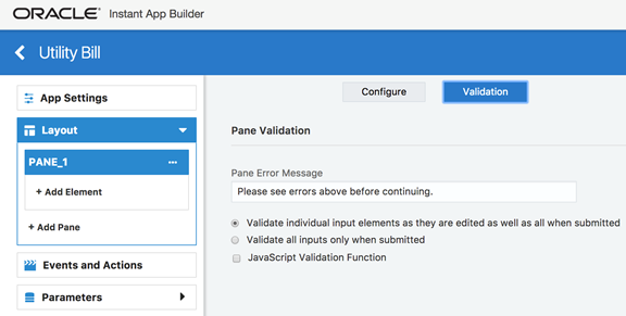
The Validator Object
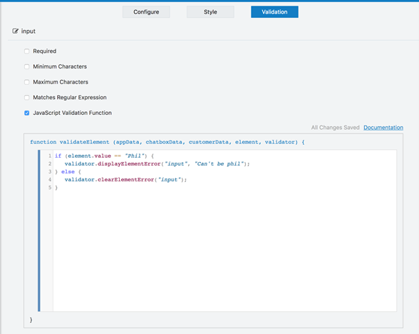
if (element.value == "Phil") {
    validator.displayElementError("input", "Can't be Phil");
} else {
validator.clearElementError("input"); -
validator.displayElementError(<ElementId>,<errorMsg>Note:
If the snippet does not calldisplayElementErrorduring execution, then that element is considered valid. -
validator.clearElementError(<ElementId>);
Events and Actions
In the Events and Actions section for an instant app, you specify actions that will occur when the events fire. For instance, when the customer clicks a radio button, the instant app fires the event associated with the radio button’s changed event. Or, when the instant app is sent to the customer, the App Sent event is fired. This event might be used to set up the initial element values, hit an external web API to collect data, or make certain elements invisible or disabled. In summary, the Events and Actions section is where you make your instant apps dynamic.
Events with associated actions are displayed with a green dot in the upper right corner. Events without any associated actions will not have a dot. For example, in the following illustration, the input element firstNameInput has configured actions, while the shippingOption radio button element does not.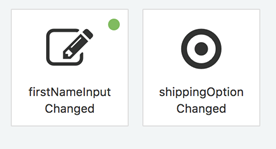
App Events

-
App Sent Event—This event and any associated actions are fired the very first time the instant app is sent to the recipient (a customer). Typically, you use this event for disabling or hiding elements, calling an external web API to retrieve data that is used in the instant app, and for instantiating input elements with their initial values.
-
Customer Connected Event—This event and any associated actions are fired every time the customer opens the instant app. Most often, you can use this event to refresh data from an external web source, ensure consistency and validity of the various values, and to reset the active pane.
-
Customer Disconnected Event—This event and any associated actions are fired when the recipient disconnects from the app. In general, you would use this event is to pipe partially completed data to an external web source or to the bot.
-
App Locked and Unlocked Events—This event and any associated actions are fired when the instant app is locked or unlocked. The instant app can be locked or unlocked using actions, a JavaScript snippet, or by a manual action by the sender.
-
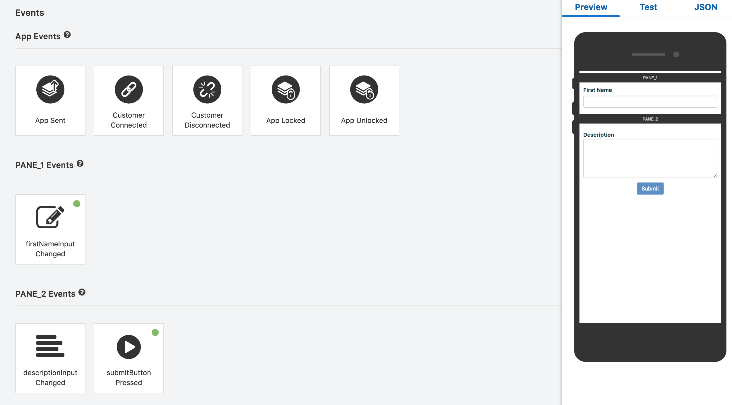
Input Value Changed and Button Pressed Events—When instant Apps have input or button elements, an event is automatically created for that element. An element’s input events are arranged by pane. For example, the following illustration shows the events that were created for two separate panes. On the first pane (PANE_1 Events), there is an event for the single line input element named firstNameInput. This element has a green dot, which indicates that actions have been configured for it. On the second pane (PANE_2 Events), there are two events: one for the descriptionInput , a multi-line Input element and another for the submitButton Button Press event.
The Choice elements (Radio Buttons, Checkbox, Pick List, Select Menu, Button List) support Conditional Action Lists. For these events, you can build action lists that execute when a specific condition is met. For example, the following illustration shows a radio button with Conditional Action Lists. The conditions are tested and then executed sequentially. One of the options for the Condition is value changes. By selecting this option, you enable the actions to fire whenever the value changes for the element.
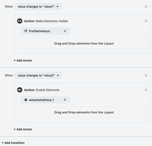
You can delete a condition by clicking the X icon in the upper right corner associated with the condition. Deleting a condition will delete any and all associated actions.
Actions
Actions can be configured for each event. These actions can modify the state of the app, for example, by setting an element value, showing or hiding elements or activating a pane. You can also use them to call external web APIs or to execute JavaScript snippets.
For actions that require an element to operate on (for instance, the action), you specify the element by dragging and dropping them from the Layout section. See Adding, Moving, and Deleting Elements.
You can create actions using the Instant App Builder, or specify them programmatically and execute them as a JavaScript Snippet.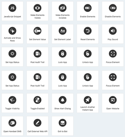
| Event | Action | JavaScript Function Signature |
|---|---|---|
| Computation | JavaScript Snippet | N/A |
| Element Operations | Set Element Value | app.setElementValue(ElementId, value) |
| N/A | Make Elements Visible | app.makeElementsVisible(Elements) |
| N/A | Make Elements Invisible | app.makeElementsInvisible(Elements) |
| N/A | Enable Elements | app.enableElements(Elements) |
| N/A | Disable Elements | app.disableElements(Elements) |
| N/A | Toggle Visibility | app.toggleVisibility(Elements) |
| N/A | Toggle Enabled | app.toggleEnabled(Elements) |
| N/A | Set Element Label | app.setElementLabel(ElementId, textOrHTML) |
| N/A | Set Element Properties | app.setElementProperties(elementId, properties) |
| External Data | Call External Web API | chatbox.callExternalWebAPI(dataKey, eventName, method, URL) and other variants.
|
| Pane Operations | Activate and Show Pane | app.activatePane(PaneName)
|
| N/A | Reset Elements | app.resetElements(ElementName) and app.resetElements(PaneName) |
| Interaction | Play Sound | app.playSound(soundNameOrURL, volume)
|
| N/A | Show Alert Dialog | app.showAlertDialog(dialogTextOrHTML) |
| N/A | Focus Element | app.focusElement(ElementName) |
| N/A | Open Website | chatbox.openWebsite(url, dialogMessage) |
| N/A | Open Handset SMS | chatbox.openHandsetSMS(message, phoneNumber, dialogMessage) |
| Audit/Console | Set App Status | app.setAppStatus(statusString) |
| N/A | Post Audit Trail | app.postAuditTrail(string); |
| App Lifecycle | Lock App | app.lock() |
| N/A | Unlock App | app.unlock() |
| N/A | Launch Another Instant App | chatbox.launchInstantApp(schemaId, [params]) |
| N/A | Exit to Bot | app.exitToBot({key: value, key: value}) |
JavaScript Snippet
This action, which executes JavaScript on the server, broadens your options for configuration and error checking. You can also use it to create dynamic customer experiences.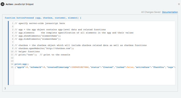
-
Button Press Events (for Button Elements)—
function buttonPressed(app, chatbox, customer, element) {} -
Value Changed Events (for Input Elements)—
function valueChanged(app,chatbox, customer, element, oldValue, newValue) {} -
App Sent Event—
function appSent(app, chatbox, customer) {} -
Customer Connected Event—
function customerConneted(app, chatbox, customer, count) {} -
Customer Disconnected Event—
function customerDisconnected(app, chatbox, customer) {} -
App Locked Event—
function appLocked(app,chatbox,customer) {} -
App Unlocked Event—
function appUnlocked(app.chatbox.customer) {} -
Input Validation Event (on an Input Element’s Validation tab)—
function validateElement(appData, chatboxData, customerData, Element, validator) {}
| Function Parameters | Description |
|---|---|
app.appId |
The unique identifier for this instance |
app.schemaId |
The schema number for this Instant App |
app.createdTimestamp |
The number of milliseconds since 1/1 1970 |
app.status |
A string denoting the app’s current state as set by app.setAppStatus(str).
|
app.locked |
A boolean indicating if app is locked/unlocked |
app.activePane |
A string indicating name of the current Pane |
app.tags |
|
app.parameters |
A key-value list of parameters passed to the Instant App at launch |
App.Elements |
A list of elements and all their associated information.
|
customer.customerId |
A unique customer ID for current customer |
customer.name |
The customer name, if known |
JavaScript Snippet Execution
-
Limited Run time and Length—JavaScript Snippets are limited to a total server run time of 1s. If your snippet exceeds that time, an error will be posted and the snippet will fail to execute. Snippets are limited to 10000 characters in total length.
-
External Resources—The only way to access external resources is to use the
app.callExternalWebAPI()function, which executes asychronously and returns data to a named callback event for further processing. -
Asynchronous, Server-side Execution—The code that is executed on the server-side. No client side injection is possible and each snippet is sandboxed to avoid data integrity issues. Snippets execute asynchronously; blocking operations are not allowed or supported.
-
Actions Performed Post-Execution—Values that are changed through a function call are not immediately reflected in the objects that were passed to the function. For instance, calling
app.hideElements(“input”)will not affect the value ofapp.elements.input.visiblewithin the scope of the function. For example:
The following illustration shows how the Console reflects this action, with the visibility remaining unchanged. See Test Mode.print(app.elements.input.visible); app.hideElements("input"); print("After hiding: " + app.elements.input.visible);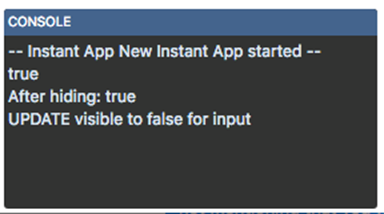
Commonly Used JavaScript Snippets
Here are some common JavaScript snippets and guidelines.
How to Change the Value of an Element
function valueChanged(app, chatbox, customer, element, oldValue, newValue) {

  if (newValue) {
    var capitalized = newValue[0].toUpperCase() + newValue.slice(1);
    app.setElementValue(element.id, capitalized);
  }
}
How to Change the Behavior of the Instant App Based on a Selection of a Radio Button or Select Element
function valueChanged(app, chatbox, customer, element, oldValue, newValue) {
  switch(newValue) {
     case "shippingIssue":
        app.showElements("description");
        app.hideElements("starRating");
        break;
     case "return":
        app.showElements("starRating");
        app.hideElements("description");
        break;
     case "changeAddress":
        app.activatePane("changeAddressPane");
        break;
  }
}
Set Element Value
-
The following illustration shows setting the fullName element to a static value.

-
In this illustration, the fullName element is set to the value of the
{firstName}and{lastName}values.
-
This illustration shows setting value of Picklist element to check options corresponding to
value1andvalue2.
JavaScript Action
app.setElementValue(“ElementId”, value); Important:
You’ll get an error if you usesetElementValue to change the label or other properties of an element.
Make Elements Visible
This action displays one or more hidden elements.
JavaScript Action
app.showElements("ElementName"); // single element
app.showElements("ElementName", "ElementName2"); // comma-separated Elements
app.showElements(["ElementName", "ElementName2"]); // list of Elements
Make Elements Invisible
This action hides one or more hidden elements.
JavaScript Action
app.hideElements("ElementName"); // single element
app.hideElements("ElementName", "ElementName2"); // comma-separated elements
app.hideElements(["ElementName", "ElementName2"]); // list of elements
Enable Elements
This action enables the input of the elements that you drag and drop from the Layout category. The elements enabled by this action still respect the Element Usability setting, meaning that the element remains disabled when you’ve enabled an element for a target that can’t use it. See Common Configuration.
JavaScript Action
app.enableElements("ElementName"); // single element
app.enableElements("ElementName", "ElementName2"); // comma-separated elements
app.enableElements(["ElementName", "ElementName2"]); // list of elements
Disable Elements
Use this action to disable input for the elements that you drag and drop from the Layout category. When you disable an element, it’s grayed out and in this state, can’t accept a customer’s input or manual updates.
JavaScript Action
app.disableElements("ElementName"); // single element
app.disableElements("ElementName", "ElementName2"); // comma-separated elements
app.disableElements(["ElementName", "ElementName2"]); // list of elements
Toggle Visibility
This action toggles the visibility for the elements that you drag and drop from the Layout category. If an element is invisible, it will become visible (and vice versa). 
JavaScript Action
app.toggleVisibility("ElementName"); // single element
app.toggleVisibility("ElementName", "ElementName2"); // comma-separated elements
app.toggleVisibility(["ElementName", "ElementName2"]); // list of elements
Toggle Enabled
This action toggles the input state for the elements that you drag and drop from the Layout category. If an element is enabled, it will become disabled. Likewise, if an element is disabled, it will become enabled.
JavaScript Action
app.toggleEnabled("ElementName"); // single element
app.toggleEnabled("ElementName", "ElementName2"); // comma-separated elements
app.toggleEnabled(["ElementName", "ElementName2"]); // list of elements
Set Element Label
-
As shown by the InputField Element in this image, you can set the set the label value as a static value (
My new label).
-
This image shows using static values and brace notation for stored values (
Welcome {firstName}).
-
This image shows a combination of a static value, HTML tags and value replacement through brace notation (
Welcome <span style=’color: red’>{firstName}</span>).
The following image shows how this combination renders the label at runtime.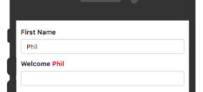
JavaScript Action
app.setElementLabel(“ElementId”, “new Label (supporting {} and HTML)”); Note:
UsingsetElementLabel on a Checkbox Element also changes the text that’s next to the checkbox.
Set Element Properties
app.chartElement.properties.data. This is set as:app.setElementProperties("chartElement", { "data": d });app.element.properties is an object that stores properties that are settable with the app.setElementProperties() function. It supports only the data property. For example:var chartData = app.elements.chartElement.properties.dataapp.setElementProperties(elementId, properties) sets a collection of properties on the given element. The properties parameter is a key-value map of the properties to update and their updated value. It supports only the data property. For example:app.setElementProperties("chartElement", { data: chartData })Call External Web API
Use this action to call an external API endpoint. To configure this action, specify the API method (GET, DELETE, PATCH, POST, or PUT) and the URL endpoint.
Note:
All external web API calls are asynchronous in that they don’t block and wait. Instead, they execute any subsequent actions immediately. When the data is returned from the API call, the specified Named Callback Event will then fire and execute.If you provide a value in the Data Key field, use brace notation to make the API return data addressable. For example, if your Data Key is called myCurlyData, you can add {myCurlyData.x} to the Elements in the JavaScript that support the curly notation format.
To test various scenarios without actually having to hit the specified endpoint, you can also specify test response and the status code. In Test Mode, when the action is executed, this test response and status code are sent to the named callback event. See Test Mode.
JavaScript Action
chatbox.callExternalWebAPI Action:chatbox.callExternalWebAPI(dataKey, eventName, method, url);
chatbox.callExternalWebAPI(dataKey, eventName, method, url, value);
chatbox.callExternalWebAPI(dataKey, eventName, method, url, value, contentType);
// value and contentType are optional (needed where method equals POST or PUT)
// contentType defaults to application/json if not specified.
chatbox.callExternalWebAPI(dataKey, eventName, method, url, testModeStatusCode, testModeResponse);
chatbox.callExternalWebAPI(dataKey, eventName, method, url, value, testModeStatusCode, testModeResponse);
chatbox.callExternalWebAPI(dataKey, eventName, method, url, value, contentType, testModeStatusCode, testModeResponse);Activate and Show Pane
This action switches the pane that’s currently active. Using this action, you can switch context and also add wizard-like behavior to your app. 
To configure this action, drag and drop a pane from the Layout category.
JavaScript Action
app.activatePane("PaneName"); Reset Elements
Use this action to reset elements (along with their visibility, label, and value attributes) to their original state. For example, you can configure this action for a form reset button by dragging and dropping the elements that the button resets.
JavaScript Action
app.resetElements("ElementName"); // single element
app.resetElements("PaneName"); // all elements on the specifiedPane
app.resetElements(["ElementName", "ElementName2"]); // list of elements
Play Sound
This action enables your instant app to play a specified sound at a specified volume. 
You can configure this action by selecting one of the built-in sounds or, by choosing the Specify URL option, you can use an external sound file that’s accessed via https. For the latter, you need to enter the URL where the file is hosted (https://example.com/sound.mp3, for example).
Note:
There are a few things to keep in mind if you opt for an external sound file:-
The instant app can only access the file through
https. -
The instant app can’t play a sound if you don’t specify a sound file, or if the file is unavailable or can’t be reached.
-
The file types vary by browser. Typically, browsers support mp3, mpeg, opus, ogg, oga, wav, aac, caf, m4a, mp4, weba, webm, dolby, and flac.
-
For the broadest browser coverage and compatibility, use an mp3–formatted file.

Built-in Sounds
-
AscendingTone
-
BellTwinkle
-
DoubleBlip
-
HappyChime
-
OptionChange
-
PercussionBlipsNotic
-
PercussionBlipsPop
-
SlipperyStuttering
-
SuccessAle
-
SuccessChime
JavaScript Action
// supports all the tones from the drop down menu
app.playSound("AscendingTone", 100); // play at full volume

// play a sound from an external website at half volume
app.playSound("https://example.com/sounds/yahoo.mp3", 50);
Show Alert Dialog
This action enables your instant app to display a modal dialog message to its customers. 
Your message definition can include both a limited set of HTML tags and brace notation. For example, Thank you!<br/><b>your order<b> is confirmed, {firstName}.
JavaScript Action
app.showAlertDialog("Thank you!");
app.showAlertDialog("Thank you {firstName}"); // use {} value replacement
app.showAlertDialog("<b>Thank you!</b>"); //use of limited HTML
Focus Element
Use this action to move the keyboard focus to a specified element.
JavaScript Action
app.focusElement(“ElementName”); // unlock the app and allow input changesOpen Website

To configure this message, enter a message and a website URL using one of the following schemes:
| Scheme | Example |
|---|---|
http |
http://example.com |
https |
https://example.com |
sms |
sms:+12065551212 |
mailto |
mailto:support@acme.co |
tel |
tel:+12065551212 |
ftp |
ftp://myftp.com |
Note:
Some URLs, likesms and tel, are not supported by desktop browsers while others (ftp) are not supported by mobile browsers.
JavaScript Action
chatbox.openWebsite("http://example.com", "Let us take you to example.com");Open Handset SMS
Thank you, {firstName}.<br><br>Return to SMS).
Note:
Some URLs, likesms and tel, are not supported by desktop browsers while others (ftp) are not supported by mobile browsers.
Important:
Some older mobile phones may not fully support the pre-instantiation of the messageJavaScript Action
chatbox.openHandsetSMS(“MENU”, “12065551212”, “Return to SMS?”);Set App Status

Tip:
Your string definitions can include brace notation ({ElementOrParameterName}).
JavaScript Action
app.setAppStatus("Form Submitted");Post Audit Trail
Use this action to post a timestamped line of text to the customer record. 
Your string that specifies the audit trail message can access element or parameter values using the brace notation ({ElementOrParameterName}). For example, First Name Updated {firstName}.
JavaScript Action
app.postAuditTrail("Something happened");
app.postAuditTrail("First Name Updated: {firstName}");
Lock App
Use this action to lock the instant app and prevent users from making any further changes. When this action is fired, the instant app displays an indicator that the instant app has been locked. At this point, your users can no longer click buttons or change any input field. After this action is called, the App Locked Event will fire if any actions are configured for that event.
JavaScript Action
app.lock(); // lock the app from further changesUnlock App
Use this action to unlock the instant app and allow users to resume with the instant app. In other words, your users can continue to click buttons and change and input values. After this action is called, the App Unlocked Event will fire if any actions are configured for that event.
JavaScript Actions
app.unlock(); // unlock the app and allow input changesLaunch Another Instant App

Tip:
Use the value in the App ID field in the App Settings page.JavaScript Action
// launch an instant app with no parameters specified
chatbox.launchInstantApp("schemaId",  null);

// launch with specified parameters comma-separated
chatbox.launchInstantApp(
  "schemaId",
  { name: "paramName1", value: "paramValue1" },
  { name: "paramName2", value: "paramValue2" }
);


// launch with specified parameters in an array
var array = [];
array.push({ name: "paramName1", value: "paramValue1" });
array.push({ name: "paramName2", value: "paramValue2" })

chatbox.launchInstantApp("schemaId",  array);
Important:
You can’t launch another instant app with parameters.Exit to Bot
Use this action to enable the instant app to return values to the bot. The instant app remains visually active for the customer even after it returns its values to the bot unless you set actions that enable it to behave otherwise.
Note:
Returning values to the bot does not alter the visual state or usability of the bot in any way.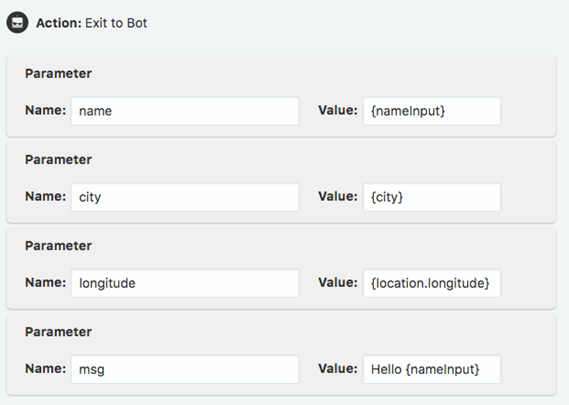
While you can define these values as static values, you’re more likely to specify them using curly bracket notation like
Hello {nameInput} or {location.longitude} so that they can return values from other elements. For example, the payload returned to the bot would look like this because of the value substitution:{
"name": "Phil Gordon",
"city": "Seattle",
"longitude": "-32.33221156",
"msg": "Hello Phil Gordon"
}JavaScript Action
app.exitToBot(); // no parameters
app.exitToBot({"name":"value", "name":"value"}); // exit and send data
Parameters
Parameters are used to pass data from a bot into an instant app. This data can then be used both in elements and as part of the JavaScript snippets.
-
When passing in a parameter to the instant app. This happens when an instant app is launched from a bot, or when you enter the parameters manually as part of testing. See Test Mode.
-
Inside an instant app with the
{parameterID}notation. -
Inside an instant app (and within a JavaScript snippet through
app.parameters.parameterName).
To give your parameter some context, you can add a description, which is optional. The text that you add in the Description field is for internal use only. It doesn’t display in the instant app and isn’t passed in the parameter. 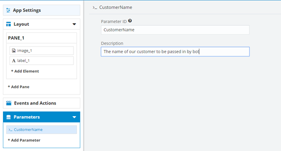
-
Create the parameter. In this case, it’s called CustomerName.
-
Add a Label element. In the Text field, enter
{CustomerName}.
-
On the right side of the Instant App Builder (where the phone is), select Test and then click Start as Recipient.
-
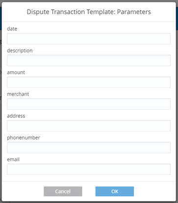
As the admin, you’ll see the Parameter popup, where you can add a name like Jane Doe. Click OK.
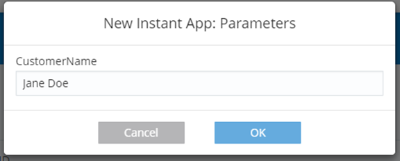
You’ll see Jane Doe show up on your instant app as your Label element text.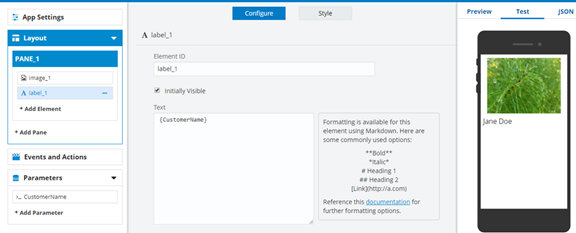
Using Brace Notation in Element and Parameter Values
-
{ElementName} -
{parameterName}
{ElementName.key} notation.
Barcode Element
-
{barCodeName.barcode}—The numeric barcode -
{barCodeName.barcode.type}—The type of the barcode (AZTEC, CODABAR, CODE_39, CODE_93, or CODE_128) -
{barCodeName.url}—The URL of the barcode image -
{barCodeName.html}—The barcode and image as a HTML fragment
Upload Element
-
{uploadElementName.url}—The URL of the uploaded data -
{uploadElementName.html}—The uploaded data as a HTML fragment -
{uploadElementName.filename}—The uploaded data’s filename
Location Element
-
{locationElementName.latitude} -
{locationElementName.longitude} -
{locationElementName.url.google}—The URL for a Google Maps location -
{locationElementName.url.bing}—The URL for a Bing location -
{locationElementName.url.openStreetMap}—The URL for an Open Street Map location -
{locationElementName.url.hereMap}—The URL for a Here Map location
Date Element
-
{dateElementName.day} -
{dateElementName.month}— 0 = January, 11 = December -
{dateElementName.year} -
{dateElementName.hour} -
{dateElementName.minute} -
{dateElementName.epoch}—The number of milliseconds that have elapsed since 1/1/1970
Tip:
The epoch value is the easiest way to convert back to the JavaScript date:var d = new Date(app.Elements.date.value.epoch)Modes
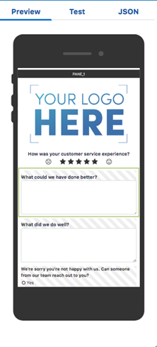
Preview Mode
-
The elements that you configure as initially invisible are shown with the hatch marks.
-
The current element that you’ve selected or are editing is outlined in green.
-
Panes are separated by name.
-
Clicking an element in the Preview highlights that element in the Layout section and opens the element’s editor.
Note:
Changing values in Preview mode has no effect on the instant app and will not trigger events to fire.
Test Mode
In Test Mode (which you activate by clicking Test), you’ll see a full preview as well as the Console, which is a running commentary on events and actions as they occur. 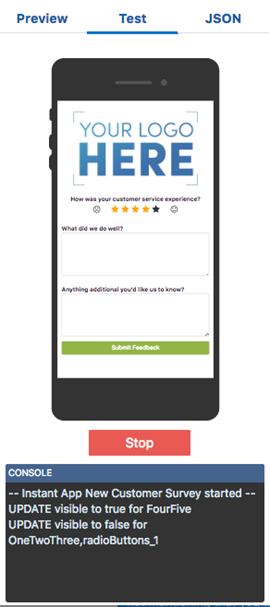
There are two choices when Test Mode starts: Start as Recipient and Start as Sender. Because an app can behave differently depending on sender or recipient role, you need to pick one of these options before testing the app so that you can assess a particular user experience. For example, you can configure an element’s usability setting that limits the ability to edit a field to only the customer (the recipient). 
Print to Console in JavaScript Snippets
print(“Hello World”);Limitations of Test Mode
-
The Call External Web API action can’t call the target resource. Instead, it uses test data that you’ve provided in the Test Response field. You also need to provide a response code.
-
You can’t use the Lock App and Unlock App actions.
-
If the instant app requires any parameter data, you’ll be prompted it when Test Mode starts. See Parameters.
JSON
The JSON tab displays the complete specification for this instant app as expressed in JSON. While you can export this JSON, modify it using any code editor that you want, and then import it to the Instant App Builder, you can avoid the validation errors and other problems (like creating or improper or inconsistent schemas) the you might encounter if you take this route if you create the app entirely with the Instant App Builder. See Exporting and Importing.
Starting an Instant App from a Template
If you’re not sure exactly where to start on your instant app, you can use template that you can customize to your business needs.
Similar to starting a new instant app from scratch, you click the New Instant App tile. But instead of choosing a blank instant app, you can scroll through the templates and choose the one that’s most relevant to your use case. From there, the Instant App Builder opens for the template, allowing you to both customize it and save it to your library.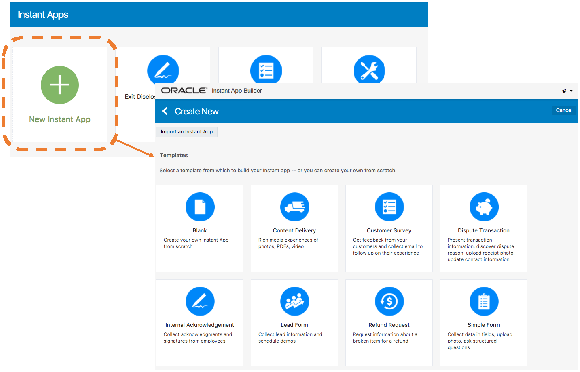
Instant App Lifecycle
You can manage your library of instant apps by activating and deactivating them, deleting them, making clones that you can edit, or by editing the app directly.
You access these management functions from hamburger menu on the bottom right of an instant app tile.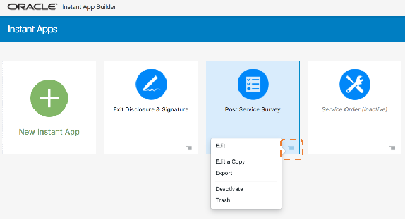
Editing
You can edit any instant app in your library in one of two ways: simple Edit, or Edit a Copy.
Simple editing takes you into the existing instant app to make changes. Once you’ve completed your changes, clicking Save overwrites the existing version. If you choose to Edit a Copy, your instant app will be cloned. Any changes that you make will be saved to a new instant app, with the default name Copy of (original instant app name). Rename, make edits, and save your new instant app.
Publishing
Any inactive instant app displays with its name and description grayed out and italicized. If you an inactive instant app in your library, you can reactivate them by choosing Activate from the menu in the tile. 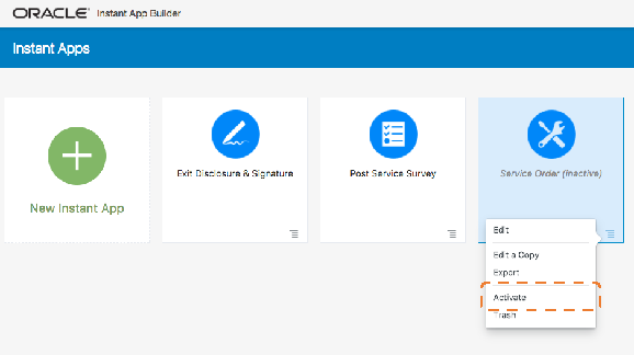
Deactivating
Similar to activating an instant app from your library, you can use the hamburger menu to deactivate an active instant app.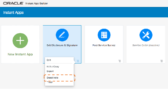
Deleting and Restoring
You can remove an instant app from your library by choosing Trash from the instant app’s tile menu.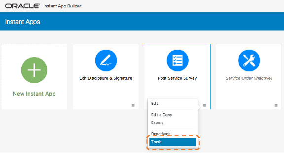
The Trash option doesn’t permanently delete an instant app. Once you’ve trashed it, you will see options related to trashed items display at the top of the instant app library.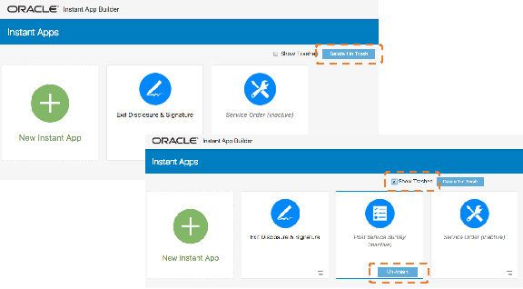
Clicking the Delete (#) in Trash permanently deletes any instant apps in your trash.
You can restore an instant app anytime by first selecting Show Trashed, identifying the instant app that you want to restore, and then clicking Un-trash.
Exporting and Importing
You can export any instant app into a JSON file. By doing this, you can edit the JSON directly using some other framework instead of the Instant App Builder. You can also export and import across different instances.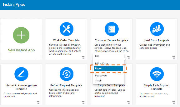
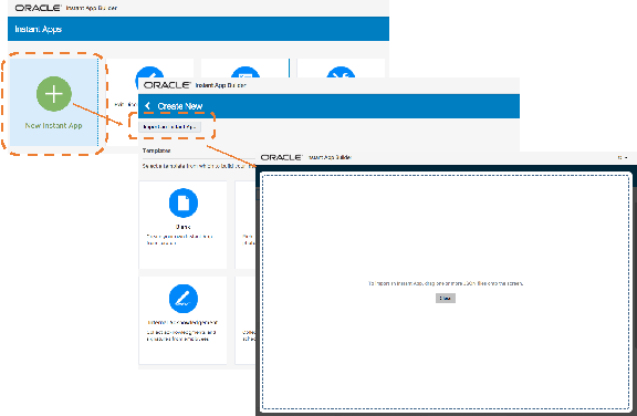
To import a JSON file into the Instant App Builder, click the green plus icon (+) to add a new instant app. Next, click Import an Instant App. From there, drag and drop the JSON file into the Instant App Builder, where you can modify and save your instant app.