How Are App UIs Structured?
If you've ever built a visual application with Visual Builder or VB Studio, you should already be familiar with the concepts needed to build or configure App UIs and fragments. If you haven't, you may want to quickly read through this topic before you start developing or configuring in earnest.
Let's begin by taking a look at a simple App UI in the Navigator: 
Description of the illustration basicstructure1.png
In this example, we've created an empty extension called sampleWorkspace and added an App UI called sampleappui to it. All App UIs are represented in the Navigator by an expandable ![]() node.
node.
sampleappui, all of which apply to App UIs (and fragments) in general:
- When you first create an App UI (not fragment), a flow called
mainis automatically created for you. A flow is a group of one or more pages that is treated as an independent unit to perform some function in your application. For example, you might have a flow that contains the pages and artifacts used to register a new person. Each App UI can have as many flows as you need. Although the default flow's name ismain, you can rename it by right-clicking the flow and choosing Rename. - By default, the
main-startpage in themainflow is set as the default page in the flow, and themainflow is set as the default flow for the App UI. This means that they are the flow or page that is first invoked when your user interacts with your App UI. However, you can choose to have another page serve as the default for a flow, and/or choose another flow to be the default for the App UI. To do this, highlight the page or flow, then click Settings. The default flow and page within an App UI are always badgeddefaultfor easier identification. - A page (or fragment) typically contains one or more UI components, usually bound to data provided by a service connection.
- If you create a custom root page, the
Application Root Pagesfolder contains pages that you can use to brand your App UI with a common header, footer, background, or other elements, to provide a consistent look and feel. - Your extension has two
Resourcesfolders for images, style sheets (css), and JavaScript functions. TheResourcesfolder undersampleappUIis available to that App UI only. The otherResourcesfolder contains resources available to all App UIs and fragments in your extension.
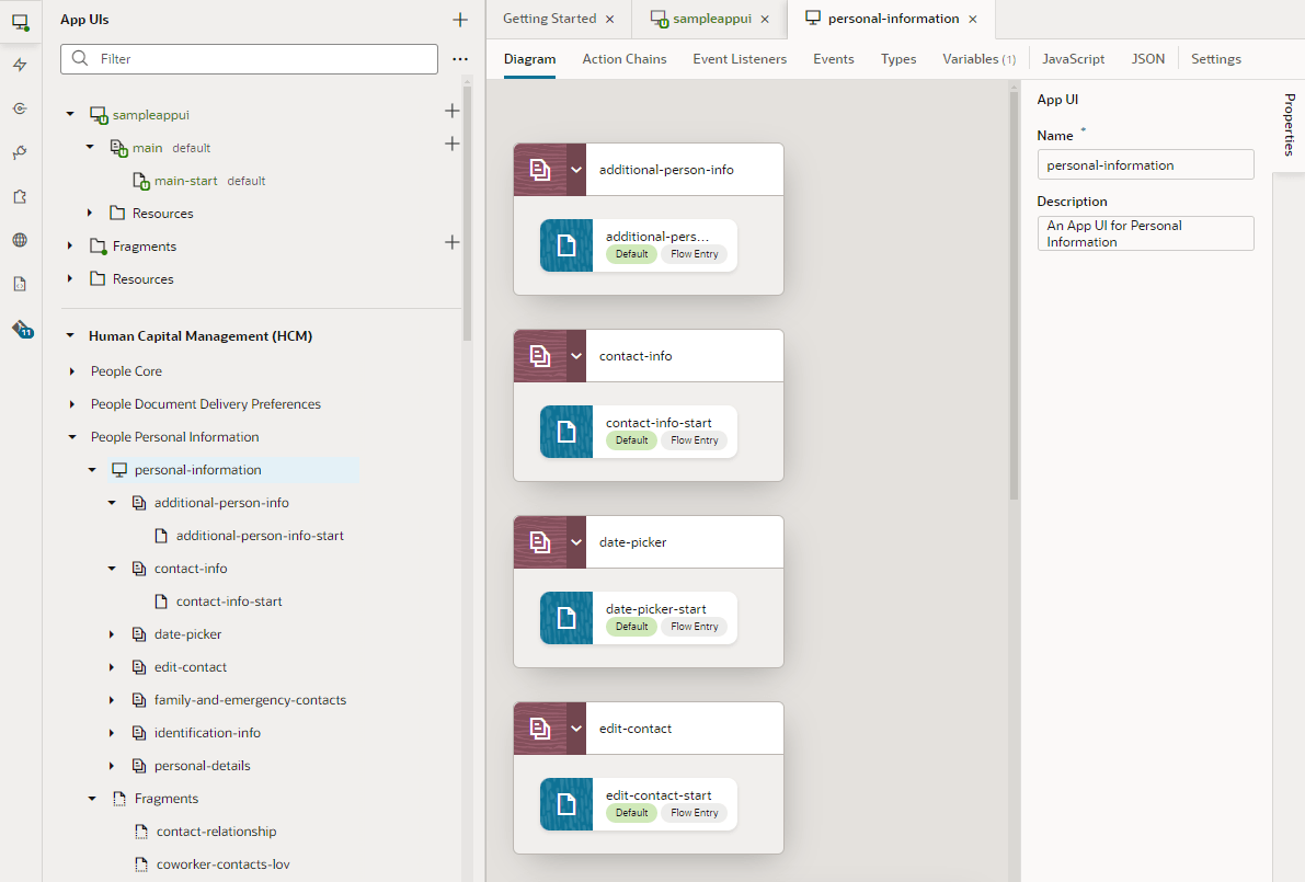
Now let's say we add an extension as a dependency, for example, the Oracle Hcm People Personal Information Extension, which contains the personal-information App UI:
Description of the illustration structurewithdependency1.png
Unlike the newly created sampleappui, this App UI has multiple flows: additional-person-info, contact-info, and so on, each with pages called additional-person-info-start and contact-info-start, and so on.
Now that you understand the basic structure of extensions and App UIs, you're ready for the concept of scopes.