How You Customize Surveys for Use on Mobile Devices
Case sections and conditional sections using runtime variables can be added to the HTML content of your survey questionnaire if you want to show different content for mobile devices from what you show for desktop mode.
For instance, you might want to use a smaller image at the top of your survey for mobile devices than the one you use for surveys viewed on desktops. In another situation, you could use a case section to hide a lengthy matrix question that might not be effective when viewed on a small mobile device.
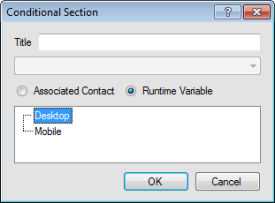
This image shows the Conditional Section window with the Runtime Variable option selected.
When using conditional and case sections with runtime variables, it’s important to remember the following.
- Mobile conditional sections are honored on a mobile device even if mobile optimization is disabled in your survey.
- When using desktop and mobile runtime variables, we recommend that you create content for both variables on one page. You can do this either with a conditional section for each variable, or by adding content that appears for both variables. Otherwise, the runtime variable for which no content is defined will display a blank page.
- If the mobile user selects the Switch to Desktop Mode link, available on the first survey page, all content that displays will be desktop content, even if a mobile device is being used. (Switch to Desktop Mode is available only on the first page of a survey.)
- Test and preview your survey in both mobile and desktop modes to ensure your conditional sections work the way you intend them to.