Best Practices for Using Matrix Questions in Mobile Surveys
When matrix questions display on small mobile devices (400 pixels wide or less), questions and choices automatically reflow to display vertically. Larger mobile devices, such as tablets (or when small devices are viewed in landscape mode), are wide enough to display matrix questions horizontally, as they display on a desktop.
Instead of using matrix questions in your mobile surveys, consider adding a case section with conditional content using runtime variables to the HTML content of your questionnaire. This way, you can show different content for mobile devices from what you show for desktop mode. See How You Customize Surveys for Use on Mobile Devices.
Here is an example of how you could use a case section with conditional content for both variables to hide a matrix question that wouldn’t be effective when viewed on a small mobile device.
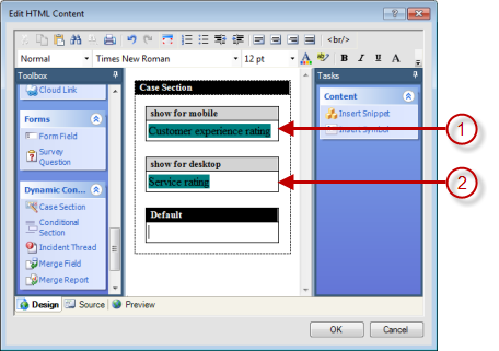
Legend for image: 1. Choice style question displays for mobile 2. Matrix style question displays for desktop
You could accomplish the same effect by adding a conditional section for each variable. Either way, the important takeaway is to create content for both variables on a single page. Otherwise, the variable for which no content is defined will display a blank page.