Monitoring Ingest and Delivery
The Ingest & Delivery Monitoring page in the Oracle Data Cloud platform includes tools that enable you to monitor data ingest and delivery proactively and to receive alerts and notifications. You can use these tools to diagnose and troubleshoot issues with data ingestion or delivery. For example, you can monitor ingest efficiency for online data gathered from web sites. If efficiency is low, that might indicate that your users have browsers that block cookies or that users have manually disabled cookies.
You can use the tools on this page to:
- Verify that your data is being ingested as expected.
- Learn how many calls and user profiles are being sent to the platform for ingestion.
- Learn how many times user profiles are found and ingested successfully into the platform.
- Look for errors in site and data ingestion configuration.
- Verify that user profiles are being classified into categories correctly.
- Look for unexpected changes in category inventory.
- Learn how your inventory is trending over time.
- Verify that user profiles are being delivered as expected.
- Look for broken deliveries.
The Ingest & Delivery Monitoring page includes a number of tabs that display different information:
- Summary tab. Provides an overview of the information presented in the other tabs.
- Data Source Ingest tab. Displays information about activity related to all the sites and containers that you deployed for ingest into the platform.
- File Ingest tab. Displays information about files you ingest.
- Category Inventory tab. Displays information about the user profiles in your first-party categories.
- Audience Delivery tab. Displays information about audience delivery.
The Ingest & Delivery Monitoring page includes a Filters area to the left and the main workspace on the right.
- The Filters area enables you to focus the information displayed on the page based on dates and other criteria. The page can display highly aggregated data over a long period of time, but in most cases it is more useful to focus narrowly.
- The workspace includes graphs, tables, and other elements that display information meeting the filter criteria you have selected.
Opening the Ingest & Delivery Monitoring page
The Ingest & Delivery Monitoring page is included in the Reports area of the platform menu.
To open the Ingest & Delivery Monitoring page:
- In the platform toolbar, select Reports > Audience & Delivery Reporting > Ingest & Delivery Monitoring .
Working with graphs and tables
The Ingest & Delivery Monitoring page displays information in tables, graphs, and charts. This section includes information about using these features and about customizing their content. The data displayed reflects the dates and other filters you set.
Using trend graphs
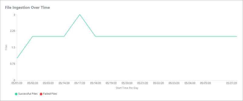
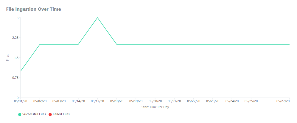
Many tabs include graphs that display trends. For example, the graph below shows file ingestion volume over time.
Graphs that show data from different sources or of different types, use color to differentiate the data. You can get precise information about a particular time increment in trend graphs by mousing over the graph. In this example, the interval is daily, so mousing over the graph displays information for a specific day.
Sorting tables
Tables display data in rows and columns, sometimes presenting a more detailed view of the same information shown in a graph. A table can be linked to a graph. In this case, the graph displays data about items selected in the table.
You can sort the information in tables by highlighting a column and then specifying ascending or descending order. In this example, the table is in descending order by path. To sort by Category ID, click that column and then click the arrow to set the order.
Using filters
Each tab includes a number of filters that you use to specify exactly the data you want to display.
Some of the filters are based on the nature of the data itself. These criteria include ID source, country, audience, and container. The available filters vary from tab to tab and are documented separately in the appropriate sections of this document.
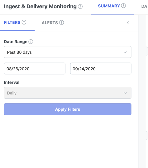
In addition, each tab includes the ability to select the date range and interval that applies to data on the page. The date range and interval you select apply to all tabs, not just the current one.
- The date range defines the period of time the report covers. You can select from several pre-defined ranges or enter custom dates. The maximum range is 90 days.
-
The interval defines whether data in reports is aggregated daily or hourly.
The date range and interval settings interact with each other. If you select an hourly interval, the date range is limited to three days. Similarly, the daily interval is available only for date ranges of more than one day.
To filter data:
-
In the Filters area, select a date range or enter custom dates. Custom dates you specify are inclusive. For example, the date range 06/09/2020 to 06/11/2020 defines a three-day period.
-
In the Interval field, select Daily or Hourly. The Hourly setting is available only for date ranges of three days or less. The Daily setting is available only for date ranges of more than one day.
The data in the current tab updates as you make date and interval changes. Data in other tabs reflects the current settings when you display them.
- Select additional filter criteria that appear for the current tab.
-
Click Apply Filters.
The data displayed in the workspace changes to reflect your selections. The date range and interval also apply to data in other tabs.

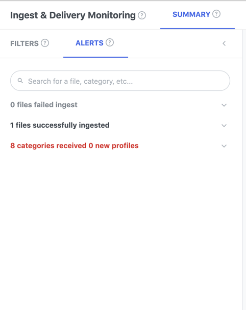
Alert Log
The Alerts tab displays alerts that enable you to monitor ingest and delivery. The log includes alerts that were triggered during the selected date range. Older alerts are discarded automatically.
You see the following types of alerts:
- Files that failed ingest. The alert includes the file size and failure date. Use these enable to identify and respond quickly to file ingestion issues.
- Files that have been ingested successfully. The alert includes the file size and ingestion date. Use these alerts to monitor the status of your file ingestion process.
- Categories that have zero newly tagged profiles during the date range but previously had nonzero volume for the interval on the previous day. The alert includes the category path and category ID. Use these alerts to identify and respond to unexpected changes in profile volume.
The following illustration shows the Alerts tab. To see or hide the alert text, click the arrow next to each alert type.
Exporting data
You can export ingestion and delivery monitoring data to TSV files for use in spreadsheets or other applications. For example, you may want to send audience delivery information to a partner or client in a form they can read. In some cases, you can export data that is not displayed in the user interface.
There are two ways to export data:
-
You can export the data from some panels. The exported data is based on the current filter selections. An export icon in a panel indicates the availability of this feature.
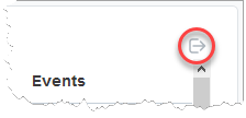
To export data:
- Do one of the following:
- In the upper-right corner of the File Ingestion Details or File Ingest by Config panel, click the export icon.
- Specify a file location or an application to open the file.
Reports tab
The Reports tab lets users:
- Create new reports
- View existing reports
- Filter the report list

By default, the Reports tab displays a maximum of 100 reports. Customers can create new reports in two ways. The first method requires the customer to:
- Click the plus symbol. From the pop-up, select the report type to generate. Enter other parameters such as date, aggregation interval, and the like.

- Click Next, then enter specific report parameters.
- Click Generate One-Time Report.
- The Report will be submitted for generation, and shows up as processing in the Report list.

- Click the Refresh icon or you could come back to the tab at a later time. Once the report is generated, the icon turns to green. Use the download icon to download the report.


Alternatively, customers can follow the steps below to produce new reports.
-
On the Filters pane, select your filter criteria and apply it.
-
Select the Export Report option to open the Report creation dialog. The filter criteria you apply will be automatically picked by the Create Report dialog.

Report Availability
Reports once generated will be available for future download. Furthermore, reports generated in a seat are visible and available to all users in a seat.
Summary tab
The Summary tab provides an overview of the information presented in the other tabs. It also includes an alert log.
The tab includes the following information:
- Data Source Ingest KPIs. A digest of important information related to data ingestion from sites. API calls, and MAID direct ingestion. See Data Source Ingestion for more information.
- File Ingestion KPIs. A digest of important information related to category inventory. See File Ingestion for more information.
- Category Inventory KPIs. A digest of important information related to category inventory, including the total number of categories associated with your partner seat and the total number of user profiles in your categories. See Category Inventory for more information.
- Audience Delivery KPIs. Shows the number of audiences in your inventory and the numbered delivered in the date range. See Audience Delivery for more information.
- Events Trends. A trend graph of event volume over time with color coding to differentiate ID types. See Data Source Ingestion for more information.
- File Ingestion Over Time. A trend graph that of file ingestion volume over time. See File Ingestion for more information.
- Category Inventory Over Time By ID Space. A trend graph of category inventory over time, with color coding to differentiate ID types. See Category Inventory for more information.
- Audience Delivery Over Time By ID Space . A trend graph of audience deliveries over time, with color coding to differentiate ID types. See Audience Delivery for more information.
Data Source Ingest tab
You use the Data Source Ingest tab to monitor activity related to data ingestion based on known ID spaces that do not require an ID swap, These ingestion types include site-based cookies, API calls, and MAID direct ingestion.
Many of the tools in the Data Source Ingest tab show information about events. An event occurs any time a call is made to send to the platform. For example, to determine that data is flowing properly, you can use ingest efficiency. Ingest efficiency is calculated by dividing the number of events that resulted in a user profile update by the total number of events. A low efficiency level may indicate configuration problems or other issues.
Note: While the tab can display aggregated data for all your sites, it is usually more effective to use filters to restrict data to individual sites. Aggregated data is often too general to be useful.
Use the Data Source Ingest tab to:
- Troubleshoot your integrations to ensure that data is flowing properly.
- Monitor, review, and control data delivered to your sites.
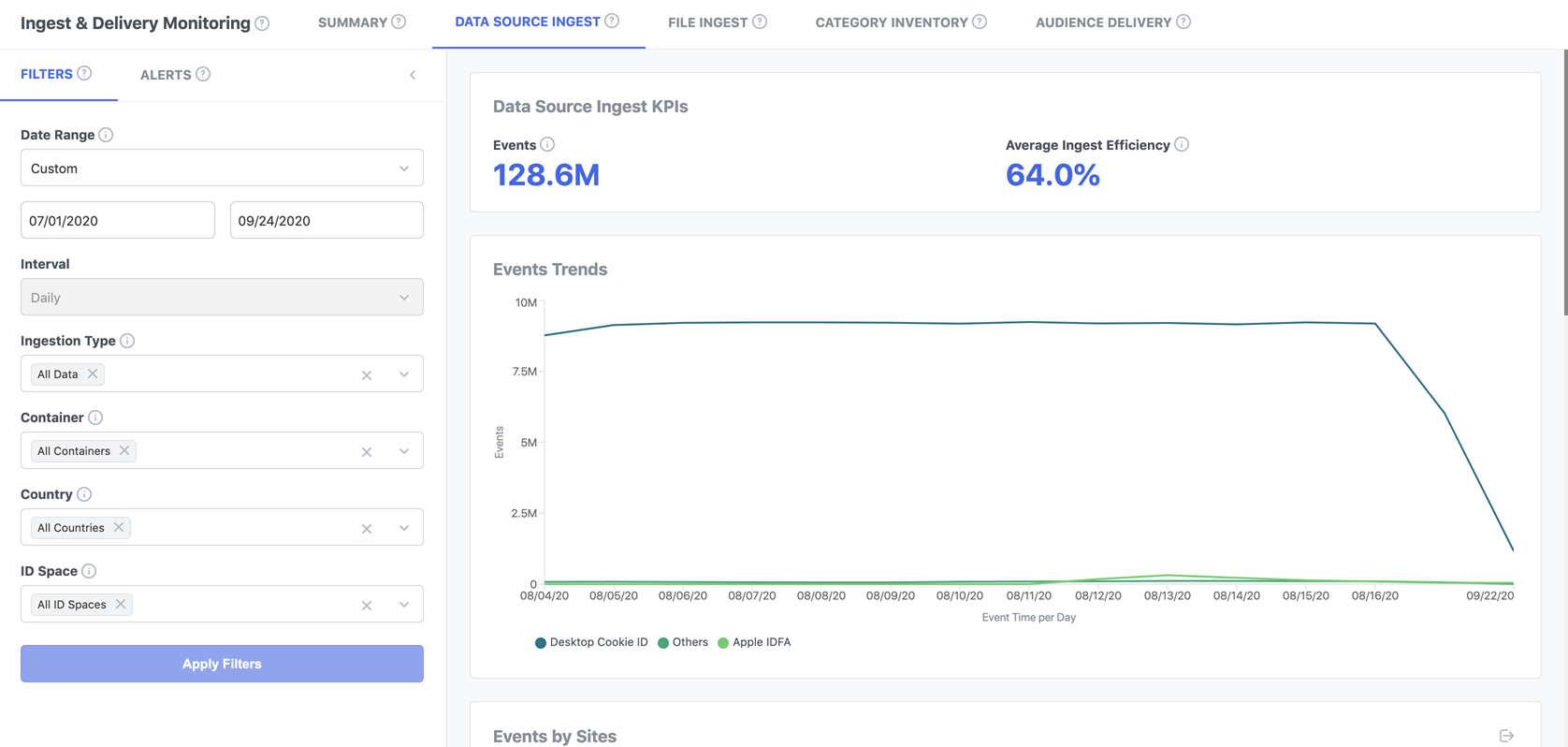
Filtering the data source ingest data
In addition to specifying a date range and interval, you can use the following filters to focus the data source ingest data:
- Ingestion Type. Select Online to see data gathered from the core tag firing, User Data API calls, and SDK calls. Select Direct Ingest to see MAID data sourced from files. All of these ingestion types are based on known ID spaces that do not require an ID swap.
- Container. Select one or more containers (sites) to see data from those containers only. Each container has a unique site ID. You can select from all containers owned by your partner seat.
- Country. Select one or more countries to see data from those countries only.
- ID Space. Select on or more ID types to see data associated only with those types. Options include Apple IDFA, Desktop Cookie, Mobile Cookie, Google AdID.
Data Source Ingest KPIs
The Data Source Ingest KPIs chart includes indicators that you can use to get an overview of ingest performance.
- Events. The number. of calls that sent data to the Oracle Data Cloud platform. This figure includes the core tag firing on a website, calls from the User Data API, and SDK calls.
-
Average Ingest Efficiency. The percentage of total events for which there is a user profile in the DMP. You use this indicator to understand whether profiles are being transmitted successfully to the platform.
If ingest efficiency is low, possible causes depend on the data source:
- Direct Ingest. The likely cause is a formatting issue with the file or with the MAIDs.
- API calls. Sites may be sending expired user IDs or there may be a problem with the site ID.
- Online. The browser may prohibit tracking or users may have opted out.
Data Source Ingest tools
-
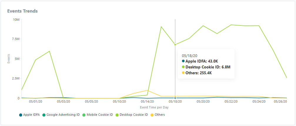
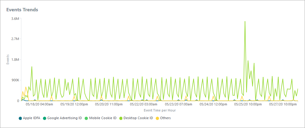
Events Trends. Displays the volume of events over time. The graph below illustrates the volume of events at an hourly interval. Colored shading represents the sources of the events.

-
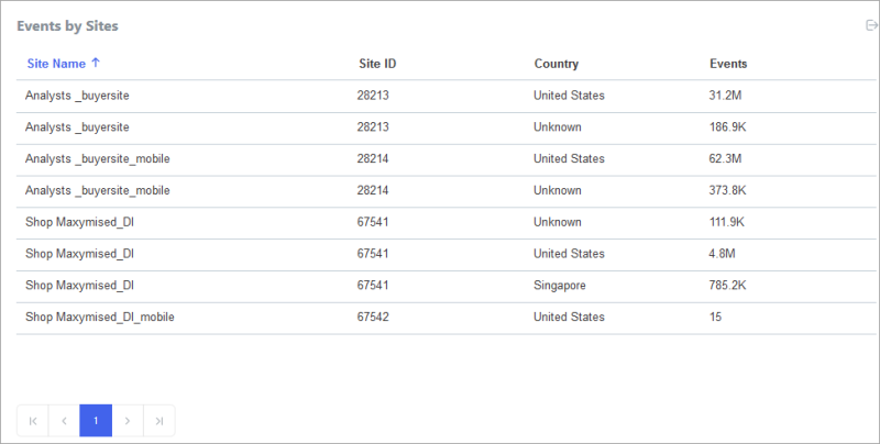
Events by Site . Lists all the events that meet the filter criteria you have set, listed by the site that generated them. You can export the data from the table.
-
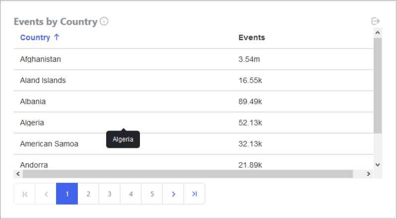
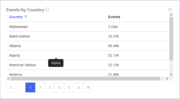
Events by Country. Lists all the events that meet the filter criteria you have set, listed by their country of origin. You can export the data from the table.
-
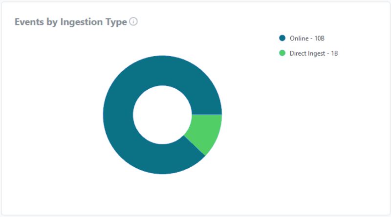
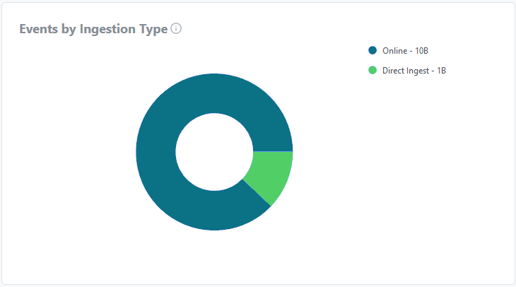
Events by Ingestion Type. Displays the distribution of events by ingestion type (online or direct ingest). The following example includes both types.
-
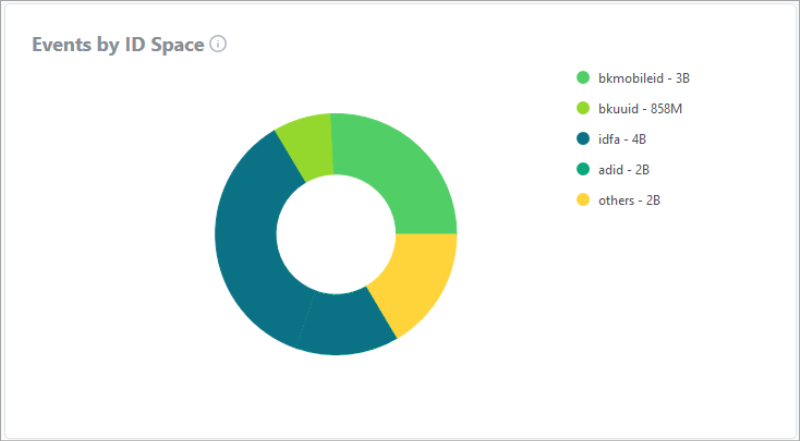
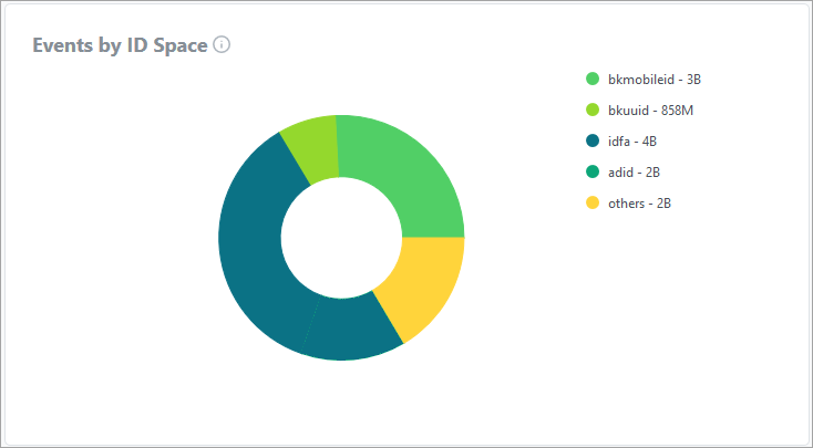
Events by ID Space. Displays the distribution of events among the ID sources you have selected. The following example shows all the available ID sources.

Data Source Ingest reports could list a country as “Unknown” for user profiles that could not be ingested. While there could be multiple reasons for this, it is often caused due to the inability of Oracle DMP to drop a cookie. This could be either due to 3rd party cookie issue or privacy issue.
Monitoring file ingestion
You use the File Ingest tab to monitor file ingestion activity. You can monitor both direct ingestion of MAID-based data and offline match ingestion.
Much of the data displayed in the tab is based on configs. A config is the combination of the file delivery location, ingestion method, and ID source that controls how a file or group of files are ingested. For example, a config may define file ingestion for the data delivered for one of your brands. Narrowing the data displayed in the tab to a single config enables you monitor and troubleshoot file ingestion at a very granular level.

Filters
In addition to specifying a date range and interval, you can use the following filters to focus the file ingest data:
- Ingestion Type. Select Direct Ingest to see information about ingestion of MAID-based data only. Select Offline Files to see information about offline match only.
- Directory Name. Select one or more of the directories where you drop files for ingestion.
- Config ID. Select the ID of one or more offline configs for an offline ingestion.
- Site. Select one or more sites from which data was collected.
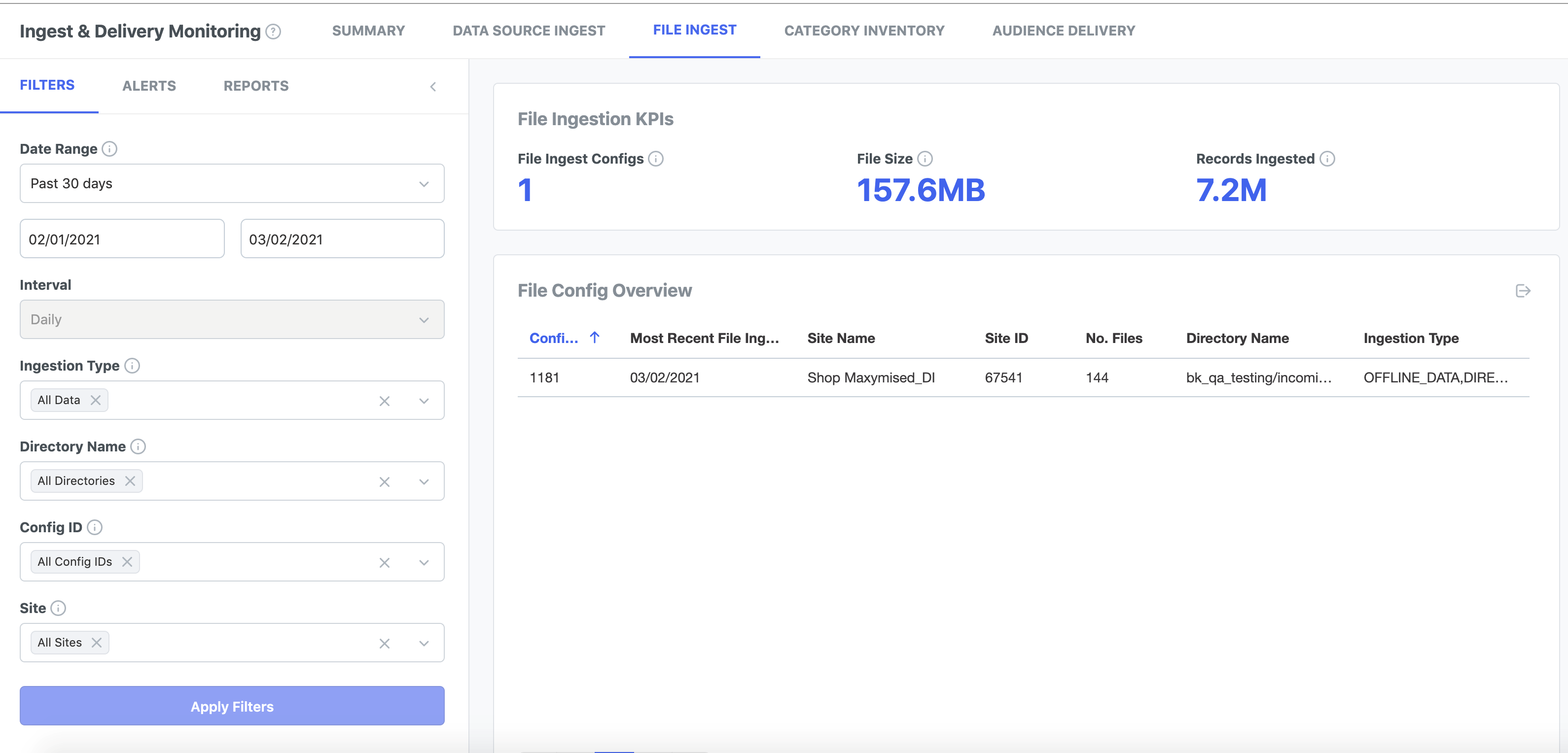
File Ingestion KPIs
The File Ingest KPIs chart includes performance indicators that you can use as a general overview.
- File Ingest Configs. The total number of file ingest configurations, including both offline match and direct ingest.
- File Size. Total size of files ingested.
- Records Ingested. The number of offline user records ingested.
File Ingestion data
-
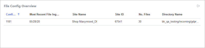
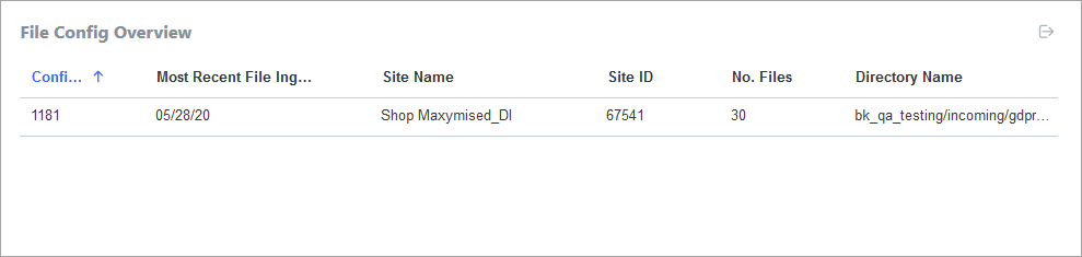
File Config Overview. Lists all configs used for file ingestion. For each config, you see the config ID, the most recent file ingested, site name, site ID, number of files, and the directory from which files are ingested. You can export the list to a TSV file.
-
File Ingestion Over Time. Tracks your file ingestion volume over time. Displays separate lines for successful and failed file ingest.
-
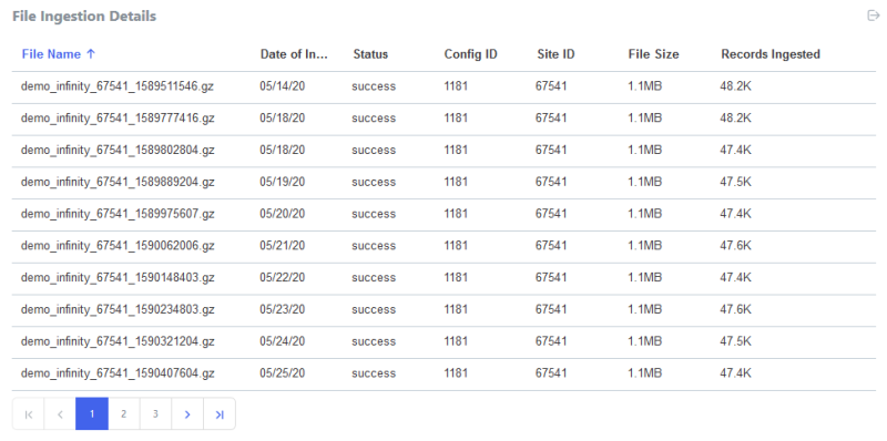
File Ingestion Details. Lists all ingested files that meet the filter criteria you have set. For each file you see the name, date of ingestion, status, config ID, site ID, file size, and number of records ingested. Using filters to narrow the scope of the data to a specific config enables you to verify that file ingestion is occurring as expected. You can export the list to a TSV file,

-
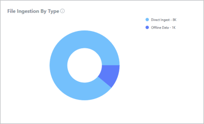
File Ingestion by Type. Displays the distribution of file ingestion by type. The chart shows the proportion of file ingested by direct ingest and from offline data, based on the current filter criteria. This chart is useful only if you have set the Ingestion Type filter to All Data. If you have selected only one type or the other, the chart shows 100% for that type.

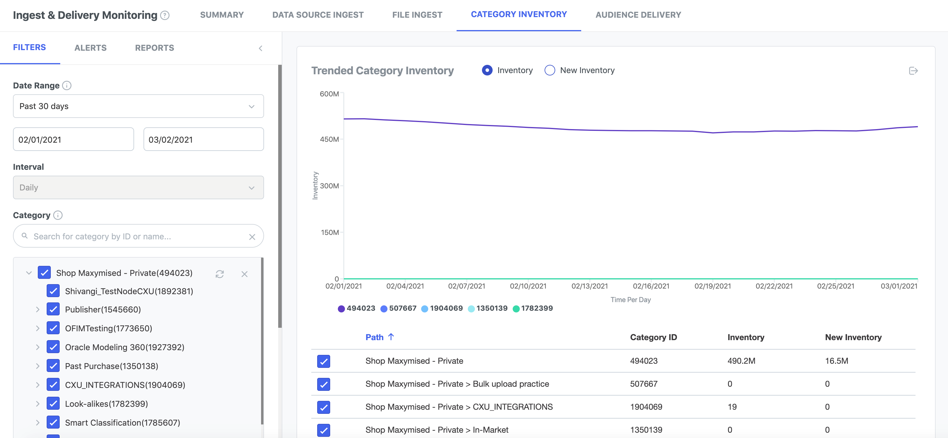
Category Inventory tab
You use the Category Inventory tab to monitor the number of unique user profiles in your first-party categories and how that inventory changes over time. The tab can aggregate data for all your categories, but it is probably more useful to use filters to restrict the information to a particular category or group of categories. Aggregated data may be too general to be useful.
To use the Category list filter:
- To select a category, click it. A check mark shows that the category is selected. A hyphen (-) shows that the category itself is not selected, but that some of the categories below it in the tree are selected.
- Use the Search box to search for categories. If you search for a category and add it, the category gets added to the other selected categories. You would then need to unselect categories that you don't want in the report.
- Click the Reload icon to erase all changes and reload the tree.
- Click the Clear icon to clear all selections.
Note: The Category Inventory report will show only the selected categories. If a category below a selected category is not selected, the unselected category will not be shown in the report.
Filters
In addition to specifying a date range and interval, you can use the following filters to focus the category inventory data displayed in the tab.
- Category. Select one or more categories to see data about only those categories. All Categories appears by default.
- Country. Select one or more countries to see data only for categories that include profiles from only those countries. All Countries appears by default.
- ID Space. Select on or more ID types to see data associated only with those types.
Category KPIs
- Categories gives the count of total number categories.
- Total Inventory gives the total inventory across all categories in the seat.
Category Inventory data
-
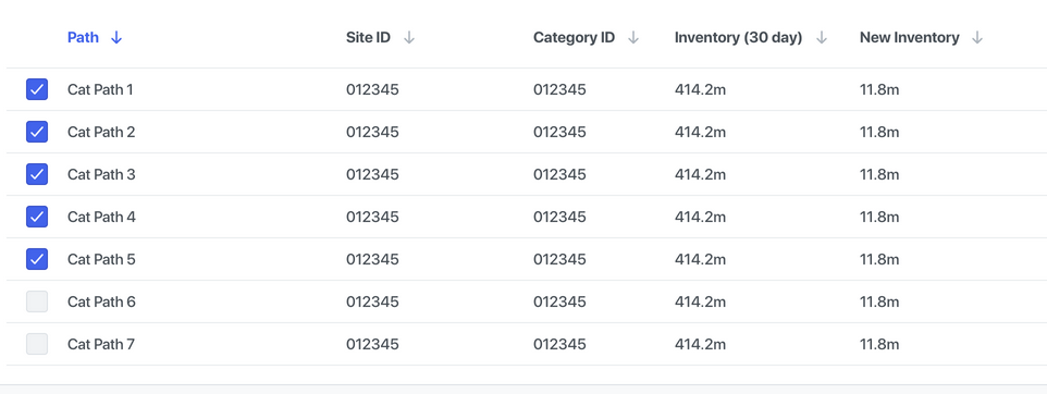
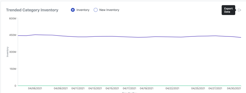
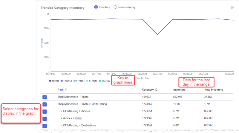
Trended Category Inventory. Displays the progress of your category inventory over time. This tool includes a graph that displays how many user profiles are in the categories selected in the table below the graph. Colored shading indicates the volume of the different categories. Two buttons enable you to filter the graph quickly:
- Click Inventory to display the total inventory for the dates displayed.
- Click New Inventory to display the new profiles received on the dates in the range.
Keep in mind that data is not reported immediately. If the date range includes today's date, there may be a gap in the data for the last day or two of the range.
In addition to the graph, a table lists all the categories associated with your partner seat. You select categories to display in the graph from the list. For each category, you see the ID, current inventory, and the new inventory. The inventory values are based on the last day of the date range for which data exists.
-
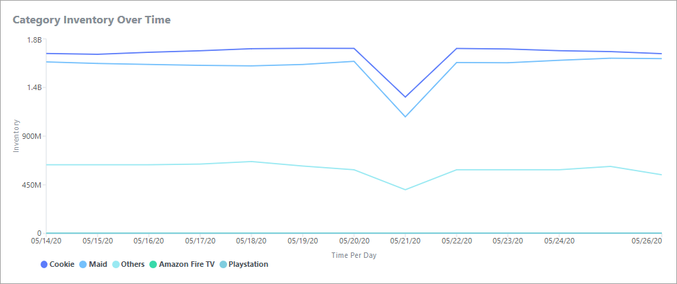
Category Inventory Over Time. Displays your category inventory over the date range. Separate lines display inventory volume by ID type.

-
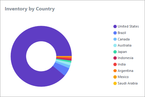
Inventory by Country. Displays the distribution of your inventory by country.

-
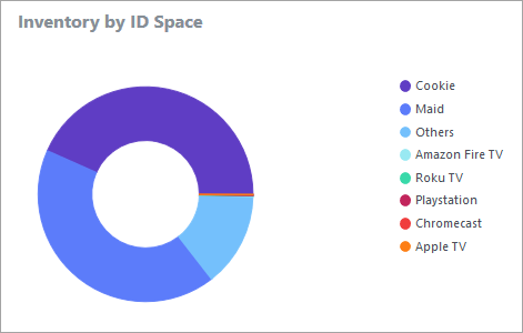
Inventory by ID Space. Displays the distribution of your inventory by ID type.


Shared Categories
Oracle DMP supports the ability for partners to share categories in their taxonomy tree in one seat, either with other seats belonging to them or to other partners. The shared categories are visible in the taxonomy tree of those it is shared with, under the Second Party Sub-Group in the Taxonomy View. For further details on Category Sharing, see Using Taxonomy Permissions to Share your Data.
This report provides partners a view into the categories that have been shared by them and shared with them (visible only to those shared with), as well as the corresponding permissions the categories have been shared with.
The report page will show only the top 1000 categories sorted in alphabetical order. To get the complete list of all the categories, download the report in TSV format.

Audience Delivery tab
You use the Audience Delivery tab to monitor and troubleshoot your audience deliveries. (In earlier versions of the Oracle Data Cloud platform, audience deliveries were called campaigns.)
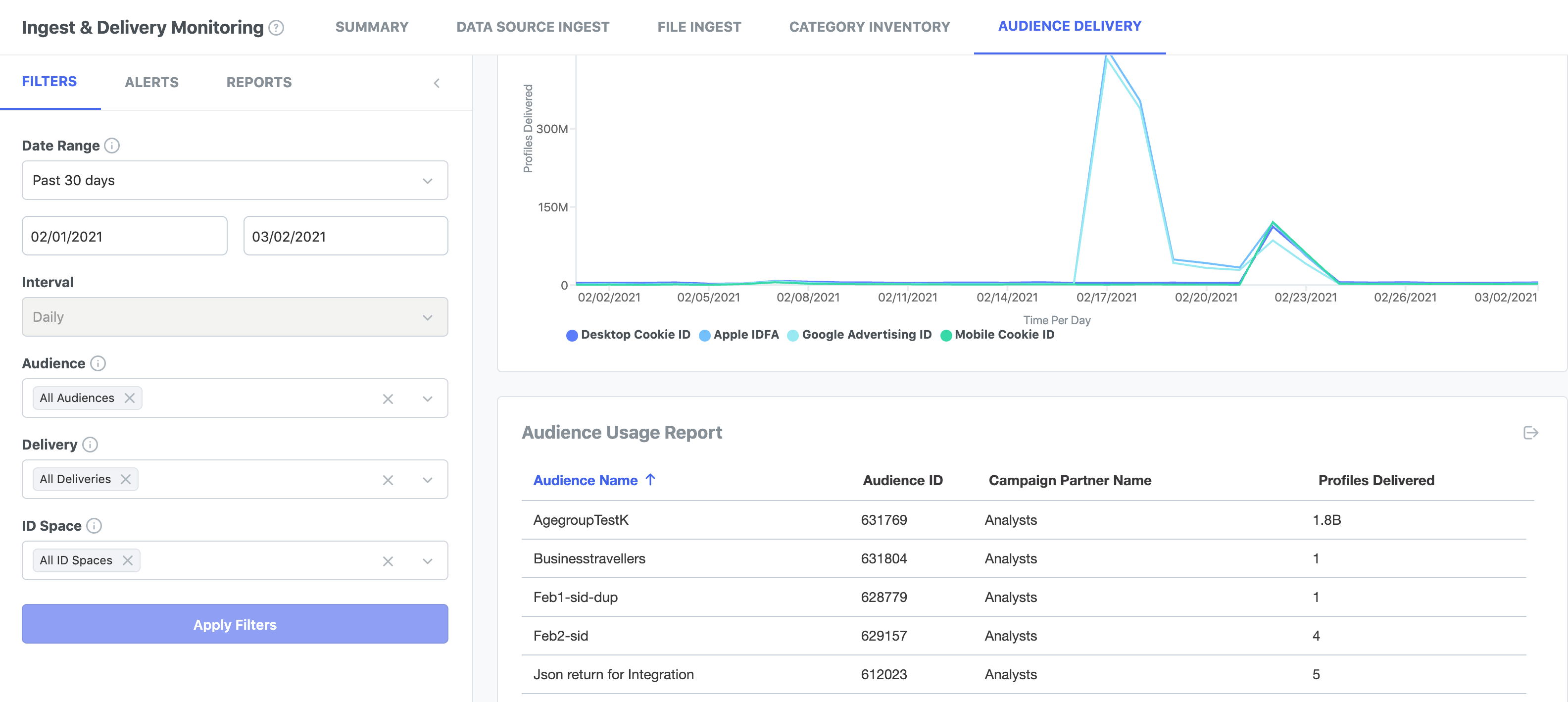
Note: When you first deliver an audience, you will notice a large spike in delivery numbers. That is normal because deliveries are front loaded. After this initial period, deliveries normalize because only updated or new profiles are reflected in the data.
Filters
In addition to specifying a date range and interval, you can filter audience delivery data by the following criteria:
- Audience. Select one or more audiences to view data about only them.
- Delivery. Select one or more audience deliveries (campaigns). A delivery can have the same name as the audience or a custom name.
- ID Space. Select on or more ID types to see data associated only with those types. Options include Apple IDFA, Desktop Cookie, Mobile Cookie, Google AdID.
Audience Delivery Data
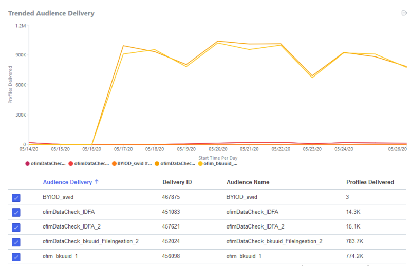
-
Audience Trend Displays the volume of user profiles delivered by your audiences over time. A graph displays audience delivery volume for the deliveries selected in the table below the graph. Colored shading in the graph indicates individual deliveries.
The table lists all the audience deliveries associated with your partner seat. You select deliveries from the list to display them in the graph. For each delivery, you see the delivery ID, audience name, and the number of profiles delivered. Profile deliveries numbers in the table are for the last day of the date range for which data exists.
-
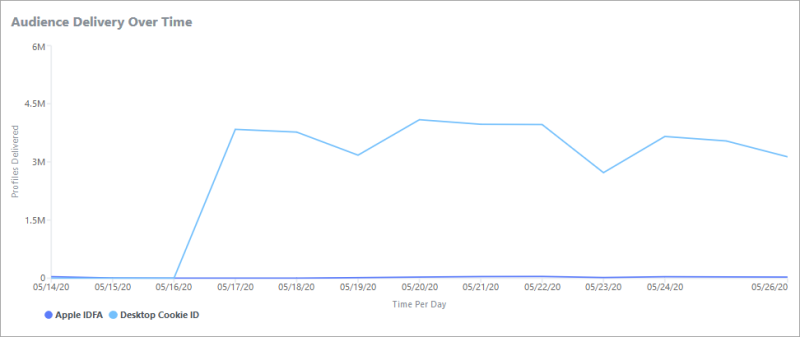
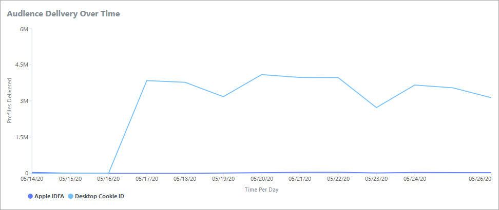
Audience Delivery Over Time. Displays your audience deliveries over the date range. Separate lines display audiences by ID type.
-
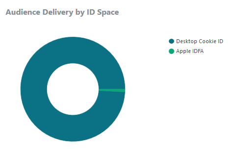
Audience by ID Space. Displays the distribution of audience deliveries by ID type.


Audience Usage Report
You can run the audience usage report to view the number of profiles delivered against all of the audiences you have created and the audiences you have shared with media partners. The report lists the ID and name for each of your audiences, the name of the partner who used the audiences, and how many profiles were delivered against the audiences.
Applicable filters are :
-
Date Range,
-
Audience, and
-
ID Space