About Treemap and Sunburst Charts
This section introduces two new chart types: Treemap and Sunburst charts, which help you find data patterns and compare data quantities.
Treemap Charts
A Treemap Chart is a data visualization that shows hierarchical data using nested rectangles of varying sizes and colors. Each level hierarchy is depicted as a rectangle, often called a branch, which contains other rectangles (leaves). The space inside each of the rectangles that compose a Treemap is highlighted based on the quantitative value in the corresponding data point.
Sunburst Charts
A Sunburst chart is also for visualizing hierarchical data structures. A sunburst chart consists of an inner circle surrounded by rings of deeper hierarchy levels. The angle of each segment is proportional to either a value or divided equally under its inner segment.
Both of these chart types make it easy to spot data patterns or to compare data quantities. In Reports, you select members and functions from a single dimension to visualize the hierarchy in a Treemap or sunburst chart. You can also set chart properties and define element colors, as needed.
Note:
-
The hierarchy elements plotted need to be in the grid rows with a single column selected in Chart Data. If more than one column is selected in Chart Data, then only the first column will be used to plot values in the chart.
-
The grid row selections can contain individual members and member selection functions for one dimension. The hierarchy rendered in both chart types is based on the member selections defined and rows selected in Chart Data.
-
If multiple dimensions are defined in the grid rows, then the chart results will not appear in a hierarchy format, hence a single dimension should only be defined in the grid rows.
Common Properties for both Treemap and Sunburst Charts
Since neither the Treemap nor Sunburst chart have a legend (member labels are displayed with each chart element) or axes, these two tabs are disabled for both chart types.
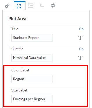
In the Plot Area properties, there are two additional optional label properties for the Treemap and Sunburst chart types: Color Label and Size Label.

Both properties display additional labels at the bottom of the chart.

Chart Colors
For each data set color defined is either visible in Default Chart Colors or in Chart Series properties.
-
In the Sunburst chart:
-
Each inner ring node has its color set based on Data Set 1, Data Set 2, and so on.
-
Each child element under each parent element in the next outer ring has its color set based on Data Set 1, Data Set 2, and so on.
-
-
In the Treemap chart:
Each node rectangle element has its color plotted based on each node’s position in the hierarchy under the parent member and the colors set for Data Set 1, Data Set 2, and so on.
For example:
-
If Data Set 1 color = Blue and Data Set 1 color = Red
-
Parent 1 has two children: "Child1" and "Child2"
-
When plotted in a Treemap chart, "Child1" will be colored Blue, "Child2" will be colored Red.
-