About Scatter and Bubble Charts
A bubble chart is a variation of a scatter chart in which the data points are replaced with bubbles, with an additional dimension of data represented in the size of the bubbles.
About Scatter Charts
. They have two axes: one to show a set of numerical data along a horizontal axis, and another to show a second set of numerical data on a vertical axis. Let's look at an example of a scatter chart that compares Actual and Plan data for a set of products and services.
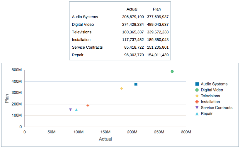
Figure 8-6 Scatter Chart and Data

Figure 8-6 displays a set of Actual and Plan data for products and services for an electronics store. In the accompanying scatter chart, the Actual data is plotted along the horizontal X-axis, and the Plan data is displayed on the vertical Y-axis.
To create a scatter chart:
-
Insert the scatter chart into your report.
-
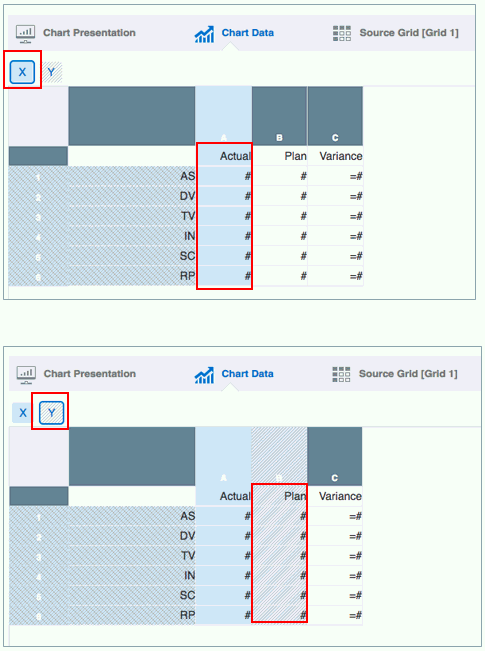
On the Chart Data tab, select the X button, and then highlight the data to be plotted on the X-axis.
-
Select the Y button, and then highlight the data to be plotted on the Y-axis.
-
Optionally, set labels for the axes in Axes Properties.
-
Optionally, set the marker color, style, and size in Scatter Properties.
Figure 8-7 shows the setup of the Actual data in the X-axis and the Plan data in the Y-axis.
Figure 8-7 Scatter Chart Setup

About Bubble Charts
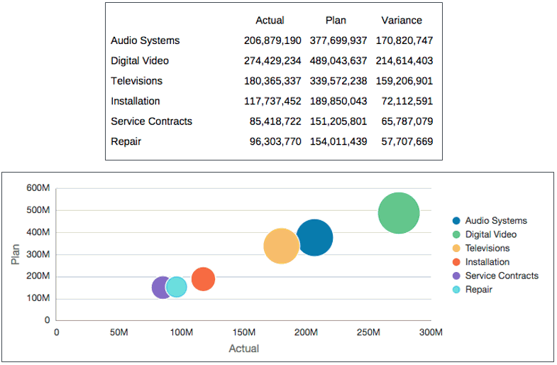
Let's look at an example of a bubble chart that uses the same Actual and Plan data as the scatter chart above, but adds the variance between the two as a third data set.
Figure 8-8 Bubble Chart and Data

Figure 8-8 displays a set of Actual and Plan data for products and services for an electronics store, as well as a third column that shows the variance between the two. In the accompanying bubble chart, the Actual data is plotted along the horizontal X-axis, the Plan data is displayed on the vertical Y-axis, and the Variance data is represented by the size of the bubbles.
To create a bubble chart:
-
Insert the bubble chart into your report.
-
On the Chart Data tab, select the X button, and then highlight the data to be plotted on the X-axis.
-
Select the Y button, and then highlight the data to be plotted on the Y-axis.
-
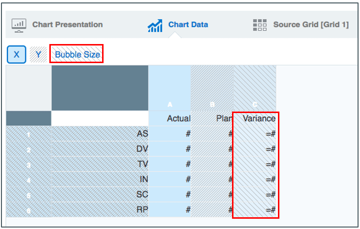
Select the Bubble Size button, and highlight the data to be used for the bubble size.
-
Optionally, set labels for the axes in Axes Properties.
-
Optionally, set the bubble color and marker style in Bubble Properties.
Figure 8-9 shows the setup of Variance as the bubble size.
Figure 8-9 Bubble Chart Setup

Note:
Sample Report 8 (Waterfall and Bubble Charts) contains a bubble chart example.