About Waterfall Charts
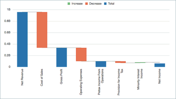
These charts display a running total of positive and negative values, which is helpful in showing how you arrived at a net value from an initial value.
The, Figure 8-2 starts with Net Revenue and then shows the positive and negative contributions that led to Net Income.
Figure 8-2 Waterfall Chart Example

Waterfall chart data is typically plotted on grid row data values with a single column, where row elements are plotted on the X axis.
-
The default setting for the Series/Groups is "Columns/Rows".
-
If the X-axis data appears in the grid columns, use "Rows/Columns" instead.
Positive Values, Negative Values, and Totals
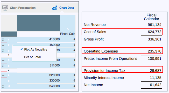
Typically, EPM data is displayed as positive values in a grid. You must manually set data values as negative (for example, Cost of Sales and Operating Expenses) or as totals (for example, Gross Profit and Net Income).
To set a data value as negative:
-
Select the row or column that contains the data value that you want to set as negative.
-
On the row header, click the down arrow, and select Plot As Negative.
The row or column displays a minus sign to indicate that it is a negative value.
Figure 8-3 Waterfall Negative Data Values

Figure 8-3 shows an example of Cost of Sales, Operating Expenses, and Provision for Income Tax set as negative data values.
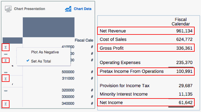
To set a data value as total:
-
Select the row or column that contains the data value that you want to set as a total.
-
On the row header, click the down arrow, and select Set As Total.
The row or column displays a Ʃ sign to indicate that it is a total value.
Figure 8-4 Waterfall Total Data Values

Figure 8-4 shows an example of Net Revenue, Gross Profit, Pretax Income From Operations, and Net Income set as total data values.
Properties
You can set these properties for waterfall charts:
-
Set the bar colors for increase, decrease and total, as well as the connecting line color and style.
-
Set the label location, with text and number formatting. Use either the Auto or Center settings to show the labels for all bars.
-
Set the bar width and border.
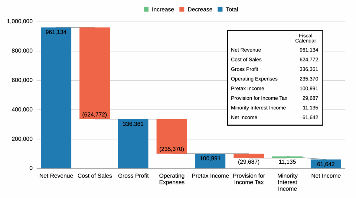
Figure 8-5 Waterfall Chart Finished Example

Figure 8-5 shows a finished example of a waterfall chart with the corresponding data values inset.
Note:
Sample Report 2b (Advanced Charts) contains a bubble chart example.