Understanding the Dual Y Axis in Charts
When the data values in a chart vary widely from data series to data series, or when you have mixed types of data (for example, currency and percentages), you can plot one or more data series on a secondary vertical (Y) axis.
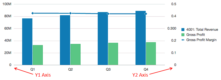
The scale of the secondary Y-axis reflects the values for the associated data series.
While the secondary Y-axis can be used with any line and bar chart type, it is more commonly used with the combination chart type, which helps to distinguish the data series that are plotted on the secondary Y-axis. For example bar for the primary Y- axis and line for the secondary Y-axis.
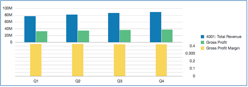
You can also plot the secondary Y-axis as a split dual chart, where the secondary Y-axis appears with its data series below the original chart. In this case you can use any bar or line chart type.
Setting up a chart with a secondary Y-axis requires changes to two places:
-
In the Chart General Properties, set Toggle Dual Y Split to one of the following:
-
On—creates a secondary Y-Axis in the same chart.
-
Split Dual—displays the secondary Y-Axis below the chart.
Note:
When a Combination Chart Type is used, the Dual Y property is Split Dual (On/Off).
-
-
In the Chart Data view, select the data rows and columns to include in the secondary Y-Axis.
Let’s look at a couple of examples illustrating the usage of the secondary Y-Axis. For both examples the source grid has Accounts in the rows for Revenue and Gross Profit, as well as Gross Profit Margin, which is displayed as a percentage. Figure 8-1 shows the source grid for the chart that we will use in the following examples.
Figure 8-1 Source Grid for Dual Y Examples

Example 1: Dual Y = On (Split Dual = Off)
-
Because all of the data series will be displayed in the same chart, in chart general properties, change the Chart Type to Combination.
-
Set Split Dual Y to Off.
-
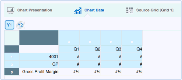
In the Chart Data view, select the rows and columns for the primary (Y1) axis. In this example, we select rows 1 and 2, and columns A-D:
-
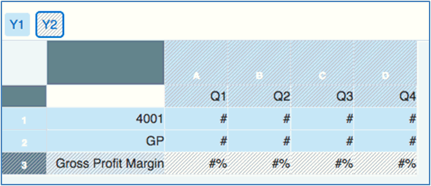
Click the Y2 button and select the row and columns for the secondary Y-Axis. In this example, we select row 3 and columns A-D:
-
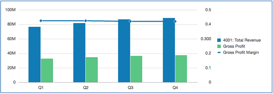
Preview the chart. Note that the Gross Profit Margin values, plotted as a line, are reflected in the secondary Y-Axis on the right. The Total Revenue and Gross Margin values are reflected in the primary Y-axis on the left.
Example 2: Dual Y = Split Dual (Split Dual = On)
-
Using the same chart, data and selections in Example 1: Dual Y = On (Split Dual = Off), in the Chart General Properties, set the Split Dual Y to On.
-
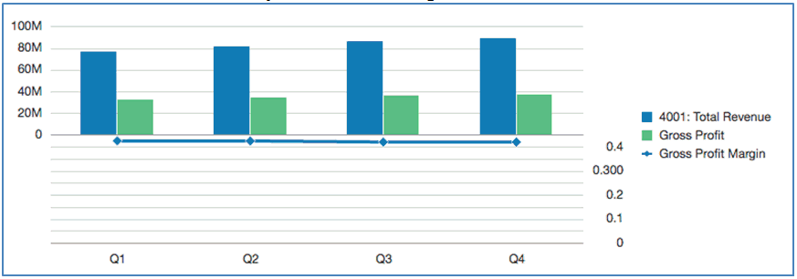
Preview the chart. Note that the Gross Profit Margin values, plotted as a line, are reflected in the secondary Y-Axis on the right and below the bar series:
-
Change Chart Type to Bar, and then preview the chart. Note that the chart displays all data series as bars, with the Gross Profit Margin plotted below.
