Add a Chart
Let's add a chart to show the operating expenses for Quarter 1.
Note:
The following steps show you how to add a chart to the sample report in this Learning Path. Review these topics for more information on charts:
Creating Charts in Oracle Enterprise Performance Reporting Cloud (video)
Working With Charts (doc)
To add a chart to our sample report:
-
Scroll down to the area below the grid you created, right-click and select Add Report Content, and then select Chart.
-
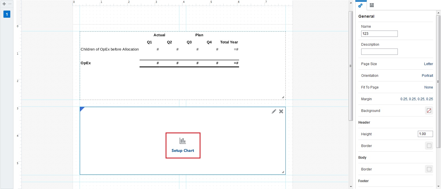
Expand the chart area, and click Setup Chart.
-
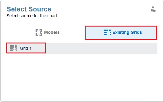
One of the benefits of Management Reporting is that when you are creating charts, you can either select an existing grid or you can choose a model or cube and create a grid. In this example, select Existing Grids, and then select Grid 1.
-
The Chart Editor shows a simple bar chart based on the data in the grid. In the chart General properties on the right, click
 to view the different types of charts you can create.
-
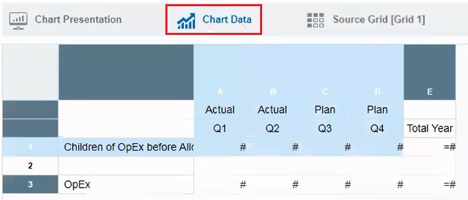
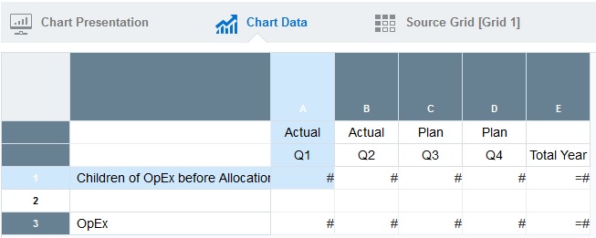
Click Chart Data, and select these rows and columns:
-
Click Preview
 to preview the chart.
-
Let's change the chart type. To do this, click Edit
 to return to the Chart Data view. In the chart General properties on the right, click
  , and then select Pie
  . Since pie charts typically display just one column of data for the point of view, change selected columns to Q1 in column A.
-
Click Preview
 to preview the chart.
-
Click Close to return to the Report Designer.
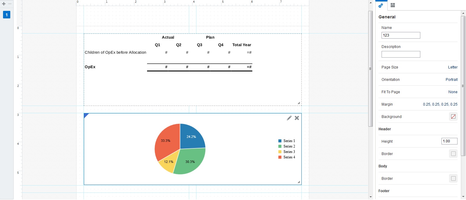
The chart is displayed in the Report Designer as follows:
