Modify Dashboard Charts
You can modify the display of a chart by modifying the chart properties such as minimizing, restoring, configuring and deleting.
Minimize Dashboard Charts
To minimize Dashboard charts or reports:
- Click the minimize icon.
The chart setting window collapses into a single title bar with two icons – maximize and 'remove.
- Click the Minimize icon to hide the chart from view.
A minimized Dashboard floats to the top of the Dashboard page, where it appears with other minimized dashboards.
This figure shows how minimized dashboards appear in the Dashboard page.
- Click the maximize icon to restore the chart to its original size.
- Click the Close icon on the title bar to remove the chart from the Dashboard.
Maximize Dashboard Charts
The size of a chart displayed on the Dashboard page can be increased or decreased according to the user's preferences.
To maximize a chart on the Dashboard page:
Locate the resizing tool in the bottom right corner.
Drag the corner of the chart window to resize the chart as necessary.
The chart content (diagrams and legend) is resized accordingly.
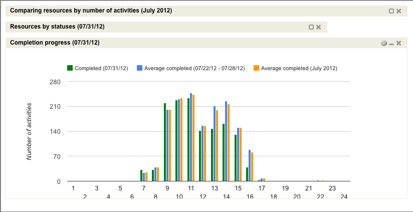
Animated Highlighting in Charts
Discusses the animation actions that occur when data is highlighted in charts.
All reports (except Gauge) have legends describing the data shown in the charts.
When the mouse hovers over a legend item, the corresponding section of the chart is highlighted. The same effect occurs when the mouse hovers over the chart itself.
If a chart legend item is clicked, the corresponding chart section remains highlighted even when the mouse is removed. This gives the user a clearer view of the data shown on the chart.
To remove the highlighting, the user has to click the same legend item again or click a different item to have it highlighted instead.
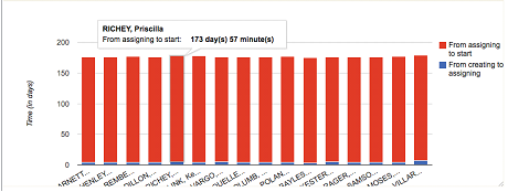
Chart Hints
A set of hints displayed to assist the user working on charts. All charts (except Gauge) have hints containing the details of the data used in the chart. The hints appear when the mouse is hovered over the chart sections. Depending on the type of the chart and the type of the report, the hint content may vary.
This figure shows the dashboard window for Resource by statuses report. The dashboard window displays a pie chart with chart hints for a selected slice.
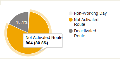
In pie charts, the hints contain the description of the data to which the selected 'slice' corresponds, the absolute value of the slice and its percentage value.
In column charts, the hints contain the description of the data to which the selected column corresponds and its absolute value.
This figure shows the dashboard window for Mean time to deliver report. The dashboard window displays a column chart with chart hints for a selected resource.
Dashboard Calendar
Selecting a date opens a calendar showing the three-month period around the selected date.
Depending on the report type, the chart displays data for a certain date or for a date range. In any case, the data displayed in the chart is related to a date selected by the user. Initially, the charts are created for today's date which can be changed if necessary. The date is displayed in the calendar window which has a left and right arrow to switch the currently selected date one day earlier or later.
Clicking the calendar window opens the calendar for a three-month period with the currently selected month in the middle.
A different date can be selected by clicking it in the calendar. The left and right arrows shift the calendar one month earlier or later. When the date is clicked, the calendar is hidden and all charts in the dashboard are immediately updated with the data corresponding to the selected date.