Workflow Visualization
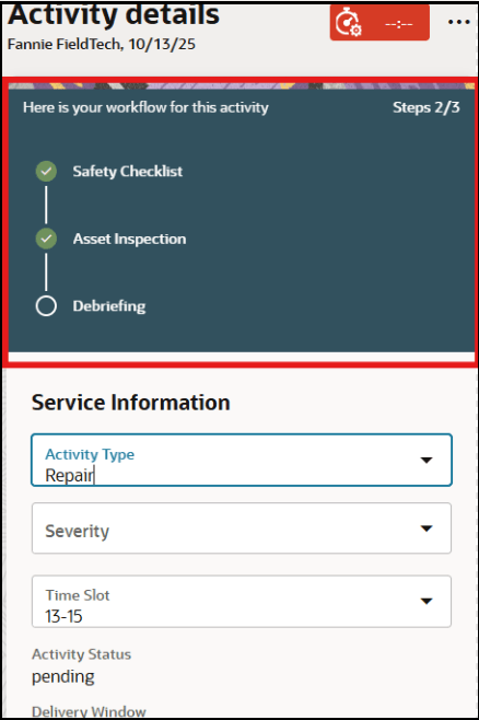
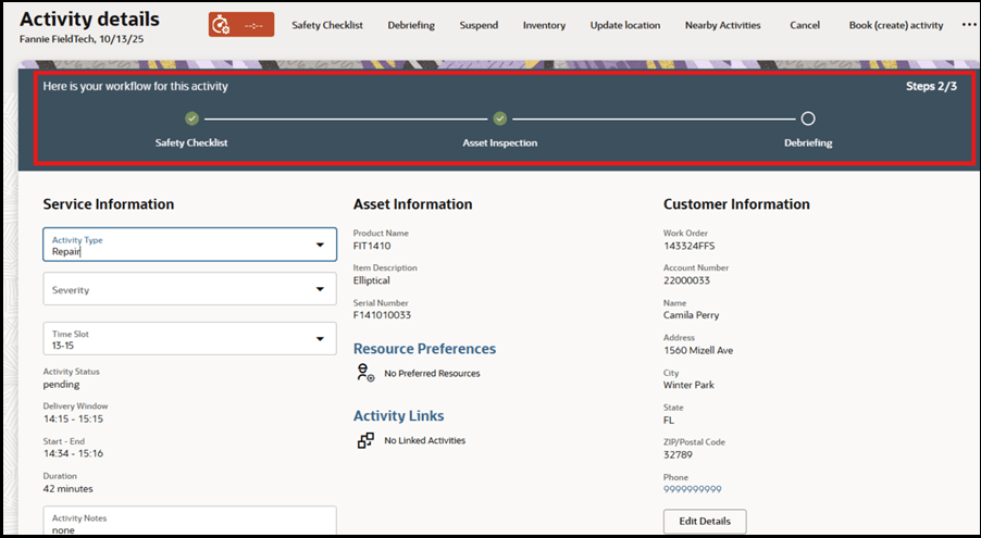
On the Activity Details page, the workflow panel displays the sequential steps for a specific activity. The panel automatically adjusts its display and behavior based on the device's size and orientation (computer, tablet, or phone) to ensure optimal clarity and usability.
Device View Types
The panel uses these views to best utilize your page space.
- Vertical View
- Horizontal View
Display on Different Devices
| Device/Orientation | Display View | Description | Scrolling Behavior |
|---|---|---|---|
| Computer or Large Tablet | Horizontal (side by side) | Steps are arranged in a line from left to right. | Scroll horizontally to view all steps if the list is long. |
| Tablet or Phone (Landscape) | Horizontal (side by side) | Steps are arranged in a line from left to right. | Scroll horizontally to view all steps. |
| Phone (Portrait) | Vertical (stacked up and down) | Steps are stacked one above the other. | Scroll vertically to view all steps. |
| Small Screens | Adaptive | The panel initially shows only a few steps to prevent it from consuming too much of the page area. | Scroll vertically to view all steps. |
Design Rationale
This responsive design ensures:
- The panel maintains a clean and readable appearance regardless of device screen size.
- The panel does not obstruct the primary view of the service activity, especially on mobile devices.
- Mobile Workers can easily scroll to get to the next step of workflow by swiping horizontally or vertically.
- The most relevant steps are always presented and visible first.
The workflow panel fits the mobile worker’s device, show only essential information, and allow scrolling the rest, similar to viewing photos or messages on a mobile device.
Workflow Panel Theme
The workflow panel's appearance is based on your selected theme.
- For dark themes, the panel uses the default color.
- For light themes, the panel background is white.