Frequently Asked Questions (FAQ) About Dashboards
Learn about the benefits of using Dashboards 2.0 in FreeForm.
Review these frequently asked questions (FAQ) about dashboards using these documentation links.
To learn more, see Creating and Managing Dashboards 2.0.
- What is Unique About EPM Dashboards?
- What Can a Dashboard Do in an EPM Workflow?
- How Do Dashboards Benefit Users?
- How Are EPM Dashboards Different From EPM Reports?
- When Should You Choose a Dashboard Rather Than a Report?
- What Are the Unique Benefits to EPM Teams?
- What Actions Can You Take Within EPM Dashboards?
- What Chart Types Can You Create Within EPM Dashboards?
- What Do Users Like About EPM Dashboards?
- What Are the Top Three Features That Differentiate EPM Dashboards?
- What are Examples of EPM Dashboard Usage across Business Processes?
- Planning Example Dashboards
- FreeForm Example Dashboards
- Financial Consolidation and Close Example Dashboards
- Tax Reporting Example Dashboards
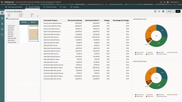
- Enterprise Profitability and Cost Management Example Dashboards
What is Unique About EPM Dashboards?
The key difference is architectural: Dashboard 2.0 is designed as a front end to an EPM application, rather than a separate visualization layer. A dashboard component can be driven by Forms 2.0, a cube, or an ad hoc grid. The dashboard can apply global and local points of view (POVs), so its grid and visual components can operate in a common planning context.
This provides three practical distinctions:
- Context is EPM-aware. Users collaborate with member selections, valid intersections, scenario/version/time, and application security. The same dashboard framework can support reporting dashboards, CFO cockpits, composite data-entry workspaces, and rule-driven what-if workspaces.
- Analysis and planning can be co-located.
- The dashboard supports tailored EPM analysis patterns. These include Quick Analysis from a cube, tables with spark charts, and EPM-oriented charts such as waterfall, geomap, gauge, pyramid, radar, combination, and Sankey charts.
What Can a Dashboard Do in an EPM Workflow?
The most valuable behaviors are native Dashboard 2.0 interactions tied to EPM forms and rules: users can work in governed context, change planning data, execute approved calculations, and continue their analysis without creating a separate handoff between insight and action.
- Write values in a Forms 2.0 grid, save globally or locally, and launch associated rules—Users do not have to leave the visual context to submit a plan change.
- Use grid spread (proportional, even, or fill) across dimensions—Supports common planning allocations while preserving the form and EPM dimensional context.
- Apply context from a master grid to related forms or charts—Enables an executive-to-detail flow inside a purpose-built planning dashboard.
- Add cell comments and attachments; view change history; lock/unlock cells—Keeps explanation, evidence, and controlled collaboration close to the plan value.
- Build Quick Analysis directly from a cube without a prebuilt form—Allows a user to explore a governed cube slice and choose its layout/visualization at design time.
- Switch to Smart View / analyze on cell / export from form-backed components—Allows power users to extend the same governed planning data into familiar Excel-based analysis.
Dashboard 2.0 is designed to combine visual analysis and planning interaction in one finance work surface. Its value is highest where a user must move from a signal to a governed planning decision, rather than only reviewing a static result.
How Do Dashboards Benefit Users?
For a user, the benefit is not simply a better chart. It is the ability to see what changed, understand the driver, make a bounded change, and immediately evaluate the effect using the organization’s planning logic.
| User benefit | How Dashboard 2.0 creates it | Business effect |
|---|---|---|
| Fewer handoffs | Visualize, enter, calculate, and save in one runtime. | Shorter cycle time from variance discovery to approved plan update. |
| More consistent decisions | A global/local POV and EPM form context keep components oriented to the same entity, scenario, and period. | Less risk of acting on a mismatched slice of data. |
| Faster exception handling | Quick Analysis, chart choices, drill/analyze actions, and master-detail context support focused exploration. | Users investigate material drivers while remaining in the plan process. |
| Higher adoption | Dashboard layouts combine accessible visual summaries with write-enabled grids and guided navigation. | A broader mix of executives, users, and analysts can use the same operating surface. |
| Governed flexibility | The runtime stays inside application permissions, forms, valid intersections, and business-rule logic. | Self-service exploration is bound by the EPM model rather than an unmanaged spreadsheet copy. |
How Are EPM Dashboards Different From EPM Reports?
| Design choice | EPM Cloud Dashboards 2.0 | EPM Cloud Reports |
|---|---|---|
| Primary job | Operational planning, interactive monitoring, exploration, and action. | Controlled financial/managerial reporting and repeatable distribution. |
| Interaction model | Dashboard components, shared POV, runtime grids, visualizations, quick analysis, actions. | Report layout, grids, charts, text, report/book viewing, prompts and POVs. |
| Write-back focus | Native for Forms 2.0 grid components. You can save and run rules from the dashboard. | Reports are principally designed to create/view report artifacts; their documented strengths include formatted report development, books, and bursting. |
| Distribution | Direct URL and application navigation; designed for live runtime use. | Books and bursting generate scheduled/targeted PDF or Excel outputs. |
| Best reader moment | "What should I adjust now?" | "What is the official, formatted management or financial package?" |
When Should You Choose a Dashboard Rather Than a Report?
Choose a Dashboard 2.0 experience when you need to interact with the planning process, not just consume its output.
| Use a Dashboard 2.0 When... | Use an EPM Report When... |
|---|---|
| A user must enter or adjust assumptions, spread values, run a rule, and save. | The organization needs a highly formatted financial or management report. |
| A manager needs a live operational cockpit across KPI charts and a relevant input grid. | The deliverable needs to be distributed as a book or burst to many members as PDF/Excel. |
| The investigation requires global/local POV changes, detail context, or Quick Analysis. | The goal is a repeatable, presentation-ready reporting artifact with report layout control. |
| Users need one operating screen during a forecast, budget, or close-related decision. | The audience needs a published period-end package, board pack, or controlled narrative output. |
A useful pattern is to use both: dashboards for the recurring decision and execution loop; reports for the controlled result, narrative, and distribution package.
What Are the Unique Benefits to EPM Teams?
Oracle EPM Dashboards are especially valuable in finance-led, model-driven planning scenarios where analysis must flow directly into governed action. The distinctive customer benefit is a connected experience: live EPM context, visual analysis, Forms 2.0 write-back, calculation-rule execution, and planning workflow in one dashboard runtime.
| Advantage | What Oracle EPM Dashboards contribute |
|---|---|
| Action close to insight | Write-enabled Forms 2.0 grids, global/local save, and associated rules in the dashboard. |
| EPM-context integrity | POV, dimensions, valid intersections, forms, and rules operate as a coherent planning interaction. |
| Role-based experience range | A single dashboard can serve a visual executive view, an analyst’s exploration, and a user’s input grid. |
| Purpose-built visual analysis | Quick Analysis, chart variants, tables/spark charts, and master-detail context support planning questions. |
| Excel continuity | Smart View access and form operations support deeper Excel analysis without abandoning the EPM source of truth. |
Dashboards provide benefits for many audiences.
| Audience | Benefit |
|---|---|
| CFO / finance leader | Because dashboard grids are writable and can run associated rules on save, you can turn planning insight into governed action without a dashboard-to-spreadsheet handoff. |
| Planning owner | Forms, charts, Quick Analysis, POV, and master-detail context in one designer/runtime gives users an operational cockpit that connects drivers, plan entry, and impacts. |
| IT / data leader | Because dashboard behavior stays within EPM forms, dimensions, permissions, and calculation logic, you retain planning governance while broadening insight and self-service. |
| BI stakeholder | Oracle uses native EPM writeback and rules, which allows you to use EPM dashboards when users must act on a governed EPM plan. |
What Actions Can You Take Within EPM Dashboards?
The most differentiating actions occur in a Dashboard 2.0 Forms 2.0 grid. These actions turn the dashboard into an EPM work surface, rather than only a view of data. Availability depends on application settings, form properties, role permissions, and the dashboard’s underlying Forms 2.0 configuration.
Action categories:
- ENTER—Edit, cut, copy, paste, clear
- ADJUST—Adjust data; spread proportionally, evenly, or fill
- GOVERN—Save/write-back, run rules, lock cells, view history
- INVESTIGATE—Apply context, Analyze on Cell, add comments and attachments
| Action family | Actions | Why it is distinctive in an EPM workflow |
|---|---|---|
| Plan entry and editing | Update cell values: Cut, Copy, Paste, Clear. | Keeps direct data entry on the decision screen. |
| Calculation and commit | Global or grid-level Save/write-back, run associated rules, respond to runtime prompts. | A change can invoke approved business logic as it is committed. |
| Data adjustment | Adjust Data by value or percentage, Grid Spread proportionally, evenly, or Fill. | Supports planning allocations across dimensions from within the grid. |
| Context and drill | Apply Context from a master grid, Analyze on Cell, open/adapt in Smart View, export form data. | Moves from summary to analysis while preserving the EPM intersection. |
| Commentary and control | Comments, file attachments, change history, Lock/Unlock Cells. | Pairs numerical action with explanation, evidence, and controlled collaboration. |
| Dashboard-level navigation | Change global/local POV, refresh, maximize components, open/edit forms where permitted. | Creates a focused, context-aware planning workspace. |
What Chart Types Can You Create Within EPM Dashboards?
| Category | Chart types | Typical planning question |
|---|---|---|
| Comparison / trend | Bar, column, line, area, scatter, bubble. | How is performance changing by period, entity, account, or scenario? |
| Composition / profile | Pie, doughnut, radar, pyramid. | What is the mix, profile, or relative share? |
| Contribution / bridge | Waterfall, Sankey, combination. | What explains a change, and how do values flow across dimensions? |
| Status / highlight | Gauge, tile, table with spark chart. | Are we on target, and which KPI needs attention? |
| Location / variance | Geomap - data bubbles or color highlight. | Where are results concentrated or variances occurring? |
| Planning interaction | Forms 2.0 grid, Quick Analysis, tables. | What should I inspect, change, or model next? |
What Do Users Like About EPM Dashboards?
| Commonly valued outcome | Features |
|---|---|
| A single planning workspace | Grid, chart, POV, Quick Analysis, and actions in one runtime. |
| Fast connection from variance to action | Write-back, rules on save, and master-detail Apply Context. |
| Freedom within governance | Form security, valid intersections, business rules, and Smart View continuity. |
| Clearer narrative around a number | Comments, attachments, change history, and visual drill/analysis. |
| Multiple personas on one surface | Visual summaries for leaders; write-enabled grid for users; analysis pathways for analysts. |
What Are the Top Three Features That Differentiate EPM Dashboards?
| Differentiator | Why it matters |
|---|---|
| Action in context | A dashboard can be an EPM work surface: write data to Forms 2.0 grids, run associated calculation rules, and save/write-back without leaving the dashboard. |
| EPM-native governance | The experience works inside the EPM model - POV, dimensions, valid intersections, form behavior, security, and planning logic. |
| Flexible analysis designed for planning | Quick Analysis, master-detail Apply Context, charts/tables/sparks, and Smart View paths extend analysis while retaining planning context. |
What are Examples of EPM Dashboard Usage across Business Processes?
Dashboard 2.0 is a shared Cloud EPM capability across Planning, FreeForm, Financial Consolidation and Close, Tax Reporting, and Enterprise Profitability and Cost Management. The visual patterns are consistent; the business question, dimensional model, form content, and permitted actions change with the business process. The use cases documented in this section are examples only.
| Business process | Dashboard Usage | Illustrative dashboard pattern | Typical components and actions |
|---|---|---|---|
| Planning |
|
Forecast operating cockpit: revenue, headcount, expense, and driver changes. |
|
| FreeForm |
|
Custom model analysis for a flexible dimensional application. |
|
| Financial Consolidation and Close |
|
Close and financial-statement performance review. |
|
| Tax Reporting |
|
Tax provision or jurisdiction-oriented monitoring and analysis. |
|
| Enterprise Profitability and Cost Management |
|
Profitability and cost-to-serve analysis. |
|
Planning Example Dashboards
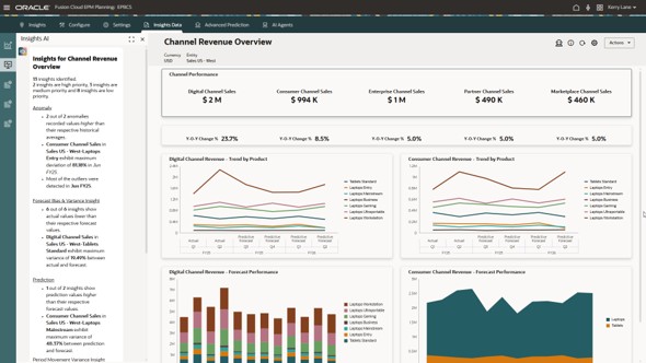
Figure 13-11 Planning dashboard: finance KPIs, trend views, variance analysis, and narrative insights in one workspace
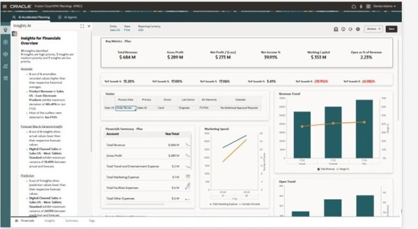
Figure 13-12 Planning dashboard: Sankey, channel-performance, and profitability-waterfall views for deeper analysis
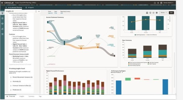
Figure 13-13 Planning performance overview dashboard: financial trend, key measures, and variance visuals in one decision workspace
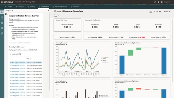
Figure 13-14 Planning executive view dashboard: KPI cards, revenue trend, product performance, and portfolio visuals
FreeForm Example Dashboards
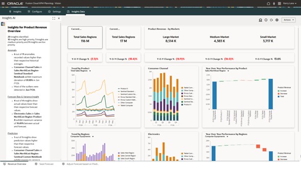
Figure 13-15 FreeForm analysis canvas dashboard: multi-chart view combining trend, comparison, and distribution insights
Financial Consolidation and Close Example Dashboards
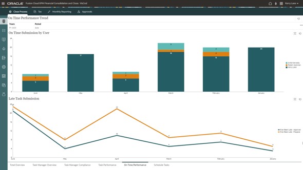
Figure 13-16 Financial Consolidation and Close dashboard: financial performance trend with comparison visuals and supporting metrics
Tax Reporting Example Dashboards
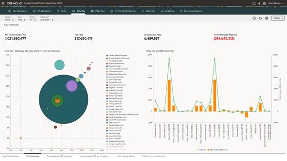
Figure 13-17 Tax Reporting dashboard: portfolio view using contribution and category visuals for review
Enterprise Profitability and Cost Management Example Dashboards
Figure 13-18 Enterprise Profitability and Cost Management dashboard: KPI, trend, and contribution analysis for profitability management
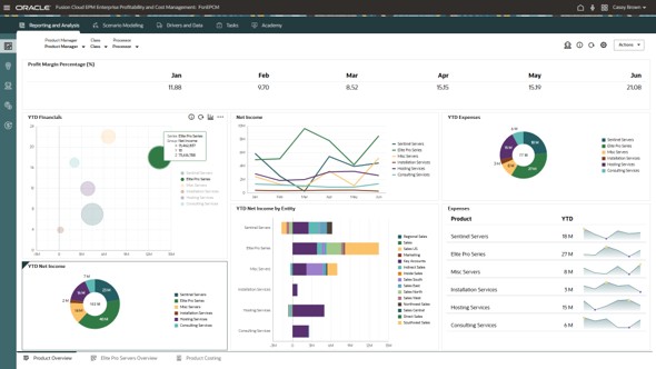
Figure 13-19 Enterprise Profitability and Cost Management dashboard: comparative performance and driver analysis by business dimension
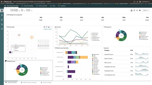
Figure 13-20 Enterprise Profitability and Cost Management dashboard: visual profitability, cost, and allocation insights in one workspace
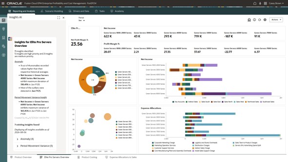
Figure 13-21 Enterprise Profitability and Cost Management analysis dashboard: dimensional comparison with status and distribution visuals