View Historical Values for a Specific Metric

View the historical values for a specific metric to better understand the current performance of your factories. The graphic also lets you compare the historical values against the values of the best performing factory.

  1. In the Map view or in the Factory view, select a metric, then click History History icon.
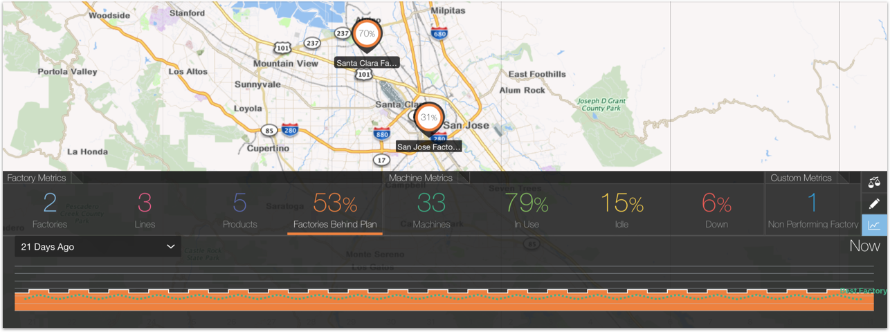
    A graphic showing the historical values for the selected metric appears. The graphic also contains the historical values for the best performing factory.
  2. Select the period of time for which you want to view the historical values.
    The default value is 7 Days Ago. You can change this value to show the last day, or the last two or three weeks.
  3. (Conditional) In the factory view you can select one or more options of comparative data.
    Comparative data helps you understand the values in the graphic. For example, if you’re looking at the history for the percentage of machines behind plan, you might want to compare it with the history of unavailable (Down) machines to understand if this is what’s causing them to fall behind schedule.
    You can compare your values with the following metrics:
    • Behind Plan
    • In Use
    • Idle
    • Down

The following image shows the historical values for the percentage of factories behind plan for the last three weeks for the Santa Clara and San Jose Factory. The green dotted line lets you compare the performance of your factories with the best performing factory.
This image is described in the surrounding text.