Contact fields, form elements, and field groups
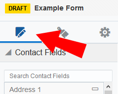
The Oracle Eloqua form Design Editor uses three types of design components to build your forms: contact fields, form elements, and field groups. These components are found in the Design  tab. Drag-and-drop them onto the canvas to add them to your form.
Learn more about each of these form design components and how to customize them:
Contact fields
Contact fields are the most commonly used fields in forms. These fields provide information about the contact such as their name and address.
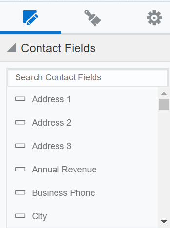
Many of these fields are mapped to the fields in contact records so that information can be re-used. Using field merges in contact fields allows Oracle Eloquato pre-populate forms with the information from a contact's record, or to show their current information so that they can update selected fields if needed.
The contact fields which you can select are created in the Setup > Fields and Views area. Learn more about creating contact fields.
Form elements
Form elements are used when you want to add additional fields for special functions. For example, if you want the form submitter to include a block of text such as a description, you can add a Paragraph Text field; or you can have the form submitter select one of several options using check boxes. You can also use a Hidden Field to add administrative information (such as a form ID number) that is not shown to the submitter.

The following is a list of the types of custom fields available:
- Form Text: Allows you to add general information to the form.
- Single Line Text: Inserts a field which allows users to enter short text data without being connected to existing contact data.
- Paragraph Text: Inserts a field which allows users to enter longer sections of text data (a paragraph) without being connected to existing contact data.
- Single Picklist: Inserts a drop-down list (picklist) from which the user can select one option.
- Multiple Picklist: Inserts a list of options from which users can choose one or more selections.
- Radio Buttons: Inserts a series of radio buttons from which users can select only one option.
- Single Checkbox: Inserts a single check box that a user can click. You can configure this field to be pre-populated with either the submitter's subscription status for a specific email group or their global subscription status.
- Checkboxes: Inserts a series of check boxes from which users can select more than one choice.
- Hidden Field: Inserts a hidden field which will not appear for the user when submitting the form but can provide you with valuable data. For example, a form number can be placed in the form so that it's submitted along with other form data. Similarly, a CRM campaign ID can be placed in the form to allow for simple automation of campaign information from a form submit to your CRM.
Field groups
If your form calls for a standard set of fields such as First Name, Last Name, Email Address and Postal/Zip Code, there are several pre-configured groups available that allow you to add the fields at once so you do not have to recreate the groupings each time you create a form.

Important: Once a field group (for example, Basic Contact Info) is added to a form, the fields are no longer grouped together. They are treated separately, like contact fields and form elements.
The following is a list of the available field groups:
- Basic Contact Info: First Name, Last Name, and Email Address
- Extended Contact Info: Title, First Name, Last Name, and Email Address
- Address Field Group: Address 1, Address 2, City, State or Province, Zip or Postal Code, and Country
- Custom Two Column: Two blank fields, one in each column
- Custom Three Column: Three blank fields, one in each column
Note: The Custom Two Column and Custom Three Column groups are available to make it easier for you to add a group of two (or three) fields side-by-side. For example, you can use the Custom Two Column group to position the City and County fields in your form side-by-side. Note that the custom Field Groups settings are valid only for that form, the settings are not saved for future use (you would have to recreate them). Individual fields in the group cannot be deleted, however they can be edited to suit your needs without making changes to the default settings.
Next steps
Working with contact fields, form elements, and field groups