Dashboards
About Infinity Analytics Dashboards
Dashboards provide an at-a-glance view of key performance indicators (KPIs) and quickly bring focus to areas of success and areas that need attention. Dashboards help to visualize complex data and provide a launching point for drilling down into further data analysis.
Accessing Infinity Analytics Dashboards
Each collection in Infinity Analytics has a default dashboard that provides a common set of KPI’s and widgets to help you get started.
To access a collection’s default dashboard:
- Sign In to Oracle Infinity and select Analytics.
-
On the Analytics Home screen, click a collection’s thumbnail image to access its default dashboard.
In an upcoming release, you will be able to set any dashboard in the collection as the default.
Viewing Infinity Analytics Dashboards
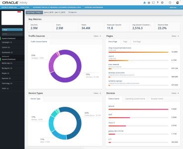
To help you get started, a standard set of widgets are available on the dashboard to visualize the data included in a collection. Any segment that is applied to the collection will filter the data that is available to the dashboard.
The following provides an overview of the features available on a collection’s default dashboard:
- Date Range – Data on the dashboard can be filtered to a specific range of time. The default date range is set to “Last 7 Days + Today”, and this date range can be customized. View “Selecting a date range”.
- Segments – A segment of data can be used to filter the data available on a dashboard. Segments can be added to dashboards in the same way they are added to reports. View “Adding segments to reports”.
- Key Metrics Widget – KPIs provide an at-a-glance view of how your digital property is performing. The Key Metrics widget provides six common metrics to help you get started and can be customized to include any metrics of your choosing.
To customize the metrics displayed in the Key Metrics widget:
- Hover your cursor over the Key Metrics widget. The Edit icon will appear in the upper, right corner of the widget.
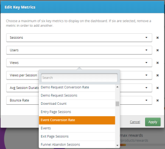
Click the Edit icon and the Edit Key Metrics window appears.
Select up to six metrics to display in the widget. You can remove metrics not needed, replace existing metrics with different metrics, etc.
Once you have selected the desired metrics, click Apply.
- Geography Widget – (Coming soon) Visualize real-time data happening in the moment across the geography map.
-
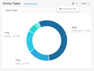
Donut Widget for Traffic Sources and Device Types – The donut style widget shows how the top five dimension values break down as a percentage of the total. The default metric is “Views”.
For the donut style widget, the following interactions are available:
-
Hover your cursor over any slice of the donut to view additional details in the tool tip.
-
When hovering your cursor anywhere on the widget, an option to change the widget style appears. Here, you can change to the horizontal bar style.
-
Also when hovering on the widget, an option appears to change the metric from “Views” to “Events”. Additional metrics are coming soon.
-
Click the “View Details” link to drill down from the widget into report-level detail showing the full list of dimensional values.
-
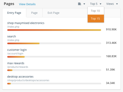
- Horizontal Bar Widget for Pages and Devices – The horizontal bar widget shows a comparison of the top dimensions and their total values. The default metric is “Views”.
- For the horizontal bar style widget, the following interactions are available:
Hover your cursor over any horizontal bar to view additional details in the tool tip.
When hovering your cursor anywhere on the widget, an option to change the widget style appears. Here, you can change to the donut style.
Also when hovering on the widget, an option appears to change the metric from “Views” to “Events”. Additional metrics are coming soon.
And, when hovering, you will see an option to include the Top 5, Top 10, or Top 15 dimensions in the widget.
Click the “View Details” link to drill down from the widget into report-level detail showing the full list of dimensional values.
- For the horizontal bar style widget, the following interactions are available:
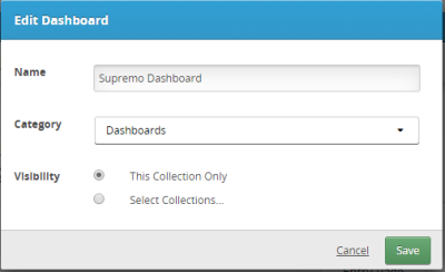
Editing the Dashboard Name, Category, and Collection
Click the Edit icon in the upper, right of the dashboard to change the name of the dashboard, the category in which the dashboard is organized, and in which collections the dashboard appears.
Saving Infinity Analytics Dashboards
When a collection is first created, a default dashboard is created in the collection to help you get started. You can modify this dashboard, such as changing the key metrics, widget styles, the number of top dimensions, etc and then save your changes.
To save changes to the default dashboard:
- From the collection’s default dashboard, click the Save As button in the upper, right corner of the dashboard.
- Enter a name for the dashboard.
- Choose a category or create a new category in which the dashboard is organized.
- Select in which collection(s) the dashboard can be accessed.
- Click Save.
This new dashboard can then be accessed in the left menu under the category you selected.
For any custom dashboard you have created, you will see the option to Save or Save As. Clicking Save will update the dashboard you are currently viewing, while Save As will create a new dashboard with your changes.
