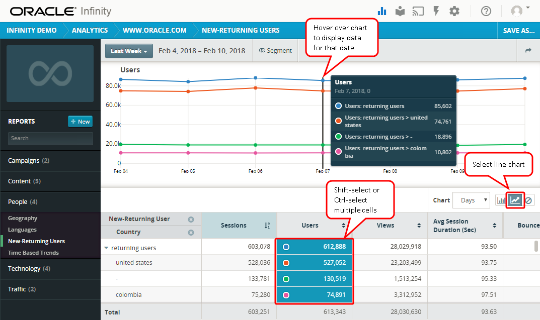
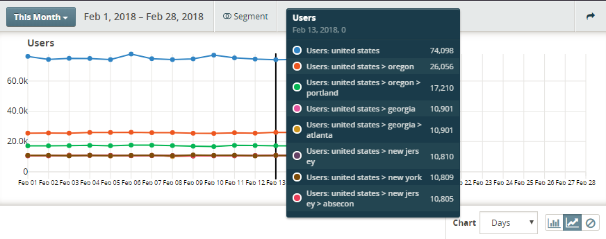
Displaying chart data
Data is presented in a report table at the bottom of the report window. You can select one or more cells in the report table to display:
- A single data point: Click a cell in the report table.
- Multiple adjacent data points: Select a cell and then Shift-click to select additional cells.
- Multiple data points that are not adjacent: Select a cell and then Ctrl-click (Linux or Windows) or Command-click (Mac) to select each additional cell.
Your selections in the report table display a color dot corresponding to the same color trend line or bar in the chart view.
Note: You can select multiple data points within a single measure, but you cannot select multiple cells across different measures. For example, you can select any number of cells in the Sessions measure column, but you cannot select cells from both the Sessions and Views measure columns.
Example trend line chart
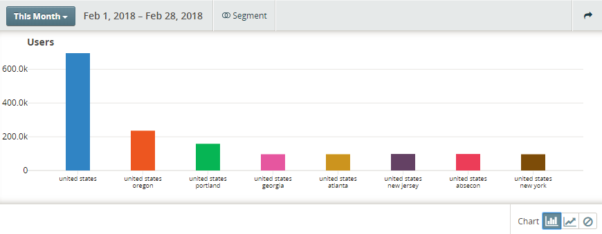
Example bar chart
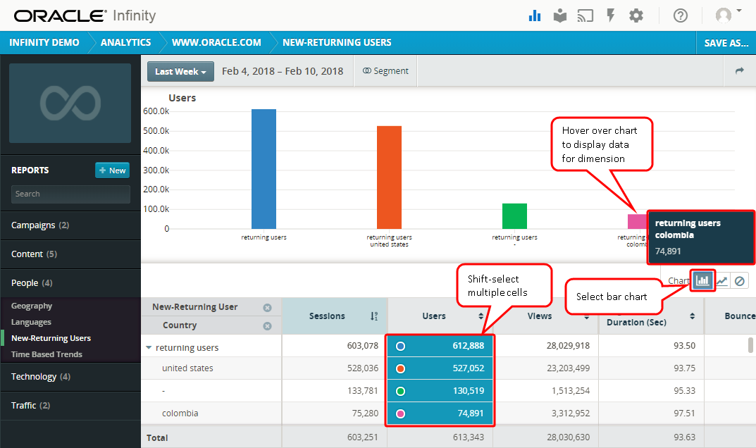
Tip: You can click cells in the report table while a query is still in progress. New queries for the additional cells selected will be added to the query that is already running. You can use the shift and control (or command) keys to select more than one cell at a time—up to a total of ten cells.
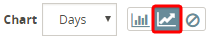
Changing the chart type
You can display a trend line or bar chart for report data or hide the chart to focus on data in the report table.
Note: Whenever you select a chart display preference, it applies to all reports you view until your preference is changed.
To change the chart type for a report:
- Click the chart option at the upper right of the report table.
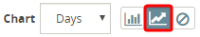
Sample trend line chart 
Sample bar chart

To hide the chart, click the hide chart icon  .
.