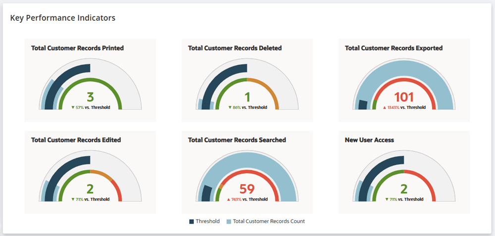
Key Performance Indicators Portlet
Key performance indicators or KPIs provide a quick snapshot of your organization's compliance status.
The KPI portlet helps you monitor data security compliance by displaying key metrics on the dashboard.
The following screenshot shows the Key Performance Indicators portlet in the Compliance 360 Dashboard:
The comparative data in the portlet can be filtered by the following time periods:
-
Day - the tiles show comparative numbers for today versus yesterday.
-
Week - the tiles show comparative numbers for last week versus this week.
-
Month - the tiles show comparative numbers for last month versus this month.
To change the default date filter applied in the Key Performance Indicators portlet, see Date Filter Settings.
KPI Meter Tiles
The Key Performance Indicators portlet displays six KPI Meter Tiles. Each tile displays a gauge meter that gives you a preview of the compliance status of your account.
The following screenshot shows a KPI meter tile, the details of its graphs, and its displayed values:
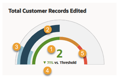
Refer to the following table for the details of the KPI meter tile's elements:
|
Number callout in the screenshot |
Element and Description |
Interpretation |
|---|---|---|
|
1 |
Total record count - The total record count displays the number of records for the selected time period. The font color of the total record count matches the threshold color. For example, a green threshold will display a green record count font color. |
The screenshot shows that there were 2 customer records edited this month. |
|
2 |
Threshold graph - The threshold graph displays the daily threshold limit for the KPI meter. The threshold limit is set daily. The system calculates the total threshold by multiplying the daily limit by the selected time filter (Day, Week, or Month). For more information about setting threshold limits, see KPI Settings and Daily Threshold Limits. |
You must hover over this graph to see the exact threshold value and the total record count in the particular action (searched, exported, deleted, etc.) |
|
3 |
Total record count graph - The total record count graph shows the record count's position on the meter relative to the variation range. |
In this example, the graph shows where 2 (total record count) is lying in the variation range meter. You must hover over this graph to see the exact threshold value and the total record count of the particular action (searched, exported, deleted, etc.) |
|
4 |
Percentage increase or decrease versus threshold - This percentage indicates the total value's increase or decrease compared to the KPI meter's threshold limit. The percentage color changes based on the variation range percentages defined for the KPI meter. For more information about setting KPI meters' variation range, see KPI Settings and Variation Range. |
The screenshot shows that the total value of customer records edited is 71% less than threshold set for the KPI meter. The percentage shown is rounded off. |
|
5 |
Visual color graph of the variation range - The visual color graph shows the variation range for the KPI meter tile in color. Hover over the graph to see the record range counts for the KPI meter tile. |
The green color represents the variation range set for Good. The orange color represents the variation range set for Concerning. The red color represents the variation range for Attention Required. |
Clicking a KPI meter tile opens a modal window showing the related customer records. For descriptions of each KPI meter tile's modal window, see KPI Modal Windows.
The Key Performance Indicators portlet shows the following KPI meter tiles:
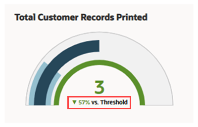
Total Customer Records Printed
The Total Customer Records Printed KPI meter tile displays the total printed customer records for the selected time frame.
The following screenshot shows the Total Customer Records Printed KPI meter tile with the percentage change against the threshold, boxed in red.
To display the percentage change versus a threshold, set a daily threshold limit for the Total Customer Records Printed KPI. For procedure and guidelines for setting threshold limits, see KPI Settings and Daily Threshold Limits.
The KPI gauge chart's colors are based on the set variation ranges for this KPI. Set the variation ranges for this KPI meter tile in the KPI Settings. For more information, see Variation Range.
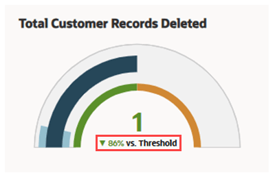
Total Customer Records Deleted
The Total Customer Records Deleted KPI meter tile displays the total deleted customer records for the selected time frame.
The following screenshot shows the Total Customer Records Deleted KPI meter tile with the percentage change against the threshold, boxed in red.
To display the percentage change versus a threshold, set a daily threshold limit for the Total Customer Records Deleted KPI. For procedure and guidelines for setting threshold limits, see KPI Settings and Daily Threshold Limits.
The KPI gauge chart's colors are based on the set variation ranges for this KPI. Set the variation ranges for this KPI meter tile in the KPI Settings. For more information, see Variation Range.
Total Customer Records Exported
The Total Customer Records Exported KPI meter tile displays the total exported customer records for the selected time frame.
The following screenshot shows the Total Customer Records Exported KPI meter tile with the percentage change against the threshold, boxed in red.
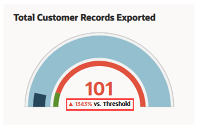
To display the percentage change versus a threshold, set a daily threshold limit for the Total Customer Records Exported KPI. For procedure and guidelines for setting threshold limits, see KPI Settings and Daily Threshold Limits.
The KPI gauge chart's colors are based on the set variation ranges for this KPI. Set the variation ranges for this KPI meter tile in the KPI Settings. For more information, see Variation Range.
Total Customer Records Edited
The Total Customer Records Edited KPI meter tile displays the total edited customer records for the selected time frame.
The following screenshot shows the Total Customer Records Edited KPI meter tile with the percentage change against the threshold, boxed in red.
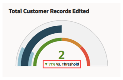
To display the percentage change versus a threshold, set a daily threshold limit for the Total Customer Records Edited KPI. For procedure and guidelines for setting threshold limits, see KPI Settings and Daily Threshold Limits.
The KPI gauge chart's colors are based on the set variation ranges for this KPI. Set the variation ranges for this KPI meter tile in the KPI Settings. For more information, see Variation Range.
Total Customer Records Searched
The Total Customer Records Searched KPI meter tile displays the number of customer records searched during your chosen time period.
The following screenshot shows the Total Customer Records Searched KPI meter tile with the percentage change against the threshold, boxed in red.
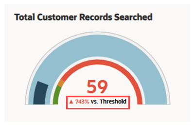
To display the percentage change versus a threshold, set a daily threshold limit for the Total Customer Records Searched KPI. For procedure and guidelines for setting threshold limits, see KPI Settings and Daily Threshold Limits.
The KPI gauge chart's colors are based on the set variation ranges for this KPI. Set the variation ranges for this KPI meter tile in the KPI Settings. For more information, see Variation Range.
New User Access
The New User Access KPI meter tile displays the number of new users added during your chosen time period.
The following screenshot shows the New User Access KPI meter tile with the percentage change against the threshold, boxed in red.
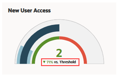
To display the percentage change versus a threshold, set a daily threshold limit for the New User Access KPI. For procedure and guidelines for setting threshold limits, see KPI Settings and Daily Threshold Limits.
The KPI gauge chart's colors are based on the set variation ranges for this KPI. Set the variation ranges for this KPI meter tile in the KPI Settings. For more information, see Variation Range.
KPI Modal Windows
When a KPI meter tile is clicked, it displays a modal window.
Most KPI tiles excluding New User Access open a modal window listing related accessed customer records.
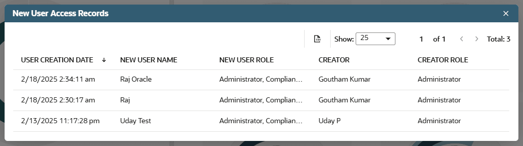
On the other hand, the New User Access KPI tile opens a modal window showing new user accounts created.
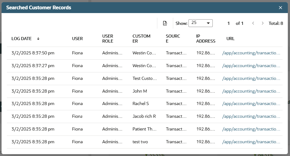
The following columns outline the information you can view and filter in the KPI modal windows:
-
For all KPI meter tiles except New User Access KPI:
-
Log Date - Date and time when the data was accessed, displayed in the time zone of the user who accessed the log.
-
User - Name of the user who accessed the data.
-
User Role - Role of the user who accessed the data.
-
Customer - Customer whose data was accessed by the user.
-
Source - Source from where the customer data was accessed.
-
IP Address - The IP address used by the user to access the data.
-
URL - The URL of the accessed data.
The following screenshot shows a sample of the modal window from a KPI meter tile.
-
-
For the New User Access KPI meter tile:
-
User Creation Date - Date and time when the new user access was created.
-
New User Name - Name of the new user.
-
New User Role - Role of the new user.
-
Creator - Name of the user who created the new role.
-
Creator Role - Role of the user who created the new role.
The following screenshot shows a sample of the modal window from a KPI meter tile.
-
You can sort the customer records list in the KPI modal window by clicking on most column headers, excluding IP Address and URL.
You can export the list as a CSV file by clicking the CSV file icon.