Style Definitions
To help you maintain and develop Sass variables, Commerce websites use the following Sass style definitions. These styles provide flexible, comprehensible, and easy-to-maintain variables and their values.
Read the following information to learn how Commerce websites use these style definitions:
Colors
Colors represent a large number of variables throughout SuiteCommerce and SuiteCommerce Advanced. These are represented as primary colors, secondary colors, themes, messaging, links, and neutral shades.
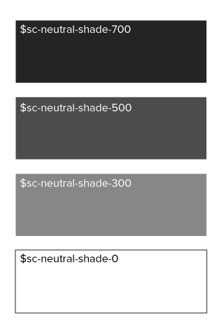
Neutral shades and theme colors are handled differently than other color definitions. Both neutral shades and theme color palettes use a shading scale from 1000 (dark) to 0 (light).
For example, the BaseSassStyle module defines neutral shades in the BaseSassStyles/Sass/variables/_colors.scss file as follows:
          //...

$sc-neutral-shade: #4D5256;
$sc-neutral-shade-700: darken($sc-neutral-shade, 18);
$sc-neutral-shade-500: $sc-neutral-shade;
$sc-neutral-shade-300: lighten($sc-neutral-shade, 20);
$sc-neutral-shade-0: lighten($sc-neutral-shade, 100);

//...
In this example, sc-neutral-shade defines the base neutral value #4D5256, which is a very dark gray. Commerce websites declare other neutral shades as calculated percentages of the base. Therefore, sc-neutral-shade-500 has no calculation and matches the base shade. However, sc-neutral-shade-300 renders as the base shade lightened 20%. As we progress through each neutral shade, shades becomes lighter. You can extend the class definitions in the _colors.scss file to introduce intermediate shades as shown in the following image.
The theme color palette handles colors in a similar way. Instead of defining a hexadecimal value, the theme palette defines a previously declared color value. For example, $sc-color-secondary.
Typography
Like color variables, Commerce websites declare typography variables in an intuitive, human-readable manner. This relies on the familiar sizing method of extra-small (xs) through triple-extra-large (xxxl). Each of these sizes is relative to a base font size ($sc-font-size-base). The source Sass expresses the base font size in pixels and all related font sizes in rem units (relative em). 1rem equals the font size of the base element. Therefore, 1.067rem is a calculation meaning the value for $sc-font-size-base times 1.067.
In the following example from BaseSassStyles/Sass/variables/_typography.scss, $sc-font-size-m is equal to 15 pixels (1 x 15px), and $sc-font-size-l is equal to about 16 pixels (1.067 x 15px). Likewise, $sc-font-size-xxxl is equal to about 26 pixels (1.73 x 15px).
          //...

 $sc-font-size-base: 15px;

$sc-font-size-xxs: 0.75rem;
$sc-font-size-xs: 0.87rem;
$sc-font-size-s: 0.93rem;
$sc-font-size-m: 1rem;
$sc-font-size-l: 1.067rem;
$sc-font-size-xl: 1.2rem;
$sc-font-size-xxl: 1.47rem;
$sc-font-size-xxxl: 1.73rem;

//...
Spacing
Spacing variables affect the structural height, width, and spacing of elements. These are most commonly referred to as the padding and margins. Like color and typographic variables, spacing variables are declared in an intuitive, human-readable manner. Commerce websites use levels to indicate the added or reduced space for a class relative to a base style. Each level designation in the named variable equals the multiplier. That is, lv2 bares a multiplier of 2.
In the following example from BaseSassStyles/Sass/variables/_spacing.scss, $sc-padding-base is equal to 5 pixels, and $sc-padding-lv2 is equal to 10 pixels (2 x 5px). Likewise, $sc-padding-lv8 equals 40 pixels (8 x 5px).
          //...

$sc-padding-base: 5px;
$sc-padding-lv1: $sc-padding-base;
$sc-padding-lv2: $sc-padding-base * 2;
$sc-padding-lv3: $sc-padding-base * 3;
$sc-padding-lv4: $sc-padding-base * 4;
$sc-padding-lv5: $sc-padding-base * 5;
$sc-padding-lv6: $sc-padding-base * 6;
$sc-padding-lv7: $sc-padding-base * 7;
$sc-padding-lv8: $sc-padding-base * 8;

//...