Style Guide
This information applies to the Aconcagua and Kilimanjaro releases of SuiteCommerce Advanced (SCA) only. Recent versions of SCA do not support this functionality.
A style guide helps developers and designers use the various style elements defined for a site. Contributors can refer to a style guide to create new pages and elements or customize existing ones. A style guide can also ensure that your best practices for site design are being met by multiple contributors.
You can use the developer tools to create a style guide automatically. To do so, the source BaseSassStyles module uses KSS notation to document and define Sass elements. As a best practice, build any Sass customizations using KSS notation as defined in this section.
To create a style guide using the developer tools:
-
In your local developer environment, open a command line or terminal and access the top-level development directory.
-
Run the following command:
gulp theme:local styleguide -
Point your browser to:
localhost:3000
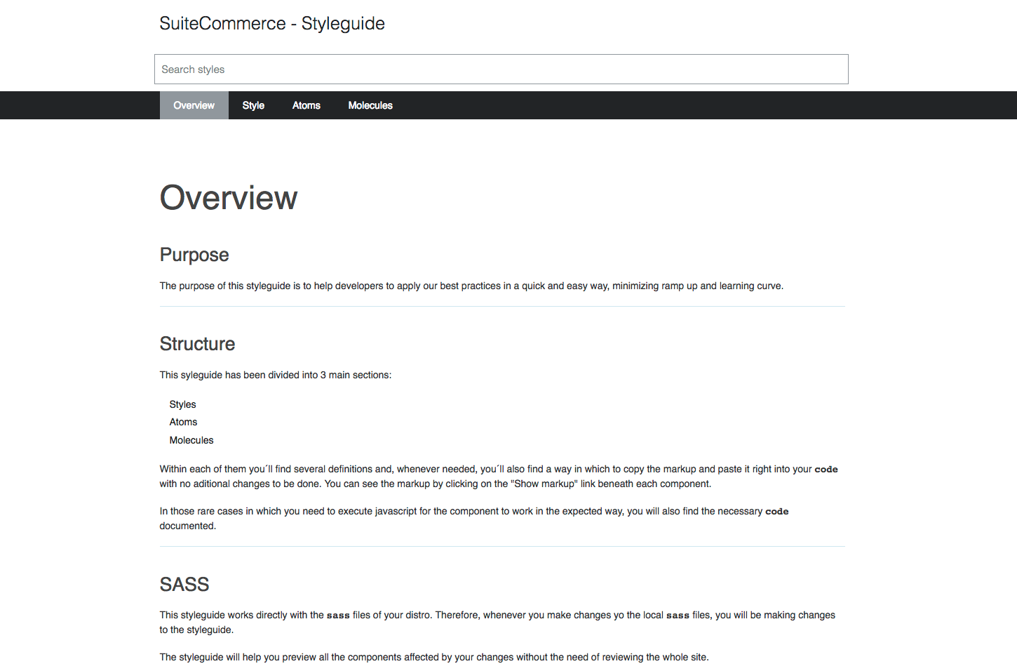
You should see your style guide as shown in the following example:
KSS Notation
Commerce websites use Knyle Style Sheets (KSS) notation to automate the creation of a Sass style guide. KSS is simply a documentation syntax for CSS, written in a human-readable way. A style guide serves as a place to publish KSS documentation and visualize different states of user interface elements defined in your Sass.
KSS does not affect the performance or rendering of CSS in any way. It is meant to document your styles in a human-readable way and automate the creation of a related style guide.
The following elements of this notation appear before each element defined in a Sass file:
-
Title - defines the element. Best practice is to use an intuitive, human-readable title.
-
Description - briefly explains the intended purpose and implementation of the element.
-
Markup - provides the HTML markup used to generate the element.
-
Index - defines where the element exists within the style guide structure.
The following example comes from the base Sass style atom _buttons.scss and highlights the basics of KSS notation as used by Commerce web stores.
          //...

// Primary buttons
(This is an example of the Title element)
//
// The primary action is generally the action that completes a task or desired action.
// Primary buttons use bright and saturated colors to provide stronger visual weight that
catches the user's attention to avoid confusion and competition with secondary actions.
(This is an example of the Description element)
//
// Markup:
// <button class='button-primary button-medium">Button Primary</button>
(This is an example of the Markup element)
//
// Styleguide 2.1.1
(This is an example of the Index element)

.button-primary {
   background: $sc-button-primary-background-color;
   color: $sc-button-primary-text-color;
   font-weight: $sc-font-weight-normal;
   border: 1px solid $sc-button-primary-border-color;
   border-radius: $sc-button-primary-border-radius;
   text-transform: $sc-button-primary-text-transform;
   display: inline-block;
//...