APM Action Diagnostics
To begin monitoring actions, use the following dashboards:
-
SuiteCommerce Action Diagnostics
-
SuiteCommerce InStore Performance Diagnostics
For more information, see Action Performance Dashboards.
For more information concerning the elements on these dashboards, see the following help topics:
Action Tiles
Each tile shows detailed information about an action's performance based on your selected filters. Tiles help spot changes in action duration over time. Use the average, median, and 95th percentile data to learn about long-running processes.
Click a tile to see the timeline, then click any point to view the action's history for that time.
The following screenshot shows examples of action tiles shown on SuiteCommerce InStore APM:
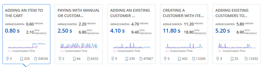
Depending on the feature that you are using, the following details are available on each tile:
|
APM for Commerce Feature |
Data |
Description |
|---|---|---|
|
All |
Action Name |
Shows the name of the action. |
|
Average Duration |
Shows the average time to process an action, based on your selected filters. The average is total duration divided by number of actions. |
|
|
Median |
The median shows the middle value of the performance data, so it's not affected by extremely low or high values. Data is sorted by total duration, and the value in the middle is used. |
|
|
95th Percentile |
The 95th percentile gives a realistic measure of the performance for the action most of the time. |
|
|
Customization Time Chart |
Shows a smaller version of customization performance over time. |
|
|
Performance Logs |
Shows how many performance logs were captured for the action. You can view these logs in the Action History table. For more information, see APM Action History. |
|
|
SuiteCommerce InStore APM |
Location |
Shows how many locations where the action happened. |
|
Devices |
Shows how many devices on which users performed the action. |
Total Duration of Actions and Customization Performance Over Time
Data related to customizations are available only after the SuiteApp has finished processing them. To see when customization data was last updated, check the note before the action tiles.
When you click a point in the timeline, you see a popup with aggregate performance data for that action, showing how many times it happened and the average time it took, including time for customizations. By default, the graph shows average total duration, but you can click tabs to see the median or 95th percentile.
You can drag to zoom in on any part of the graph. User event scripts and workflows are shown with different colored lines, and all dates and times are in Pacific Time.
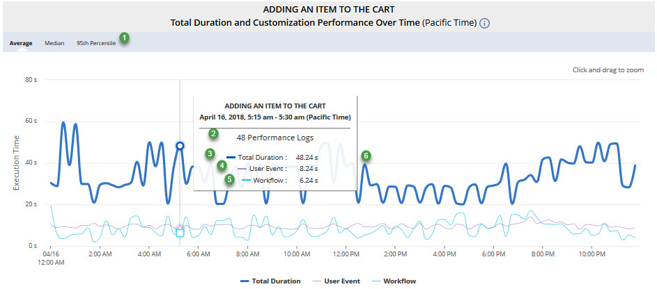
For example, the timeline graph shows the following information:
|
Item |
Description |
|---|---|
|
1 |
Tabs let you view Average, Median, or 95th Percentile data. |
|
2 |
Shows how many times the action occurred based on your filters. |
|
3 |
Shows the total time it took to process the action. |
|
4 |
Shows how long user event scripts for the action took to run. |
|
5 |
Shows how long workflows for the action took to run.
Note:
User event scripts and workflows are customizations. The feature shows when customization data was last available. |
|
6 |
Click the node to see the Action History with details for each action. |