Chart Tab
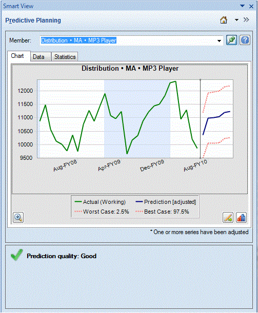
Predictive Planning results are displayed graphically on the Chart tab (Figure 2-1).
Figure 2-1 Predictive Planning Panel, Chart Tab with Summary Area

The default view, Prediction, includes plots of historical and predicted data. The historical data series is displayed to the left of the vertical separator line. The predicted data series is bounded by dotted lines that show the upper and lower confidence intervals (labeled Worst Case and Best Case).
To change the appearance of a chart, double-click it or click the Chart Preferences button, ![]() (Setting Chart Preferences).
(Setting Chart Preferences).
You can use the Chart Scale button, ![]() , to display a slider control that enables you to show more or less detail in the chart. You can also display a prediction fit line, a trend line (best fitting line), a growth rate line, or other scenario data from the application (Editing the Chart View).
, to display a slider control that enables you to show more or less detail in the chart. You can also display a prediction fit line, a trend line (best fitting line), a growth rate line, or other scenario data from the application (Editing the Chart View).
You can click the Adjust Series button, ![]() , to change values in future data series (Adjusting Future Data Series).
, to change values in future data series (Adjusting Future Data Series).