Working with Group Boxes
This topic describes how to add group boxes to your form and discusses group box layout options and attributes.
Use group boxes as containers to indicate the items contained within a group box are grouped logically. Once you add a group box to a page, you can drag these items into the group box:
-
Predefined field groups
-
User-defined fields
-
Other group boxes (nested group boxes)
Adding Group Boxes
To add a group box:
-
Open the Add New list in the Elements panel.
-
Open the Layout list.
-
Click and hold on the Group box option.
-
Drag and drop the group box into the workspace.
Deleting Group Boxes
To delete a group box:
-
Select the group box.
-
Click the Remove button in the Attributes panel.
Setting Group Box Attributes
Select a group box to view the Group Box Attributes panel.
|
Page Element |
Description |
|---|---|
|
Remove |
Click to remove the group box from the page. |
|
Label |
Add a name for the group box, describing the collection of items within it. |
|
Collapsible |
Turn on to enable the group box to be collapsed when an end user clicks it, hiding items it contains. If not turned on, the group box is always expanded and its content is always visible. |
|
Collapsed |
Turn on to have the group box render collapsed upon the initial load of the intake form. Having group boxes collapsed can streamline the initial display of the intake form. Applicants can expand the group box to view the contents as needed. |
|
Flexible Box Layout |
Use the Flexible Box Layout attribute to establish a group box container based on the CSS flexible box layout model. In the flexible box layout model, the items contained within the parent container assume a layout position automatically, based on space in the container. As the available unused space grows or shrinks, the items in the container grow to fill the unused space or shrink to avoid overflowing the parent. With Flexible Box Layout enabled, the system displays as many controls within the group box in one line until all of the space is utilized, then the system wraps the row, beginning a new line. When disabled, the controls within the group box display as stacked items, with each additional control displaying directly beneath the previous control. |
|
Show Label |
Select to hide the group box label (specified in the Label field). Note: You can add help only to group boxes
with Show Label
turned on. If Show Label is turned off, the Add Help button does
not appear on the attributes panel and any help icons associated with any
previously added help no longer appear.
|
|
Hide Border |
Hides the element border. When turned on, the border is not visible. |
|
Add Help |
Click to launch the Contextual Help page, which you can use to add help information to aid public users in completing the intake form. The Add Help button appears only if Show Label is turned on. Help text added for grids should apply to the overall group box content. Help can be added also at the page level, field group level, and field level depending on the scope of the help text. For more information on adding Contextual Help, see Adding Contextual Help to Forms. |
|
License Activity |
Note: This attribute applies only to the
Business Licenses offering.
Expand the Display section to view this feature. License activity filtering enables you to control the display of group boxes, depending on the current business license activity selected by the applicant. For more information on setting display filters, see Configuring Activity Filtering for Business Licenses. |
|
Fee Estimate |
Expand the Display section and the Fees section to view this feature. Select to incorporate this field element into simplified fee estimates that users can perform while making decisions regarding the transaction associated with an intake form. For more information on configuring simplified fee estimates, see Configuring Simplified Fee Estimates. |
|
Control Display |
Expand the Display section to the view this attribute. Click to select an element in the form that controls the display of the group box. For more information, see Displaying Form Elements Conditionally. |
|
Hide from public user |
Expand the Security section to view this attribute. Hides the group box and all the elements in the group box container from the public user at runtime. Only agency staff can view and update information within a group box with Hide from public user turned on. In addition to hiding the UI element from the public user in the interface, the application also secures the back end for that specific UI element, such as preventing any unauthorized access to the fields contained within that UI element using a REST API, for example. Note: The Hide from public user setting
and the Confidential setting are mutually exclusive.
Note: For fields within elements set to
be hidden from the public, the default value for that field entered on the
intake form design can be used to calculate fees for the intake form application
at runtime.
|
|
Confidential |
Note: The Confidential attribute applies
only to the Business Licenses offering.
Expand the Security section to view this attribute. Turn this attribute on to specify that the user-defined fields within the group box container hold confidential information. At run time, fields with confidential information will be hidden to all users except for users without the appropriate privilege. These users can see the confidential information:
Note: The field does appear in the JSON
payload for the page, however the field value will be null.
Note: You can’t add a predefined field
group to a group box with the Confidential attribute turned on. The Confidential
attribute can be set only for pages and group boxes, and it applies only to
user-defined fields within those containers. You can’t apply the Confidential
attribute to field groups.
Note: The Hide from public user setting
and the Confidential setting are mutually exclusive.
|
Example: Nesting Group Boxes
Nested group boxes can be used to represent subcategories of information and to enhance layout options, such as creating columns for form elements.
The following example illustrates nested group boxes, which you achieve by dropping group boxes within group boxes.
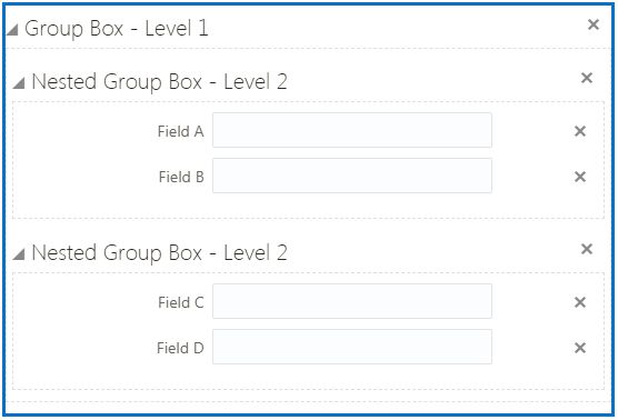
When setting up nested group boxes, keep these considerations in mind:
-
The system does not impose a limit to the depth of nested group boxes you can insert. For more complicated pages, for example, you may find that group boxes could be nested to 4–5 levels deep. Make sure to consider how a page with multiple levels of nested group boxes will render on all the devices you intend to support for your user base.
-
If a parent group box has the Flexible Box Layout attribute enabled, the child group box consumes 50 percent of the parent group box width on medium and large form factor devices and 100 percent of the width on small form factor devices.
-
If a nested group box is hidden due to the Hide from public user feature or the control display feature, the space it would have occupied is consumed by elements coming after it in sequence to the right of it. To avoid fields and other elements shifting into these spaces, it is recommended to either add controlled or hidden group boxes to their own row (with the Flexible Box Layout attribute turned off in the parent group box), or put them in the right column (with the Flexible Box Layout attribute turned on in the parent group box).
Example: Using Group Boxes to Combine Predefined Elements
In some cases you may want to give the appearance of multiple field groups being combined. You can do this using a group box to act as the outer container for the set of field groups. When using a group box to contain field groups, consider the following items:
-
The collapsible attribute of the group box container controls the visibility of the contained field groups. If the group box container is set to be collapsible, when the user collapses that group box, all of the elements within that group box will be hidden.
-
If you want the field groups within the group box to be categorized under just the label of the group box, turn off the Show Label attribute of the contained field groups.
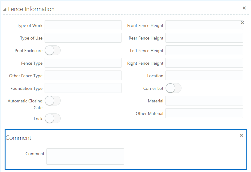
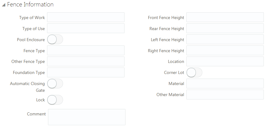
In the following example, assume you want to combine the Fence Information and Comment field groups, giving the appearance that Fence Information field group also contains a Comment field.
To combine field groups within a group box container:
-
Open the Add New list in the Elements panel.
-
Open the Layout list.
-
Drag and drop a Group box into the workspace.
-
Select the group box and make these changes on the Group Box Attributes panel:
Group Box Attribute
Sample Value
Label
Fence Information
Flexible Box Layout
Off
-
Open the Ready to Use list.
-
Open the Field Groups list.
-
Drag and drop the Fence field group into the group box
-
Select the Fence field group, and turn off Show Label on the Attributes panel.
-
Drag and drop the Comment field group into the group box.
-
Select the Comment field group, and turn off Show Label on the Attributes panel.
-
Save your changes.
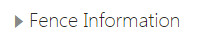
At runtime, the example steps above produce a single, collapsible section in the form that includes both the Fence Information and the Comment predefined elements.
This example illustrates the collapsed Fence Information group box.
This example illustrates the expanded Fence Information group box containing multiple field groups.
Example: Using Group Boxes to Combine Field Groups and User-Defined Fields
Similar to combining field groups within a single group box container, you can also combine field groups and user-defined fields within a single group box container creating the appearance of user-defined fields being part of a delivered field group.
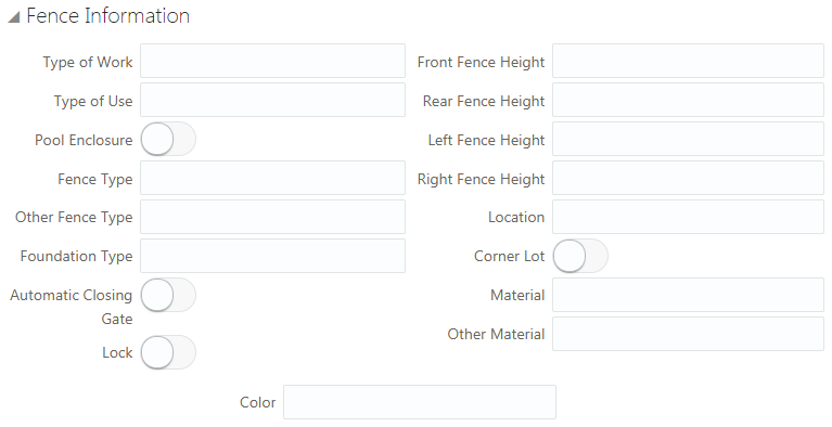
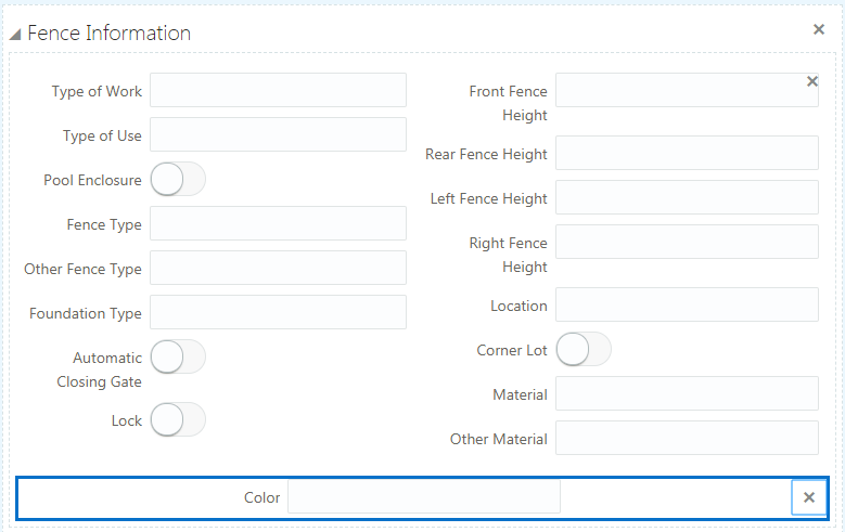
In the following example, assume you need to associate a field with the Fence Information element to capture the color of a proposed fence.
To combine predefined elements and user-defined elements with group boxes:
-
Open the Add New list in the Elements panel.
-
Open the Layout list.
-
Drag and drop a group box into the workspace.
-
Select the group box and make these changes on the Group Box Attributes panel:
Group Box Attribute
Sample Value
Label
Fence Information
Flexible Box Layout
Off
-
From the Ready to Use > Field Groups list, drag and drop the Fence field group into the group box.
-
Select the Fence field group, and turn off Show Label on the Attributes panel.
-
From the Add New > General list, drag and drop a text field into the Fence Information group box.
-
Select the text field, and enter Color for the Label in the Field Attributes panel.
-
Save your changes.
The following example illustrates how at runtime, the group box containing the field group and the user-defined field create the appearance of the manually created field being part of the delivered field group.