Visualize Warehouse Employee Travel Metrics with Redwood WFM Dashboard
A new Employee Dashboard has been introduced to provide deeper insights into employee travel behavior within the warehouse. This update brings in new visualizations, KPI organization, and time-based trend analysis to help you in making more informed operational decisions.
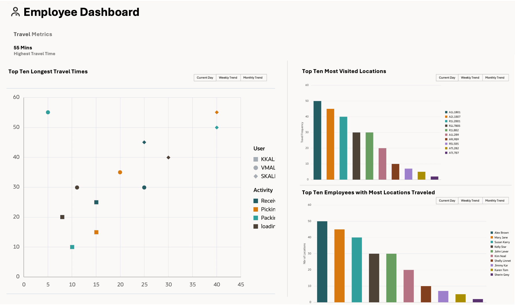
One of the key additions is a scatter chart that highlights the top 10 longest employee travel times. This visual allows you to quickly identify travel-intensive activities.
You can hover over any point to view details such as employee name, travel time, and the number of visited locations. A toggle is provided to view trends by current day, week, or month. Another bar chart displays the most visited warehouse locations. This helps identify high-traffic zones within the facility. You can interact with the chart to view specific visit counts and the corresponding dates.
Employee Metrics
To monitor employee travel activity further, a second bar chart showcases the top 10 employees who have visited more number of locations. This enables quick identification of highly mobile employees and supports workforce planning. Like the other charts, this view can be filtered by day, week, or month.
Additionally, toggle buttons at the top of the dashboard allows you to switch between viewing data for the current day, the past week, or the past month. When a selection is made, the chart automatically refreshes in the corresponding panel to display the relevant data.
Steps to Enable
You don't need to do anything to enable this feature.