Visualize the Supply Chain Network for Inventory Optimization Plans
With this update, you can improve inventory optimization by visualizing supply chain relationships and relative inventory values across multiple echelons of the supply chain network. The supply chain network is a predefined visualization on the Inventory Analysis page, which is a default page layout for all inventory optimization plans. The visualization increases traceability through dynamic highlighting of upstream and downstream paths on node interactions. It also simplifies decision-making by providing search and filtering capabilities and recommended reallocation path insights.
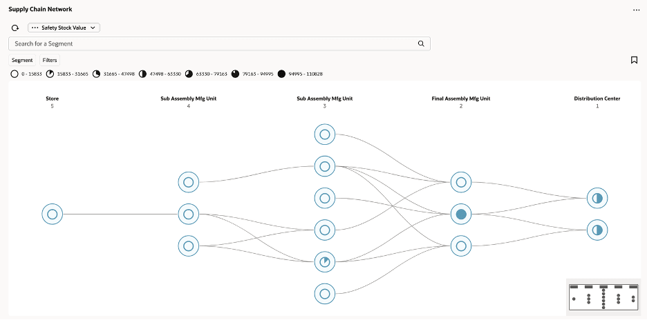
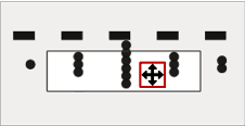
Supply chain network echelons are visualized as vertical tiers, with nodes representing relative inventory values and with arcs indicating upstream-to-downstream material flow. Nodes encode various measures, such as safety stock values or user-defined safety stock, enabling quick assessment of inventory distribution across multiple tiers. The network visualization highlights full upstream and downstream paths on node interaction, fading unrelated nodes to improve traceability and support inventory optimization.
Search and filtering capabilities enable isolation of nodes by segment, organization, category, and time-based criteria. Using zoom controls, you can adjust the visibility of measure values and labels. And tooltips provide detailed inventory and service-level information. Clicking on a node provides visibility to recommended reallocation paths to nearby warehouses or demand centers, facilitating informed decision-making for inventory rebalancing.
Supply Chain Network Visualization
Supply Chain Network Visualization
The Supply Chain Network visualization provides an end-to-end view of the supply chain, helping you understand how inventory is positioned across multiple echelons, from manufacturing to final delivery points.
The visualization represents the supply chain as a network of organizations, starting with the end-demand organizations on the right and tracing the material flow level-by-level in the supply chain to the left. The relationships between organizations are traced based on the sourcing assignment set and apply to all items in each organization.
Key visualization elements include:
- Nodes that correspond to inventory organizations, such as distribution centers and manufacturing facilities.
- Arcs that represent material flow and supply relationships between the nodes.
- Visual cues that indicate the relative achievement of the selected planning measure (chosen from the visualization’s measure selection menu). Nodes with higher relative achievement are filled with a greater proportion of color in a pie-chart style icon, enabling quick comparison across the network. There are seven different pie-chart icons, allowing seven distinct value ranges, or performance bands, of the selected measure to be represented.
Echelon-Based Network Structure
The Supply Chain Network visualization is organized into multiple echelons (tiers), where each echelon represents a group of item-holding locations (for example, stores, subassembly units, final assembly, and distribution centers). Each echelon is visualized as a vertical column, and nodes within the column represent the corresponding locations.
Echelon Naming (Dynamic Column Headers)
You can override default echelon names by using the Edit Properties action, as shown in the following image.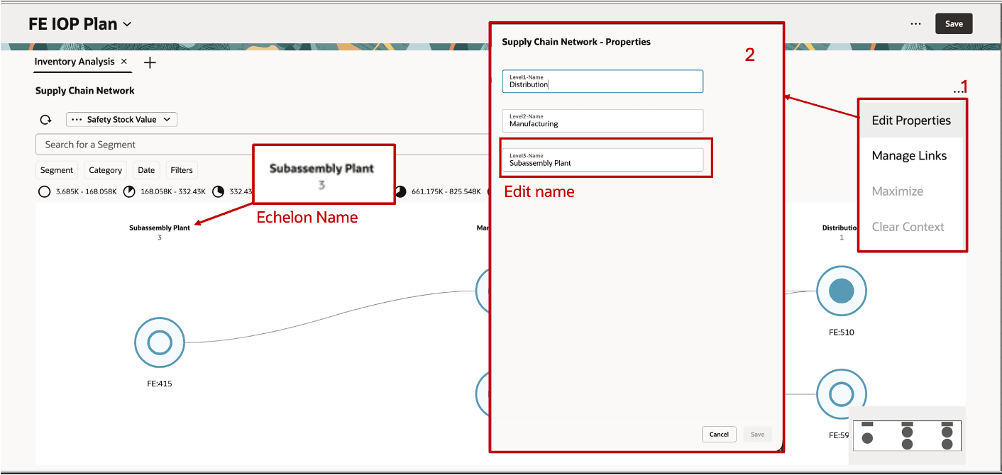
Editing the Name of an Echelon
The user-defined echelon names are displayed as column headers in the network visualization. This enables business-friendly labeling such as:
- Store
- Subassembly Manufacturing
- Final Assembly Manufacturing
- Distribution Center
Default Tiered Layout
The network renders in a left-to-right, column-based hierarchy:
- By default, all echelons of the network are shown.
- Each echelon is displayed as a fixed vertical column.
- Nodes are aligned consistently within their respective echelons for readability.
Example 1: Multi-Tier Relationship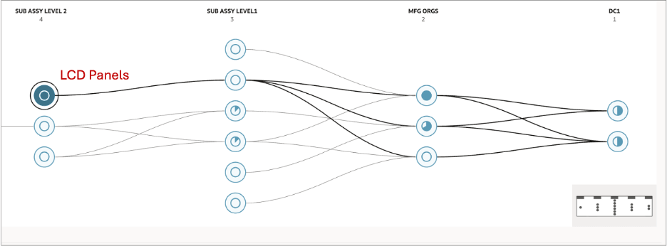
Illustration of a Shared Echelon Consolidation – LCD Panels in Subassembly Level 2 Echelon
In this example, the illustration shows the downstream supply chain of the LCD Panels manufacturing node (Subassembly Level 2). The network traces the multi-tier relationship in every organization that depends on LCD Panels, directly or indirectly, all the way through to the distribution centers at DC1. The highlighted path is shown in bold black arcs, while all unrelated nodes and arcs are faded into the background.
Example 2: Shared Echelon Consolidation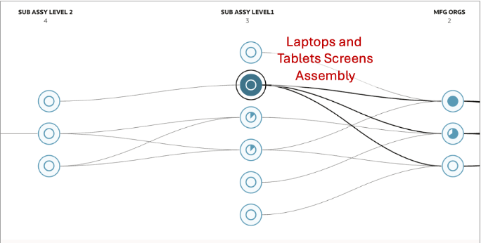
Illustration of a Shared Echelon Consolidation – Laptops and Tablet Screens in Subassembly Level 1
In the example shown in this illustration, two end items, Laptops and Tablets Screens, are both assembled at the same manufacturing organizations and both ship to the same two distribution centers in DC1. In this case, the network renders this as the shared Subassembly Level 3 organization that appear as single nodes in the same echelon, not duplicated once per product.
Arcs from those shared nodes to the manufacturing organization nodes are rendered once per organizational relationship, even though both the Laptop and Tablet Screens sourcing rules reference the same interorganizational connections.
Node and Arcs Representation in the Supply Chain Network
The Supply Chain Network visualization is constructed from the relationships defined in the sourcing rules in the assignment set for the plan.
By default, the visualization shows all the inventory organizations in the plan as nodes organized in different echelons. When you search for a specific segment or category, the nodes in the first level on the right will be limited based on the search filters. All upstream nodes to the left are then displayed based on the sourcing relationships for those end items. The arcs capture the full breadth of manufacturing, procurement, and transfer relationships across all components of an end item (for example, the keyboard, display, and battery for a laptop), with the nodes representing the organizations.
Network Rendering
The network is rendered left to right. The rightmost column represents the end point of the supply chain, typically a distribution center from which finished goods are shipped to the customer. Each column to the left represents an upstream echelon in the sourcing chain, with the leftmost column containing the organizations farthest upstream in the end-item sourcing relationships.
Example: Electronics Segment
Consider a segment called Electronics containing end products such as Laptops. When you search for this segment or a category within it (such as Laptops), the network is built as follows:
- The end items (Laptop and other finished products in the segment) are identified first.
- The sourcing rules for each end item are traversed to determine which organizations are involved in manufacturing, procuring, and transferring the item across the supply chain.
- Nodes represent the organizations; arcs represent the sourcing relationships that exist across all components of the end item (keyboard, display, battery, and so on) capturing the interorganizational relationships.
- When you search by category (such as Laptops), all organizations and arcs that have an end item or component assembly manufacturing relationship within that category are rendered.
Nodes and Arcs in a Supply Chain Network
Node Fill Behavior
The scale of the pie-chart style icon at the node represents the value of the selected measure for the items in each node.
Interactive Highlighting
When you click on a node on the visualization, the selected node is highlighted with a bold outer ring, visually distinguishing it from all other nodes on the canvas. In the following illustration, IOP_ORG1 (Level 2) is the selected node and is shown with a prominent bold circular border.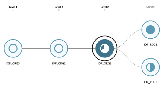
Selection Highlights the Node
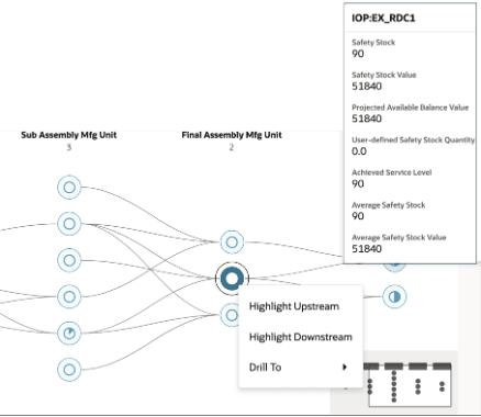
On hovering over nodes, a tooltip panel appears adjacent to the node, showing the measure values for that organization (such as Safety Stock, Safety Stock Value, Projected Available Balance Value, User-defined Safety Stock Quantity, Achieved Service Level, Average Safety Stock, and Average Safety Stock Value).
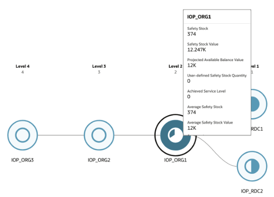
Tooltip Panel When Hovering on a Node
When you right-click on a given node, a context menu appears with three options: Highlight Upstream, Highlight Downstream, and Drill To.
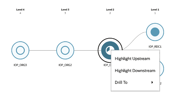
Context Menu Options
You can choose to highlight upstream or downstream:
- Selecting Highlight Upstream traces all sourcing relationships flowing left from the selected node, that is, all organizations that directly or indirectly supply the selected node.
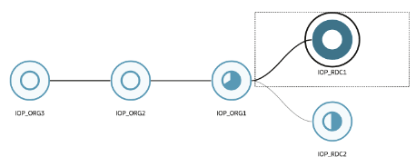
Highlighting Upstream
In the preceding image, highlighting upstream for the selected node (IOP_RDC1) would emphasize all connected nodes in the immediate left and any further echelons to the left, along with the arcs connecting them to the selected node. Only organizations that have a direct sourcing arc leading into IOP_RDC1 are highlighted, not every node in those echelons.
- Selecting Highlight Downstream traces all sourcing relationships flowing right from the selected node, that is, all organizations that the selected node supplies to. For IOP_ORG3 in the following image, highlighting downstream would emphasize the connected node(s) in the rightmost echelons and the arcs leading to them.
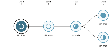
Highlighting Downstream
Related arcs are emphasized, while unrelated nodes and arcs are visually faded. You need to refresh the network view to clear the highlights.
Search Functionality in Supply Chain Network Visualization
The Search capability enables you to quickly locate, filter, and analyze specific portions of the supply chain network. It supports multidimensional exploration across segments, time, categories, and measures, dynamically updating the visualization to reflect the selected context.
Search by Filter Chips
Filter Chips for the Supply Chain Network
Search is driven through interactive filter chips, allowing you to search or filter by:
- Segment – Select one or more segments to render the Supply Chain Network visualization for all end items belonging to those segments. When multiple segments are selected, the network displays a composite view of all sourcing relationships across the union of end items in the selected segments. Organizations shared across segments appear as single nodes, with arcs reflecting all relevant interorganizational sourcing relationships.
- Category – Select a category to scope the network to end items belonging to that category. The categories available for selection are populated from the category hierarchies defined in the assignment set configured for the active plan. If an expected category hierarchy doesn’t appear in the filter, add it to the plan's assignment set in the plan options.
- Date – Define a date range to scope the measure values displayed on the network nodes to a specific planning horizon. Only measure data falling within the specified From and To dates is aggregated and shown on each node and in the hover tooltip. The network nodes and arcs remain unchanged regardless of the date range selected; only the measure values reflect the filtered period. Filters can be applied individually or in combination for refined analysis.
Search by Segment
- Enables you to identify and focus on specific segments within the supply chain network.
- Segment values are sourced from the segment group associated with the plan.
Search scenarios
- Default View:
- Displays all segments in the network.
- Single Segment Search:
- Focus on a specific segment and its associated nodes and relationships.
- Multisegment Search:
- Select multiple segments to compare or analyze overlap.
- Multicriteria Search:
- Combine Segment + Category
- Combine Segment + Date
- Combine Segment + Category + Date
For example, you can filter for a high-value segment within a specific category to analyze value concentration across echelons.
Search by Time-Based Analysis
- Enables you to analyze the network across specific time windows or snapshots.
- Supported time filters are:
- Date Range (From–To), which enables you to define start and end dates for analysis.
Example of Search Behavior
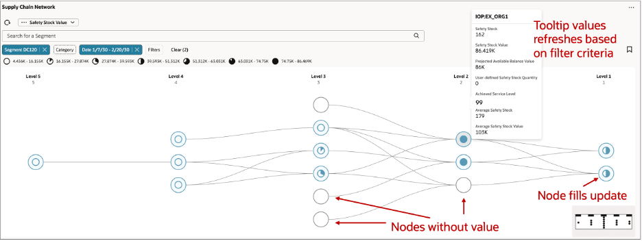
Consider the following illustrations that depict the differences between the default network view prior to search and after the search criteria are defined.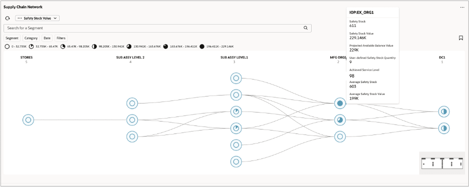
Default View Prior to Search
View After Search
The preceding illustration shows the supply chain network after applying a Segment (DC120) and Date range (1/7/30 – 2/20/30) filter. The following updates occur on the network in response to the applied search criteria:
- Measure values update – The selected measure, Safety Stock Value, is recalculated and displayed on each node for the specified date range only. The node fill updates to reflect the measure value for that period, as visible on the nodes in Level 3 and Level 2. The legend at the top of the network area updates accordingly to reflect the new relative value distribution across the network.
- Nodes without end-item relationships render blank – Organizations that exist in the network but don’t carry end-item demand for the selected segment appear as empty, unfilled nodes, as shown at Level 3 and Level 2. These nodes remain visible on the network but carry no measure value.
- Tooltip values refresh – Hovering over a node displays measure values scoped to the applied filters. In the illustration, the tooltip for IOP: EX_ORG1 shows Safety Stock, Safety Stock Value, Projected Available Balance Value, User-defined Safety Stock Quantity, Achieved Service Level, Average Safety Stock, and Average Safety Stock Value reflecting the filtered date range and segment context.
Zoom Behavior and Mini-Map Guidance
The Supply Chain Network visualization supports a continuous zoom range between a minimum (fit-to-screen) and a maximum zoom level. The following two screenshots represent the two extremes of this range. All intermediate zoom levels are available via scroll wheel, pinch gesture, or the zoom control panel.
Default View Zoom (Fit-to-Screen)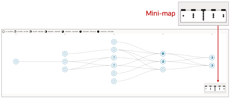
Default Zoom Level View
At the default (minimum) zoom level, the entire network is scaled to fit within the available canvas. At this level:
- All nodes are visible simultaneously, rendered at their smallest size.
- Node labels are hidden to prevent overlap. The pie-chart fill within each node indicates the relative measure value.
- Arcs are visible as thin curved lines connecting nodes across supply chain tiers.
- Tier echelon column headers remain visible along the top of the visualization.
- The mini-map viewport indicator covers the entire mini-map because the full network and the canvas view are coextensive at this level.
Maximum Zoom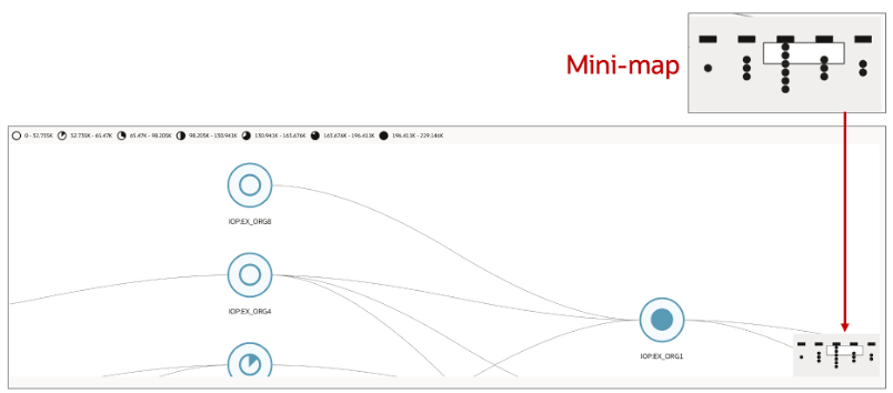
Maximum Zoom Level View
At the maximum zoom level, a small subset of nodes fills the canvas. At this level:
- Nodes are rendered at full size with their labels fully visible beneath each node (for example, IOP:EX_ORG4, IOP:EX_ORG1).
- The pie-chart fill within each node icon is more prominent, allowing the measure value to be read for individual nodes.
- Only a small number of nodes are within the viewport and the rest of the network is off screen.
- The mini-map viewport indicator shrinks to a small rectangle, reflecting the narrow slice of the network currently in view. This rectangle moves in real time as you zoom in and out of the network visualization.
Intermediate Zoom Levels
At zoom levels between the default and maximum, nodes and labels progressively come into view as you zoom in, with the mini-map viewport indicator scaling continuously to reflect the proportion of the network visible on the canvas. The curvature and relative appearance of the arcs remain consistent across all zoom levels.
Mini-Map Behavior Across Zoom Levels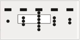
Mini-Map and Viewport Indicator
The mini-map remains anchored to the bottom-right corner of the canvas at all zoom levels and provides continuous spatial orientation:
- At default zoom level, the rectangle viewport indicator fills the entire mini-map.
- The size of the viewport indicator adjusts as you zoom in and out of the visualization.
- At maximum zoom level, the viewport indicator is a small rectangle, highlighting the precise region of the network in view.
- Clicking anywhere in the mini-map pans the canvas to center on that point.
- Dragging the viewport rectangle within the mini-map pans the canvas continuously.
Using the Focus Control in the Mini-Map to Navigate
Measure Selection in Supply Chain Network
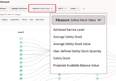
Measure Drop-Down List
The Supply Chain Network visualization is driven by a selected measure, which determines the color gradation used for rendering the nodes.
You can select a measure from a Measure drop-down list available in the toolbar.
The following measures are available for selection from the drop-down list:
- Achieved Service Level
- Average Safety Stock
- Average Safety Stock Value
- User-defined Safety Stock Quantity
- Safety Stock
- Projected Available Balance Value
Drill To — Navigation from the Supply Chain Network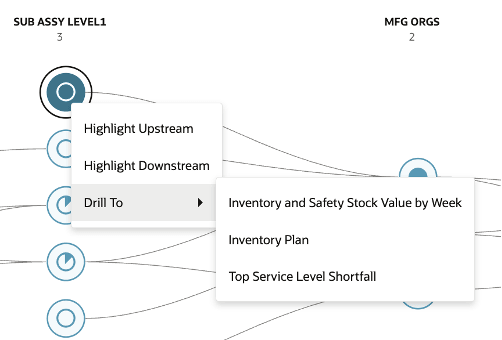
Drill To Options in the Supply Chain Network Visualization
When you select a node on the Supply Chain Network visualization, the context menu also displays a Drill To option. Selecting the Drill To option reveals a submenu of available drill targets, as shown in the following table. In this example, Subassembly Level 1 node is selected.
Drill To Visualization Contexts
| Drill To Visualization | Purpose | Context Passed |
|---|---|---|
| Inventory and Safety Stock Value by Week | Displays weekly inventory value alongside safety stock levels to monitor investment and availability to fulfill demand | Organization |
| Inventory Plan | Provides supply-demand alignment and optimizes inventory using projected balances and refined safety stock | Organization |
| Top Service Level Shortfall | Identifies top items across categories with the largest gaps between target and achieved service levels, highlighting areas with the highest fulfillment risk | Organization |
User-Defined Drill-To Links
In addition to the predefined drill visualizations, you can configure your own drills to any table, graph, or page layout within Supply Chain Planning using the Manage Links option from the Actions menu of the Supply Chain Network visualization.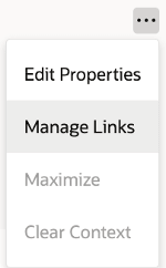
Manage Links Option
Once you’ve selected the Manage Links option, you can do the following:
- Create a link to another table, graph, page, or AI Agent.
- Review the details of an existing link.
- Edit the properties of an existing link.
- Delete an existing link.
Steps to enable and configure
You don't need to do anything to enable this feature.
Tips and considerations
- To add the Supply Chain Network visualization to a page, go to the Content Library. Then search and select the Supply Chain Network visualization.
- The Supply Chain Network visualization doesn’t work in Compare Plans mode.
Access requirements
Users who are assigned a configured job role that contains these privileges can access this feature:
• Monitor Inventory Optimization Planning Work Area
(MSC_MONITOR_INVENTORY_OPTIMIZATION_PLANNING_WORK_AREA_PRIV)
• Review Supply Chain Network
(REVIEW_SUPPLY_CHAIN_NETWORK_PRIV)
These are new privileges available as part of this update.