Charts
Interactive charts help salespeople identify patterns, track progress, and communicate performance clearly. Using charts, salespeople can visualize sales data trends and distributions, such as pipeline by stage, revenue by region, or lead conversion rates, for example. And they can drill down into individual records.
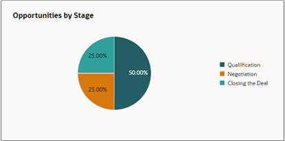
You can choose any of the available chart types including bar, pie, donut, funnel, scatter, and combo charts.
AI Insights into the Information in a Chart
From any chart a salesperson can use the Narrative Insights AI agent to generate a description of the key information underlying the chart and they ask follow-up questions.
For details see the topic AI Agents in the Sales Dashboard.
What Tools to Use to Create Charts
There are several tools available for sales administrators to create charts for the sales dashboard. Which you should use depends on the complexity of your use case:
-
To create simple charts, you can enter a query in the sales dashboard Ask Oracle bar. The Sales Analyzer agent does the rest.
The Sales Analyzer agent can create charts from attributes enabled for Adaptive Search and your chart can group data by 1 attribute. For example, you can have the Sales Analyzer create a bar chart showing the number of opportunities for each of your team members by sales stage, but you can't generate a stacked chart that shows the number of opportunities and revenue by sales stage.
-
To create more complex charts from Oracle Transactional Business Intelligence (OTBI) analyses, you can use the Express Reports tool.
Express report charts can group data by several factors. For example, you can group revenue by product and state. Take advantage of prebuilt visualizations to display the trends and key performance indicators
How to configure and use Express Reports is covered in a separate playbook How do I get started with Express Reports?.
-
Another tool for creating complex charts from both Adaptive Search and OTBI analyses, is the Visualization Configuration tool. With this tool, you can create charts for both sales dashboards and the CX Sales Mobile app.