6Site Builder Configuration
Site Builder
Site Builder Overview
The Site Builder provides clients access to all of the pages that exist within a site to enable them to easily and simply build, brand and manage one or more targeted sites. Site Builder allows customers to build up to 100 different sites. Before diving into the Site Builder capabilities, it's good to have a basic understanding of what a site is for Sourcing purposes and what it's comprised of.
Sites and the Home Page
Each implementation of Sourcing includes a default site. A site in Sourcing is a website where candidates and/or recruiters access and search different job opportunities, can learn about company values and areas of specialization or interest, can apply for jobs, etc. A Sourcing site can be used in addition to a company's Recruiting site and can provide an experience that may be different and more personalized than what is possible using their core Recruiting product alone. A site attracts many different types of populations and generally contains content for those populations whether someone is looking for an internship, internal jobs, external jobs or is interested in a particular line of business, brand, location, etc. A site is broad and contains general information as its goal is to attract as many users as possible.
The central access point to a site is its Home page, meaning that when a user first logs into a site, the page that displays is this Home page. A Sourcing site is delivered with Pages, Landing pages and Modules and each of these elements can be accessed via the site's Home page.
The default Sourcing site is delivered with the following pages:
Home page (referred to as the Jobs page in the navigation) - central access point to a site; job opportunities are typically listed here.
Job Details page - when a job is selected, the Job Details page opens. This describes individual job opportunities in detail.
Help page - usually contains company FAQ's, contact information, etc. Some configuration is required to use the following pages to your site, but the functionality to do so is delivered:
Category and Location Landing pages - a page that groups job opportunities either by their location or by job category.
Combination Custom Landing pages - a page that groups job opportunities by both their location and job category. Up to 200 Custom Landing pages per site are allowed.
Custom pages - can contain any HTML content. Custom pages are limited to 3 across all sites, meaning only 3 custom pages total are available for each Sourcing instance, not per site. An additional page, the Rewards page, is available but can only be accessed and implemented by creating a Service Request.
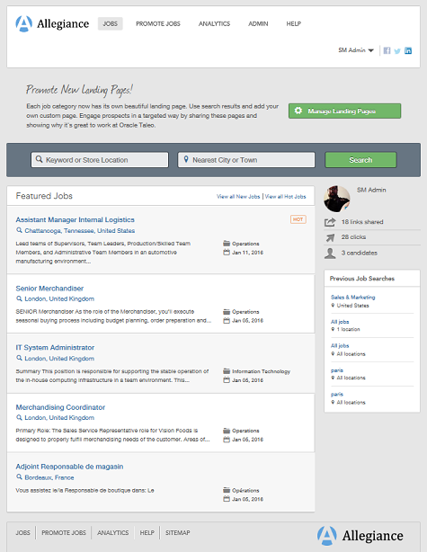
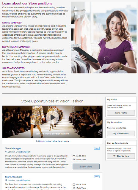
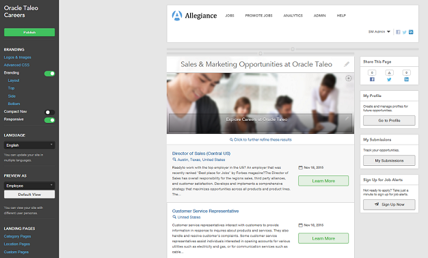
The image below is likely how your delivered default Sourcing site will look upon implementation:
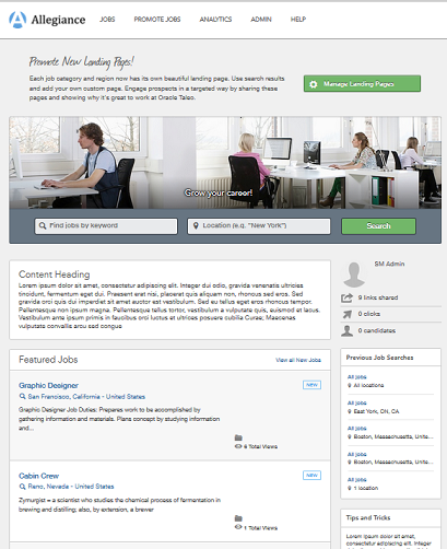
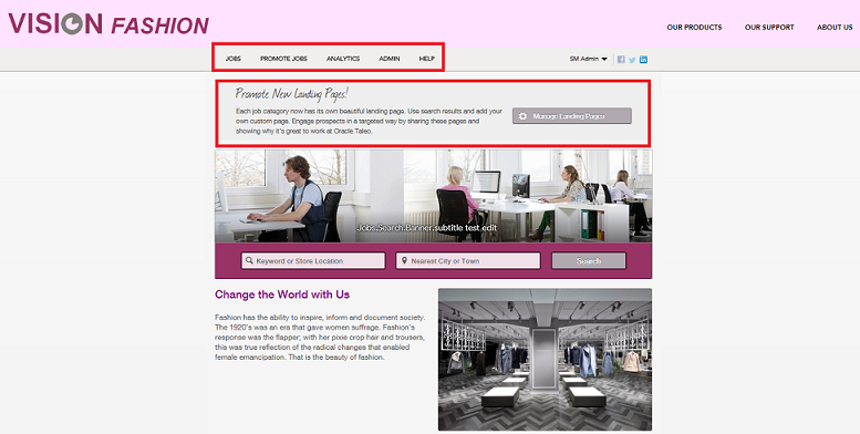
Using Site Builder, Administrators can configure and brand this default site to best fit and represent their organization's needs. In this example, we've taken the default site above and branded it for a company named Vision Fashion. We've transformed the default site into Vision Fashion's site using Sourcing's Site Builder.
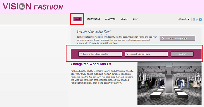
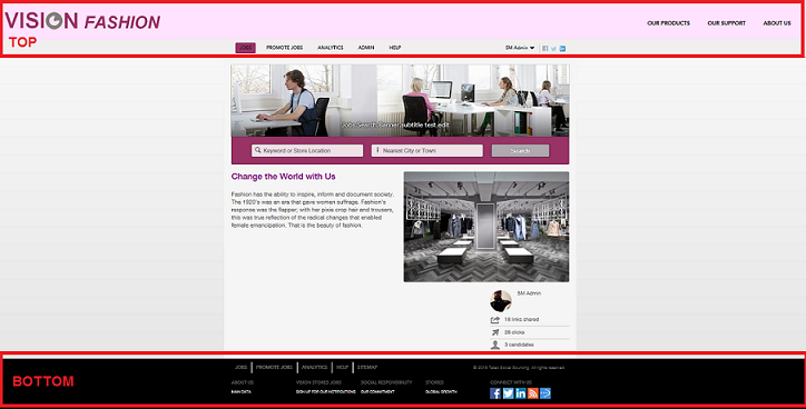
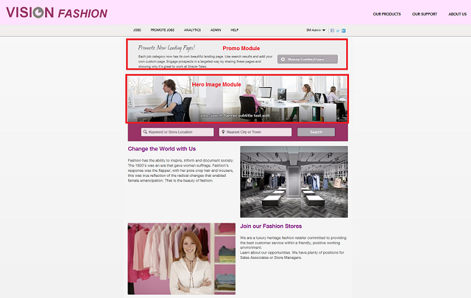
The image below is Vision Fashion's Home page, which we created using the default site and all of Site Builders capabilities. This is what users are presented with when they login to Vision Fashion's site:
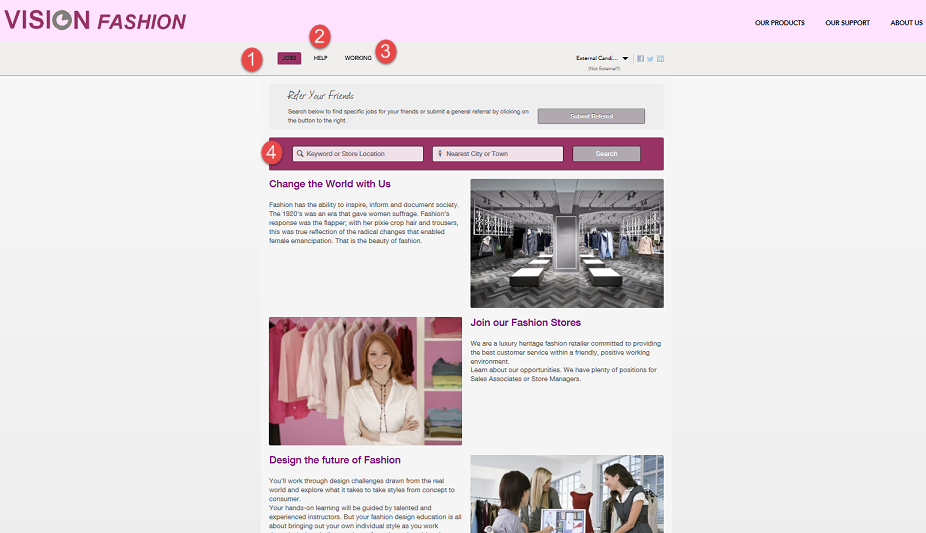
Jobs page - This is also a site's Home page. Remember, the Home page is the central access point to a site, so when users first login, this is the page that displays.
Link to the Help page.
Link to the Working page - This is an example of a Custom page that was created by Vision Fashion for their site. We know it's a Custom page because Working is not listed as one of the pages that Sourcing delivers. Creating and managing Custom pages is discussed TDT.
Search Banner - This is useful for users to initiate their job search. This is an optional item as it can be hidden from view, however, if an organization chooses not to list their job opportunities on their Home page, this Search Banner is a method that candidates can use to view job opportunities. The options for the Search Banner are discussed later in this document.
Featured Jobs Module - Because sites are highly configurable, organizations may choose not to list their job opportunities on their Home page. In this example, however, the Featured Jobs Module is enabled and jobs do display on Vision Fashion's Home page. Modules and the different ways that organizations can choose to have their candidates navigate to job opportunities are discussed later in this document.
Landing Pages
While a Home page is the central access point to a site and is broad in its content, Landing pages narrow the focus of the content presented. Landing pages group jobs by job category or job location which helps reduce the navigation for the users. A Home page may contain links to several Landing pages. Landing pages have a narrower focus than the Home page and are directed at targeted populations of users, as opposed to the broader populations that a site's Home page is designed to attract.
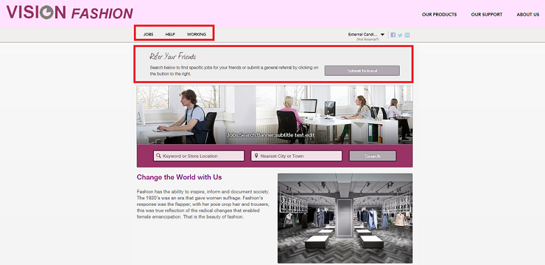
Continuing with the example of Vision Fashion, notice that in the image below the hand icon displays as we hover over some of the images on the Home page. This indicates that this image is actionable and that if clicked, the user is taken to another page within the site; this secondary page is an example of a Landing page.
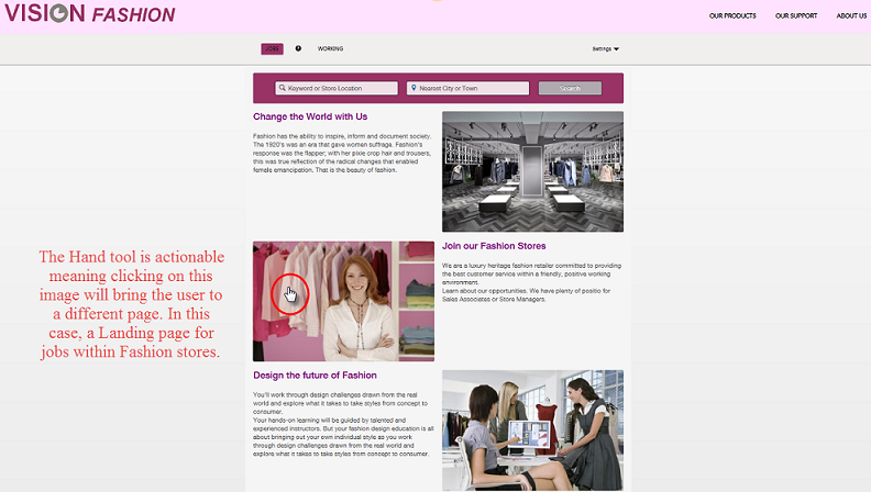
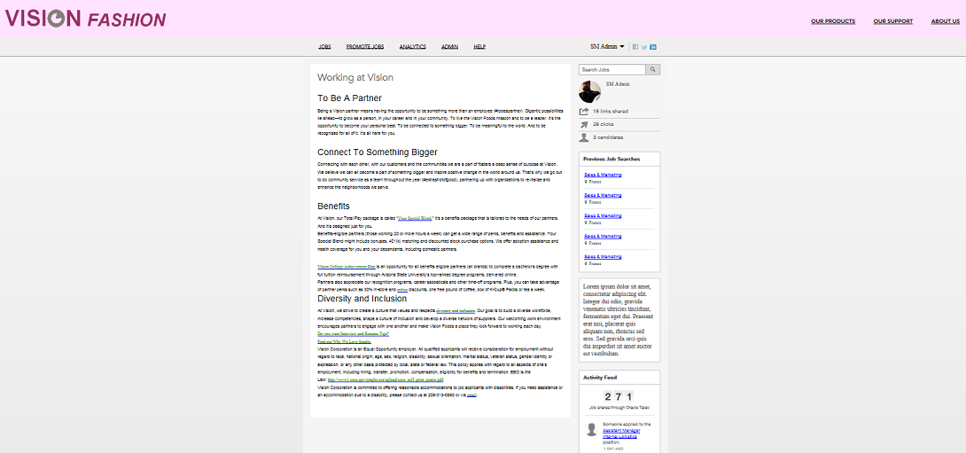
Landing pages ease the navigation for a user as they reduce the number of clicks they need to perform to get to the information that's relevant to them. For Vision Fashion, if a candidate is only interested in opportunities in their retail stores, they could click on the image beside Join our Fashion Stores. This would bring the user directly to the jobs within the retail stores instead of having to navigate through the entire site via the Home page to search for those jobs.
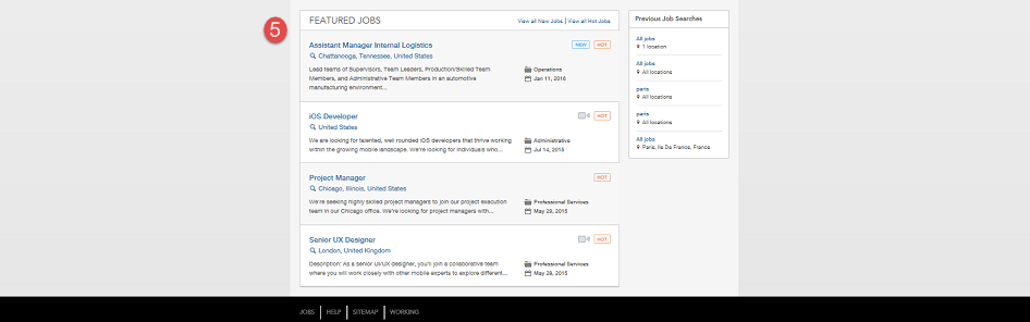
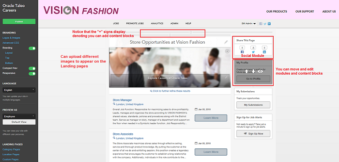
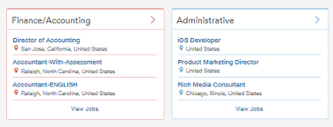
The image below is the result of clicking on the image next to Join our Fashion Stores from the site's Home page. You can see that the page that opens speaks to and lists only those jobs within Vision Fashion's retail stores.
There are three different types of Landing pages:
Location Landing pages - a page that groups and displays job search results by the location of the job, i.e. all available jobs in Northern California.
Category Landing pages - a page that groups and displays job search results by the category of the job, i.e., all available jobs within retail stores. The example from the image above for retail store jobs within Vision Fashion is a Category Landing page.
Custom Combination Landing pages - a page that groups and displays job search results by a combination of both the location and the category of the job, i.e, all available Retail Store positions (category) that are also located in California (location).
Creating and maintaining Landing pages is discussed in detail later in this document.
Site Builder
The Vision Fashion site in our example has been branded. That is to say that company colors and logos have been used, content has been edited, images have been uploaded, their company story has been told, etc. All of this branding has been done to Vision Fashion's default site using the Site Builder.
Site Builder allows clients to build their own sites which can be branded and customized to best fit and represent their organization, its brands if applicable, and its business needs. Multiple sites can be created from one Sourcing instance. Both Home pages are Landing pages are configured at the site level, enabling each of your sites to have a unique Home page and Landing pages. The ability to create and manage multiple sites is useful for customers who want to segment audiences into distinct populations based upon brands, geographies, job types, etc. Sourcing's Site Builder functionality allows for a brand-specific career site experience.
The Site Builder allows Client Administrators (must have Administrator privileges) to centrally access all of the many different experiences and content that are presented to candidates, employees and referrals and to easily customize these experiences with consistent branding, different languages, Landing pages, and so on. Administrators can freely customize their sites without worry of corrupting their Sourcing instance because for each instance, a default site is delivered which cannot be deleted.
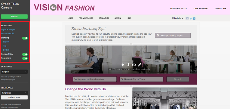
The image below is how the Vision Fashion site that we've been working with displays when opened in Site Builder.
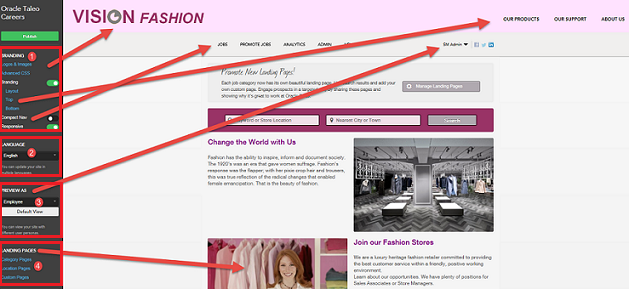
Branding elements
Language
Preview As
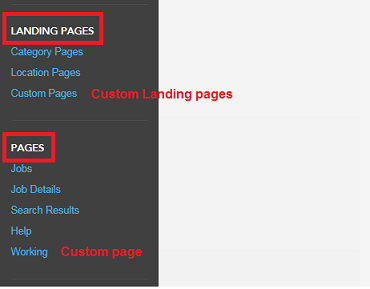
Landing Pages
Pages
Modules
Content Blocks
Each of the elements listed above are accessible in Site Builder and used to build, brand and customize sites.
Site Maintenance
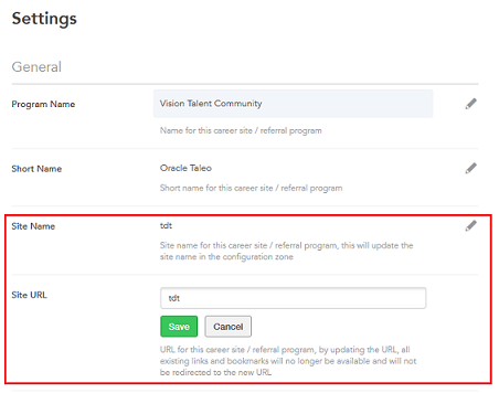
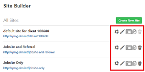
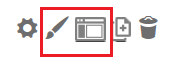
By default, a single site is created for each client and this default site persists and cannot be deleted. Administrators can create new sites using this instance, or can clone the default site. Individual sites can be deleted within Site Builder by clicking the trash can icon. Once an individual site is deleted, all incoming links that formerly went to the deleted site will be rerouted to the default site. Site names and URL's can be edited in the Site Settings of the Site Builder. Clicking the pencil opens up the Site Name and Site URL fields for editing. Once the changes are saved, the changes are reflected both in the Site Settings and on the Site Builder main page (Site Builder - All Sites).
Path: [Sourcing] Login as Administrator > Configuration > Site Builder > Edit Site Settings
Whether a site is deleted, or the Site URL is changed, the original URL is stored. If an Administrator attempts to add a site with the same name as a deleted site, a warning message displays informing the user the URL is one of a previously deleted site, which means that the links and the bookmarks to the former URL will now go to the new URL. Users will receive this same warning message when they change a site's URL within the Site Builder's Site Settings.
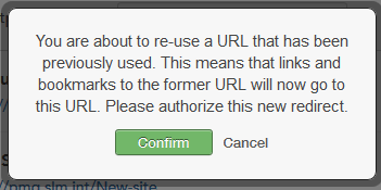
Users going to the original URL are redirected to the new URL. In the case of a deleted site, users will be taken to the default URL.
Listed in the table below are the different entry points of editing when accessing the Site Builder.
| Setting | |
|---|---|
| Name | Location |
|
[Sourcing] Administrator login > User Settings (Name) > Configuration > Site Builder
|
Branding
For Sourcing purposes, branding refers to the different colors, fonts, images, logos, content, etc. that appear on a site. Generally speaking, established, well-known organizations have some colors and fonts that we tend to associate with them. For a newer organization that's trying to establish their brand, brand consistency is key; something that their customers come to identify them with. For this reason, it's recommended that some time and consideration be spent on branding.
Each site is controlled and configured independently which means that branding can be customized from site to site; each site can have its own unique look, feel and branding. This should be taken into consideration upon beginning to build your sites using the Site Builder. Something as simple as the font color can help identify an organization and either differentiate or assimilate brands.
There are 2 different places in Site Builder that you're able to edit your site branding: Edit Site Branding and Edit Site which are both accessed from the Configuration > Site Builder menu.
Edit Site Branding
When accessing Edit Site Branding from the Site Builder, there are 5 areas of customization available: Content Colors, Navigation Colors, Button Colors, Category Tiles Colors and Fonts.
Path: [Sourcing] Login as Administrator > Configuration > Site Builder > Edit Site Branding (paint brush icon)
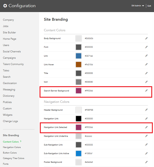
In the image above, you can see that the Search Banner Background and Navigation Link Selected are Vision Fashion's signature magenta shade in the Site Branding. Each of these settings are site-specific allowing companies to use different colors and fonts for each site. The desired colors should be entered as a hexadecimal value. In the image below, you can see how those color choices translate on the site.
Edit Site
When you open a site in Site Builder, you're presented with a Branding section. The elements contained within this section work together and affect each other.
Path: [Sourcing] Login as Administrator > Configuration > Site Builder > Edit Site (screen icon)
Advanced CSS
The Edit Site Branding described in the previous section is the user-friendly way of updating your style sheets. If you want something beyond what's delivered, then you have the option of entering HTML here in the Advanced CSS section of the Branding area in Site Builder. This allows the ability for Administrators to use their own buttons, fonts, etc. that are not delivered in Edit Site Branding. A list of custom styles can be created and then must be referred to in the Branding HTML.
Logos and Images and Compact Nav
The Logos and Images section of the Branding area is where images are uploaded, stored and managed for the site; your default site will be pre-populated with images, but any image can be uploaded to be made available in the navigation on the site. Also stored here are the images that are attached to social media outlets. For example, if you share a Landing page URL on Facebook, you can upload an image here that will display with the URL. Logos and Images works in conjunction with the Compact Nav setting. If an organization is satisfied with the default images and logos and does not wish to include their logo in the Branding header, then the logo will display in the same area as the navigation. In this case, the Compact Nav setting should be disabled as when the Compact Nav is enabled, the logo does not display in the navigation area.
The image below shows the header of the default site with the Compact Nav setting disabled and no HTML entered into the Branding Top area:
Now let's look at what happens when we enable the Compact Nav setting, again with no HTML entered into the Branding Top area:

Notice that in the image above, the logo is gone and the navigation is on the same line as the user login and social media icons reducing the area of real estate that the header takes up on the page. This is to lend a bit more space on the header to allow an organization to brand the header with their own colors, logos and images.
The image below is the result of branding the default site to use Vision Fashion's brand:
To display the logo as it is in the header above for Vision Fashion, Compact Nav was enabled and HTML was entered into the Top Branding area.
Layout, Top and Bottom
When the Branding setting is enabled, Layout and Top, Side (if you choose a layout that includes a Side) and Bottom display. Layout determines how your site displays its content. You can choose to have just a Top (Header) and Bottom (Footer) or a layout that has a Top, Bottom and Side.
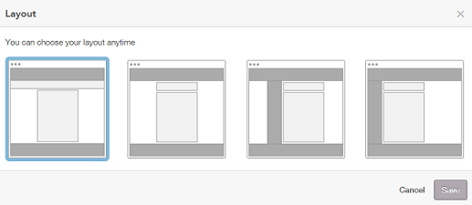
Vision Fashion uses a layout with only a Top and Bottom:
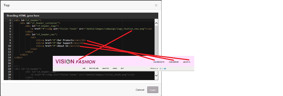
When you select Top, Side or Bottom under Branding, a Branding HTML window opens allowing Administrators to enter branded HTML for the Top (Header), Side and Bottom (Footer) of their sites. The image below shows how what's entered into the Top Branding HTML translates into the header for the Vision Fashion site.
Responsive
Sourcing optimizes its rendering no matter the device used to access it. The Responsive toggle allows the Administrator to indicate whether Responsive Design HTML was used when branding the site. If Responsive Design was used then the Responsive setting should be enabled. If Responsive Design was not used then the setting should be disabled to allow Sourcing to compensate and render the branding appropriately on the different devices.
Custom Fonts
Customers can align the Sourcing interface even more closely with their corporate identity with the ability to upload custom fonts to be used in Site Builder and in campaigns.
The custom font upload formats supported are:
eot
woff
ttf
svg
The custom fonts will not be available for use in the new Font dropdown menu in the RTF editor, but can be consumed through the use of Advanced CSS.
Administrators can upload custom fonts in the same way they upload images. Once these fonts are uploaded, they are available for use. These fonts can only be referenced through branding, and are not surfaced through the standard font selector in the content block editor.
Uploading Custom Fonts
Administrators can upload custom fonts in the same way they upload images using Site Builder.
Content Blocks and Modules
Administrators can easily customize sites by adding, deleting, hiding, moving and editing content containing text and images using pre-defined content blocks. Content blocks are available on all the pages of your sites.
The look and content of your site's pages can be configured, customized and branded quickly and easily using one of Site Builder's most powerful features, configurable content blocks. Different content layouts are available to the user depending on what page they are configuring and where on the page they are placing the content. Content blocks can contain text that can be enhanced with a rich text editor and images that can contain links to other pages. Content blocks can be deleted, hidden and moved to customize the layout of a site.
Custom content blocks are multilingual enabling Administrators to configure the content blocks in Site Builder with content that can be translated to each locale and can be unique to each locale. When site users toggle their language preference, the content in the custom content blocks will display in that language, provided the blocks have been configured in the locale/language selected.
For new custom content blocks that customers add after migrating to Release 15B, it is mandatory for content to be entered into the Default Locale. If for whatever reason content is not entered into an active locale, these locales with missing content will borrow the content from the Default Locale. This ensures that users will see actual content, although perhaps not in the language of their choice, instead of the placeholder Lorem Ipsum text and the placeholder image delivered with the blocks.
All of the system locales, including inactive ones, are available to select in Site Builder to allow Administrators to immediately configure the multilingual content blocks. Content blocks in inactive locales can be pre-configured to make efforts more scalable. Administrators can freely create content in inactive locales without risk of exposing incomplete or inaccurate content as that content remains internal until that locale is activated.
Adding Content Blocks
To add content, users click on the [+] symbol and the available content block types display.
Path: [Sourcing] Login as Administrator > Configuration > Site Builder > Edit Site
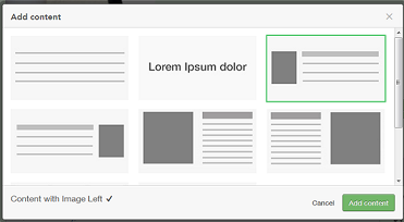
Users get presented a series of relevant content blocks to choose from for creating the new content. The following content formats are available:
Paragraph Text
Text with Heading
Heading
Content with Image Left
Content with Image Right
Two Columns, Image Left
Two Columns, Image Right
Image
Three Columns, Images and Text
When a block is selected, the content template is created and ready to edit and format. A rich text editor is available on all content blocks enabling content font type, color, size, orientation, styles, etc. to be customized for each individual block.
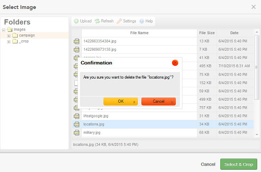
Images
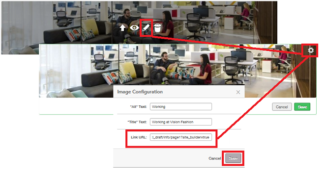
When you choose to create a content block that includes an image, clicking on the white space of the image displays upload options where you can select and crop the image. To keep a more concise and organized list of images, you can delete images by selecting the image in the list and pressing delete on the keyboard.
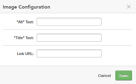
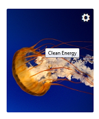
Clicking on the gear icon of the image enables you to configure the image to include hover text as well as embed a link within the image. A link could potentially be a URL to a specific Landing page so that clicking on the image would take users directly to that Landing page.
Once a new content block is added to a page it can be edited, moved, hidden or deleted.
Changes are saved as the user works and saves throughout the Site Editor. Flipping the blocks triggers a refresh that allows the user to see the content in the Site Builder mode, but these changes are not published to the live site until the user selects Publish.
Deleting and Hiding Content Blocks and Disabling Modules
One of the benefits of this feature is the ability to create a clean site or whitespace where you can begin creating a customized site. This is accomplished by hiding or deleting content blocks and disabling modules.
For example, the image below is an example of the default site accessed through Site Builder:
Very quickly the site shown above can be transformed into the site shown below with a few clicks.
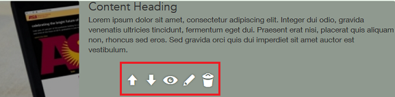
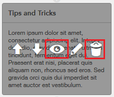
To hide content, users click on the Eye icon. To delete content, users click on the Trash Can icon.
Modules
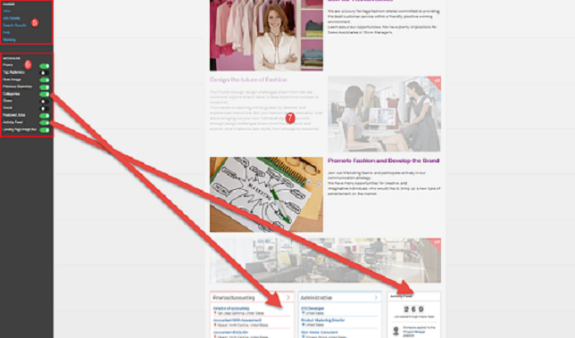
In addition to being comprised of pages (the Home page, Job Details page, Help page, Custom pages and Landing pages), the default Sourcing site is also comprised of and delivered with modules. Modules are system delivered. What you see on Site Builder is an exhaustive list and while you cannot create additional modules, you can disable and enable and move them to customize the pages within your sites. Modules provide additional content and more configuration options for your site and can be used throughout its different pages. The default Sourcing site is delivered with the following modules:
Promo - enables the management and creation of Landing pages and Widgets. This must be enabled to create Custom Combination Landing pages.
Top Referrers
Hero Image - the main image for your site.
Previous Searches - displays the previous job searches performed.
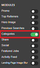
Categories - enables Landing page tile capabilities. This must be enabled for your Home page to display tiles.
Share - only displays on Landing pages. It allows you to share the Landing page URL to Facebook, Twitter and LinkedIn with a single click.
Social
Featured Jobs - on the Home page only. Hot jobs and new jobs are listed.
Hero Image - the main image for your site.
Previous Searches - displays the previous job searches performed.
Categories - enables Landing page tile capabilities. This must be enabled for your Home page to display tiles.
Share - only displays on Landing pages. It allows you to share the Landing page URL to Facebook, Twitter and LinkedIn with a single click.
Featured Jobs - on the Home page only. Hot jobs and new jobs are listed first with the most recent posting listed first and then in reverse chronological order. Also, the user's locale is taken into consideration and jobs that are within their vicinity are also listed here.
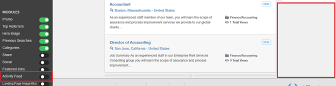
Activity Feed - tracks and displays the activity on the site. Items included are which jobs have been applied to, which jobs have been referred, etc.
Landing Page Image Blur - allows the image on the Landing pages to display blurred.
Modules displayed on the Home page:
In the image below, the Activity Feed is displayed as you can see that it is toggled on in the Module menu.
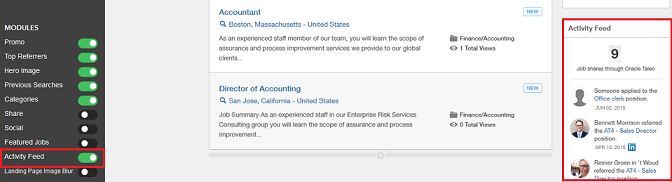
In the image below, the Activity Feed is missing as it has been toggled off.
While not a necessary starting point, users can continue to hide and disable content until they are left with a white space to begin their custom site if that's their preference.
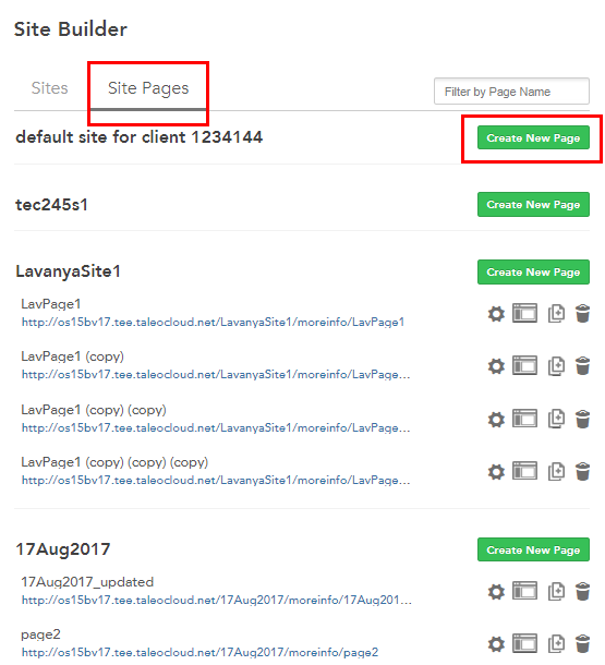
Site Pages
Sites in Sourcing tend to be aligned by brand, vertical, or other recruitment segment to differentiate audiences. Using Site Pages allows each of these audiences to have multiple supporting content pages.
Administrators can create and configure multiple content pages associated to specific sites. These Site Pages:
-
Leverage existing multilingual content blocks which include an RTF editor and the ability to display images.
-
Share the Custom Branding and Advanced CSS with the rest of the site.
-
Share the header, footer and all navigation components and styling with the rest of site.
-
Leverage the existing Site Builder Configuration toolbar and its functions, but at the page level, rather than the site level.
When a site is created in Site Builder, the site automatically displays in the Site Pages tab. A Create New Page button allows Administrators to create site pages tailored to each site. The site must be published within Site Builder first to be able to begin creating Site Pages.
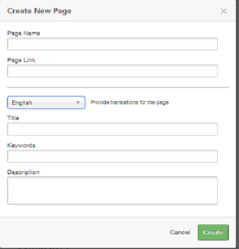
Each page has several attributes. Page Name and Page Link are unilingual while Title, Keywords, and Description are multilingual. Multiple site pages can have the same page link across different sites, however, a single site cannot contain pages with duplicate links. For the multilingual page attributes, there is a usability benefit included in the system in that values will get propagated to all locales from the default locale. If values have been entered into the other locales, other than the default locale, those values will remain and the default locale will not propagate over the top of what has already been entered.
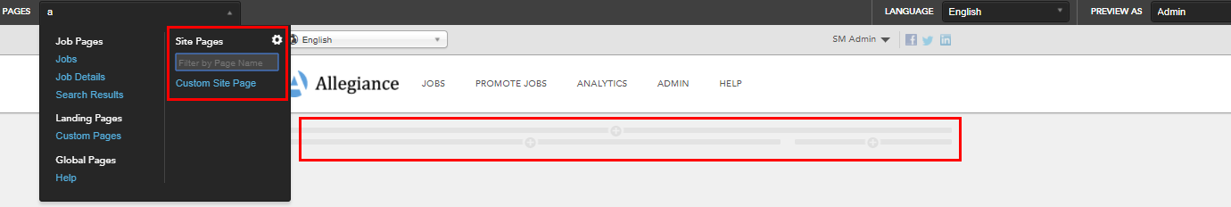
Once a Site Page is created, Administrators can edit the page in Site Builder. Content blocks can be added to the page using the same content block functionality as elsewhere in Site Builder. Referencing the image below:
-
The three Plus icons on the page Indicate places where content blocks may be added.
-
Multiple content blocks can be stacked within each of these three areas.
-
Site Pages share the same layout dimensions as other system-delivered pages.
A Site Page can be edited, cloned and deleted. When a Site Page is cloned it can be used again within the same site using a different name, or the cloned page can be tethered to other sites. If a page is deleted, links to that page that may still remain will be redirected to the Home Page of that site. Page links that were previously deleted can be reused.
-
The three legacy Custom Pages are still delivered and are now referred to as Global Pages within Site Builder.
-
To add the Site Pages to the navigation bar custom branding work is needed at this time.
-
It is recommended that customers review any Custom CSS and Branding HTML for rendering on Site Pages.
Landing Pages and Landing Page Tiles
Although aspects of Landing Pages can be managed and maintained outside of Site Builder, the focus of this chapter is creating, managing and branding Landing pages within the context of Site Builder.
Location and Category Landing Pages
When Landing pages are enabled, Site Builder automatically populates and creates the Location and Category Landing pages. Administrators can then select any of those locations and categories from within Site Builder and customize and brand the associated Landing pages. An unlimited number of Landing pages may be created. As explained earlier in this document, the goal of a Landing page is to ease the navigation for users by targeting specific populations. For example, a Location Landing page could target the candidates that were interested in job opportunities in New York, whereas a Category Landing page could target the candidates that were interested in Retail Store opportunities. Landing pages take users directly to the information they're interested in; they do not have to look through the entire site for the opportunities in New York or for Retail Store opportunities; one click and they are there. Administrators can copy and email Landing page URL's or they can also post the Landing page URL to social media sites with one click using the Share module.
The image below is an example of how a default Category Landing page displays in Site Builder. Notice that the only jobs that are listed are those within the Sales and Marketing category.
If you are working with a site that you've branded, such as our example, Vision Fashion, the branding elements you've already established will be carried over to the Landing pages. You can then continue to customize your Landing pages by adding or removing content blocks, enabling and disabling modules, etc.
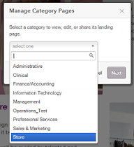
Path: [Sourcing] Login as Administrator > Configuration > Site Builder > Edit Site > [Landing Pages] > Category Pages
Custom Combination Landing Pages
A Custom Combination Landing page allows the combination of both category and location. For example, this may be useful if a company has many retail stores but wants to promote the jobs within a new store that is opening in a particular location. A Custom Landing page could gather all jobs that are store-related (category) in New York (location) only. The Promo module needs to be enabled to create Custom Combination Landing pages. Once it's enabled, be sure to Publish so that the change gets pushed to your site. Then, to create a Custom Landing page, perform a job search entering parameters for both category and location on your newly published site. Once you do this the Create a Landing Page button displays. Click this button and your new Landing page displays. You can then give your page a title and edit this page to your liking inside Site Builder. Once published, this Custom Landing page is available from within Site Builder as a choice under Landing Pages > Custom Pages.
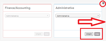
Pinning Landing Page Tiles to the Home Page
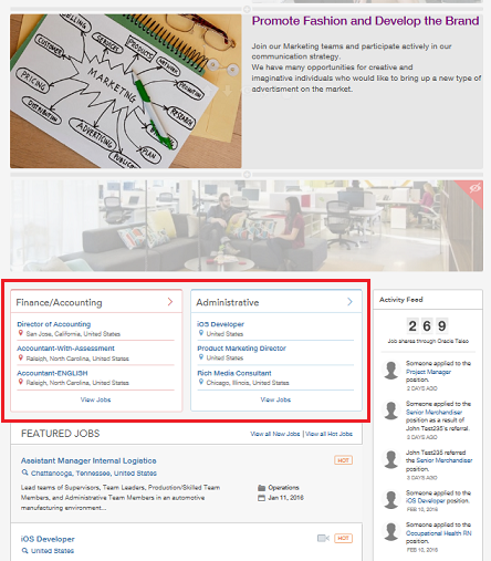
If an organization chooses to use Landing page tiles on their Home page, Administrators can select which Category and Location Landing page tiles display by pinning tiles. Sourcing uses logic that places the tile with the highest number of new job openings first. There must be 3 new jobs for a tile to display. Then, if that requirement is met in more than one location or category, the tiles display in order of the number of jobs that are new. For example, if both Sales and Design have 10 open jobs, and 3 jobs in Sales are new and 6 jobs in Design are new, the Design tile is displayed first. Pinning Landing page tiles allows Administrators to override this existing logic.
Pinning Category and Location tiles and overriding this logic is useful as an organization may, for example, always have a need for Engineers or Sales Managers, no matter if these categories have new jobs in them. Or, they may generally have a high demand for jobs in certain geographic locations. The ability to pin tiles to the Home page gives Sourcing users the benefit of highlighting particular areas of need in their organizations. These needs are displayed using tiles on the Home page, which then links users directly to the associated Landing pages.
If there are 3 open jobs, not just new jobs, in any category or location, the tile can be pinned.
If a pinned tile has at least 3 open jobs, then it will display on the Home page; if not, it will stay hidden until there are enough jobs to populate a tile.
A maximum of 6 tiles can be pinned.
Unpinning the Landing page tile defaults it back to the original display logic.
The tile in the upper left is generated by the current algorithm and persists. It cannot be edited; this is the anchor.
If a candidate has selected preferences for specific job categories and locations, the tile will dsiplay according to their preferences if the 3 new jobs criteria is met.
To be able to take advantage of pinning tiles, Landing pages must be enabled and you must select to have more than one tile displayed on your Home page. Both of these settings are in the Site Settings of your site.
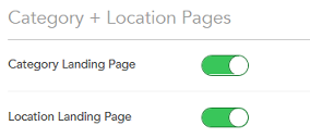
Path: [Sourcing] Login as Administrator > Configuration > Site Builder > Edit Site Settings (Gear icon) > [Settings] > Category + Location Pages
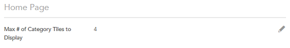
Path: [Sourcing] Login as Administrator > Configuration > Site Builder > Edit Site Settings (Gear icon) > [Settings] > Home Page
Also, for the tiles to display on the Home page, the Categories module must be enabled in the Site Builder.
The image shows two Category tiles.
When pinning tiles, flipping the page by clicking on the X triggers a refresh and allows users to see the new tiles in the Site Builder mode.
Custom Pages
In addition to the delivered pages in the site, Administrators have the option of creating up to 3 custom pages per Sourcing instance; these 3 pages must be shared among all sites.
While the Custom pages are not created using the Site Builder, they are displayed and accessible in the Site Builder under Global Pages. Again, this is to give the Administrator a complete picture of the site in one place; every page and module contained within a site is displayed in Site Builder. The content of the custom pages is managed in the Custom menu in the Configuration, however, the content blocks and modules that surround the Custom page content can be added, moved, edited, deleted, etc. in Site Builder.
Path: [Sourcing] Login as Administrator > Configuration > Custom > [Custom Page 1, Custom Page 2, Custom Page 3]
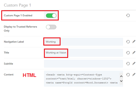
The image below shows the Custom page titled Working at Vision (Navigation Label = Working) enabled in Site Builder:
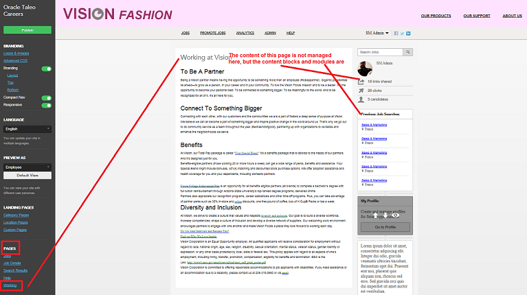
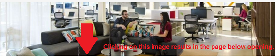
Disabling a Custom page removes the navigation link from the page, but the page still exists. This is useful if you'd like to embed the link to your Custom page within an image and have users navigate to the page that way instead of having the page as part of your top navigation links. To do this, you go to the page, copy the URL from the browser and then edit a content block entering the URL on the image.
Now, when users will know the image is actionable as it will display the hand tool when they hover over it. If they click on the image, the Working page will open.
You must delete the HTML used to create the page to remove the actual content from the page. This is good to keep in mind if for example, you have previously sent someone a link to that page. If they use that link, they will still be able to access it even if it's disabled. If you don't wish the page to be accessible after you disable it, you need to delete the HTML. You may want to replace the HTML with a message stating the page is not longer available, or something of the like, to better inform your users.
Language and Preview As
Administrators have the ability to preview and publish their sites in different languages and preview their sites using different user roles.
Language
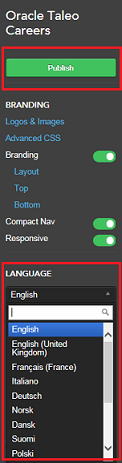
As Administrators are building different sites using different languages, they can use the Language dropdown in the Site Builder to change the language in which the site is displayed. The language is changed based on the users selection and allows them to edit in that language. Changing the language using the Language menu only changes the site view; nothing is actually saved into the database until the site is published. When published, the language settings are pushed into the site dictionary, and the site is published in that language.
Path: [Sourcing] Login as Administrator > Configuration > Site Builder > Edit Site > Language
Preview As
Administrators can apply different user roles in the Site Builder to see how the site displays to the different users. Different modules and content are presented depending on what permissions the user role grants.Administrators can toggle between the following user roles:
External Candidate
Employee
Referral
Selecting Default View returns the view to the Administrator role.
Path: [Sourcing] Login as Administrator > Configuration > Site Builder > Edit Site > Preview As
The image below shows the Vision Fashion site as viewed by an Administrator.
The image below shows the Vision Fashion site as viewed by an External Candidate.
Site Builder Configuration Settings
Site Builder Configuration Settings
The Site Builder configuration section provides access to settings relating to the ability to create multiple new sites related to the organization's main site, see a list of all sites in the organization's implementation, edit site-specific settings, edit site branding, and edit site pages.
Configuration
Settings for the Site Builder configuration are listed in the following table.
| Settings | |
|---|---|
| Name | Description |
| Configuration > Site Builder > All Sites | |
| Create New Site | Allows entry of a new site name and site URL path to create a site based on the default site. Once the name and path are saved the site appears in the list of existing sites, and the Site Builder tools can be used to complete the editing and customization of the site. |
| List of Existing Sites | Allows viewing and editing of existing sites in your implementation. |
| Site Name and URL Link | Allows viewing of an existing site's name, and opening of the site to see it in deployed mode, respectively. |
| Configuration > Site Builder > Edit Site Settings | |
| General | |
| Program Name | The client's name for their jobs and/or referral program (e.g. Vision Sourcing). |
| Short Name | The client's short name for their jobs and/or referral program (e.g. Vision). |
| Site Mode | Select from Jobs, Referrals, or Jobs and Referrals. |
| Referral Only Authentication Display | Enables Administrators to hide the Sign Up and Sign In buttons that display on sites configured as Referral Only. This setting only impacts sites with Site Mode configured as Referral Only. Sites with Site Mode configured as Job Site Only or Job Site and Referral are not impacted by this setting. |
| Site Vanity Domains | Customers with multiple brand identities, aligned to unique sites in Sourcing, can configure a vanity URL for each site here. |
| Google Analytics ID | Enables entry of customer site specific Google Analytics code to track site activity in Google Analytics. When code is present here, it appears in source code for front-end (e.g. Portal or Home) pages to enable Google Analytics tracking. |
| Google Analytics Dashboard | Use the link stating "Click here to open Google Analytics dashboard" to access the site's Google Analytics dashboard. |
| Category and Location Pages | |
| Category Landing Page | Enables landing pages based on job categories. |
| Location Landing Page | Enables landing pages based on job locations. |
| Enable State/Prov. Pages | Enables location landing pages based on states and provinces. A list of countries displays. For each country a counter shows the number of states or provinces enabled as landing pages, and the total number of states or provinces. Click on a country name to open a list of the states or provinces for the country. Use the toggle to enable or disable the landing page for each state or province. |
| Jobs | |
| Filter Jobs by Country | Select which countries to include in the jobs for this site. |
| Filter Jobs by Company | Select which companies to include in the jobs for this site. |
| Filter Jobs by Career Section | Select which career sections to include in the jobs for this site. |
| Reload Job Results | Reload job listings in all relevant landing pages. Reload this page to update Location Landing pages (above). |
| Upload Friend's Resume | Available to trusted referrers only. User has the ability to upload a friend's resume. |
| Country Filter | Enables country facet in jobs search, campaign creations and country filter in analytics. |
| Display Country After Location | Enables display of Country after Location on Job Details page. |
| Company Filter | Enables company facet in jobs search, campaign creations and company filter in analytics. |
| Start Date Range | Enables start date range. |
| Languages | Enables Languages facet in jobs search. |
| Show Hot Flags to Trusted Referrers | Enables showing flagged Hot Jobs to trusted referrers. |
| Show Hot Flags to External Users | Enables showing flagged Hot Jobs to external users. |
| Home Page | |
| Maximum Number of Category Tiles to Display | Selects maximum number of category tiles for display on the Home page. Promotes category landing pages by displaying tiles for the top landing pages that are published. Tile display is based upon the following criteria:
|
| Anonymous Activity Feed | Hide all names and pictures from Activity Feed. |
| Referrer Activity | If the Site Mode supports referral capabilities, show the user their referral activity via a widget in the sidebar. |
| Show External ID in Referrer Activity | Enables display of external ID in Referrer Activity. |
| Search | |
| Country List Filter | Select which countries will show up in PlaceFinder jobs search. |
| Maximum Number of Results | Enter maximum number of results to show in PlaceFinder jobs search. |
| TEE Account URLs | |
| Submit Profile URL - Guests | Allows the links Go to Profile and My Submissions to target career sections configured for their Sourcing privilege class allowing candidates to go through the targeted flows. |
| Manage Profile URL - Guests | |
| My Submissions URL - Guests | Allows the links Go to Profile and My Submissions to target career sections configured for their Sourcing privilege class allowing candidates to go through the targeted flows. |
| Submit Profile URL - Employees | Allows the links Go to Profile and My Submissions to target career sections configured for their Sourcing privilege class allowing candidates to go through the targeted flows. |
| Manage Profile URL - Employees | |
| My Submissions URL - Employees | Allows the links Go to Profile and My Submissions to target career sections configured for their Sourcing privilege class allowing candidates to go through the targeted flows. |
| Configuration > Site Builder > Edit Site Branding | |
| Content Colors | |
| Body Background | Enter hexadecimal value. |
| Font | Enter hexadecimal value. |
| Link | Enter hexadecimal value. |
| Link Hover | Enter hexadecimal value. |
| Title | Enter hexadecimal value. |
| Icon | Enter hexadecimal value. |
| Search Banner Background | Enter hexadecimal value. |
| Navigation Colors | |
| Header Background | Enter hexadecimal value. |
| Navigation Link | Enter hexadecimal value. |
| Navigation Link Selected | Enter hexadecimal value. |
| Navigation Link Underline | Enter hexadecimal value. |
| Sub-Navigation Link | Enter hexadecimal value. |
| Sub-Navigation Link Active | Enter hexadecimal value. |
| Footer Background | Enter hexadecimal value. |
| Footer Text | Enter hexadecimal value. |
| Footer Link | Enter hexadecimal value. |
| Footer Link Underline | Enter hexadecimal value. |
| Button Colors | |
| Primary Background | Enter hexadecimal value. |
| Primary Text | Enter hexadecimal value. |
| Secondary Background | Enter hexadecimal value. |
| Secondary Text | Enter hexadecimal value. |
| Search Background | Enter hexadecimal value. |
| Search Text | Enter hexadecimal value. |
| Create Background | Enter hexadecimal value. |
| Create Text | Enter hexadecimal value. |
| Category Tiles Colors | |
| Category Tile 1 | Enter hexadecimal value. |
| Category Tile 2 | Enter hexadecimal value. |
| Category Tile 3 | Enter hexadecimal value. |
| Category Tile 4 | Enter hexadecimal value. |
| Category Tile 5 | Enter hexadecimal value. |
| Category Tile 6 | Enter hexadecimal value. |
| Fonts | |
| Body Text Normal | Enter font family name. Font family must include web-safe fonts. |
| Body Text Bold | Enter font family name. Font family must include web-safe fonts. |
| Header Light | Enter font family name. Font family must include web-safe fonts. |
| Header Normal | Enter font family name. Font family must include web-safe fonts. |
| Header Bold | Enter font family name. Font family must include web-safe fonts. |
| Button | Enter font family name. Font family must include web-safe fonts. |
| Navigation | Enter font family name. Font family must include web-safe fonts. |
| Promo (Promotional text) | Enter font family name. Font family must include web-safe fonts. |
| Footer | Enter font family name. Font family must include web-safe fonts. |
| Messaging Body | Enter font family name. Font family must include web-safe fonts. |
| Messaging Header | Enter font family name. Font family must include web-safe fonts. |
| Configuration > Site Builder > Edit Site | |
| Publish | Publishes the edited site, saves the site settings. |
| Branding | |
| Logos and Images | Opens Logos and Images modal, enabling uploading of site Portal/Home page banner, Facebook Application and LinkedIn logos; and Favicon and Landing Page images. |
| Advanced CSS | Opens the Advanced CSS (Cascading Style Sheets) modal. Enables entry of custom, advanced CSS that works in conjunction with customer's specific branding, so that Sourcing is styled correctly for wrapping Sourcing with the customer's header, footer and sidebar navigation. This CSS is separate from the CSS that controls the colors and styling of Sourcing-specific content. |
| Branding | Toggles On/Off links to branding functions for page layout, pre-header and sub-footer. When activated, each link opens a modal for configuring that feature. Language-specific branding can be manually edited here. If no language-specific branding is specified, the site default language branding is displayed. |
| Layout | Modal enables selection from available page layouts. |
| Top | Modal enables entry and editing of pre-header HTML. |
| Bottom | Modal enables entry and editing of sub-footer HTML. |
| Compact Navigation | Toggles On/Off the company logo in the pre-header. |
| Responsive | Enables site branding to be responsive to viewing on a mobile device. |
| Language | |
| Language dropdown | Ability to preview sites in different languages. |
| Preview As | |
| User role dropdown | Administrators can select different roles to see how the site will present to different users. |
| Default View | Selecting this brings the user back to the Default user role, the role that they logged in with. |
| Landing Pages | |
| Category Pages | Select a category to view, edit, or share its landing page. |
| Location Pages | Select a location to view, edit, or share its landing page. |
| Custom Pages | Select a custom page from a list to view, edit, or share. |
| Pages | |
| Pages (List) | Lists links to the pages in the site that can be edited with Page Editor. Click a page name link to open it in the Page Editor. |
| Modules | |
| Promo | Toggles On/Off display of the Promo block. |
| Top Referrers | Toggles On/Off display of the Top Referrers block. |
| Hero Image | Toggles On/Off display of the Hero image. |
| Search | Toggles On/Off display of the Search block. |
| Previous Searches | Toggles On/Off display of the Previous Searches block. |
| Categories | Toggles On/Off display of the Categories block. |
| Share | Toggles On/Off display of the Share block. |
| Social | Toggles On/Off display of the Social block. |
| Featured Jobs | Toggles On/Off display of the Featured Jobs block. |
| Activity Feed | Toggles On/Off display of the Activity Feed block. |
| Landing Page Image Blur | Toggles On/Off Land Page Image Blur. |
| Configuration > Site Builder > Create Clone of Default Site | |
| Site Name | Allows entry of a name for a new site that is a clone of a selected, existing site. |
| Site Path | Allows entry of a URL path for the cloned site. |
| Configuration > Site Builder > Delete Site | |
| Delete Site | Allows deletion of sites. Prior to deletion, the following message displays: Warning: You are about to delete this site and all it's settings. All incoming links will be rerouted to the default site. The default site cannot be deleted |
Role-Specific Links to My Profile and My Submissions
The links Go to Profile and My Submissions target career sections configured for their Sourcing privilege class, or role, and users will be directed to the appropriate profiles and submissions (external and internal) based upon those privileges. The settings that allow candidates to go through the targeted flows are:
-
Submit Profile URL – Guests
-
My Submissions URL – Guests
-
Submit Profile URL – Employees
-
My Submissions URL - Employees
For customers who tether multiple career sections with different application flows to a single Sourcing site, the following is recommended:
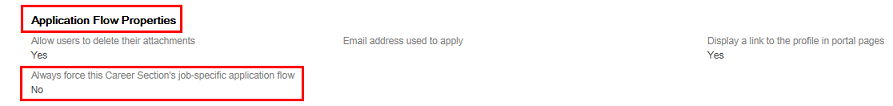
For the career sections which are targeted by these new Site Builder settings, it is best practice for customers to configure the “Always force this Career Section’s job-specific application flow” setting in Career Section to No.
-
Having this setting configured to No, ensures that candidates who edit their job submissions using the deeplink in Sourcing will be directed to the correct application flow; the flow in which the submission was originally created. A value of No here translates to saying, “Force the application flow on which this submission was originally created.”
-
This configuration mitigates any perceived need for multiple links to multiple career sections for accessing the My Submissions page.
Path: Career Section Configuration > Administration > Career Sections > Select a career section > Properties (not Application Flow Properties) > Scroll down to Application Flow Properties
Requisition Data on Job Details Page
There are four sections on which to display up to twenty fields total for each requisition. Customers can choose which fields to display on job requisitions at the site level and can further specify whether to show those fields to internal, external or both types of job seekers. This functionality allows job seekers to better evaluate if a job is right for them by learning more details about the job using this additional job-specific information.
An editor, the Field Display and Layout Editor, is available in Site Builder which provides the interface for Administrators to configure which fields in the various sections display on the Job Details page for each site.
The four section titles can be relabeled in the dictionary if desired. Any field can reside in any section. The default sections are:
-
Additional Information
-
Bonus Eligibility
-
Compensation
-
Contact Information
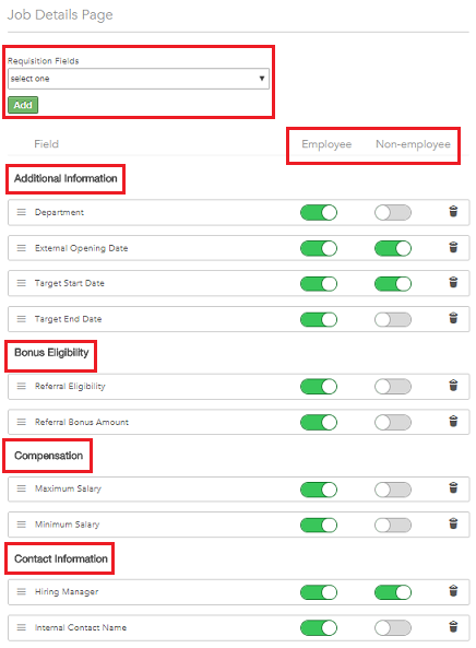
New fields that are added appear in the Additional Information section and inherit the existing styling, colors and fonts used to show requisition data. Drag-and-drop allows Administrators to easily move the newly added fields to different sections and to reorder the fields within sections. Fields are easily removed by clicking the Trash icon. Fields which are not populated do not appear as blank to job seekers; the label is suppressed. When a section has zero displayed fields for a user the section title is suppressed.
Fields can be activated for display to employees, non-employees, or both by using the toggle next to each field. Note that non-employees are defined as users with a relationship of Other, Alumni or Referral.