Concepts in Designing Dashboards
Helpful information as you design dashboards:
- On the left is the design palette. Simply drag and drop objects from the palette to the canvas.
Tip:
Drag an object to a border line. The drag icon changes to a plus sign when you can drop the object in an allowed space. See About Your Dashboard Layout.
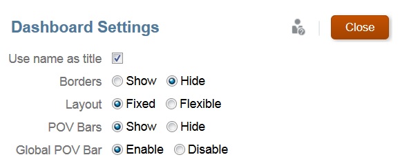
- On the top right are settings for the entire dashboard:

- Use Settings
 to set these aspects of the dashboard:

Note:
When a new dashboard is created, the borders are hidden by default. To show borders in newly created dashboards, you must change the borders setting to Show.
Note:
Only administrators can add files (for example, dashboards, infolets, forms, reports, and so on) to the Library root folder.
For more information about POVs, see About Global and Local POVs.
- At the top right of each object is a toolbar for that object that displays when you hover over it:

- As you create a dashboard, click Runtime
 so that you can immediately see how the dashboard looks and works to a dashboard user. To return to designer mode to continue designing the dashboard, click Designer.