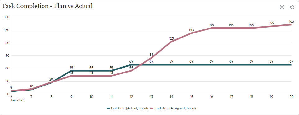
Chart View: Task Completion - Plan vs Actual
This example shows task completion over time, allowing you to see if your tasks are running ahead or behind schedule.
The chart includes all of the task end dates that fall on or before a certain date. It also shows the status of completing those tasks.

Within the dashboard, top left view:
- Click the Object Type icon and select Tasks.
- Click the View Selector icon and select Chart View.
- Click the Settings icon and specify the following:
- On the Properties tab:
-
Title: Task Completion - Plan vs Actual
- Type: Line
- Background: No fill
- Label Position: Above Point
- Line Weight: 5
- Grid Lines: Select this check box
- Period: Selection
-
- On the Layout tab:
- X-Axis:
- Type: Date
- Sort: X-Axis from the first drop-down menu and Descending from the second drop-down menu
- Legend (Series):
-
First row, add:
- Value: Task
- Aggregation: Count
- Categories: None
- Group By: End Date (Actual , Local)
- Date Aggregation: On or Before
- Click New and add another row. Specify the
following:
- Value: Task
- Aggregation: Count
- Categories: None
- Group By: End Date (Assigned, Local)
- Date Aggregation: On or Before
-
- X-Axis:
- On the Axis tab:
- Select X Axis.
- Interval : Daily
- Minimum: Auto
- Maximum: Auto
- On the Legend tab:
- Legend Position: Bottom
- Palette: Redwood
- Select the default labels for each series: End Date (Actual , Local) and End Date (Assigned, Local)
- Select the default colors for each series.
- On the Properties tab:
- Click OK.