4.4 Visualize your Data in Oracle Machine Learning Notebooks

Oracle Machine Learning Notebooks offer rich visualization capabilities of your data. The visualizations depend on the type of your dataset.

The following visualization options are available:

4.4.1 Visualize Data in a Table

A table is an arrangement of information or data in rows and columns. Using the Oracle Machine Learning Notebooks, you can create database tables, and also view the information in a tabular format.

Here is the data from the CUSTOMER_INSURANCE_LTV table presented in a tabular format. The table has 8 columns and 200 rows.
Data set: CUSTOMER_INSURANCE_LTV. In this example, we will use the example template notebook OML-Run-me-first.
To visualize data in a table:
  1. On the Oracle Machine Learning UI home page, click Examples. Or, open the left navigation menu by clicking the Cloud menu icon click Cloud menu icon on the top left corner of the page. Click Templates and then click Examples.
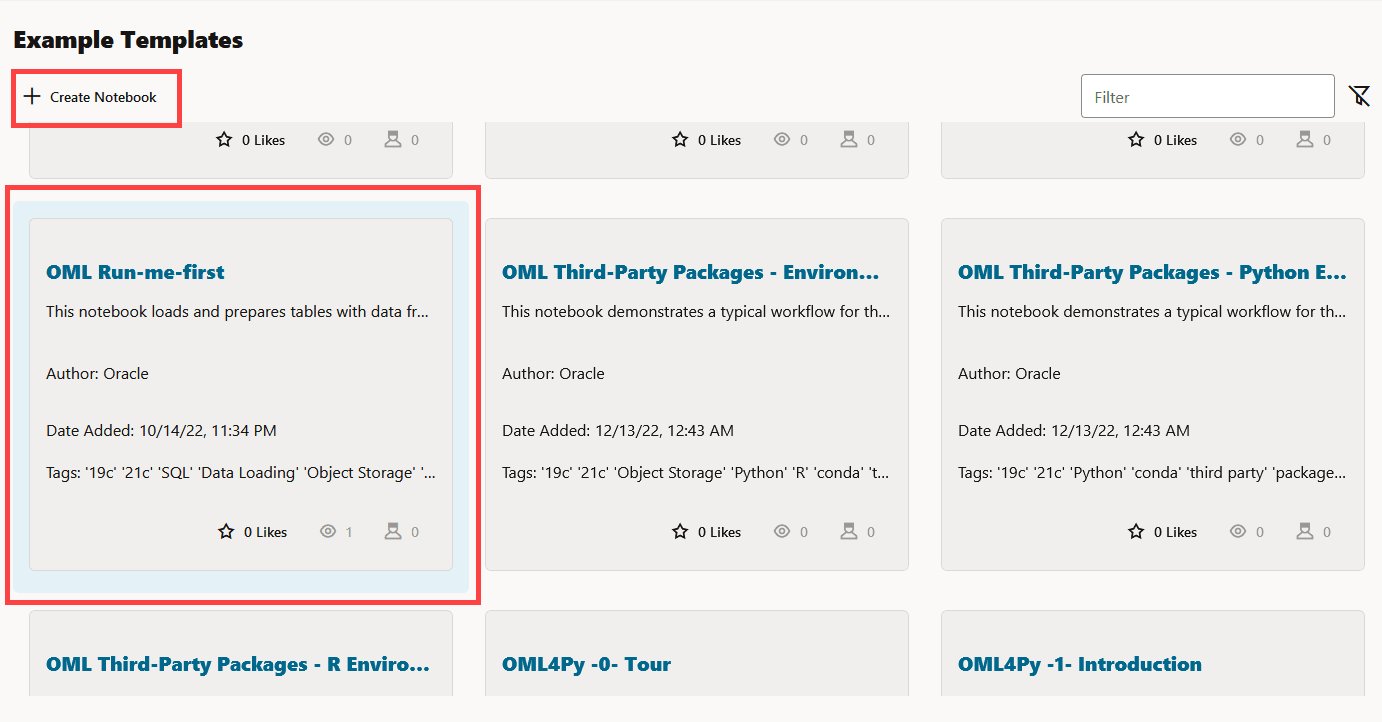
  2. The OML-Run-Me-First example template is listed. If you are unable to view it, type the name in the Filter field.

    Figure 4-18 OML Run-me-first Example Template


  3. Click on the OML Run-me-first tile (and not on the name) to highlight it in blue. Then click the Create Notebook icon.

    Figure 4-19 Create option on the Example Template page


  4. In the Create Notebook Dialog, click OK.
  5. Click Open Notebook in the confirmation dialog to open the notebook.
  6. Click the Run Paragraphs icon in the notebook to run all the paragraphs. This will also create the CUSTOMER_INSURANCE_LTV table. Click Confirm in the Confirmation dialog.
  7. To view the data in a table format, run the following script in a SQL paragraph:
    %sql
    
    SELECT * FROM OMLUSER.CUSTOMER_INSURANCE_LTV
    The script presents the data in a tabular format as shown in the screenshot:

    Figure 4-20 View the CUSTOMER_INSURANCE_LTV table


  8. In this table, you can customize your views and settings.
    • Sort the columns in ascending or descending order: Click on the down arrow or up arrow against the columns to sort the data in ascending or descending order.
    • Use the horizontal scroll bar to scroll horizontally to view the columns on the right.
    • Filter specific search terms. In the Search field, type the entry or term that you are looking for. In this example, the term Single is entered. All the rows that contain the term SINGLE in the column MARITAL_STATUS are filtered for display.

      Figure 4-22 Filtering table columns by keywords


      Note:

      Rows that do not contain this term are hidden from the view and the remaining rows highlight the location of the search term within the row.
  9. By default, 5 rows are displayed. If you want to view more rows or customize the table settings, click on the Settings icon to open the Settings dialog. Here, you can edit the following:

    Figure 4-23 Settings dialog


    Settings dialog

    • Height: This parameter changes the height of the visualization. Click on the up or down arrow to increase or decrease the visualization height.
    • Number of Items on Page: Click on the up or down arrow, as applicable, to set the number of rows to be displayed on the page. By default, 5 rows are displayed.
    Columns to Display: By default, all the columns are listed. If you want to remove any column from displaying, click on the X in the column name. To view the column again, click inside the Columns to Show field. The hidden columns are displayed. Click on the column that you want to view again. In this example the column MARITAL_STATUS was removed. Clicking on the Columns to Show field displays it. Click on it to include in the display.
This completes the task of creating a table, and visualizing the data in it.

4.4.2 Visualize Data in a Bar Chart

A bar chart is a graphical representation of data in rectangular bars. The length or height of the bars, depending on the horizontal or vertical orientation, depict the data set distribution. One axis represents a category, while the other represents values or counts.

This is a stacked bar chart generated for the CUSTOMER_INSURANCE_LTV table. The average of CREDIT_BALANCE, MORTGAGE_AMOUNT, and BANK_FUNDS are plotted along the Y-axis, and MARITAL_STATUS is depicted along the X-axis. Here, CREDIT_BALANCE, MORTGAGE_AMOUNT, and BANK_FUNDS are stacked in ascending order in each bar for the groups—SINGLE, MARRIED, DIVORCED, WIDOWED, and OTHERS.
When to use this chart: Use bar charts to show a distribution of data points, and perform a comparison of metric values across different subgroups of your data.
Data set: CUSTOMER_INSURANCE_LTV. In this example, we will use the example template notebook OML-Run-me-first.
To visualize data in a bar chart:
  1. In the OML-Run-Me-First notebook, go to the paragraph where you viewed the CUSTOMER_INSURANCE_LTV. Click on the bar chart icon.

    Figure 4-25 Tool bar showing the bar chart icon


    Tool bar showing the bar chart icon

  2. By default, it shows CREDIT_BALANCE along the Y-axis and the data is grouped by MARITAL_STATUS along the X-axis.
  3. Click on the Settings icon to get a different view of this data. Under Setup:
    • Series to Show: Select CREDIT_BALANCE, MORTGAGE_AMOUNT, and BANK_FUNDS.
    • In Group By: Select MARITAL_STATUS.
  4. The average of CREDIT_BALANCE, MORTGAGE_AMOUNT, and BANK_FUNDS are each represented by adjacent bar charts, and the bar charts are grouped by MARITAL_STATUS—single, married, divorced, widowed, and others. The bar chart now looks like this, as shown in the screenshot below:
  5. Once again, click on the Settings icon and click Customization:

    Figure 4-28 Settings - Bar Chart


    • Coordinate System: The coordinate system of the chart. Supported Values—Polar Coordinates, Cartesian Coordinates. Click Cartesian Coordinates.
    • Layout: The chart orientation. Either horizontal or vertical.
    • Stack: Defines whether the data items are stacked or not. Click Stacked.
    • Sorting: Specifies the sorting of the data. It should only be used for pie charts, bar/line/area charts with one series, or stacked bar/area charts. Sorting will not apply when using a hierarchical group axis. Click Ascending.
    • Zoom: Specifies the zoom and scroll behavior of the chart. Live behavior means that the chart will be updated continuously as it is being manipulated, while "delayed" means that the update will wait until the zoom/scroll action is done. While "live" zoom and scroll provides the best end user experience, no guarantees are made about the rendering performance or usability for large data sets or slow client environments. If performance is an issue, "delayed" zoom and scroll should be used instead.
    The bar chart now presents the data in a stacked manner, and in ascending order, as shown in the screenshot below:
This completes the task of visualizing your data in a bar chart, and customizing its output.

4.4.3 Visualize Data in a Funnel Chart

A funnel chart is a graphical representation that resembles the shape of a funnel where each segment gets progressively narrower. The segments are arranged vertically and depict a hierarchy. Within the funnel chart, each segment corresponds to a step or stage in a sequential process.

In this data visualization, the attributes CREDIT_BALANCE, MORTGAGE_AMOUNT and INCOME are depicted for each of these groups—SINGLE, MARRIED, DIVORCED, WIDOWED, and OTHERS in three funnel charts. This is the data visualization after customizing the funnel chart.
When to use this chart: Use this chart to visualize a linear sequential process, mostly in business and sales contexts. For example, you can use a funnel chart to track the sales process, order fulfillment, website visitor trends, and so on.
Data set: CUSTOMER_INSURANCE_LTV. In this example, we will use the example template notebook OML-Run-me-first.
To visualize the data in a funnel chart:
  1. In the OML-Run-Me-First notebook, go to the paragraph where you viewed the CUSTOMER_INSURANCE_LTV. Click on the Funnel chart icon.

    Figure 4-31 Tool bar showing the funnel chart icon


    Tool bar showing the funnel chart icon

  2. The data is displayed as below. Hover your cursor to view the series that is plotted in the funnel chart for each of the 5 groups.
  3. Let's compare a few attributes CREDIT_BALANCE, MORTGAGE_AMOUNT and INCOME of the same groups. Click Settings and edit the following:

    Figure 4-33 Settings - Funnel Chart


  4. These attributes CREDIT_BALANCE, MORTGAGE_AMOUNT and INCOME are now displayed in three funnel charts, as shown in the screenshot below:

    Figure 4-34 Funnel Chart after Customization


This completes the task of visualizing your data in a funnel chart.

4.4.4 Visualize Data in a Pyramid Chart

Pyramid charts present your data in a distinctive triangular configuration, horizontally segmented into partitions. Each segment in the pyramid charts represents points or steps in ascending or descending order.

Here are two pyramid charts depicting the attributes MORTGAGE_AMOUNT and INCOME for the two groups M (Male) and F (Female). Each pyramid is divided into two segments to represent the two groups in ascending order.
When to use this chart: Use this chart to depict hierarchical structures and the relative proportions of different values. They are typically used for displaying demographic data, market segmentation, or organizational structures. In any case, the data must have a progressive order.
Data set: CUSTOMER_INSURANCE_LTV. In this example, we will use the example template notebook OML-Run-me-first.
To visualize data in a pyramid chart:
  1. In the OML-Run-Me-First notebook, go to the paragraph where you viewed the CUSTOMER_INSURANCE_LTV.
  2. Click on the pyramid chart icon.

    Figure 4-36 Pyramid icon on the toolbar


    Pyramid icon on the toolbar

  3. Click the Settings icon . Under Setup:
    • Aggregate Duplicates: Select Average.
    • Series to Show: Select INCOME and MORTGAGE_AMOUNT.
    • Group By: Select MARITAL_STATUS.

    Figure 4-37 Pyramid Chart showing two series


    The Pyramid chart is now shows the average for the two series INCOME and MORTGAGE_AMOUNT, grouped by MARITAL_STATUS.
  4. On the Settings dialog, click Customization:
    • Click Customization expand Visualization.
    • Click 3D under Dimension

    Figure 4-38 Pyramid Chart rendered in three dimension


  5. Click the Setup tab again, and change Group By to GENDER.

    Figure 4-39 Pyramid Chart - Depicting the two series grouped by Gender


This completes the task of visualizing your data in a pyramid chart. The pyramid chart shows a clear correlation between the two genders, and their income level and mortgage amount. For both the categories, the average income and mortgage amount taken is higher for Females.

4.4.5 Visualize Data in a Scatter Plot

Scatter plots represent the relationship between two numeric variables in a data set. It represents data points on a two-dimensional plane and show how much one variable is affected by another. The independent variable is plotted on the X-axis, while the dependent variable is plotted on the Y-axis. You can display points by one or more grouping variables such that each group has a distinct color and shape.

This is a scatter plot rendered for the CUSTOMER_INSURANCE_LTV table. The scatter plot shows a strong correlation between INCOME and MORTGAGE_AMOUNT in the income range 50k to 80k. Along the X-axis, INCOME is plotted and along the Y-axis, MORTGAGE_AMOUNT is plotted. The data is grouped by MARITAL_STATUS.
When to use this chart: Use the scatter plot when you have paired numerical data, and you want to determine the relationship between the related variables in certain scenarios, identifying correlations and trends (linear and non-linear relationships), detecting outliers, understanding data distribution, identifying groupings or clusters of data. Scatter plots can also be useful when comparing multiple datasets where each datasets values are represented as a different group. Scatter plots are also useful for evaluating regression models by plotting, e.g., actual versus predicted values.
Data set: CUSTOMER_INSURANCE_LTV. In this example, we will use the example template notebook OML-Run-me-first.
To visualize data in a scatter plot:
  1. In the OML-Run-Me-First notebook, go to the paragraph where you viewed the CUSTOMER_INSURANCE_LTV. Click on the Scatter plot icon. A default scatter plot is shown that you will customize in the next step.

    Figure 4-41 Toolbar highlighting the Scatter Plot icon


    Toolbar highlighting the Scatter Plot icon

  2. Click the Settings icon. In the Settings dialog, under Setup:
    • Series to show on X-axis: Click and select INCOME.
    • Series to show on Y-axis: Click and select MORTGAGE_AMOUNT.
    • Group By: Select MARITAL_STATUS.
  3. Click Customization:
    • Visualization: Retain the default settings.
    • Description: Under Title, enter Scatter plot to show the correlation between income and mortgage amount.
This completes the task of visualizing your data in a scatter plot. The scatter plot shows a strong correlation between Income and Mortgage amount in the income range 50k to 80k.

4.4.6 Visualize Data in a Line Chart

A line chart is a graphical representation used to display data points connected by straight lines.

Here is a line chart displaying the sum of the amount sold from the year 1998 to 2001. It also shows the cursor hovering over the highest point in the line chart to view the values. The image shows that on 5/30/2000, the product recorded the highest sale in terms of the sum of the amount sold.
When to use this chart: Use this chart to visualize trends, changes, and relationships in data over a continuous period.
Data set: SH.SALES table in the SH schema.
To visualize data in a line chart:
  1. Enter the text of the first step here.
    %sql
    select * from SH.SALES
  2. By default, the data set is displayed in a table. Click on the line chart icon.

    Figure 4-44 Sales Table with the Line Chart icon highlighted


  3. By default, the line chart shows the average amount sold from the year 1998 till 2001, as shown in the screenshot below.

    Figure 4-45 Line Chart - Depicting the average of amount sold from 1998 - 2001


    Click on the Settings icon to view the attributes that are plotted along the X and Y axis. The dates on which the product was sold from the year 1998 till 2001 are plotted along the X-axis. Corresponding to each sale date, the average of the amount sold is plotted along the Y-axis.
  4. Click on the Settings icon. Under Setup, edit the following:
    • Aggregate Duplicate: Decides what should happen with values that are within the same group. Select Sum. This will show the sum of the amount sold for the product with PROD_ID 13, from 1998 to 2001.
    • Series to Show: All fields in the result-set that are of type number can be selected. Selecting multiple fields will add additional diagrams to the visualization. Select AMOUNT SOLD.
    • Group By: All fields in the result-set can be selected. The more groups exist, the more the data set shrinks since it collects all fields and concatenates same values. Select TIME_ID.
  5. Click Customization and edit the following:
    • X-axis: Enter Time: 1998 - 2001. The dates on which the product was sold from the year 1998 till 2001 are plotted along the X-axis.
    • Y-axis: Enter Amount Sold. Corresponding to each sale date, the sum of the amount sold is plotted along the Y-axis.
    • Description: Enter Sales trend of product ABC
    The line chart now displays the sum of the amount sold from the year 1998 to 2001, as shown below. Hover your cursor over the highest point in the line chart to view the values. You can see that on 5/30/2000, the product recorded the highest sale in terms of the sum of the amount sold.

    Figure 4-46 Line chart Line chart - Depicting the sum of amount sold from 1998 - 2001


This completes the task of visualizing your data in a line chart.

4.4.7 Visualize Data in an Area Chart

An area chart uses lines to connect the data points and fills the area below these lines to the x-axis. Each data series contributes to the formation of a distinct shaded region. This emphasizes its contribution to the overall trend. As the data points fluctuate, the shaded areas expand or contract.

Here is an area chart rendered for the SALES table. It is customized to depict the sum of the three attributes—CHANNEL_3, CHANNEL_4 and CHANNEL_9 in stacks. Along the X-axis, time is plotted, and along the Y-axis, sum is plotted.
When to use this chart: Use this chart to visualize trends, changes, and relationships in data over a continuous period.
Data set: SALES table in the SH schema.
To visualize data in an area chart:
  1. In another %sql paragraph, run the following script:
    SELECT
          TIME_ID,
          -- Use MAX(TOTAL_SOLD) to handle cases with duplicate TIME_ID and CHANNEL_ID
          MAX(CASE WHEN CHANNEL_ID = 2 THEN TOTAL_SOLD ELSE NULL END) AS Channel_2,
          MAX(CASE WHEN CHANNEL_ID = 4 THEN TOTAL_SOLD ELSE NULL END) AS Channel_4,
          MAX(CASE WHEN CHANNEL_ID = 3 THEN TOTAL_SOLD ELSE NULL END) AS Channel_3,
          MAX(CASE WHEN CHANNEL_ID = 9 THEN TOTAL_SOLD ELSE NULL END) AS Channel_9
    FROM (SELECT TIME_ID, CHANNEL_ID, sum(AMOUNT_SOLD) TOTAL_SOLD
      FROM SH.SALES
          WHERE TIME_ID >= TO_DATE('2001-09-01', 'YYYY-MM-DD')
          GROUP BY TIME_ID, CHANNEL_ID
          ORDER BY TIME_ID)
    GROUP BY TIME_ID
    ORDER BY TIME_ID
    This script groups the data by TIME_ID and CHANNEL_ID. It presents the data from 2001-09-01 and later. It shows the value for TOTAL_SOLD for each of the four channels grouped by CHANNEL_2, CHANNEL_3, CHANNEL_4 and CHANNEL_9.
  2. The data from the SALES table is now presented for the following columns—TIME_ID, CHANNEL_2, CHANNEL_3, CHANNEL_4 and CHANNEL_9.
  3. Now, click on the the area chart icon Area chart icon in the tool bar to visualize the data in an area chart.

    Figure 4-48 Area Chart showing the sum for CHANNEL_2


    Area Chart showing the sum for CHANNEL_2

  4. Click on the Settings icon to open the Settings dialog. Under Setup:
    • Series to Show: Click to add CHANNEL_3, CHANNEL_4 and CHANNEL_9.
    • Group By: Retain the default, that is, TIME_ID.
    • Aggregate Duplicates: Retain the default, that is, SUM.
  5. Click Customization and under Visualization, click Stacked. The area chart is now presented as shown in the screenshot.
This completes the task of visualizaing your data in an area chart.

4.4.8 Visualize Data in a Pie Chart

A pie chart is a graphical representation of data in a circular form, with each slice of the circle representing a fraction that is a proportionate part of the whole.

Here are two pie charts generated for the IRIS dataset. The pie charts have been customized to render the visualization in 3D. One pie chart shows the average sepal length, and the other shows the average petal length for each of the three species of the iris flower.
When to use this chart: Use this chart to visualize the numerical proportion of the parts to the whole.
Data set: The IRIS data set. The IRIS data set contains 3 classes. These classes are the three different Iris species—Setosa, Versicolor, and Virginica. The data set has 50 samples each, and four numeric properties about those classes—Sepal Length, Sepal Width, Petal Length, and Petal Width.
To visualize data in a pie chart:
  1. Run the following script in an R paragraph to create the IRIS data set:
    %r
    library(ORE)
    
    if (ore.exists("IRIS_R")) ore.drop(table="IRIS_R")
    
    ore.create(iris, table = "IRIS_R", overwrite=TRUE)
    
    ore.exec("ANALYZE TABLE IRIS_R COMPUTE STATISTICS")
    
    z.show(cat("Shape:", dim(IRIS_R)))
    This creates the table IRIS_R.
  2. Now, run the following SQL command to view the data set.
    %sql
    select * from OMLUSER.IRIS_R
  3. By default, the data set is displayed in a table. Click on the pie chart icon.
  4. The data is now displayed in a pie chart. By default, the pie chart shows the average sepal length for each of the three species of iris. It also shows a 5% threshold for others.

    Figure 4-50 Pie Chart—Depicts the average sepal length for the three classes


    Pie Chart—Depicts the average sepal length for the three classes

  5. Click on the Settings icon to open the Settings dialog. Click Customization.
    • Variant: Click Donut.
    • Inner Radius: Click the up arrow and set it to 40.
    • Label: Type Sepal Length of the 3 Iris species.
    • Close the dialog. The data is now rendered in a donut chart, as shown below:

  6. Once again, click on the Settings icon. Under Setup, click Series to Show and then select Petal Length while retaining Sepal Length.
  7. Click Customization:
    • Variant: Click Pie.
    • Dimension: Click 3D.
    • Sorting: Click Ascending.
    The data is now displayed in two pie charts in 3D, one showing the average sepal length, and the other showing the average petal length for each of the three species of the iris flower.
This completes the task of visualizing your data in a pie chart.

4.4.9 Visualize Data in a Box Plot

A box plot provides an overview of data distributions in numeric data. It provides general information about the symmetry, skewness, variance, and outliers in a dataset. The box plot uses boxes and lines to depict the data distribution.

Here is a box plot generated for the IRIS dataset. The box plot depicts the numeric distribution of the dimensions (Sepal Length, Sepal Width, Petal Length, and Petal Width) of the three species of the iris flower— Setosa, Versicolor, and Virginica. The basic box plot (Box plot 1) shows the numeric distribution of the 3 species Setosa, Versicolor, and Virginica. This box plot has been customized to display the outlier value for each of the three species. In this image, the cursor is over the outlier dot for the class Virginica. It highlights the outlier value at 4.9 for the sepal length of Virginica. This implies that in the species Virginica, there are sepals whose length is significantly below the lower count 5.6.
The box plot has the following components:
  • Central Box: Inter-quartile range and quartiles:
    • Q1 (First Quartile): This is the value below which 25% of the data falls. It represents the boundary between the lowest 25% and highest 75% of values.
    • Q3 (Third Quartile): This represents the value below which 75% of the data falls, serving as a border between the lowest 75% and highest 25% of values.
    • Interquartile Range (IQR): The IQR is the range in which the central 50% of the values fall. IQR = Q3 - Q1
  • Whiskers: The whiskers of the box plot extend from the central box to the minimum and maximum data values that are not considered outliers. They provide a graphical representation of the majority of the data distribution.
  • Outliers:Outliers are data points that deviate significantly from other data points, typically due to data variability or errors. An outlier is plotted as a dot beyond the ends of the whiskers of a box plot.
  • Median: The median is the value that divides the dataset into two halves, with 50% of the values falling below it and 50% falling above it. In the box plot, a line or a mark inside the central frame represents the median.
When to use this chart: Use this chart to show distributions of numeric data, especially if you want to compare them between multiple groups.
Data set: IRIS dataset. The IRIS dataset contains 3 classes, the three different Iris species—Setosa, Versicolor, and Virginica, along with 50 samples each, and four numeric properties about those classes: Sepal Length, Sepal Width, Petal Length, and Petal Width.
To visualize data in a box plot:
  1. We have already created the IRIS dataset in the topic Visualize your data in a pie chart. We will use the same table IRIS_R to visualize the data in a box plot. Open the notebook and go to the paragraph where the IRIS_R table is populated.

    Figure 4-52 IRIS dataset in a table with boxplot icon highlighted


  2. Click the box plot icon. The dataset is now displayed in a box plot.

    Figure 4-53 Box plot 1— Depicts the data grouped by the 3 species Setosa, Versicolor, and Virginca


    As you can see, by default the data is grouped by the 3 species (classes) - Setosa, Versicolor, and Virginca along the X-axis, and the sepal length along the Y axis. Hover your cursor over each box plot to view the count.
  3. Click on Settings to view how the data is plotted. Under Setup, go to Series to Show, and click to add the other three numeric properties—Sepal Width, Petal Length, and Petal Width.

    Figure 4-54 Box Plot 2 - Depicts the Iris 3 species and their properties Sepal Width, Sepal Length, Petal Width, and Petal Length


  4. Under Settings, click Customizations, edit the following settings:
    • Visualization: Click Show Outliers.
    • In the Text field, enter Iris Species. Color: Enter rgb(7, 17, 215, 0.88)
    • Y-Axis: In the Text field, enter Petal & Sepal Properties. Color: Enter rgb(7, 17, 215, 0.88)
    • Description: Enter the following - Box Plot of the Iris flower dimension.
    • Color: Enter rgb(241, 8, 24)
    • Once done, close the dialog.

    Figure 4-55 Box Plot 3 - Shows the Outlier, Box Plot description, and descriptions for X-Axis and Y-Axis


  5. The box plot now displays the dataset as below:
    • Hover your cursor over each box plot to view the values. In the screenshot here, the cursor is over the Sepal Length series for the species Virginica. The length ranges from 5.6 to 7.9. There is also an outlier for this, and it is indicated by the dot below the box plot whisker.

      Figure 4-56 Box Plot 4 - Shows the value for the class Virginica and property Sepal Length


      Box Plot 4 - Shows the value for the class Virginica and property Sepal Length

    • Hover your cursor over the dot that indicates the outlier for the group virginica. It shows the outlier value at 4.9 for Virginica sepal length. This means that in the species Virginica, there are sepals whose length is significantly below the lower count (5.6).

      Figure 4-57 Box Plot 5 - Shows the Outlier value for Virginica (Class) Sepal Length (Property)


This completes the task of visualizing your data in a box plot.

4.4.10 Visualize your Data in a Sunburst Chart

The sunburst chart is typically used to visualize hierarchical data structures - with part-to-whole relationships in data depicted additionally.

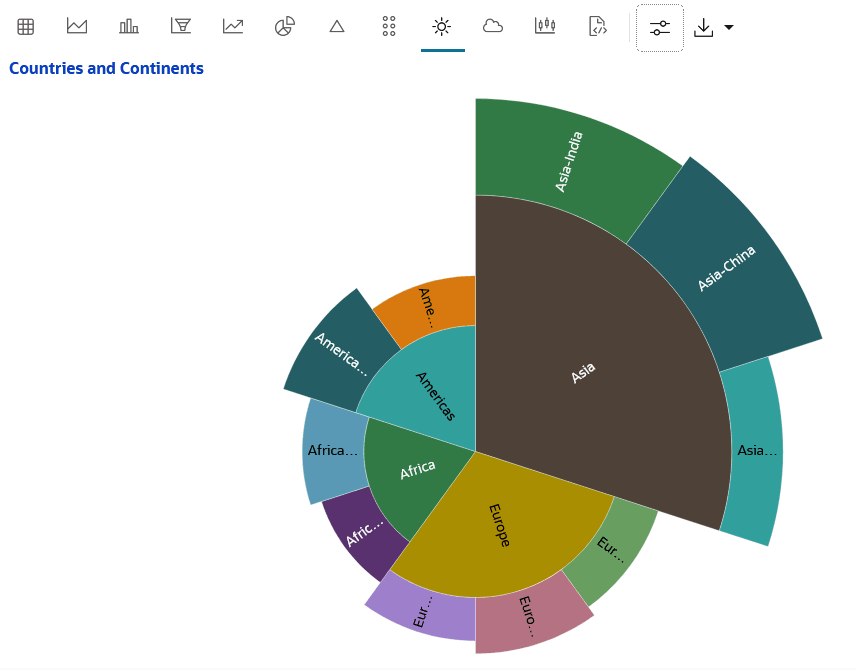
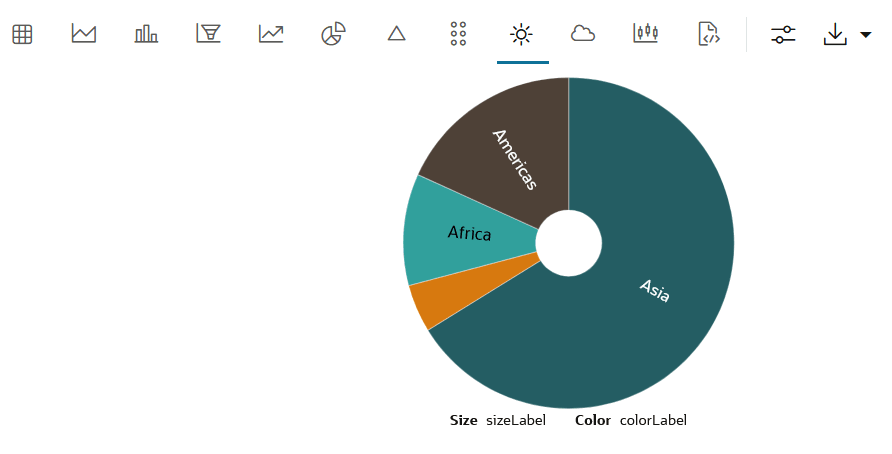
This is a Sunburst chart that depicts the four continents in four slices. The slices are of different sizes and color. After customization, the slices are segmented to depict the countries of that continent. The size of the slices is determined by the count in the Population column.
When to use this chart: Sunburst charts handle multi-level pie chart data more effectively than regular pie charts. Sunburst charts enhance efficiency and clarity by integrating the functionality of multiple pie charts into a single visual.
Data set: Custom dataset on continents, country and population.
To visualize your data in a sunburst chart:
  1. Open a notebook and in a %python paragraph, import the following python libraries—oml and pandas.
  2. Run the following command to create a dataset on continent, country and population:
    %python
    
    data = [
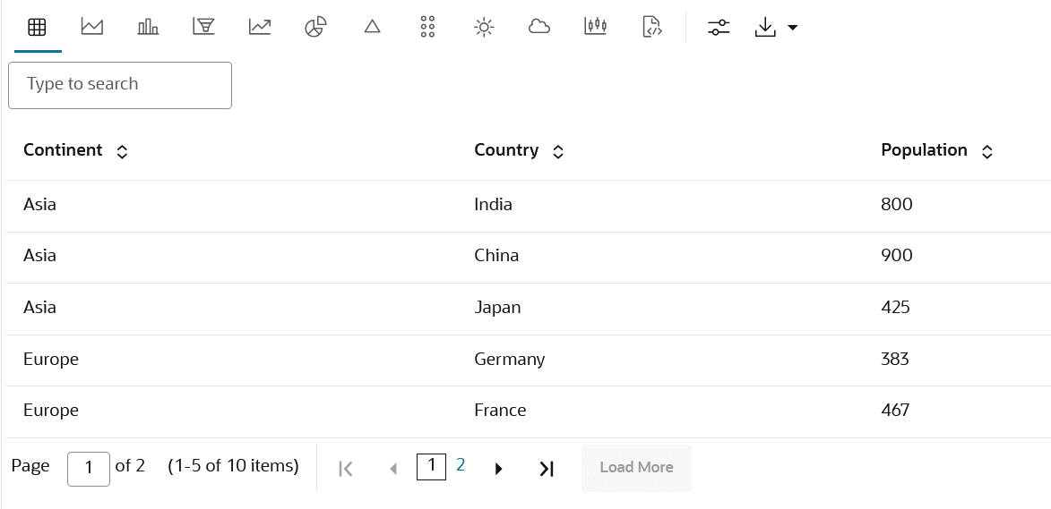
        ["Asia", "India", 800],
        ["Asia", "China", 900],
        ["Asia", "Japan", 425],
        ["Europe", "Germany", 383],
        ["Europe", "France", 467],
        ["Europe", "Italy", 360],
        ["Africa", "Nigeria", 416],
        ["Africa", "Egypt", 510],
        ["Americas", "USA", 631],
        ["Americas", "Brazil", 413]
    ]
    
    print("Continent\tCountry\tPopulation")
    for row in data:
        print(f"{row[0]}\t{row[1]}\t{row[2]}")
  3. Once the code is run, the data is displayed in a table with three columns—Continent, Country and Population.
  4. Click on the sunburst icon.
  5. The data is now displayed in a sunburst chart as shown in the screenshot here. The four continents are depicted in four slices of the sunburst chart. The slices are of different sizes and color. The size of the slices is determined by the count in the Population column.
  6. Click settingsand on the Setup tab, enter the following:
    1. Aggregate Duplicates: Click and select Count.
    2. Radius Column: The value provided in this field defines the radius by its value. Click to add Population. If Population is not available for selection, type Population.
    3. Group By: Click to add Country to it. The countries are now depicted in smaller segments of the slices representing the Continents. By default, Continents is already added to the Group By field.
  7. Click Customization edit the following under Description:
    • Title Setup: Enter the text Countries and Continents.
    • Color: Click on the color palette. Move your cursor and click on a color of your choice. Click Select.
  8. The sunburst chart now displays the data in the Country and Continent columns in segmented slices of the sunburst chart. Inside each slice representing the four continents, the countries are depicted by separate segments of different color and sizes. This shows the relation between countries and continents. Hover your cursor over each segment to view more details.

    Figure 4-62 Sunburst chart after customization


4.4.11 Visualize your Data in a Tag Cloud

A tag cloud is a visual representation of the most popular words or tags found in free-form text. The font size or the color of the text represents the frequency of occurrence.

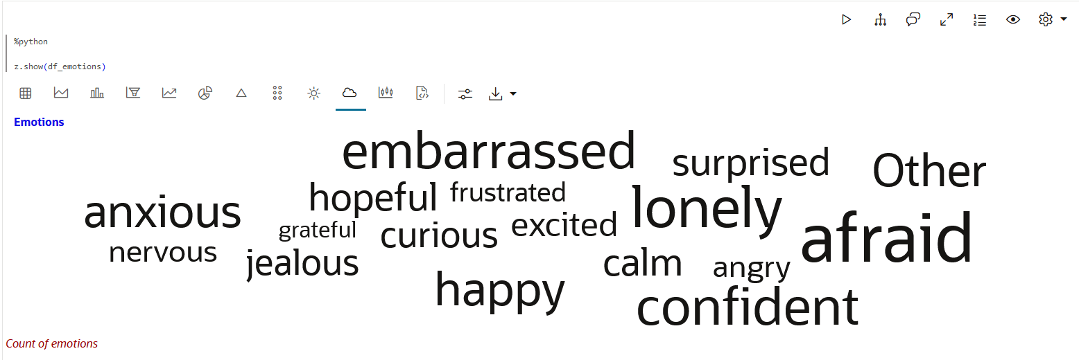
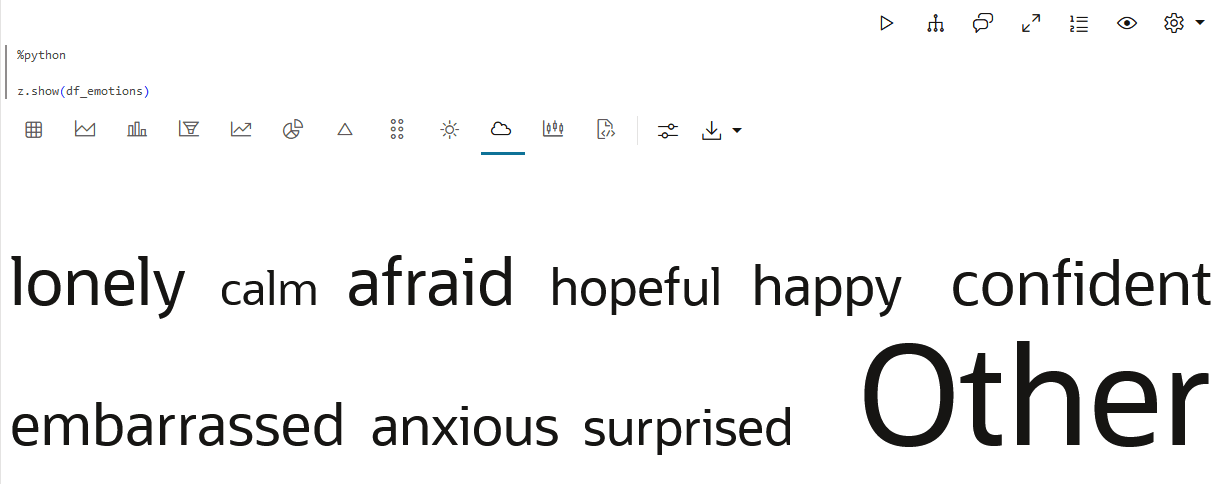
Here is a tag cloud representing some emotions picked up from user comments. The font size implies the average count of the emotions.
When to use this chart: Use Tag Cloud to visualize text data, and to conduct word-frequency analysis across tags, keywords etc.
Data set: In this example, we create a data set that contains user comments.
To visualize your data in a tag cloud:
  1. Open a notebook and in a %python paragraph, enter the following code and run the paragraph:
    import pandas as pd
    import random
    
    emotions = ["happy", "sad", "angry", "excited", "nervous", "calm", "anxious", "confident",
                "bored", "curious", "frustrated", "hopeful", "jealous", "lonely", "grateful",
                "afraid", "embarrassed", "relieved", "surprised", "proud"]
    
    weights = [random.randint(1, 10) for _ in emotions]
    total_weight = sum(weights)
    probabilities = [w / total_weight for w in weights]
    
    random.seed(21)
    emotion_samples = random.choices(emotions, weights=probabilities, k=500)
    
    df_emotions = pd.DataFrame(emotion_samples, columns=["emotion"])
    df_emotions.insert(0, "id", range(1, len(df_emotions) + 1))
    This code generates a large collection of strings (emotions) and then prints each one with a unique ID, formatted in a two-column table.
  2. Click on the Tag cloud icon to view the data in a tag cloud.
    Here is the image of a default tag cloud output. The data is generated in a rectangular layout.

    Figure 4-64 Tag Cloud in a Rectangular layout


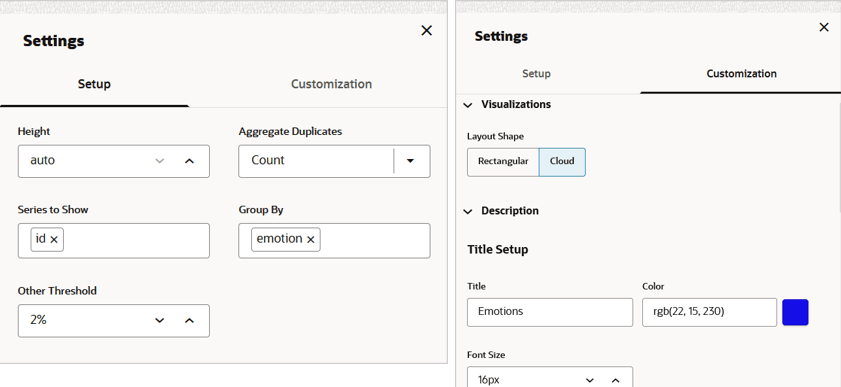
  3. Click on the Settings icon. This opens the Settings dialog. It has the Setup and Customization tabs.

    Figure 4-65 Settings - Tag Cloud


    On the Setup tab, you can configure the columns or series to display, and other settings:
    • Height: This parameter determines the height of the visualization.
    • Aggregate Duplicates: Determines the computation of the values for display. The available values are —Average, Sum, Maximum, Minimum, Count, and Last.
    • Series to Show: All applicable fields in the result-set are available for selection. Selecting multiple fields will add additional diagrams to the visualization.
    • Group By: All applicable fields in the result-set are available for selection. The more groups exist, the more the data set shrinks since it collects all fields and concatenates the same values.
    • Other Threshold: All applicable fields in the result-set are available for selection.
    On the Customization tab, you have the option to customize the Title setup, Subtitle setup, and Footnote setup.
    • Visualization: The options are Rectangle and Cloud. Click Cloud.
    • Title Setup: Enter values in each of these fields to customize the appearance. The fields are Title, Color, Font Size.
    • Subtitle Setup: Enter values in each of these fields to customize the appearance. The fields are Subtitle, Color, Font Size.
    • Footnote Setup: Enter values in each of these fields to customize the appearance. The fields are Footnote, Color, Font Size.
    Here is a tag cloud after customizing the settings. It shows the average count of the emotions. You may hover your cursor to view the count. Note the change in layout format and the title in blue.

    Figure 4-66 Tag Cloud in a Cloud layout


4.4.12 Visualize your Data in a Treemap

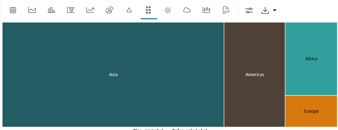
A treemap is a visualization composed of nested rectangles, that represent certain categories within a selected dimension and are ordered in a hierarchy, or “tree.” Quantities and patterns can be compared and displayed in a limited chart space.

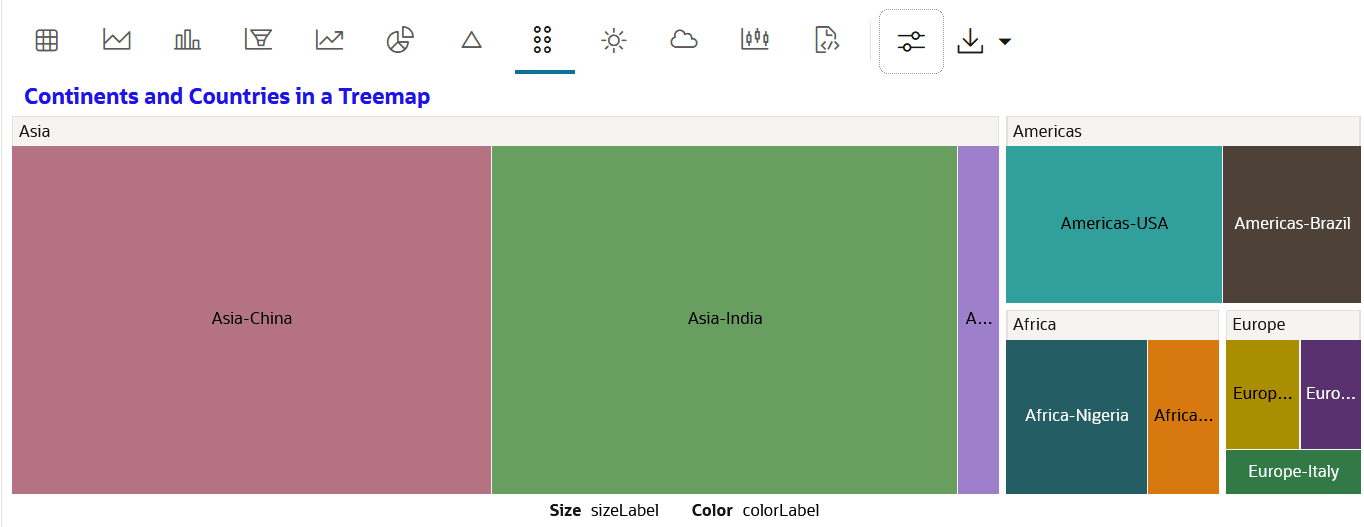
Treemaps also show the relationship of each part (or nested rectangles) to the whole (tree). Here is a treemap depicting the relationship between the parts (countries) and the whole (continents).
When to use this chart: Use this chart to visualize a large number of related categories, and also to analyze the part-to-whole relationship in your data set.
Data set: Custom dataset on continents, country and population.
To visualize your data in a tree map:
  1. Open a notebook and in a %python paragraph, import the following python libraries—oml and pandas.
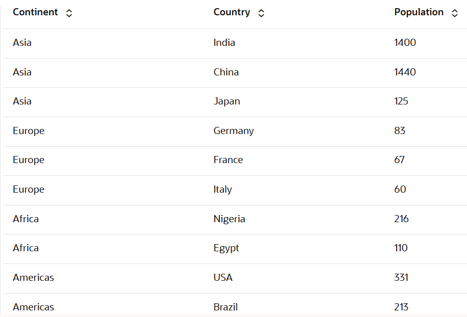
  2. Run the following command to create a dataset on continent, country and population:
    %python
    
    data = [
        ["Asia", "India", 1400],
        ["Asia", "China", 1440],
        ["Asia", "Japan", 125],
        ["Europe", "Germany", 83],
        ["Europe", "France", 67],
        ["Europe", "Italy", 60],
        ["Africa", "Nigeria", 216],
        ["Africa", "Egypt", 110],
        ["Americas", "USA", 331],
        ["Americas", "Brazil", 213]
    ]
    
    print("Continent\tCountry\tPopulation")
    for row in data:
        print(f"{row[0]}\t{row[1]}\t{row[2]}")
    
  3. Once the code is run, the data is displayed in a table with three columns—Continent, Country and Population.
  4. Click on the tree map icon.

    Figure 4-69 Treemap icon on the toolbar


  5. The data is now displayed in a treemap as shown in the screenshot here. The treemap represents the four continents in four rectangles of different sizes and color. The size is defined by the count in the Population column.
  6. Click settings and on the Setup tab, click the Group By field. Click on Country to add it. Now, the countries are depicted in nested rectangles inside the super set rectangles representing the Continents. By default, Continents is already added to the Group By field.
  7. Click on the Customization tab, edit the following under Description:
    • Title Setup: Enter the text Continents and Countries in a Treemap.
    • Color: Click on the color palette. Move your cursor and click on a color of your choice. Click Select.
  8. The Treemap now displays the relation between countries and continents in nested rectangles. The continents are represented as supersets. And the countries of the continent are depicted as nested rectangles inside the rectangles representing the continents. Hover your cursor over each rectangle to view more details.

    Figure 4-71 Treemap after customization


4.4.13 Visualize Data in a Map

The map visualization of OML Notebooks plots data points on a geographical map. For visualizing your data in a map in OML Notebooks, your data must contain explicit latitude and longitude values of locations to correctly position data on the map.
Here is a visualization of a dataset containing information about countries, capital, geographical coordinates and other related information. The displayed map type is OSM Positron style. It has the pushpin on USA clicked. The marker dialog displays the country name and its capital.
When to use this chart: Use map charts to visualize your data with geographical implications
Data set: In this example, we create a table containing data about countries and related information with geographical coordinates.
To visualize data in a map:
  1. In a Python paragraph in your notebook, run the following statements to create a table with five columns—Country Name, Longitude, Latitude, Capital, and Population with five entries for each:
    %python
    print('Country Name\tLongitude\tLatitude\tCapital\tPopulation')
    print('Morocco\t34.0218454\t-6.8408929\tRabat\t257000')
    print('USA\t38.89\t-77.036\tWashington\t67900000')
    print('India\t28.7041\t77.1025\tDelhi\t3380000')
    print('Australia\t-36.2048\t138.2529\tCanberra\t45700000')
    print('Japan\t35.6768601\t139.7638947\tTokyo\t3700000')
    A table is created with these columns—Country Name, Longitude, Latitude, Capital, and Population.

  2. Click on the map icon.
    The data is displayed on a world map in OSM Positron style. This is a non-obtrusive light vector tile basemap based on OpenStreetMap (OSM) data. This is the default style.
  3. Under Settings, on the Setup tab, you can adjust the height of the map. You can also show and hide the zoom controls by clicking Show Zoom Control.
  4. Under Settings, in the Customizations tab, you can edit the following settings. Click on the arrow to change any entries for these columns.
    • Latitude column: Select the column from the dataset which can be considered as latitude value. The column must contain numeric values (float or integer) with valid geographic coordinates. Latitude values must be between -90 and 90.
    • Longitude column: Select the column from the dataset which can be considered as longitude value. The column must contain numeric values (float or integer) with valid geographic coordinates. Longitude values must be between -180 and 180.
    • Title Columns: Select one or more columns from the dataset to be displayed as a tooltip label and marker. If you select two columns, it will be concatenated with a dash and displayed in the marker dialog that opens when you click on any pushpin on the map.
    • Description Columns: Select one or more columns from the dataset to be displayed in the marker dialog that opens when you click on any pushpin on the map.
    As shown in the Map Settings screenshot above, the Title Columns have Country Name and Capital selected, and the Description Columns have Capital selected. On clicking the pushpin for USA on the map, the marker dialog displays USA - Washington and Capital: Washington displayed based on the selections in Settings—Customization.

    Figure 4-75 Map with the marker dialog


    • Map Type: By default, the OSM Positron type is selected. This is a map style built using the OpenStreetMap (OSM) data. The other map types you can choose are:
      • OSM Bright: This is a general purpose vector tile basemap based on OpenStreetMap (OSM) data. Use this basemap style to view detailed location context for your data.
      • OSM Dark Matter: This is a non-obtrusive dark vector tile basemap based on OpenStreetMap (OSM) data. Use this basemap style to accentuate visualizations of your data.
      • World Map: This is a 2D physical map, a type of map where the geographical information is displayed in color. Use this map style to visualize the geography of a region in terms of elevation, landforms and other geospatial information.
      • Customize Type: Here, you have the option to change the map source and map style.
This completes the task of visualizing data in a map.