Determining the Cause of Spikes in Database Activity
If you see a spike in database activity in the Performance page, then you can access the ASH Analytics page to find out which sessions are consuming the most database time. This page provides stacked area charts to help you visualize the active session activity from various dimensions, such as Wait Class, Module, Actions, SQL ID, Instance, User Session, Consumer Group, and others. You can drill down into specific members of a dimension (vertical zooming), and zoom in and out of any time period (horizontal zooming).
To view active session activity on the ASH Analytics page:
-
Access the Database Home page.
See "Accessing the Database Home Page" for more information.
-
From the Performance menu, select Performance Hub and then ASH Analytics.
If the Database Login page appears, then log in as a user with administrator privileges. The ASH Analytics page appears.
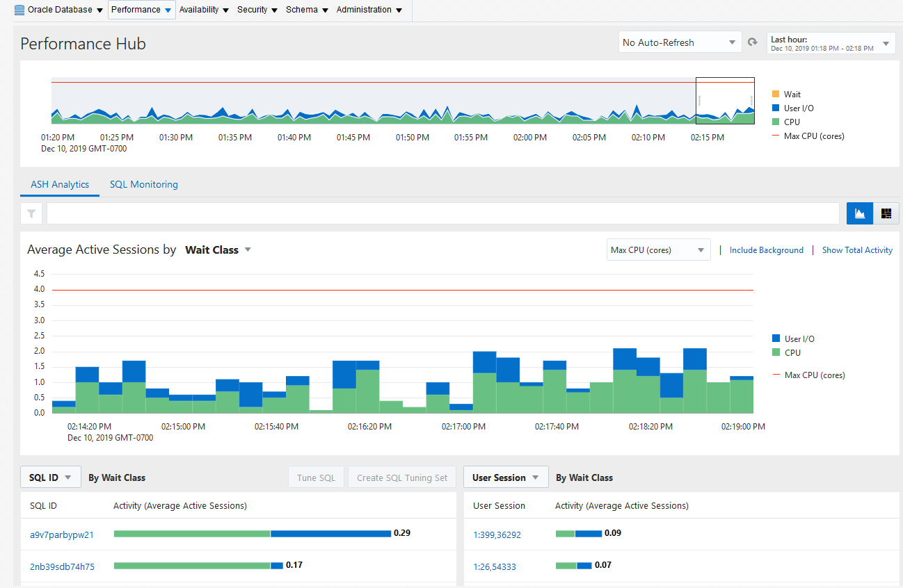
Figure 4-10 shows an example of the ASH Analytics page.
-
To view a high-level perspective of top activity during a selected time period, drag the entire shaded slider area in the top chart to the desired time period.
Tip:
You can change the amount of time selected in the shaded slider area by selecting the control at either edge of the slider and dragging it to the left or right.
You can select a time period within the default setting of one hour or you can use the selector buttons above the chart to display time periods of one day, one week, or one month. You can also use the Calendar and Custom buttons to display a time period other than one of the preset choices.
-
To view a more detailed perspective of your selected time period, use the Activity chart on the page. By default, the chart shows a breakdown of workload activity by wait classes.
-
Investigate the impact by viewing detailed statistics for the top activity sessions that are adversely affecting the system.
To view detailed statistics for a session:
-
Select the largest spike in the chart or the corresponding wait class in the legend beside the chart. The viewer now filters out everything in the chart except for the wait class of interest.
For example, if the chart shows that the Concurrency wait class has the biggest spike, select the chart area of the legend for Concurrency. The viewer refreshes the chart and now only shows the Concurrency value and displays a Wait Class: Concurrency icon in the Filters bar.
Tip:
You can create an unlimited number of filters.
-
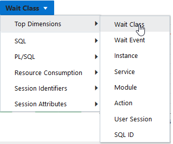
In the Activity section, select Top Dimensions from the dimensions list. The chart refreshes in response to your selection, displaying values for the particular category you selected.
For instance, if you create a filter for Concurrency as described above, then select Top Dimensions from the list, and then select User Session, the chart shows user sessions only for Concurrency.
Figure 4-11 shows the list of activities with Top Dimensions selected.
-
-
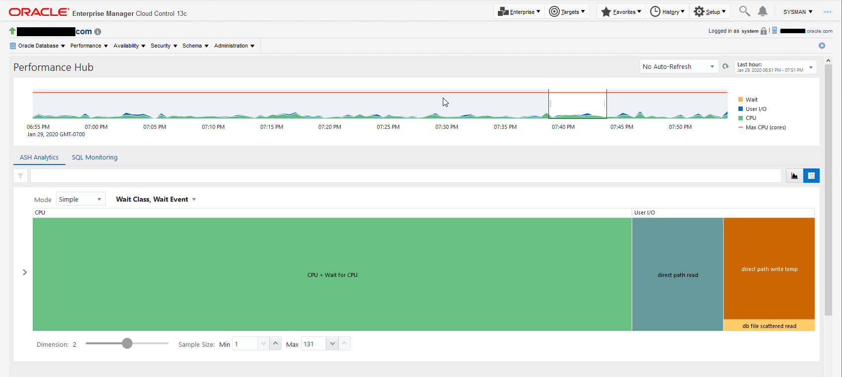
Optionally, use the Load Map for a graphical view of system activity.
The Load Map is useful for viewing activity in a single- or multi-dimensional layout when you are not interested in seeing how activity has changed over time during the selected period.
Figure 4-12 shows the load map for activity by wait class and wait events.
Figure 4-12 Load Map on the ASH Analytics Page

Description of "Figure 4-12 Load Map on the ASH Analytics Page"

