5 OGL Console Left Panel
My Content
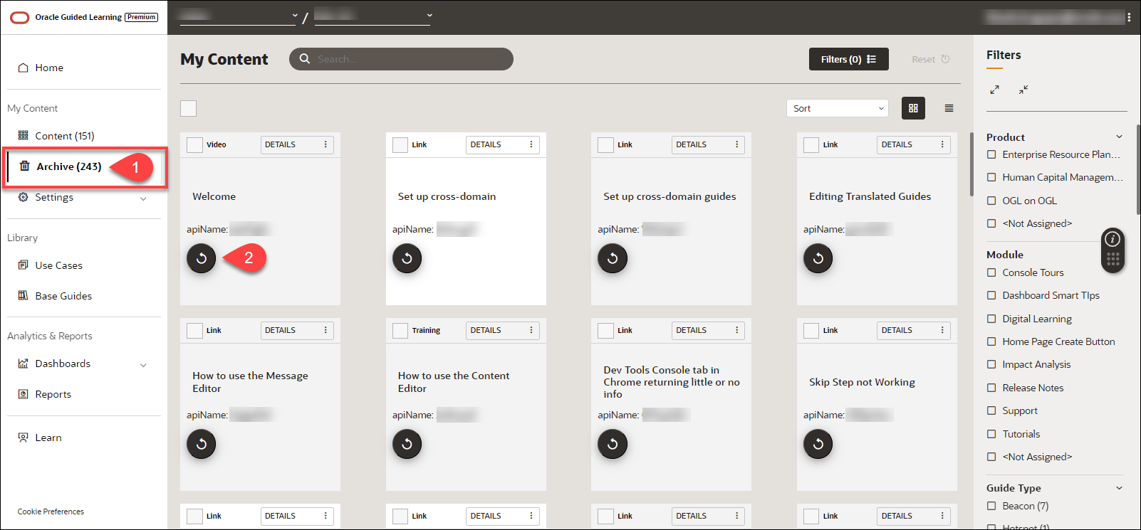
The My Content section in the left panel of the OGL Console provides an overview of all content items in the account (i.e. process guides, messages, beacons, etc.).

Select Content (![]() ) to display all of the current content items that you have created or
copied from a library, such as Use Cases. These content items will appear in the
main content page to the right and will include all content items that are in Draft,
Published, or Inactive status. These content items can be sorted and/or filtered to
allow for more efficient browsing.
) to display all of the current content items that you have created or
copied from a library, such as Use Cases. These content items will appear in the
main content page to the right and will include all content items that are in Draft,
Published, or Inactive status. These content items can be sorted and/or filtered to
allow for more efficient browsing.
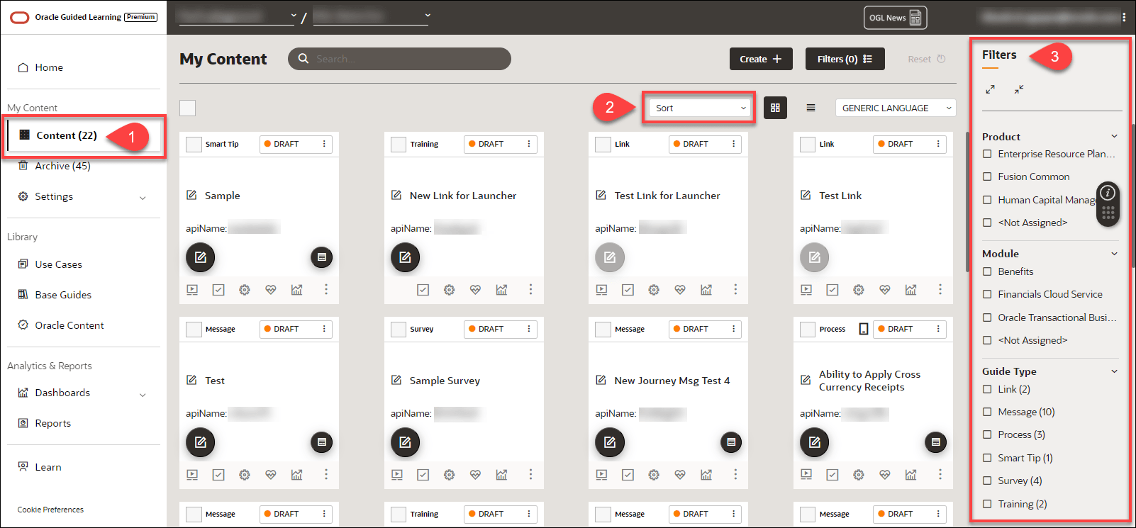
Sorting and Filtering Content Items
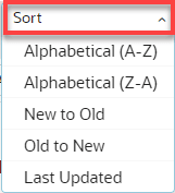
To sort your
content items, select the Sort (![]() ) dropdown menu and choose a sorting option.
) dropdown menu and choose a sorting option.
To filter your content items, use the Filters
(![]() ) panel on the right side of the page and select from any of the available
filtering categories and options to narrow the list of content items
displayed.
) panel on the right side of the page and select from any of the available
filtering categories and options to narrow the list of content items
displayed.
Note:
If the Filters panel is not displayed, be sure to activate it by
selecting ![]() button located at the top of the My Contents page.
button located at the top of the My Contents page.

Below are all of the available categories with which you can can filter content items:

Archived Content
Content items that you
delete are not permanently deleted and are simply moved to Archive. Select
Archive (![]() ) to display all items that have been deleted in the account. These content
items can also be sorted and filtered for more efficient browsing, as shown
above.
) to display all items that have been deleted in the account. These content
items can also be sorted and filtered for more efficient browsing, as shown
above.
To recover any archived items and move them back to your
Content, select the Recover (![]() ) button on the content item you wish to restore.
) button on the content item you wish to restore.
Application
Accessing the Interface
To access the Application settings modal:
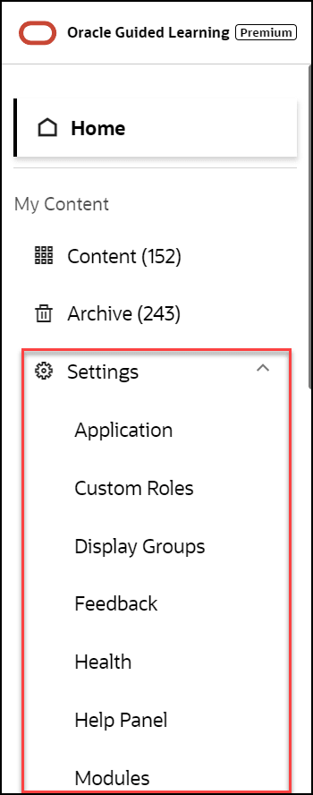
- On the OGL Console homepage, go to the left navigation panel.
- Click on Settings, then select Application.
Understanding the Application Settings Interface
The Application tab:
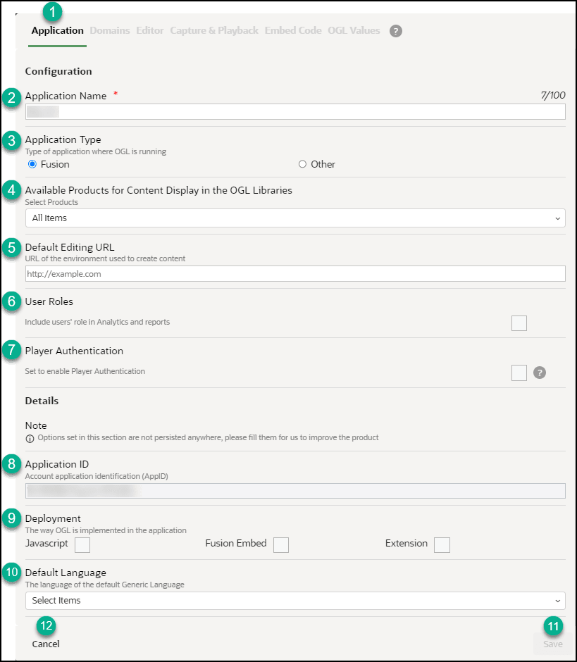
| Legend | Description | Additional Information |
|---|---|---|
| 1 | Application tab | n/a |
| 2 | Application Name | This is the application name, displayed next to the
account name |
| 3 | Application type | Fusion = This appID is linked to a Fusion
application
Other = Any application that is not Fusion (i.e. Salesforce) |
| 4 | Available Products for Content Display in the OGL Libraries | The products selected in this list will determine which content items will display in the content libraries, including Uses Cases, Base Guides, and Business Process Training libraries. |
| 5 | Default Editing URL | This is the default editing URL for new item creation. Note, setting the URL in this field does not replace/update the editing URL for existing items. |
| 6 | User Roles | Indicates if the user roles are being collected by OGL for reporting in analytics. To have identifiable usernames enabled for your organization (subject to legal requirements being met), please create a service request on My Oracle Support. |
| 7 | Player Authentication | This setting allows administrators to restrict OGL
content to only display for end-users who are properly authenticated
in the host application. If enabled, end-users must be authenticated
in the host application in order to see OGL content.
Note: For NetSuite applications, enabling this setting may cause a Content Security Policy (CSP) error and the OGL launch widget will not display.Note: For Player Authentication to be properly enabled on your OGL account, a one-time configuration will need to be performed by the OGL product team to connect your OGL account to your organization’s Single Sign-On (SSO). This configuration allows OGL to validate whether end-users have been properly authenticated by your SSO before displaying any OGL content, including the Widget. To request player authentication to be configured with your organization's SSO, please contact your Oracle account manager or reach out to OGL Support to submit a service request for “Player Authentication Setup”. |
| 8 | Application ID | This is the unique application ID for the account. |
| 9 | Deployment | Indicates OGL deployment methods. Please select only the applicable options for the appID |
| 10 | Default Language | Indicates the set default language for the appID.
(i.e. if the default content language is French, and French has been
selected in the field, this indicates to OGL that French = Generic
Language (fr = --))
Note: This is not the language of the OGL Console, but that that of the content items in the application |
| 11 | Save button |
Allows you to save the changes made to the configuration. Note: The Save action applies to the Application, Editor, and Playback tabs. The Save button on the Domains tab only applies to that and not the previously mentioned tabs |
The Domains tab - General
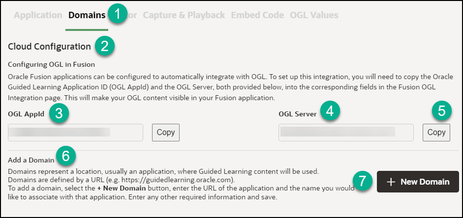
| Legend | Description | Additional Information |
|---|---|---|
| 1 | Domains tab | The Domains tab contains OGL configuration settings for Fusion. |
| 2 | Configuring OGL in Fusion | Description: Oracle Fusion applications can be configured to automatically integrate with OGL. To set up this integration, you will need to copy the Oracle Guided Learning Application ID (OGL AppId) and the OGL Server URL, both provided below, into the corresponding fields in the Fusion OGL Integration page. This will make your OGL content visible in your Fusion application. |
| 3 | OGL App ID | Identifies the application ID for use in OGL configuration, enter the ID into the Application ID field in Fusion |
| 4 | OGL Server URL | Identifies the server URL for the application ID, enter the URL into the relevant field in Fusion |
| 5 | Copy button | Allows you to easily copy the application ID or the server URL to the clipboard. |
| 6 | Add a Domain | Domains represent a location, usually an application, where Guided Learning content will be used. Domains are defined by a URL (e.g. https://guidedlearning.oracle.com). To add a domain, select the + New Domain button, enter the URL of the application and the name you would like to associate with that application. Enter any other required information and save. |
| 7 | New Domain button | Allows you to define a new domain where OGL will be enabled |
| 8 | Hosts section | If there are domains defined, they will all be listed in the hosts' section in the Domains tab |
The Domains tab - Add/Edit a Domain
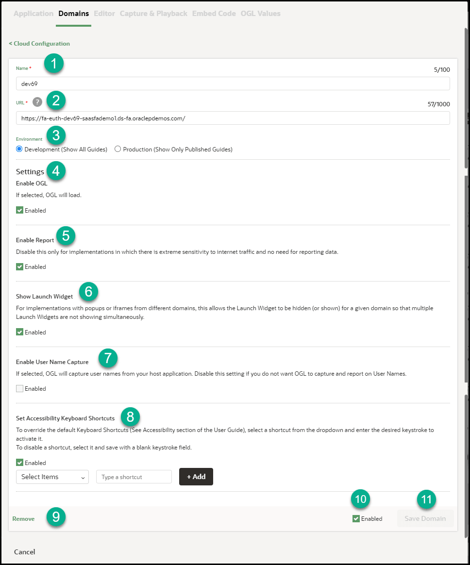
Table 5-1 Domains General Tab
| Legend | Description | Additional Information |
|---|---|---|
| 1 | Name | Defines the name of the domain (.i.e. Development / Testing / User Acceptence Testing / Production ) |
| 2 | URL | Identifies the domain URL (i.e. www.myapp-uat.com) |
| 3 | Environment | Determines if OGL will show in Development mode (shows all guides) or Production mode (shows published guides only) |
| 4 | Settings - Enable OGL | Determines if OGL will be enabled/disabled for the domain. |
| 5 | Settings - Enable Report | Determines if analytics reporting is enabled/disabled for the domain. Disable this only for implementations in which there is extreme sensitivity to internet traffic and no need for reporting data. |
| 6 | Settings - Show Launch Widget | Determines if the OGL help Widget will be shown on the domain or hidden. For implementations with popups or iframes from different domains, this allows the Launch Widget to be hidden (or shown) for a given domain so that multiple Launch Widgets are not showing simultaneously. |
| 7 | Enable User Name Capture | Determines whether OGL will capture user names
from the host application to be displayed in analytics and
reports.
Note: Please check with your regional/local user privacy laws and/or regulations and your organization's policies on user privacy before enabling this setting. |
| 8 | Set Accessibility Shortcuts | To override the default Keyboard Shortcuts (See Accessibility section of the User Guide), select a shortcut from the dropdown and enter the desired keystroke to activate it.To disable a shortcut, select it and save it with a blank keystroke field. |
| 9 | Remove | Removes the domain and associated settings |
| 10 | Enabled | Determines if the domain is enabled/disabled |
| 11 | Save Domain | Saves the domain configuration
Note: The Save Domain button only applies to the domains tab. The Save action on the Application, Editor, and Playback tabs applies only to the Application, Editor, and Playback tabs. |
Note:
The screen below indicates that there is a lack of sufficient privileges to Edit Cloud Configuration, request your OGL Admin for access or to make the necessary updatesThe Editor tab:
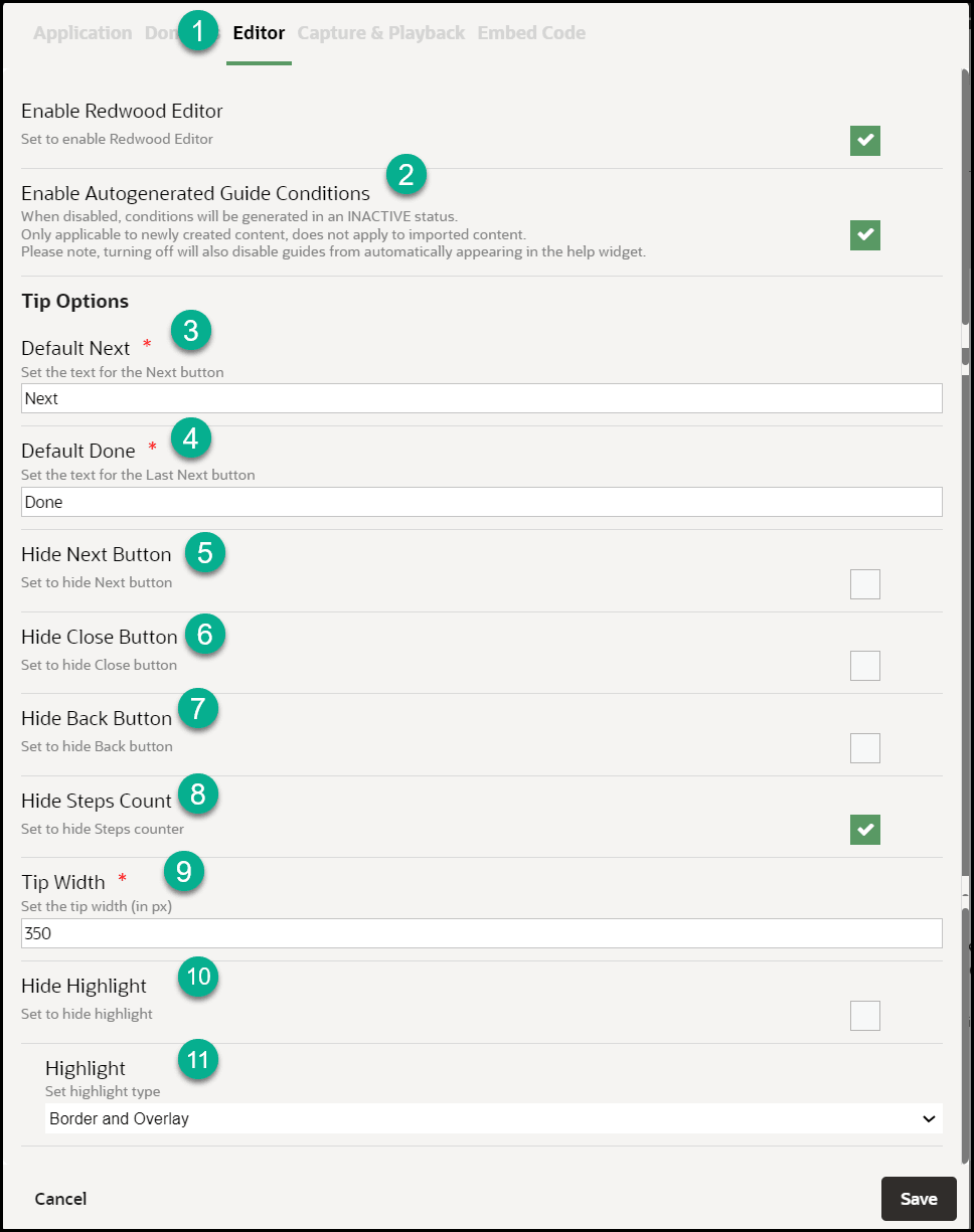
| Legend | Description | Additional Information |
|---|---|---|
| 1 | Editor tab | The Editor tab contains settings that can be set for
the editor at the application level. You can override these settings
at item level through the OGL Full Editor.
Note: Set these preferences per your governance and style guide. |
| 2 | Enable Auto Generated Guide Conditions |
When disabled, conditions will be generated in
Inactive status. This is applicable to only newly created
content and does not apply to imported content.
Note: Turning off this option will also disable guides from automatically appearing in the help widget. |
| 3 | Next Button Text | Sets the custom text to display for Next button (i.e.
Proceed / OK)
|
| 4 | Last Next Button Text | Sets the custom text to display on the button on the
last step of the guide (i.e. Close / Finish!)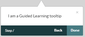 |
| 5 | Hide Next Button | Sets the Next button to hidden by default.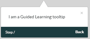 |
| 6 | Hide Close Button | Sets the Close X button to hidden by
default.
|
| 7 | Hide back Button | Sets the Back button to hidden by default.
|
| 8 | Hide Steps Count |
Sets the Step Count label to hidden by default.
|
| 9 | Tip Width |
Sets the default Tip Width in pixels (i.e. 280.
|
| 10 | Hide Highlight | Sets the default Highlight setting for all item
tooltips to Hidden.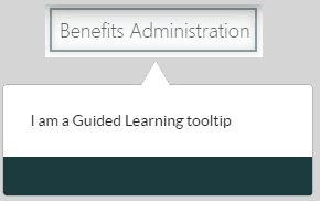 |
| 11 | Highlight | Sets the Highlight for tooltips, available options
are:
|

| Legend | Description | Additional Information |
|---|---|---|
| 1 | Playback tab |
The Playback tab contains the OGL Help Widget settings for both development and production. Note: Development would have the same settings as Production by default, in case you need different settings in Development, override the Production settings. If you change only Production settings that would be defaulted to Development as well. |
| 2 | Global Image Capturing | Enable or disable the Global Image Capturing which helps in capturing the images used for Job Aids, Simulations and Videos. |
| 3 | Job Aids (Development/Production) | Enable or disable the job aids (step guide) icon in the help widget. |
| 4 | Show Images (Production) | Display images in step guides (if step guide is enabled) and in PDF files or in guide export. |
| 5 | Step Guide (Development/Production) | Display video presentations (video preview of a guide) in job aids (if job aids is enabled) and in guide export. |
The Embed Code tab:
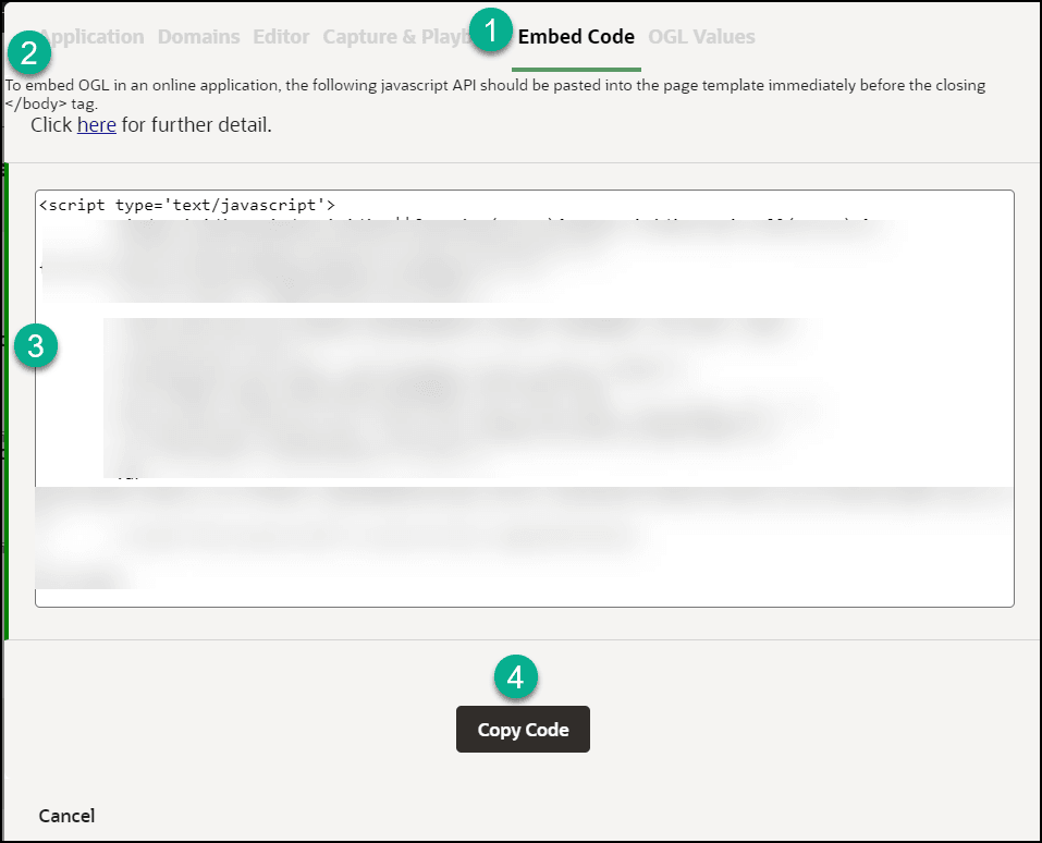
| Legend | Description | Additional Information |
|---|---|---|
| 1 | Embed Code tab | n/a |
| 2 | JavaScript API Documentation Reference | https://docs.oracle.com/en/education/oracle-university/guided-learning/ogl-faq/administration.html#GUID-9059C5AB-B0D4-4A0B-B049-28B6274AD54C |
| 3 | Guided Learning JavaScript Embed Code | n/a |
| 4 | Copy Code | n/a |
Custom Roles
To work with Simple Conditions, OGL now utilizes the Custom Roles setting in the OGL console. The OGL roles must be set up as per the roles set in your OGL Fusion embed or Javascript.
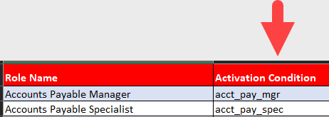
Click here to download a list of Role mappings.
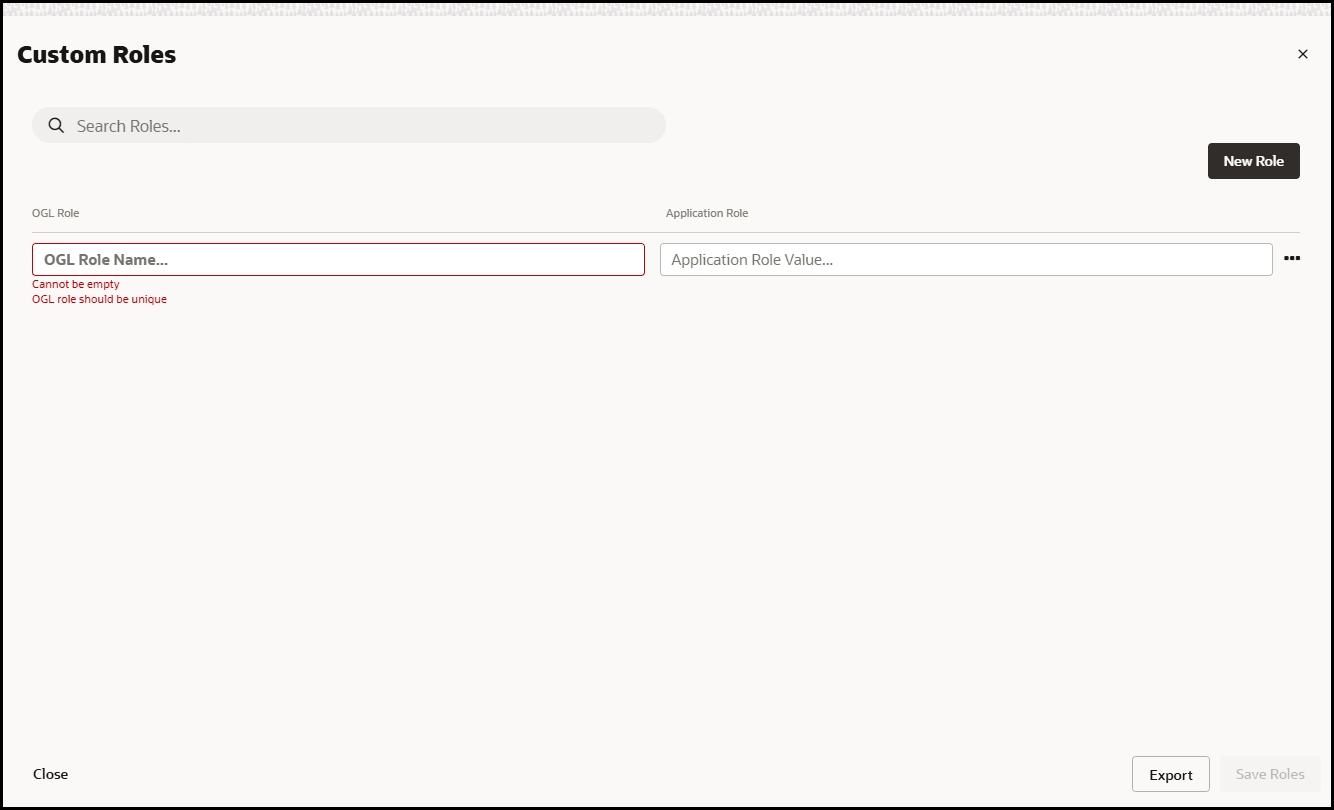
In the OGL Role Name field, enter the Role Name.
In the Application Role Value field, enter the Role Value.
Accessing the Interface
- Go to the OGL console.
- On the Main Navigation Menu, select Settings > Custom Roles.
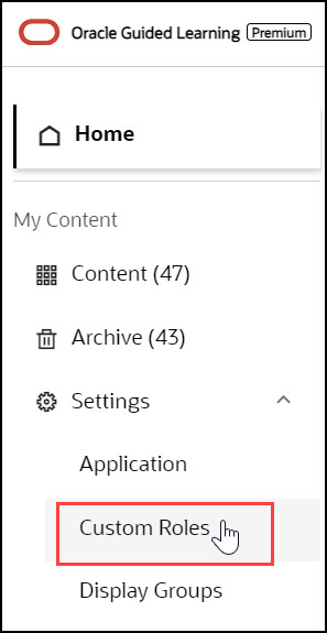
The Custom Roles interface is now displayed.
Understanding the Interface
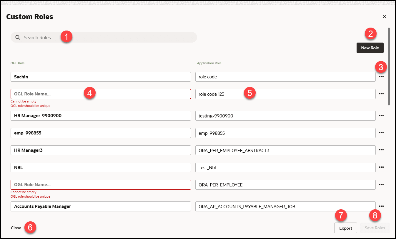
| Legend | Name | Comments |
|---|---|---|
| 1 | Search Box | Provides dynamic search functionality. |
| 2 | New Role button | Adds a new empty line to the list. |
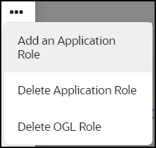
| 3 | Ellipsis Icon | Gives further Custom Roles management options.
|
| 4 | OGL Role Name field | In the OGL Role Name field, enter the Role
Name.
(This is the Role name for your role and will be displayed in the item activation condition.) Note: The name field cannot be empty, and duplicate values and special characters are not allowed.
|
| 5 | Application Role Value field |
In the Application Role Value field, enter the Role Value. (This is the value of the role as defined in your OGL JavaScript, OGL Custom JavaScript for Fusion Embed, or in the OGL Standard Roles table.) Note: The value field cannot be empty; duplicate values and special characters are not allowed( i.e., whitespace).Lets say your JavaScript (including Custom) contains lines similar to the ones below: Lets say your JavaScript (including Custom) contains lines similar to the ones below: if(#{securityContext.userInRole['ORA_PER_EMPLOYEE_ABSTRACT']}){ user_role+='|emp|'; ORA_PER_EMPLOYEE_ABSTRACT is the role code in Fusion, emp is the OGL reference for that role code, and becomes the value you enter in the value field in the User Roles interface. If you have set up role mapping in Fusion Embed and have used the spreadsheet provided in the link above, then when defining roles, please enter the values in column D for your corresponding list of roles set up in Fusion Embed.
|
| 6 | Close | Select Close to close this confirmation dialog. |
| 7 | Export | Select Export to export the custom roles to an excel sheet. |
| 8 | Save Roles | Saves the changes made to the field. The Savebutton only becomes active when an acceptable value is entered in the field. |
Display Groups
Categorize and order the content in the Help Widget quickly and easily with the Display Group Manager.
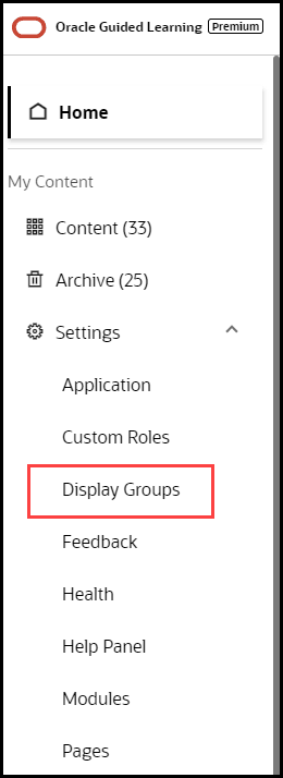
Accessing the Interface
- On the OGL Console homepage, go to the left navigation panel.
You can see the Settings section in the navigation panel.
- Select the Display Groups from the dropdown menu.
Understanding the Interface

| Legend | Description | Additional information |
|---|---|---|
| 1 | Filters section | Filtering Content for Display Groups
Use filters to locate items to associate with a display group. Select the Filters button to show or hide the filters and search box. |
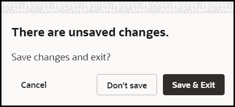
| 2 | Close button | Use to close the Display Group Manager. A warning is
displayed if there are unsaved changes.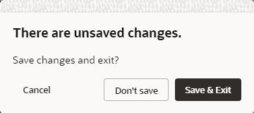 |
| 3 | Sort alphabetically | Use to sort items in alphabetical order (A→ Z). Note: Action cannot be undone. |
| 4 | Item name | Displays the item's name |
| 5 | Display group label | Displays the item's current display group association |
| 6 | Item status | Displays the item's status (i.e. Published) |
| 7 | Item count | Displays the total number of display items and the number of items per display group. |
| 9 | Display group name | Display group name field. Duplicate names are not allowed. |
| 10 | New display group button | Use the button to create new display groups. |
| 11 | Drag to reorder icon |
Use the icon to manually reorder the items and/or display groups using drag and drop, or you can specify the order by numbering them. To reorder, drag and drop each display group/item in the order of choice. |
| 12 | Display group name | Displays the display group's current name. |
| 13 | Display group/ order number | Identifies the display group's order number. To
reorder, edit the display group |
| 14 | Save all button | Saves all the changes made in the Display Group Manager. |
| 15 | Edit button | Use the Edit button to update the display group, this only includes the display group name, icon, and sequence numbering. |
| 16 | Toggle button |
Use the button to toggle the display group as active or inactive. If set to inactive, the items associated with the display group will not be visible in the OGL Help Widget but can be accessed by using the search functionality in the OGL Help Widget. This functionality is helpful when you need to make items available only by searching in the OGL Help Widget. |
| 17 | Save button | Use to save changes made to the display group, this includes changes made to the name, icon, and sequence numbering. |
| 18 | Cancel button | Use to discard changes made to the display group, this includes changes made to the name, icon, and sequence numbering. |
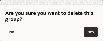
| 19 | Delete button | Deletes the display group. A warning dialog box is
displayed to confirm the action. This action cannot be undone. Items
that were assigned to the deleted group will be assigned to the
default display group.
Note: You can close the Display Group Manager and to chose to not save the changes. This will discard the changes made and revert to the display groups prior to the delete action. |
Creating Display Groups
When you create display groups in the Display Group Manager you provide a name and an icon, and then you can assign content.
To create a display group:
- On the OGL Console homepage, go to the left navigation panel.
You see the Settings section in the navigation panel.
- Select the Display Groups dropdown menu.

- Click
 New Display Group in the Display Group Manager
 - In the Display Group Manager window,
- Enter the Name of the display group
IMPORTANT: Your display group name cannot contain any special characters ( * | \ " : < > [ ] { } ` ( ) ' ; & $ )
- Select Save
- Add content to the display group by dragging & dropping to the
display group

- Select Save All to save the changes and close the Display Group Manager
Adding Content to Display Groups
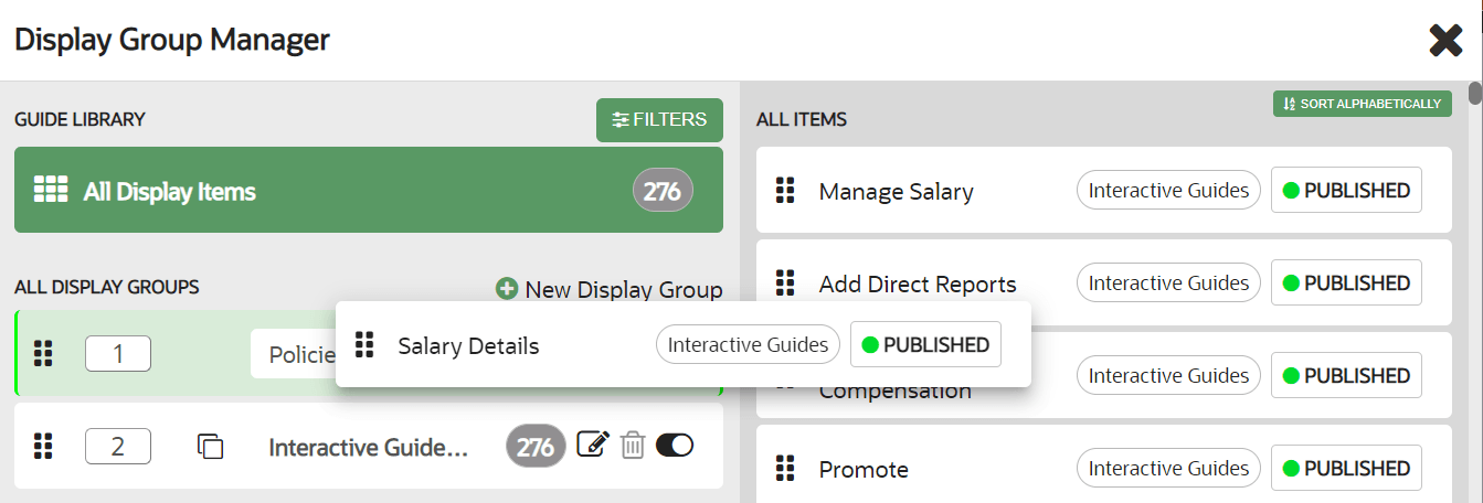
You can add content by dragging the item from the right side and dropping the item into the appropriate display group on the left. After the item is added to a display group, the display group association tag is updated next to the item name. To remove items from a display group, simply drag and drop the item into the new display group. To see the contents of a display group, select the group's name on the left of the Display Group Manager.
Filtering Content for Display Groups
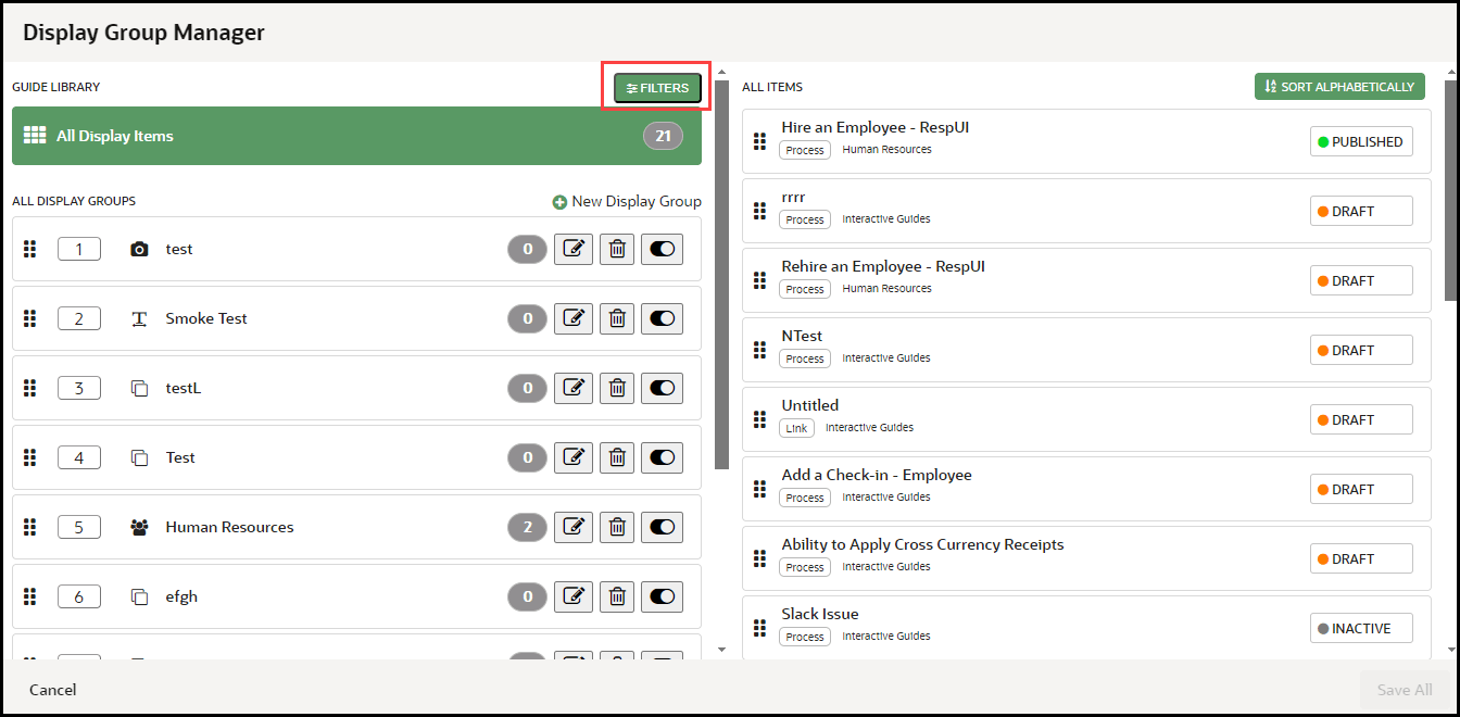
If you have many guides, you can use filtering or search for a guide to place in a display group. To access search and filters, select Filters at the top of the Display Group Manager.
Reordering Display Groups
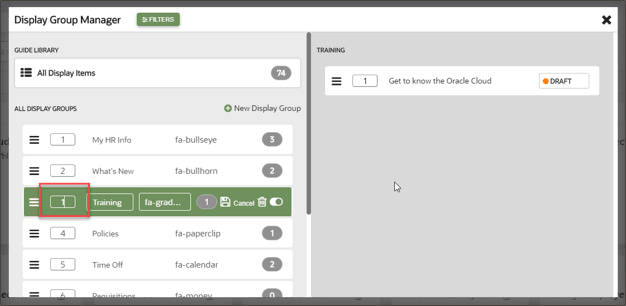
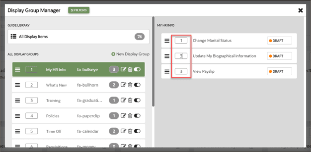
Use the Display Group Manager to configure the order of display groups and the content within them. You can reorder display groups and guides using drag and drop, or you can specify order by numbering them.
To reorder display groups:
- Drag and drop each display group in the order that you want them to be displayed.
- Edit the display group
 and specify the order by entering numbers in the display group order
boxes.
To reorder guides:
- Specify guide order by selecting a display group then entering the numeric order of
each guide in the order boxes.
Feedback
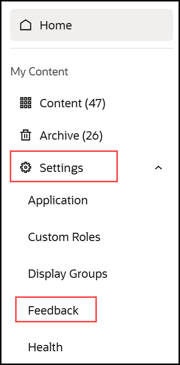
Accessing the Feedback Settings
- In the left navigation panel, select the Settings menu.
- Select Feedback from the list.
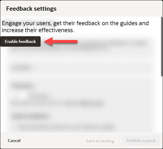
Note:
Feedback is disabled by default, to enable, select the Enable Feedback button. Once enabled, feedback is enabled for all items in the My Content library (See Guide Level Control of Feedback below)

| # | Description |
|---|---|
| 1 |
Testing | View Production settings or Production | View Testing settings Toggle between the Testing and Production settings using the link. |
| 2 |
Frequency Controls how frequently a user will be requested to provide feedback. Range 0% (Never) to 100% (Always). If set to 50% this means there is a 50% probability that feedback will be requested from the user. Key considerations: Guided Learning runs several checks before displaying the request for feedback to the user, they are:
|
| 3 |
Guide Completion If the "Show feedback when the user finishes a
guide" checkbox is selected, the feedback dialog will be
presented to users each time a user has closed/completed the
guide.
Note: Enabling this setting will override any Frequency settings above. Do not enable this setting if you intend to set the frequency for feedback.) |
| 4 |
Feedback Overlay If selected, an overlay will be applied to the page when the feedback is displayed. Elements outside the feedback tip will be visible but inaccessible while the feedback is active/being displayed. |
| 5 |
Rating Question Predefined questions can be selected from the drop-down, these are meant to assist users to rate the guide. Available options are:
|
| 6 |
Feedback Question This provides a free text field to allow for the customization of the feedback question. This field is prepopulated with the statement "Tell us what was least/most helpful about this guide" Once presented to the user, they can then enter their comments in the provided field. (See Preview) |
| 7 |
Preview Provides a preview of the feedback settings before saving them to testing/production
|
| 8 |
Save to Testing Saves the current feedback settings to DRAFT status. Settings will be reflected in the Development/Testing environment(s) where the OGL configuration is set to Development |
| 9 |
Publish to prod Saves the current feedback settings to PUBLISHED status. Settings will be reflected in the Production environment where the OGL configuration is set to Production |
| 10 |
Cancel Discards any changes and closes the Feedback settings modal |
Enabling feedback at the application ID level enables it for all items in the library. Depending on the organizational requirements, OGL also provides item level control of feedback settings, this means feedback can be disabled for some items in the library or enabled only for a select few items.
For instance, in a library of 20 items, your organization might only be interested in feedback for 5 of the items, this means, you can use item-level control to disable feedback for the 15 items and enable it only for the 5.
To view an items feedback settings:
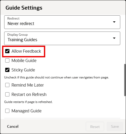
From the My Content library, select the settings icon on the guide tile.
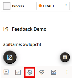
Set the Allow Feedback setting as required
Note: Checked = Feedback allowed and Unchecked = Feedback not allowed
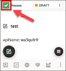
To allow/disallow feedback in bulk:
- Select multiple content items using the checkboxes.
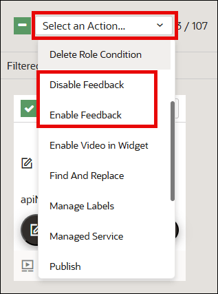
- Click the Action menu drop-down, then select Enable
Feedback or Disable Feedback.
Note:
Once completed, you can filter using the Feedback Status filter option.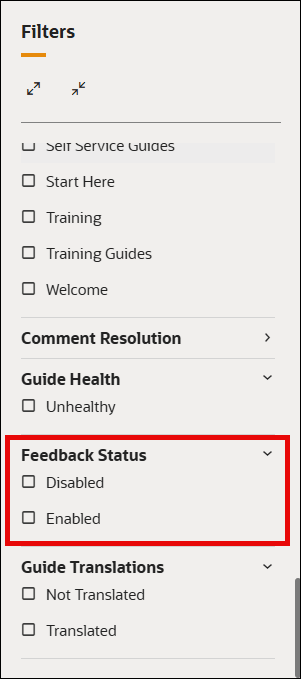
![]()
Help Panel
Accessing the Help Widget Settings
- On the OGL Console homepage, go to the left navigation panel.
You can see the Settings tab on the left navigation panel.
- Select Help Panel under the Settings tab.
Help Panel Settings window is displayed.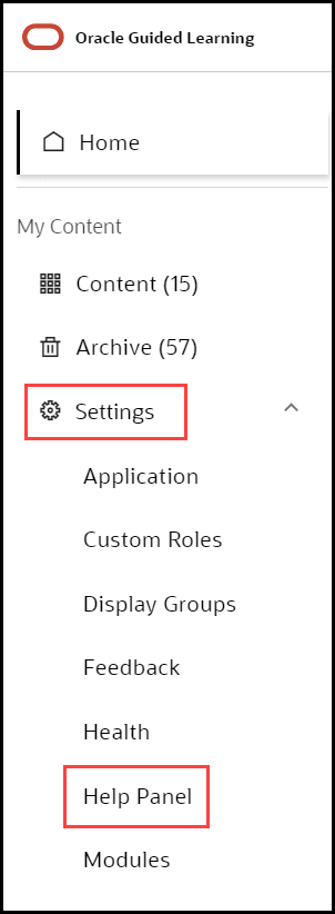
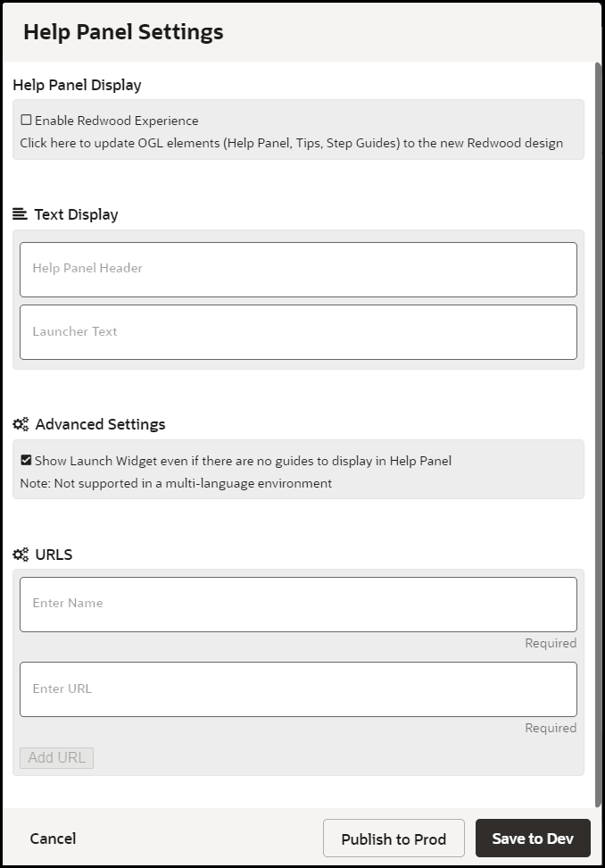
Enabling the new Help Panel
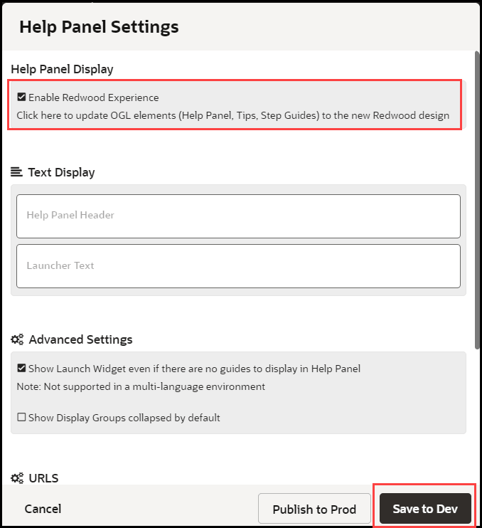
To enable/disable the new Redwood Experience Help Panel, check/uncheck the Enable Redwood Experience, then click Save to Dev (will only display in non-Prod environments) or Publish to Prod (will display in both Development and Production environments) accordingly.

Modules
Understanding Modules
As your content library grows, it can become increasingly difficult to manage a large volume of guides, especially if you have OGL deployed to multiple Fusion products (e.g. HCM, ERP, etc.) and/or modules (e.g., Financials, Procurement, Human Resources, Recruiting, etc.). One way to organize your guides may be to categorize them by the Fusion products and modules to which they are associated. Whether you are using OGL in Fusion or other applications, product and module labels allow you to manage your guides more efficiently, making it easier to find, filter, and organize guides by their respective products and modules. The Products and Modules features enable console users to create, edit, and manage custom labels which can then be tagged to guides for use in filtering in both the Content library as well as Analytics.
Accessing the Modules Manager
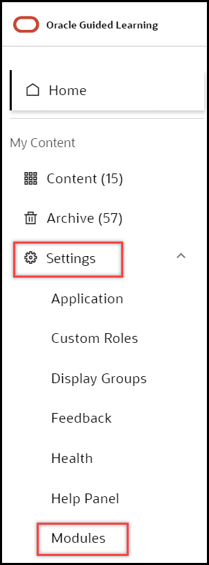
- On the OGL Console homepage, go to the left navigation panel.
You can see the Settings tab on the left navigation panel.
- Select Modules from the Settings tab on the left navigation panel.
Understanding the Interface
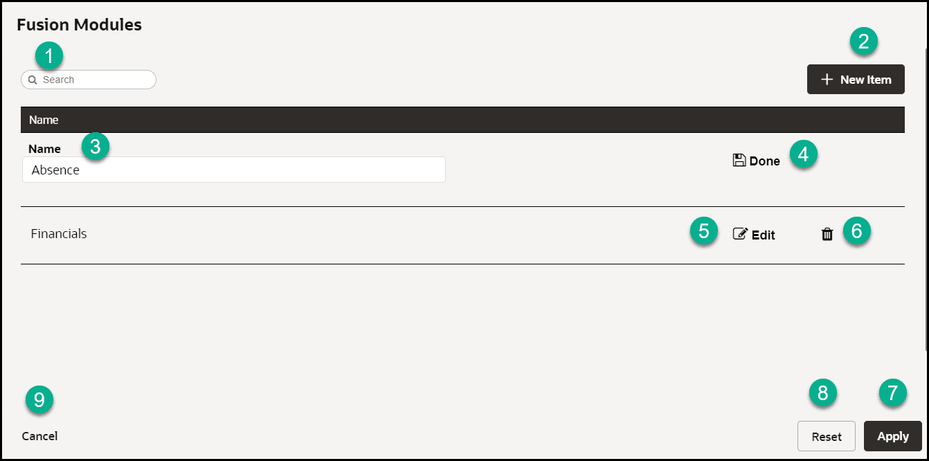
| Legend | Name | Additional information |
|---|---|---|
| 1 | Search box | Provides dynamic search functionality. |
| 2 | New Item | Adds a new line to the list. |
| 3 | Name field | The name field cannot be empty. Duplicate values are not allowed. |
| 4 | Done/Save | Saves the changes made to the field. The button only becomes active when an acceptable value is entered in the field. |
| 5 | Edit | Allows changes to be made to the field. |
| 6 | Delete | Deletes the line item. Action cannot be reversed and all linked content items will be disassociated. |
| 7 | Apply | Saves the changes made. A confirmation is displayed if the operation has either been completed successfully or failed with errors. |
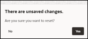
| 8 | Reset | Reset the changes made. A warning will be displayed
if there are unsaved changes.
|
| 9 | Cancel | Discards any changes that were made and closes the
interface. A warning will be displayed if there are unsaved
changes.
|
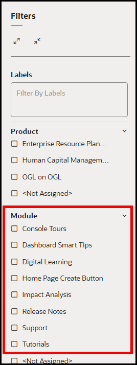
You can use the Module labels to filter your guides by their respective modules.
Pages
A common method to determine when a guide should run or be visible in the Help Panel is to apply a guide activation condition that is based on the page URL, or for Fusion, the page route. Getting the route in Fusion is not a straightforward task and keeping track of all the pages and their URLs or page routes for an application can be a difficult task. The Pages manager can help console users efficiently catalog and manage page URLs and/or Fusion page routes by assigning them a user-friendly name that can later be referenced in guide activation conditions.
Accessing the Pages Manager
From the left navigation panel, select Settings> Pages to open the Pages manager.

Configuring Pages
In the Pages manager, you can create new custom pages and assign a user-friendly name to an associated URL or Fusion page route. To find the Fusion page route, see instructions in #4 on the below.
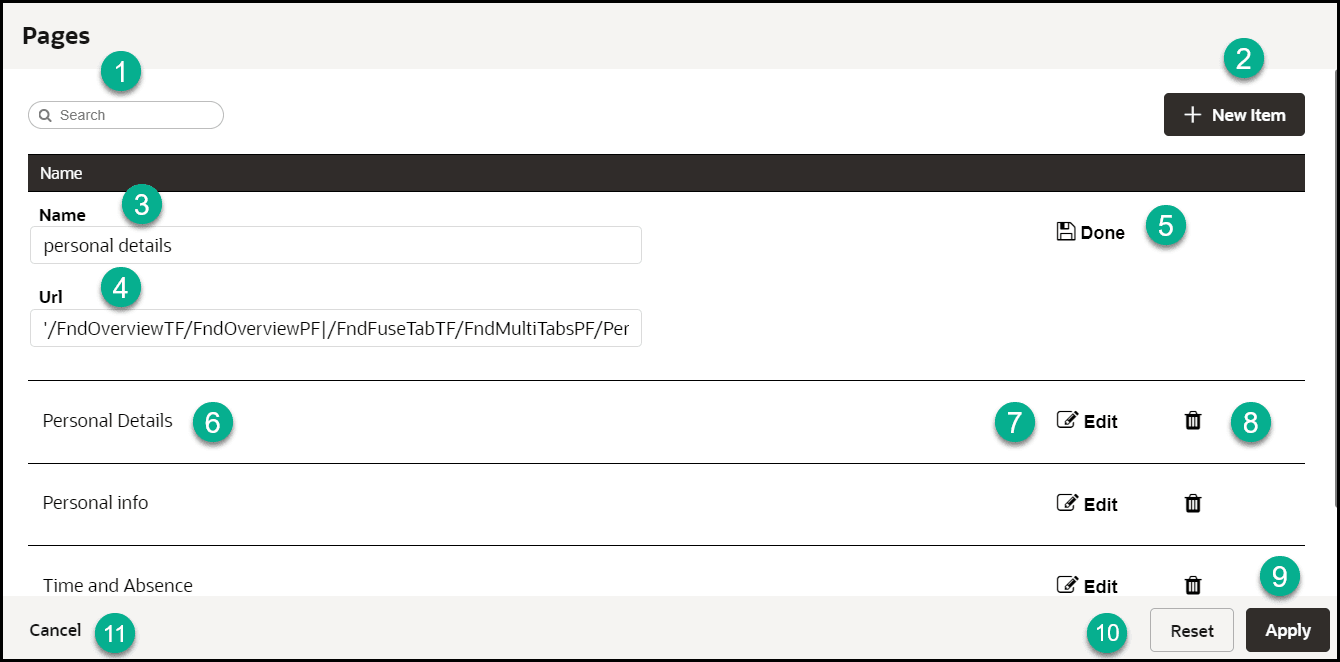
| Legend | Name | Additional Information |
|---|---|---|
| 1 | Search box | Provides dynamic search functionality. |
| 2 | New Item | Adds a new line to the list. |
| 3 | Name Field | The name field cannot be empty. Duplicate values are not allowed. |
| 4 | URL |
To find the URL:
Note: This is the route automatically captured by OGL or returned by iridize.master.getRoute() |
| 5 | Done/Save | Saves the changes made to the field. The button only becomes active when an acceptable value is entered in the field. |
| 6 | Page name field (Existing) | This name has been automatically defined by OGL. |
| 7 | Edit | Allows changes to be made to the field. |
| 8 | Delete | Deletes the line item. Action cannot be reversed and all linked content items will be disassociated. |
| 9 | Apply | Saves the changes made. A confirmation is displayed if the operation has either been completed successfully or failed with errors. |
| 10 | Reset | Reset the changes made. A warning will be displayed
if there are unsaved changes.
|
| 11 | Cancel | Discards any changes that were made and closes the
interface. A warning will be displayed if there are unsaved
changes.
|
Using Pages Info for Activation Settings
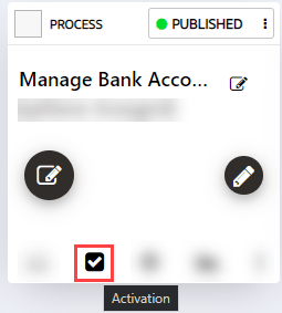
From the OGL Console, select the check icon![]() for the guide that you want to access.
for the guide that you want to access.
By copying the route value for a page (highlighted in the image below), the developer can copy the URL (or route, in the case of Fusion) for use in configuring activation settings.

Once the URL has been copied, it is just a matter of pasting that value in the field outlined in red below. Be sure to paste in the value exactly as copied and do NOT enclose the pasted URL in brackets ( [ ] ).

Important: If a page has been defined in the pages Manager, then the condition can be added as a simple condition (When Page is (or is not)). When a page becomes defined in Page Manager, OGL will update the corresponding guides to reflect the page name.
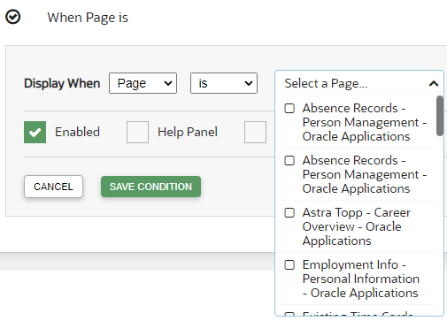
For more information, refer to Enabling Guide Activation Settings.
Note:
Some Fusion page routes may change during a Fusion quarterly update. In this case, you will need to manually update the page routes in the Pages manager. This will not happen automatically. As a best practice, we recommend that you review and update page routes with each Fusion quarterly update or consult with your Fusion administrator to identify any potential impacts on page routes and update them in the Pages manager accordingly.Products
Understanding Products
As your content library grows, it can become increasingly difficult to manage a large volume of guides, especially if you have OGL deployed to multiple Fusion products (e.g. HCM, ERP, etc.) and/or modules (e.g., Financials, Procurement, Human Resources, Recruiting, etc.). One way to organize your guides may be to categorize them by the Fusion products and modules to which they are associated. Whether you are using OGL in Fusion or other applications, product and module labels allow you to manage your guides more efficiently, making it easier to find, filter, and organize guides by their respective products and modules. The Products and Modules features enable console users to create, edit, and manage custom labels which can then be tagged to guides for use in filtering in both the Content library as well as Analytics.
Accessing the Interface
- On the OGL Console homepage, go to the left navigation panel.
You can see the Settings tab on the left navigation panel.
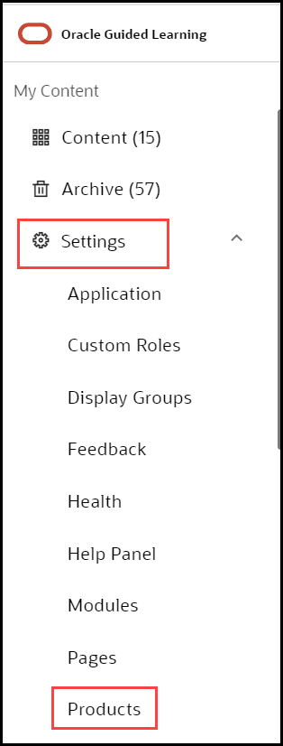
- Select Products from the Settings tab on the left
navigation panel. in the OGL Console.
Understanding the Interface
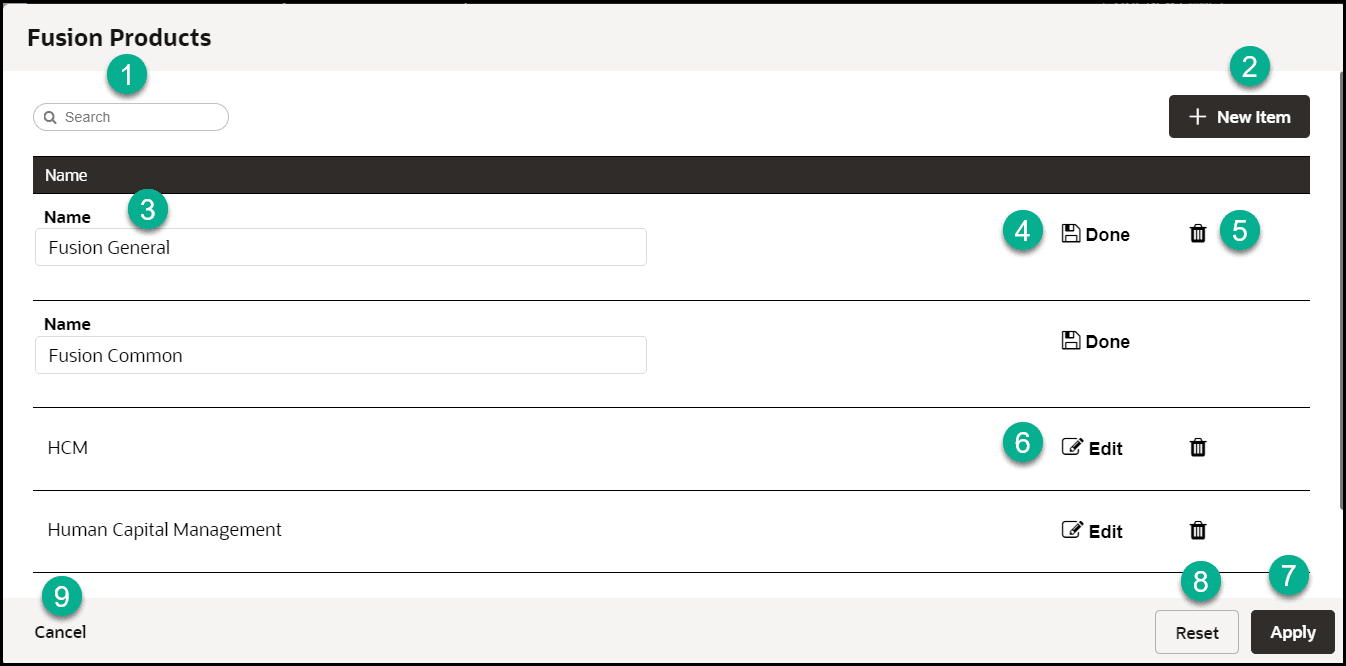
| Legend | Name | Additional information |
|---|---|---|
| 1 | Search box | Provides dynamic search functionality. |
| 2 | New Item | Adds a new line to the list. |
| 4 | Name field | The name field cannot be empty. Duplicate values are not allowed. |
| 5 | Done/Save | Saves the changes made to the field. The button only becomes active when an acceptable value is entered in the field. |
| 6 | Edit | Allows changes to be made to the field. |
| 6 | Delete | Deletes the line item. Action cannot be reversed and all linked content items will be disassociated. |
| 7 | Apply | Saves the changes made. A confirmation is displayed if the operation has either been completed successfully or failed with errors. |
| 8 | Reset | Reset the changes made. A warning will be displayed
if there are unsaved changes.
|
| 9 | Cancel |
Discards any changes that were made and closes the interface. A warning will be displayed if there are unsaved changes.
|
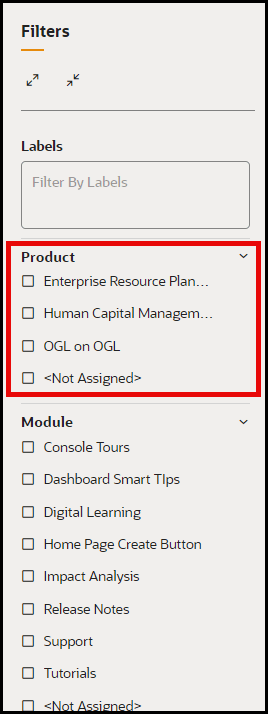
You can use the Product labels to filter your guides by their respective products.
Theme
Please note that modifying the Theme (Design Kit) might impact accessibility. For more information about Oracle's commitment to accessibility, see http://oracle.com/accessibility.
Accessing the Interface
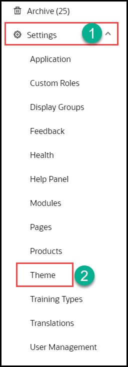
- On the OGL Console homepage, go to the left navigation panel.
You can see the Settings section in the navigation panel.
- Select the Settings dropdown menu.
- Select Theme in the left panel.
WYSIWYG Theme Editor
Customers may sometimes need to change their OGL theme to align with their corporate branding standards. Previously, OGL theme customization was limited to editing the HTML file within the OGL design kit, requiring users to have knowledge of HTML and CSS to make theme customizations.
With the new Theme Editor in OGL 25B, developers and administrators can now make changes to their OGL theme using a more user-friendly tool that incorporates a “What You See Is What You Get” (WYSIWYG) visual interface without the need to edit CSS rules in an HTML file.
This new feature offers a more convenient and efficient way to format the appearance of common OGL theme elements, such as tooltips, backgrounds, text, buttons, launch widget, smart tips, and help icons. Themes can be saved, imported, exported, and set for Development and/or Production environments.
In this first iteration of the WYSIWYG Theme Editor, users will be able to customize the primary, secondary, and tertiary colors of the following OGL theme components:
- Body Color
- Button, Launch Widget and Header Color
- Footer Color
- SmartTip Background, Icon Color, and Icon CharacterOn the OGL Console homepage, go to the left navigation panel.
The Theme Editor also allows users to preview their theme changes in real-time, save and name the theme, and set the theme for PROD and/or DEV environments. The Theme Editor also allows users to Duplicate, Export, Import, and Delete themes, as needed.
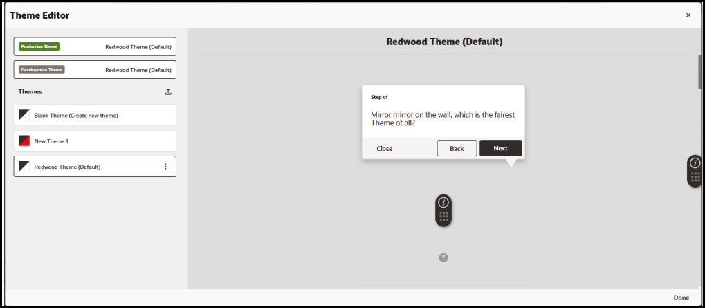
Launching the Theme Editor
From the OGL Console, select Settings > Theme
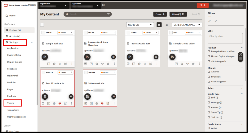
The Theme Editor modal opens:
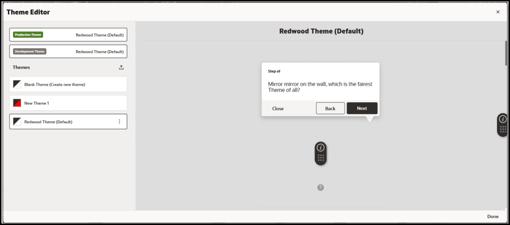
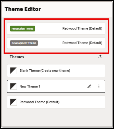
The currently set PROD and DEV themes are always listed at the top of the editor:
Importing Themes
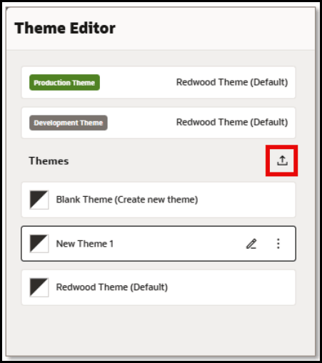
Selecting the Import Theme
button allows you to select and upload an existing theme (HTML file) from your file system.
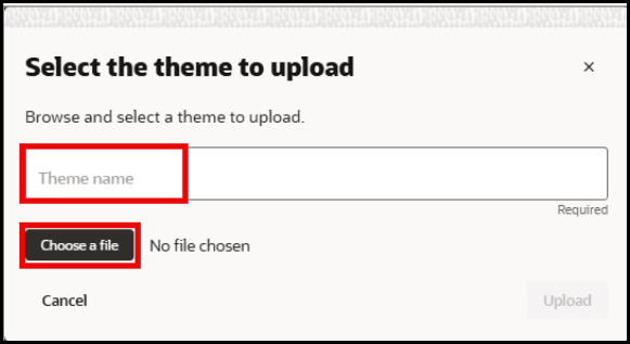
Enter a name for your theme and then select Choose a file to browse for an existing theme file.
Available Themes List
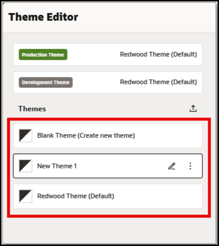
In the Themes section, users can choose from a list of available themes to edit or create a new Blank Theme.
Select the Edit
button next to any theme to open the Theme Settings for the selected theme.
Editing a Theme
The Theme Editor now displays:
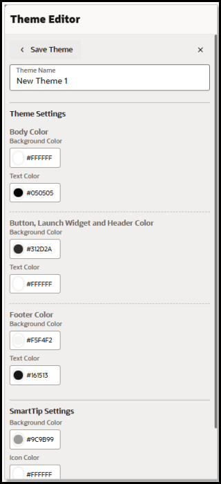
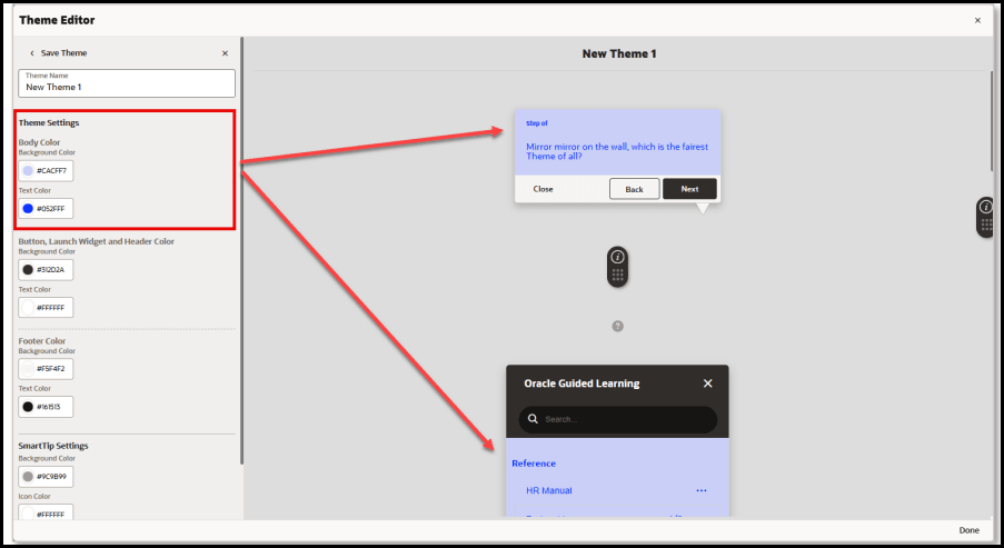
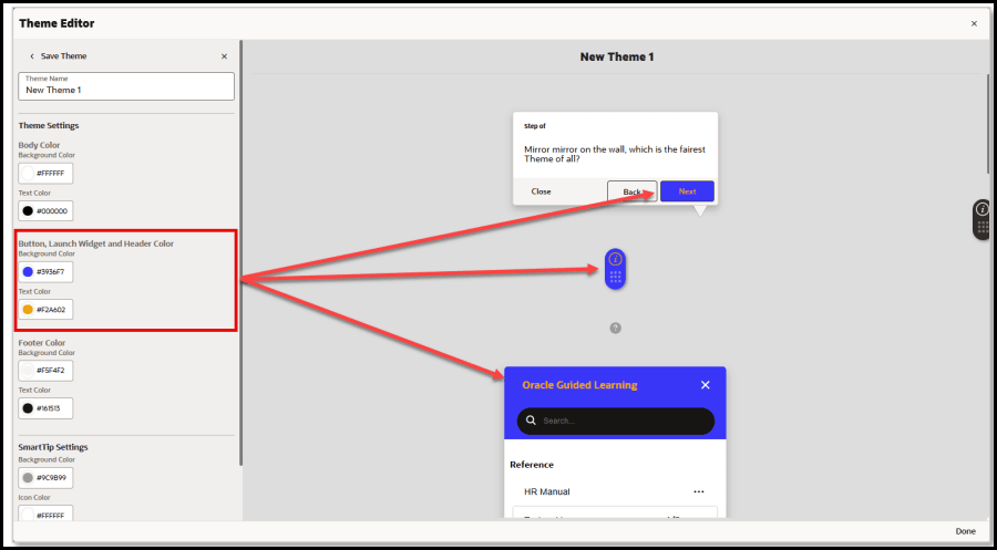
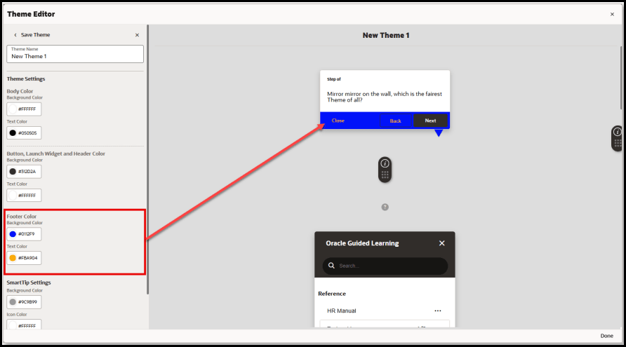
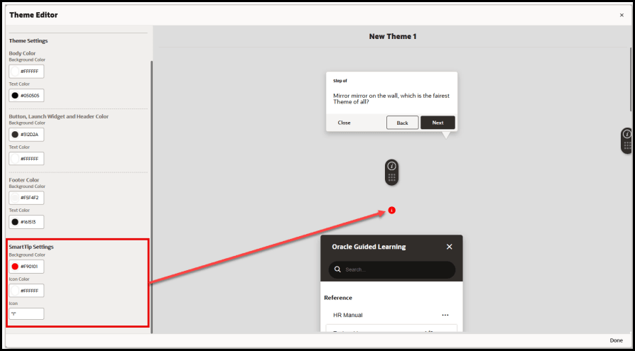
The following screenshots depict which theme elements will be affected by each theme setting:
Body Color – Background and Text:
Button, Launch Widget and Header Color – Background and Text
Footer Color – Background and Text:
SmartTip Settings – Background Color, Icon Color, and Icon (character)
Using the Color Picker
To change the color for an element, select the circle on the left of the color setting
to open the color picker. Colors can be selected by dragging the color slider to a desired hue, then selecting the desired shade of the color above. To pick a color, move your mouse cursor about the color picker (or use the arrow keys on the keyboard), then click on the desired color (or press ‘Enter’). Once selected, the color code will be displayed in the color field as a Hexadecimal code value.
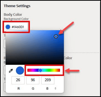
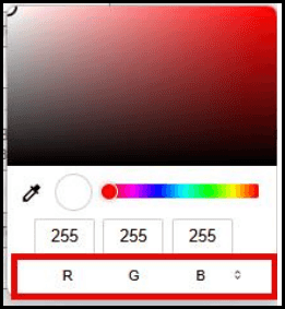
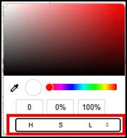
To change the color model, select the arrows ( ) to cycle between RGB, HSL, and HEX color modes.
RGB (Red, Green, Blue) Color Mode:
HSL (Hue, Saturation, Lightness) Color Mode:
HEX (Hexadecimal Code) Color Mode:
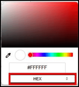
Note:
Colors can also be input as a Hex code, RGB, or HSL value directly into the color text field(s).Sampling a color on the screen
You can also pick a color by sampling the color of any pixel from anywhere on your screen using the Eyedropper tool.
Select the Eyedropper
![]() to change your mouse cursor into a magnifier that zooms into a selected
area(
to change your mouse cursor into a magnifier that zooms into a selected
area(![]() ). Move your mouse about the screen (or use the arrow keys) to position the
magnifier over any area of the screen. Place the center of the magnifier over a
pixel containing the color you wish to sample and click the mouse button (or press
the Spacebar) to sample that color. The color picker will update with the selected
color code value.
). Move your mouse about the screen (or use the arrow keys) to position the
magnifier over any area of the screen. Place the center of the magnifier over a
pixel containing the color you wish to sample and click the mouse button (or press
the Spacebar) to sample that color. The color picker will update with the selected
color code value.
Note:
To cancel and exit out of the Eyedropper/Magnifier tool, press the Esc key.Saving Your Theme
To save your theme changes, enter a name in the Theme Name field, then select Save Theme.
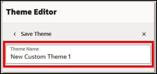
More Actions
Selecting the More…
button next to any theme will open the More Actions menu.
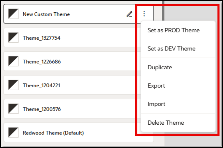
The following actions can be performed from the More Actions menu:
- Set as PROD Theme – Publishes the selected theme to the Production environment.
- Set as DEV Theme – Publishes the selected theme to the Development environment.
- Duplicate – Makes a copy of the selected theme and appends “- Copy” to the theme name.
- Export – Downloads the selected theme as an HTML file to your default Downloads folder.
- Import – Opens the Upload modal allowing you to select an existing OGL Theme HTML file to replace the selected theme
Border Settings in WYSIWYG Theme Editor
This new enhancement in the OGL Theme allows developers and administrators to easily customize Tip and Smart Tip borders through a user-friendly interface, eliminating the need to manually edit CSS in HTML files.
Tip Border Customization:
Set the border color and width for Tips in the Body Color section of Theme Settings. These settings apply to Tooltips, Feedback, and Task list components.
- Navigate to Theme Editor.
- Click Create New Theme or click the Edit icon to modify an existing theme.
- In the Body Color section, locate the Border Color option to set the border color for Tooltips, Feedback, and Task list components.
- Use the Border Width setting to define the thickness of the border in pixels.
- Changes will be reflected immediately in the preview panel on the right.
- Click Save to Dev and/or Save to PROD to apply the changes to the
respective environments.

Smart Tip Border Customization:
Configure the border color and thickness for Smart Tips in the Smart Tip Settings section. This allows you to add and control the thickness of borders specifically for Smart Tips.
- Navigate to the Theme Editor.
- Select Create New Theme or click the Edit icon to update an existing theme.
- In the SmartTip Settings section, find the Border Color option to customize the SmartTip border color.
- Use the Border Width setting to specify the thickness of the SmartTip border in pixels.
- All changes will be instantly visible in the preview panel on the right.
- Click Save to Dev and/or Save to PROD to apply the updates to the
corresponding environments.

Known Issues/Expected Behavior
Feature limitation: With OGL 25D Release, the following elements are not currently customizable using the Theme Editor:
- Search bar in the help panel
- Text area & Smiley's in the feedback modal
- Step guide menu drop-down in the player side
- Language menu drop-down in the player side
- Mouse hover color - Next button, Guide list & step guide launcher menu.
These theme elements and more will be customizable in future iterations of the Theme Editor. For now, users can still download their OGL Theme HTML file from which to make further customizations by editing the HTML code and CSS rules, as needed.
Configuring Themes
OGL includes several default themes. You can also customize tip colors, fonts, and tip positions as per your branding requirements.
Download the Design Kit
The Design Kit provides the ability to update the theme however you want, this article is meant to provide some basic guidelines and covers updating some of the basic attributes of the theme and does not cover advanced CSS methods.
- On the OGL Console homepage, go to the left navigation panel.
You can see the Settings tab on the navigation panel.
- Click the Settings tab, list of options are displayed.
- Select Themein the left navigation panel.

- Select the Upload/Download Theme tab.
The following interface is displayed.
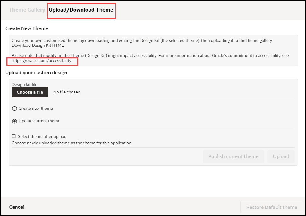
- Click Download the Design Kit HTML link.
This will download as file "OGL_Theme_Design_Kit..." HTML file. Ensure you rename the file accordingly.
- Save the HTML file to a local directory.
Note: Rename the file accordingly, our recommendation is to rename it using the following convention: Design_Kit_ORGNAME_DD_MMM_YYYY
Update the Design Kit
To update the design kit, you will need to use a suitable text/HTML editor.
- Open the Design Kit in a browser
- Open the same file with the HTML/text editor
- Find the CSS class and update the relevant attributes
- Save the changes, then refresh the Design Kit in the browser to preview the changes before uploading them to the OGL Console
Upload the Design Kit
- Select the Content tab in the OGL Console
- Select Themein the left panel
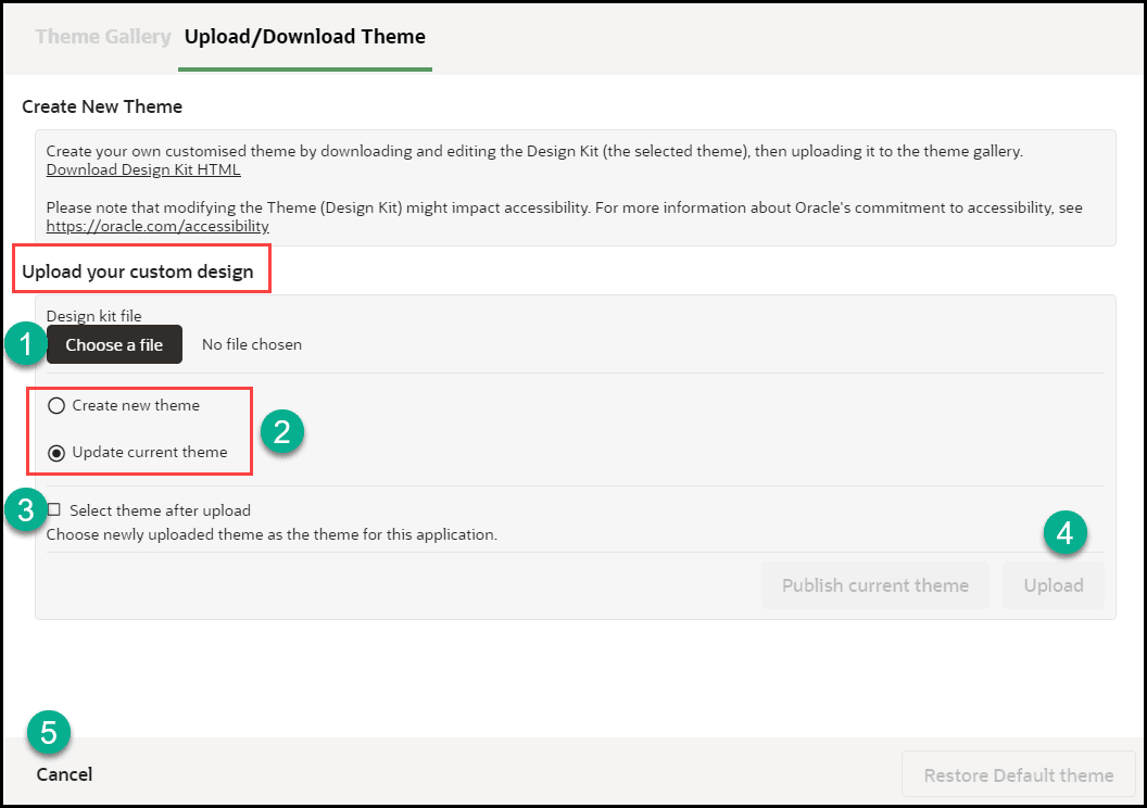
- Select Upload Theme
- Select Choose File (A), then select the file saved in your local directory.
- Select Create new theme (B). Note: Select Update current theme if you are updating an existing custom theme
- Check the Select new theme after upload check-box
Common CSS Rules in the Guided Learning Theme
Note:
This serves as a guideline.To update the colors of the Guided Learning tooltips, find the expected Hex codes, then replace them with your preferred codes:
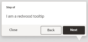
| Swatch | Find | Replace with |
|---|---|---|
| #3E3834 | Your own Hex code | |
| #F5F4F2 | Your own Hex code |
Note: Perform a Find & Replace to quickly update
| Image Reference | CSS Rule |
|---|---|
/*To change the color of the Help Widget*/

.ogl-rw-widget {
     background-color: ##3E3834;
}
|
|
/*To change the Help Widget Icon*/

.ouc-widget__launch-icon {
     background-image: url(REPLACE_WITH_ICON_URL);
}
|
|
 |
/*To change color when you hover over the Help Widget*/

.ogl-rw-widget--launch a:hover {
     background-color: #F5F4F2;
}
|
 |
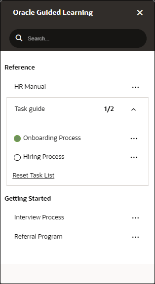
/*To change the Widget Help Panel header background*/

.ogl-rw-help-widget-header--upper {
     background-color: #3E3834;
}

/*To change the color of Widget Help Panel header (search bar area)*/

.ogl-rw-help-widget-header--lower {
     background-color: #3E3834;
}


/*To change the color of search bar input area*/

.rw-searchbar {
     display: flex;
     flex-direction: row;
     align-items: center;
     padding: 0 15px;
     font-family: Oracle Sans;
     background-color: #F5F4F2;
  }
|
 |
/*To change the font in help widget*/

.ogl-rw-help-widget-item--title {
    font-family: sans-serif;
}
.ogl-rw-help-widget--content-group--title {
    font-family: sans-serif;
}
.ogl-rw-task-list-item--title {
    font-family: sans-serif;
}
.ogl-rw-task-list--reset{
    font-family: sans-serif;
}
|
/*To make changes to tip footer*/

div.sttip div.tooltip.ogl-rw-tip div.stFooter, div.sttip div.tooltip.ogl-rw-tip.ogl-rw-hovertip.showLaterBt div.stFooter {

background: #3E3834;

/*height: 48px;*/ /*For changing the padding height on tip footers*/

}

/*To make changes to Next Button, background colour and border color was changed to match with the button colour*/

div.sttip div.tooltip.ogl-rw-tip div.stFooter .next-btn {

    background-color: #F5F4F2;

    border: 1px solid #F5F4F2;

}

/*To change the colour of Close Button text*/
div.sttip div.ogl-rw-tip div[data-iridize-role='closeBtPane'] button {
    color: #FFFFFF;
}

/*Removing the Back Button Border and changing the colour of back button text*/
div.sttip div.tooltip.showPrevBt.ogl-rw-tip .stFooter .default-prev-btn {
    color: #FFFFFF;
    border: none;
}
|
|
|
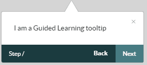
Figure 5-1 Left side tip pointer 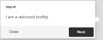 |
/*To make changes tip pointers, to match the colour of the tip pointers with either buttons or tip footer background*/

/*Left side tip pointer*/

div.sttip div.tooltip.ogl-rw-tip.in.top.top-left div.tooltip-arrow.second-arrow {

    border-top-color: #3E3834;

}
|
|
Figure 5-2 Right side tip pointer  |
/*To make changes to second arrow*/

div.sttip div.tooltip.ogl-rw-tip.in.top div.tooltip-arrow.second-arrow {

    border-top-color: #3E3834;

}

/*To make changes to right side arrow*/

div.sttip div.tooltip.ogl-rw-tip.ir-hoverTip.in.top div.tooltip-arrow.second-arrow {

    border-top-color: #3E3834;

}
|
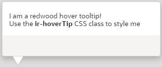 |
/*Smart-tip color*/ div.ir-marker { background-color: #3E3834; } /*Changing the icon of the smartitp*/ div.ir-marker:after { content: '?';(Change the "?" to any other special character) } |
 |
/*To change the Remind me later button color, border color and background color*/

div.sttip div.tooltip.ogl-rw-tip.showLaterBt button[data-iridize-role='laterBt']{
    border: solid 1px #F5F4F2;
    background: #F5F4F2;
}
|
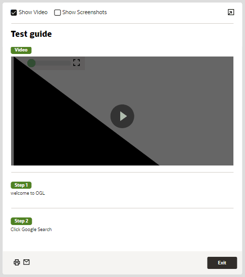 |
/*To change the color of the Step Guide view border*/

.iridize-step-guide-frame {
     border-right: solid 5px #00AAFF;
}

/*To change the font of step guide*/

.ogl-step-guide--step--caption {
    font-family: sans-serif;
}
.ogl-rw-step-guide--title {
    font-family: sans-serif;
}
|
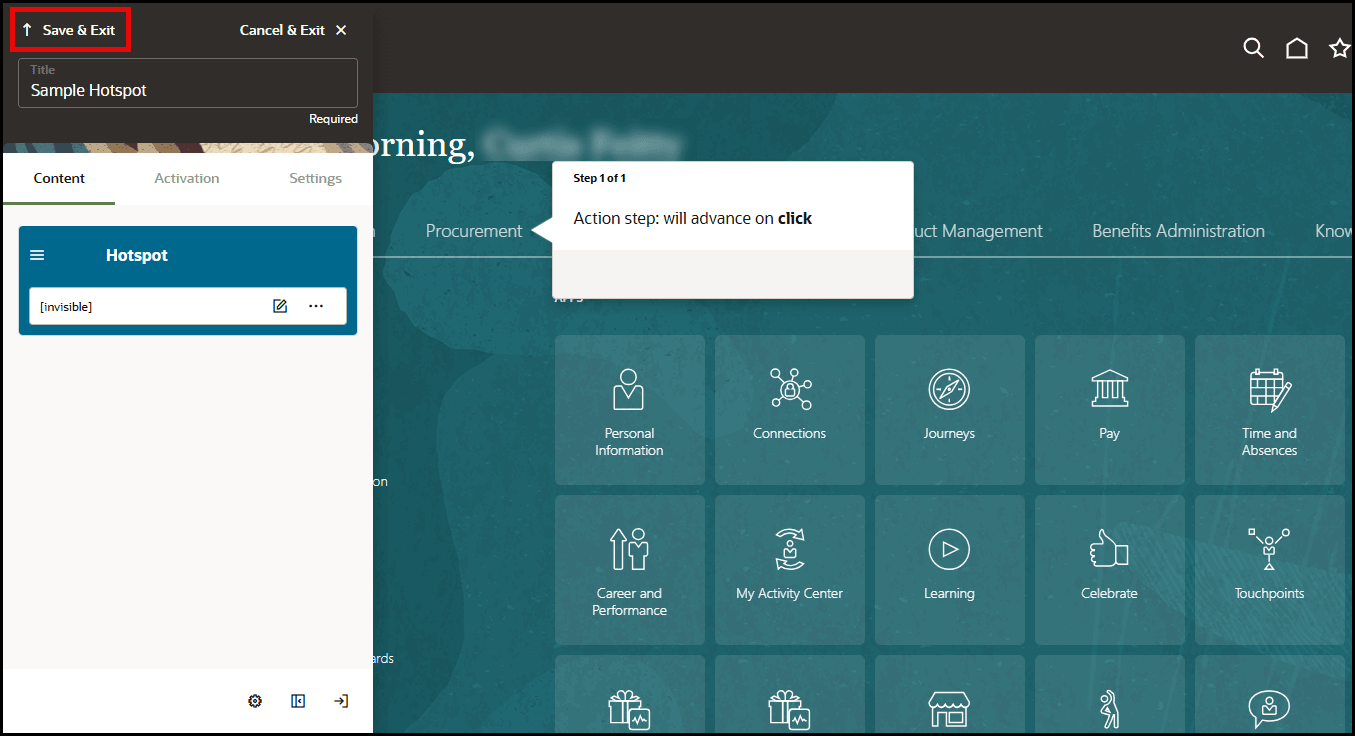 |
/*to change the Step Guide Exit Button Color*/

.ogl-rw-step-guide--footer--exit-btn {
     background-color: #00AAFF;
}
|
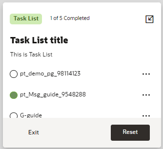 |
/*To change color of the task list footer*/

.ogl-rw-task-list--footer {
     background-color: #3E3834;
}


/*To change task list exit button*/

.ogl-rw-task-list--footer--exit-btn {
    color: white;
    width: 88px;
    height: 36px !important;
    border: none;
    cursor: pointer;
    font-size: 13.75px;
    background-color: transparent;
    font-weight: 600;
    margin-left: 16px;
}


/*To change task list reset button*/

.rw-btn {
    background: #F5F4F2;
}

/*To change the font for task list*/
.ogl-rw-task-list--title {
    font-family: sans-serif;
}
.ogl-rw-task-list--desc{
    font-family: sans-serif;
}
.ogl-rw-task-list--header--completion-text{
    font-family: sans-serif;
}
|
|
/*To change color of the step guide icon*/ .uc-panel__item__step { color: #00AAFF;}
|
|
|
/*To change color of the step guide icon on hover*/ .uc-panel__item__step:hover { color: #00b5ff;}
|
|
|
/*To change the smart tip an i with a matching border find div.ir-marker in the theme and replace with the below*/ div.ir-marker {
/*changing this will affect the color of the help icon*/
background-color: #FFFFFF;
border: 2px solid #1b3b3f;
border-radius:15px;
font-weight: bolder;
font-size: 14px;}
/*To change the ? to an i find div.ir-marker:after and replace with the below*/ div.ir-marker:after{
content: 'i';
color: #1b3b3f;}
|
|
 |
/*To change the background color*/ div.ir-marker {
background-color: #12bc8d;
}
/*To change the ? to another letter, add the following CSS rule to the design kit if it doesn't already exist*/ div.ir-marker:after {content: 'i';}
/*To change the ? to my own custom image, add the following CSS rule to the design kit if it doesn't already exist*/ div.ir-marker:after {content: none;}
div.ir-marker {
background: url(data:[your image goes here])
no-repeat
left center;
}
/*You can use the following service to get the Data URI of your image - https://dopiaza.org/tools/datauri/index.php*/ |
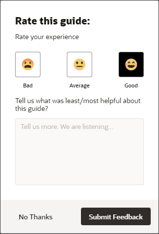 |
/*To change feedback hover over color*/
.ogl-rw-feedback--rating > input:checked + label {

    background-color: #F5F4F2;

}

/*To change feedback footer color*/
.ogl-rw-feedback--footer{
    background-color: #3E3834;
}

/*To change Feedback No Thanks Button*/
.ogl-rw-feedback--no-outline-btn {
    color: #3E3834;
}

/*To change Feedback Submit Button*/
.ogl-rw-feedback--fill-btn {
    background-color: #F5F4F2;

/*To change the button color*/
    color: #FFFFFF;

/*To change color text within button*/
    color: #FFFFFF;
}
|
Custom CSS Rules for Guided Learning Theme
Enabling Multiple Styles in the same Guide
Guided learning allows for custom CSS classes where there is a requirement to have different formatting for tips or help icons within the same guide (or even the same step). An example of this would be having a different look for Smart Tip with varying levels of information, you could have red, amber, and green alerts with varying information.
All of your CSS styles must go between the IRIDIZE_CUSTOM_THEME_START and IRIDIZE_CUSTOM_THEME_END comment lines in the Design Kit. Examples are in the table below. You can set your own class names (i.e. ORG_CUSTOM1 instead of RED_ALERT).
| Reference Image | CSS Rule |
|---|---|
| Theme default, no custom CSS | |
 |
/*The following code will result in the help icon
having a red background when the RED_ALERT class is
active*/div.RED_ALERT.ir-marker{background-color: red;} |
 |
/*The following code will result in the help icon
having an amber background when the AMBER_ALERT class is
active*/div.AMBER_ALERT.ir-marker{background-color: #F7AC08;} |
/*The following code will result in the help icon
having a green background when the GREEN_ALERT class is
active*/div.GREEN_ALERT.ir-marker{background-color: #599964;} |
|
 |
Theme default, no custom CSS |
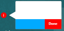 |
/*The following code will result in the Next and Done
buttons being RED when the RED_BTN class is
active*/div.sttip div.tooltip.RED_BTN div.stFooter [data-iridize-role="nextBt"] {
background-color: red;
} |
 |
/*The following code will result in the Next and Done
buttons being AMBER when the AMBER_BTN class is
active*/div.sttip div.tooltip.AMBER_BTN div.stFooter [data-iridize-role="nextBt"] {
background-color: #F7AC08;
} |
 |
/*The following code will result in the Next and Done
buttons being GREEN when the GREEN_BTN class is
active*/div.sttip div.tooltip.GREEN_BTN div.stFooter [data-iridize-role="nextBt"] {
background-color: #599964;
} |
| Grey image missing | /*The following code will result in the back button
being grey when the GREY_BTN class is
active*/div.sttip div.tooltip.GREY_BTN div.stFooter [data-iridize-role="prevBt"] {
background-color:grey;
} |
 |
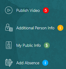
/*The following code will result in the help icon
having a red level indicator as 5 when the RED_ALERT class is
active*/div.RED_ALERT.ir-marker:after {content: "5";} |
 |
/*The following code will result in the help icon
having a the $ when the GREEN_ALERT class is
active*/div.GREEN_ALERT.ir-marker:after {content: "$";} |
Once the updates have been made, upload the Design kit to Guided Learning (see Upload the Design Kit in Configuring Themes).
Set the Custom CSS Class for Tooltips
- Open the item with the OGL Full Editor
- Expand the Display Settings section in Step Settings
- Find the Custom classes field and set the custom class for the
tooltip
Note: Set multiple custom classes by separating the class name with a single whitespace ( <custom_class_name_1><whitespace><custom_class_name_2><whitespace><custom_class_name_3>)
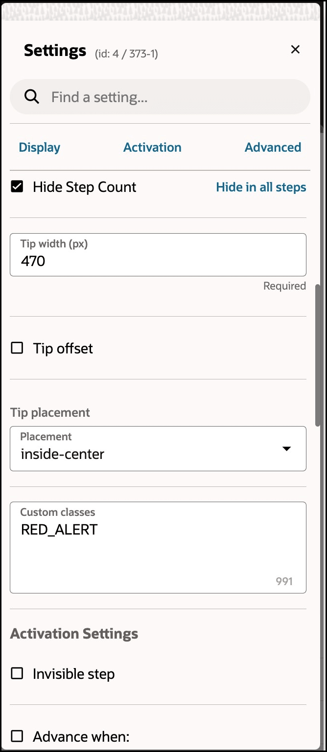
- Save the changes and close the OGL Editor
- Validate the changes in your test environment
Translation
Oracle Guided Learning is a global platform that caters to users from diverse linguistic backgrounds. It is designed to be inclusive and accessible, allowing you to customize your guides in multiple international languages. The following articles explain the process of translating guides and managing multi-language guide content. Translation of guides allows you to dynamically control which language of the guide will be displayed to the end user. Once the guides are exported you can translate the relevant text in the provided files and import them back to OGL with the new language. You can translate your guides manually using an external translation service or use OGL's new Automated Machine Translation feature. The Translation feature is available only to OGL Premium accounts.
Note:
For information about OGL Premium, visit: https://education.oracle.com/oracle-cloud-guided-learning-premiumNote:
- Please remember that with OGL, translations are only available from the generic language of English to other languages. It is not possible to use machine or automated translation to translate guides that were originally created in other languages, including US English.
- Please make sure to create all content in the designated folder Generic Language.
- The guides in the Generic Language folder are the main guides, and all the
edits are done in the main guide, like:
- Additional steps, adding a smart tip, removing a step.
- When creating English guides, it is crucial to consider the possibility of them being translated into foreign languages in the future. For this reason, the tip width of each step should be adjusted accordingly.
- Adding additional selectors for foreign languages.
- Text updates are done in the respective languages using the OGL Content Editor.
- To ensure a successful translation with Machine Translation and Automated Translation, each step in a guide should not exceed 5000 characters, including HTML tags. If a step is longer than 5000 characters, the translation attempt will fail and result in an error.
- Guides must be published or unpublished in all the foreign languages it was translated into.
- If you deactivate a guide in the default OGL language folder, it will also be deactivated in the foreign languages folder, and vice versa.
Multi-Language Functionality
The Multi-Language functionality allows you to create copies of an OGL guide (i.e., process guide, smart tip, etc.) into additional languages (i.e., An English worded OGL item can be made available in Dutch, French, etc.). With this feature, the original guide and all translated versions of the guide will all share the same apiName. Once the guide has been duplicated, you can export the guide contents and properties into a ZIP file to be translated using an external translation service. Once translated, you will be able to import the guide and properties back into your OGL content library to be deployed in their target languages for end users to consume.
Tip:
OGL's multi-language functionality supports supports over 290 languages.Automated Machine Translation
Beginning in 23C Release, OGL now offers Automated Machine Translation as an enhanced translation method. With this method, you can instantly translate guides into provided languages using AI machine translation directly from within the OGL console, without the need to export/import guides.
See the following subsections to learn more about how to translate your guides.
Automated Machine Translation
Improving upon OGL’s existing multi-language support capabilities, this new functionality now instantly translates guides into provided languages using machine translation directly from within the OGL console, without the need to export/import guides. This feature is available only to OGL Premium accounts.
Note:
For information about OGL Premium, visit: https://education.oracle.com/oracle-cloud-guided-learning-premium- Not all languages are supported at this time. Future enhancements are planned to improve upon this feature’s capabilities, performance, and expand the library of available languages.
- This feature will only translate guide contents, not application properties or selectors.
- Each translation is subject to a character limit of 5,000 characters per step (including HTML tags).
- If the selected Generic Language is not on the list of available languages as listed in the Translation dialog box, the translation will fail and return an unspecified error message.
Note:
This feature requires the following OGL security role and permissions: Owner role → Change Application Settings permissions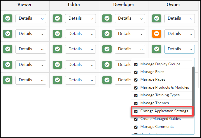
Translating Individual Guides
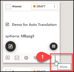
- From the My Content page, select the “More…” icon in the lower
right corner of the guide you wish to translate.
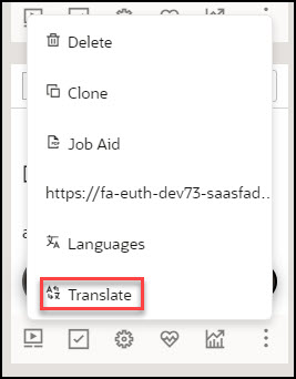
- Select Translate from the actions menu.
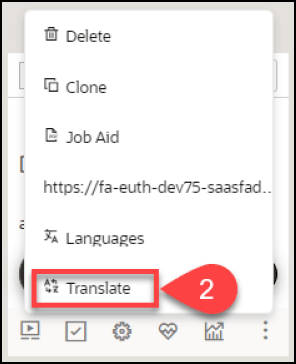
- The Translation modal opens.
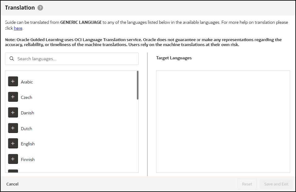
- Select the “+” button next to the language(s) you wish to translate the
guide from the list of available languages on the left. Any selected languages
will appear in the Target Languages, then select Save and Exit when
done.
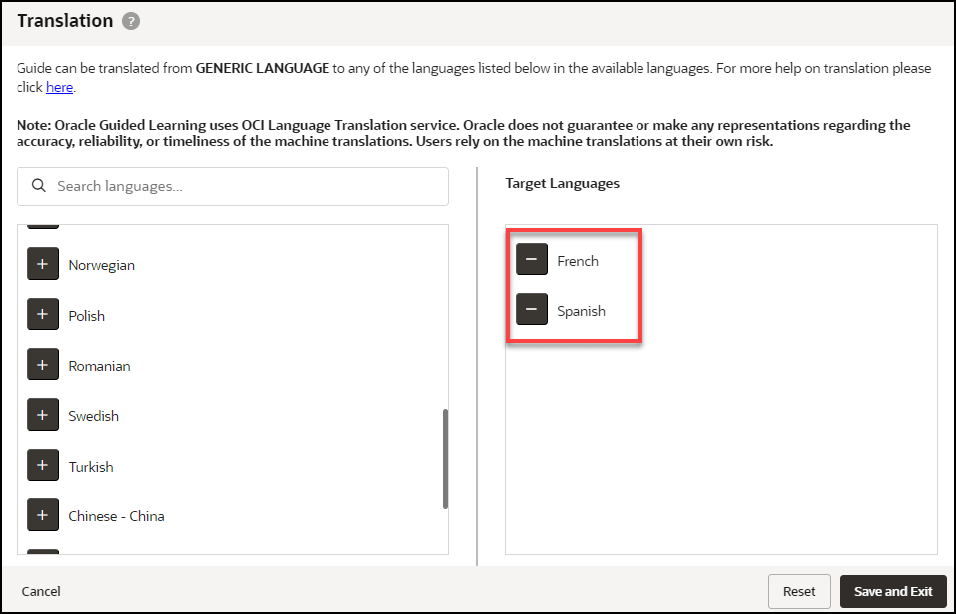
- A confirmation dialog box will appear (read carefully) and will prompt you to
confirm the action.

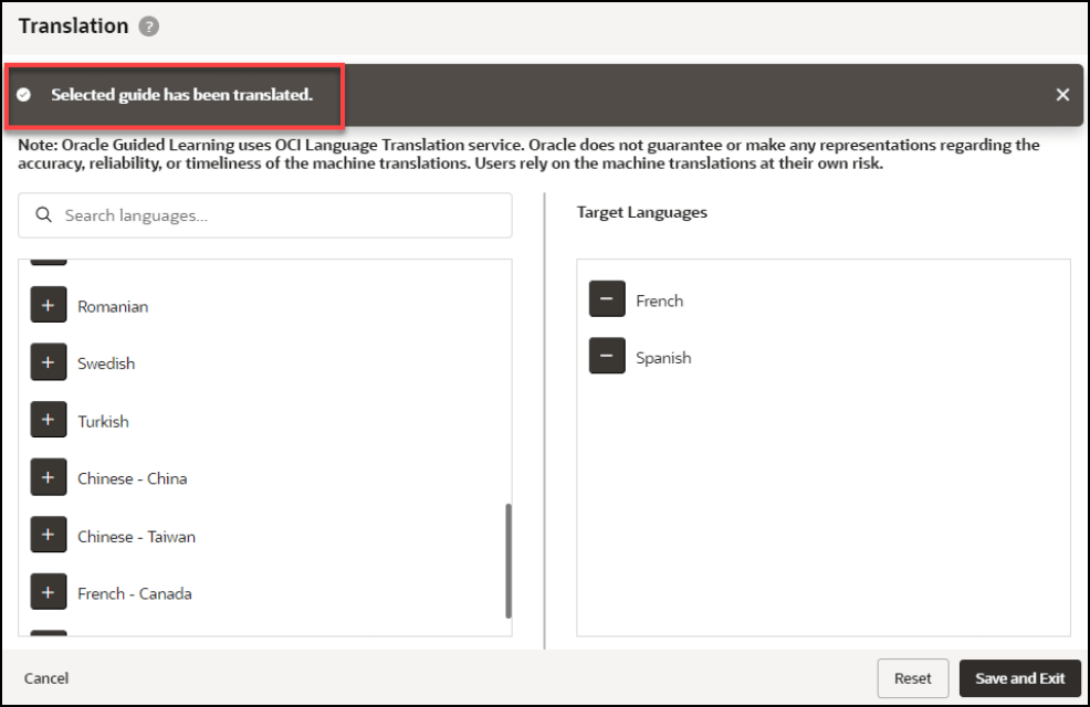
- Once the translation is complete, a confirmation message will appear at the top
of the Translation modal to confirm that the guide has been
translated.

Note:
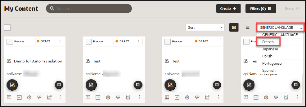
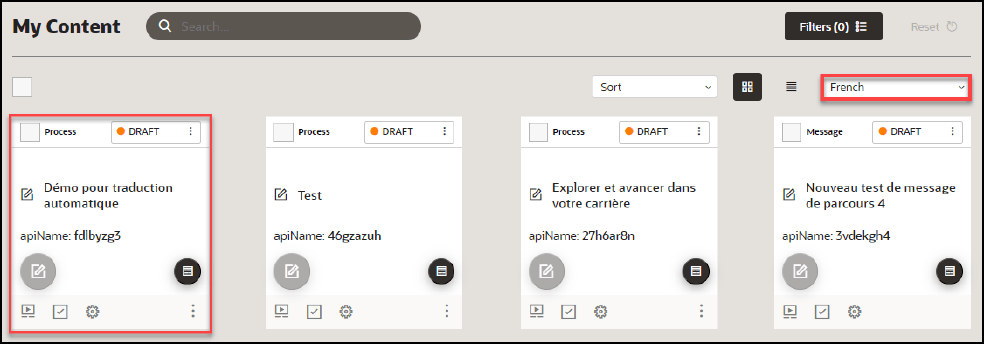
Translations cannot be undone. To restore the guide to a previous version, use the Version History in the Guide Status. - The translated guides will now appear in their respective language folders in
the My Content page. To toggle between each language folder, select the language
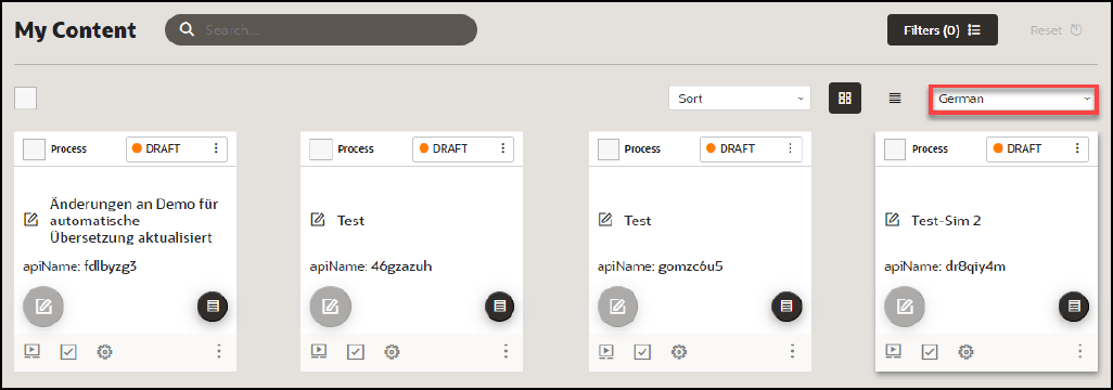
dropdown menu.
- If you make any content changes to the original guide and then translate the
guide again, you will be prompted with an option to retranslate the guide for
all target languages.
Translating Multiple Guides (Bulk Action)
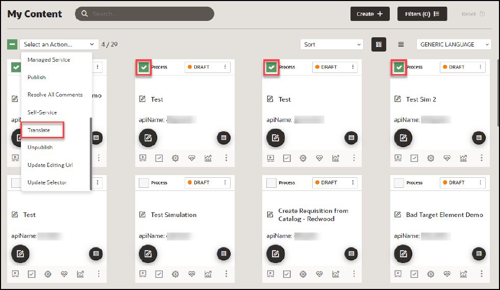
- From the My Content page, select one or more guides that you wish to
translate, then select Translate from the Bulk Actions dropdown
menu.
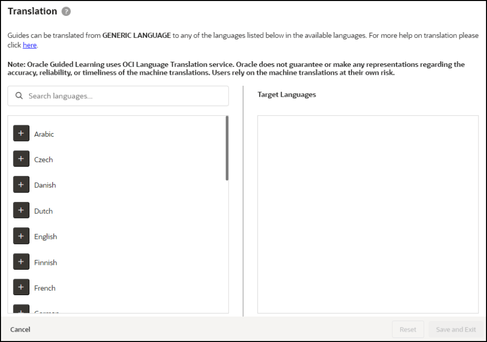
- The Translation modal opens.
Note:
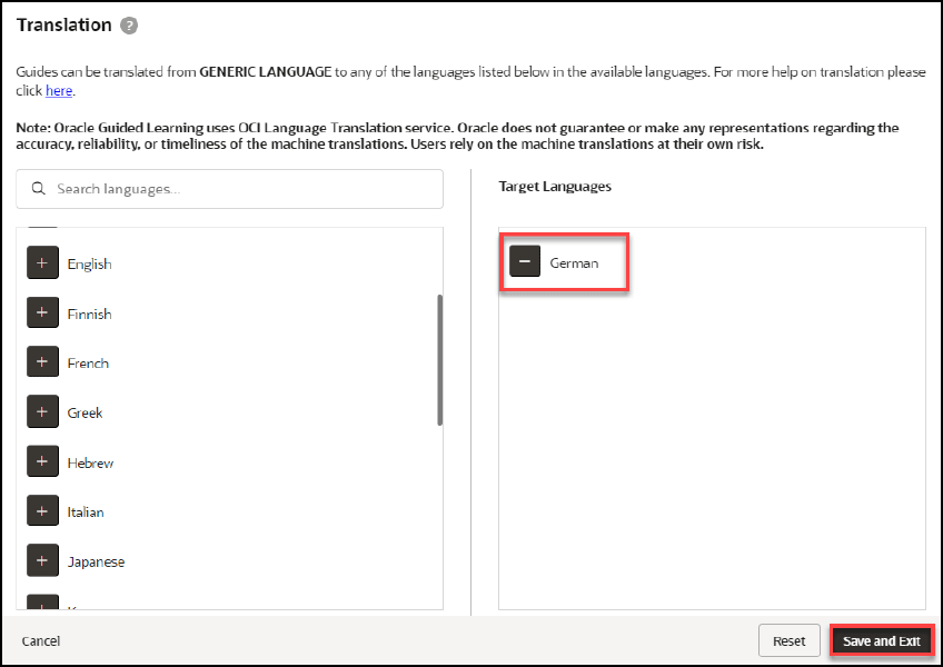
With bulk translations, any pre-existing translated languages will not be displayed in the Target Languages column. Any translations applied using Bulk Actions will affect all selected guides and will overwrite any existing translations. To translate specific guides into specific languages, consider translating the guide(s) individually. - Select the “+” button next to the language(s) you wish to translate the
guide from the list of available languages on the left. Any selected languages
will appear in the Target Languages, then select Save and Exit when
done.
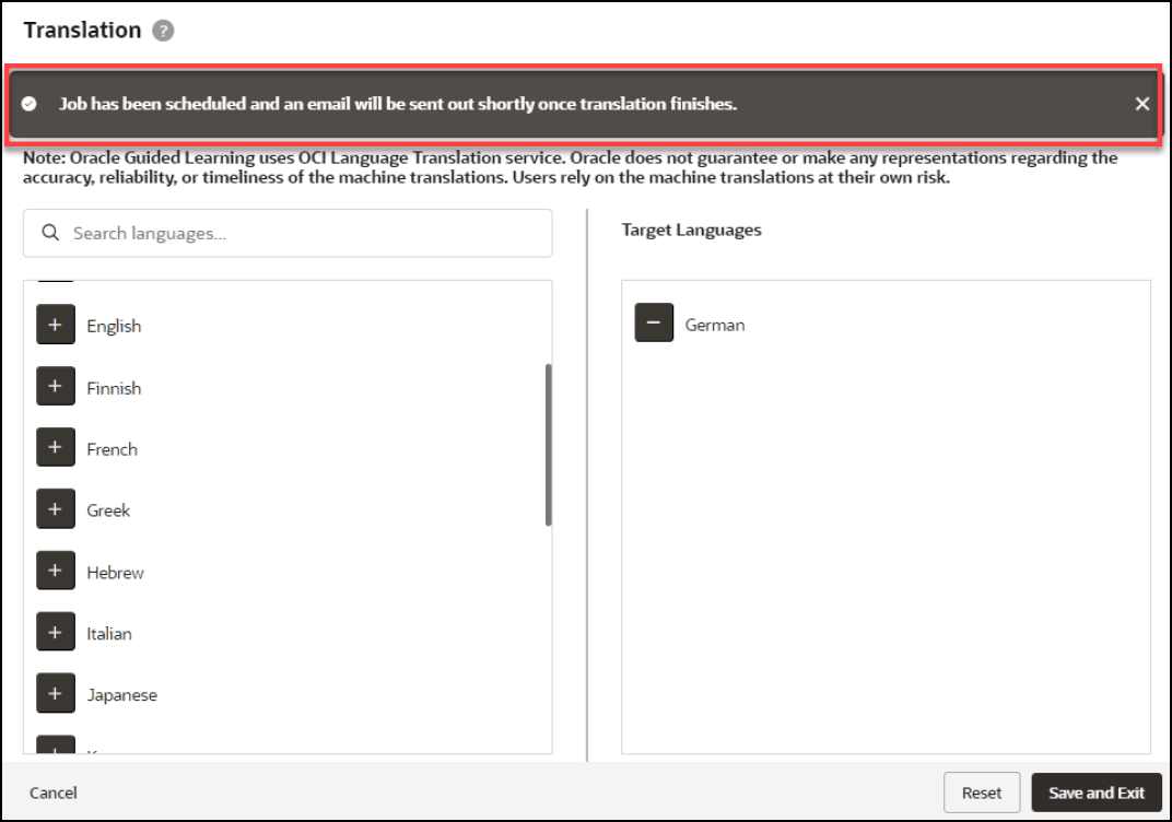
- Once the translation is complete, a confirmation message will appear at the top
of the Translation modal indicating that the job has been scheduled and that an
email will be sent to notify you when completed.
- Check your email inbox for a message from Oracle Guided Learning
<noreply_ogl@comm-apps.ou.ocs.oraclecloud.com>. The message should look like
this:
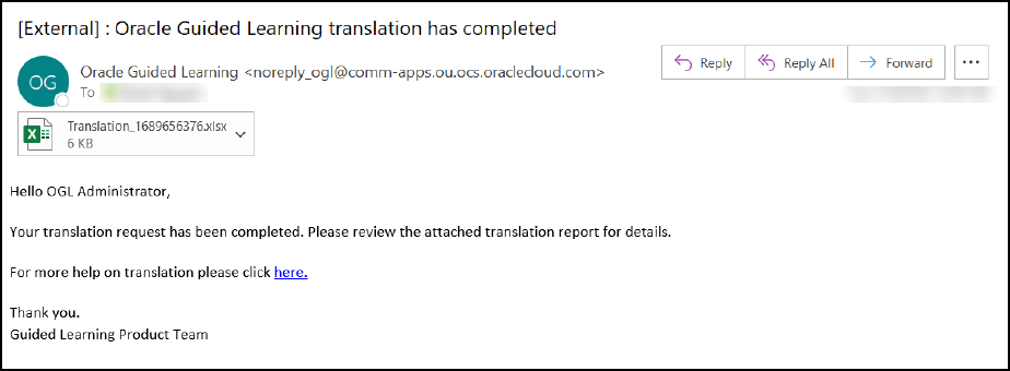
- Open the attached Excel spreadsheet to view the translation status of all
selected guides.

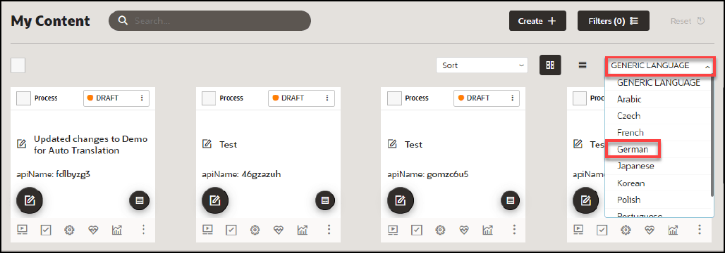
- The translated guides will now appear in their respective language folders in
the My Content page. To toggle between each language folder, select the
language dropdown menu.
Multi-Language Functionality
Overview of Multi-Language Functionality
The Multi-Language functionality allows you to create copies of an OGL item (i.e., guide, smart tip, etc.) into additional languages (i.e., An English worded OGL item can be made available in Dutch, French, etc.).
Note:
Kindly note that this feature does not have an automatic translation capability for the guides.The screenshot of the OGL console below highlights the default language or the currently selected language if there are multiple options available in the account.

Important:
The Multi-Language functionality:
- Does not apply to Training Content (Use the properties file to translate these item types. Refer to OGL Console Left Panel - Translation.
- Allows use of the Content Editor in the alternate language folder to perform quick manual translations without having to wait on/purchase a translation service.
- Updates (OGL item structure & settings ) are inherited. You only need to update the text in alternate language OGL item(s).
- Allows you to have different languages for different OGL items (i.e., OGL Item A can have languages EN(default), FR, DE, and OGL Item B can have languages EN(default), ES, NL).
Default Language Setting
Previously Oracle Guided Learning’s default language for guides was English. From OGL release 21A, we have the facility to set the default language to any Fusion-OGL-supported language.
Accessing and Using the Multi-Language Functionality
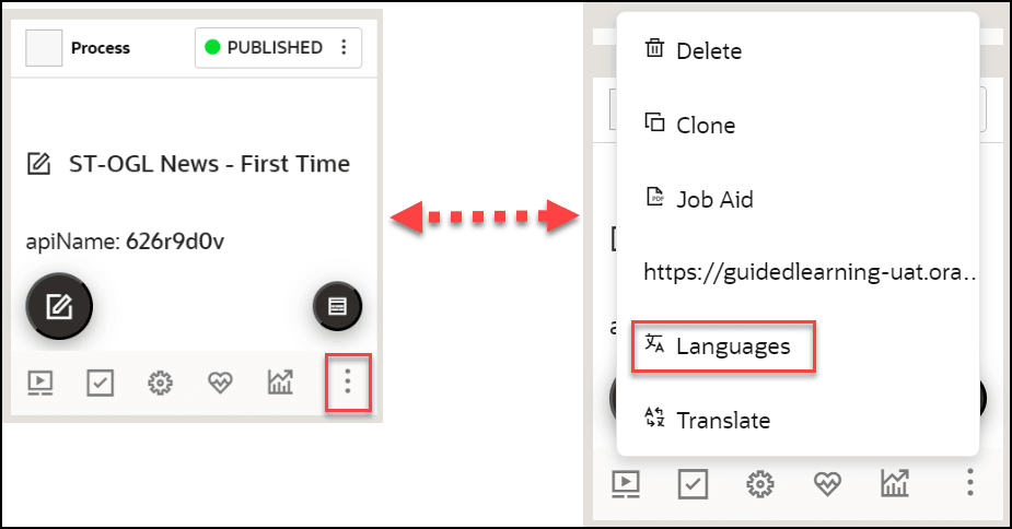
- On the OGL console, go to Contents.
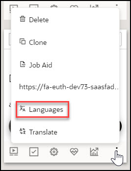
- On the target guide, select the ellipsis icon (
 ) and then Languages (
 ).
).
The Languages modal window is displayed now.
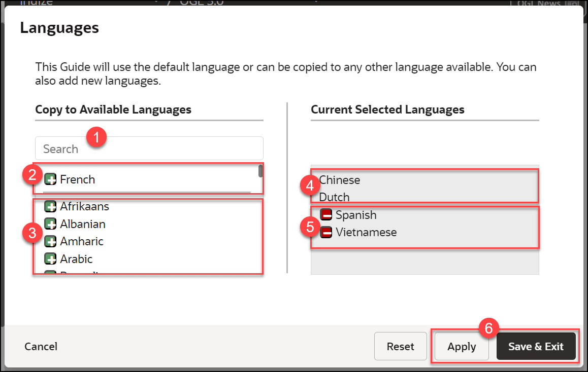
 Language Search Field
Use this field to search for a target language. Search results are filtered dynamically.
 Existing Languages in the Account/AppID
Languages currently available in the account/appID are displayed in this section (at the top). A horizontal line acts as a divider between 2 and 3.
 OGL Supported Languages
This section lists the OGL supported languages. You can select a language by clicking the green button (
 ). The selected language will be listed in the Current Selected
Languages section (5).
Restriction:
Although there might be an extensive number of languages listed in OGL, for Fusion only the languages listed below are supported.- Arabic
- Chinese (Simplified)
- Chinese (Traditional)
- Czech
- Danish
- Dutch
- English
- Estonian
- Finnish
- French
- French (Canadian)
- German
- Greek
- Hebrew
- Hungarian
- Italian
- Japanese
- Korean
- Latvian
- Lithuanian
- Norwegian
- Polish
- Portuguese (Brazilian)
- Portuguese (European)
- Romanian
- Russian
- Slovak
- Spanish
- Swedish
- Turkish
 Current Selected Languages - Previously Created
When an OGL item has an existing copy in alternate languages (i.e English) the languages are listed first as read-only.
 Current Selected Languages - To be added
Current language selections are listed below the existing languages for the OGL item. To remove a language from the current selection, click the red button (
 ).
).
 Apply and Save and Exit buttons
Once you have made your selections, click on Apply, then Save & Exit to create alternate language copies of the OGL item.
- Choose the language(s) to which the guide needs to be translated. You can select
multiple guides at once.
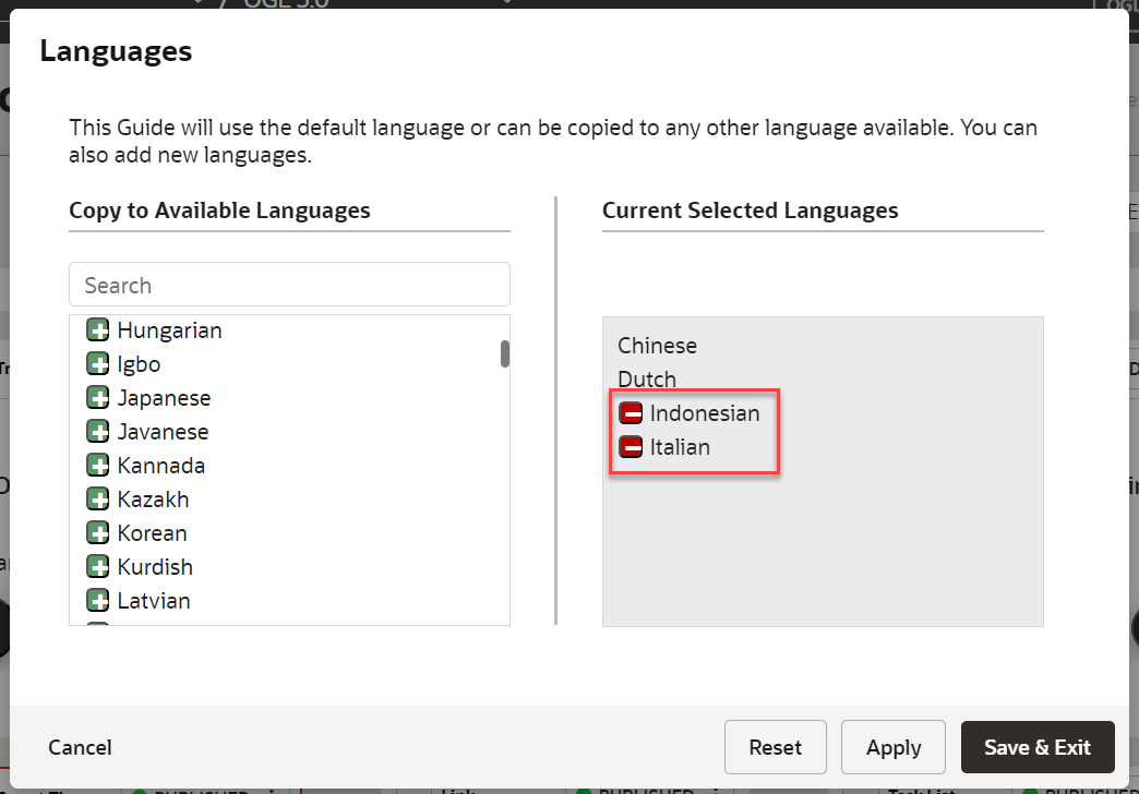
- Select Save & Exit.
The guide is now cloned.
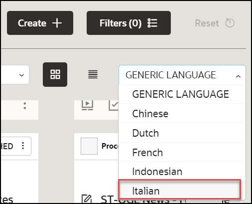
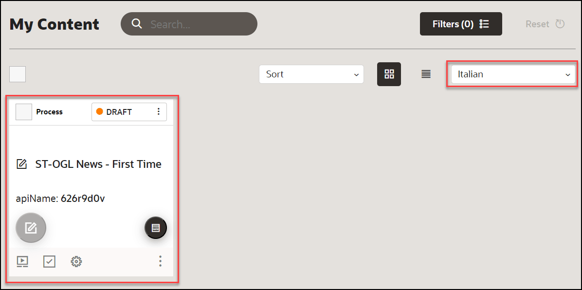
- Navigate to the specific language folder to which you have
translated the guide.
The guide is now cloned with same API ID.
Note:
Kindly note that this feature does not have an automatic translation capability for the guides. Once you have cloned the guide, it will remain in the generic language, and you will need to manually translate the guide or use an external translation service/purchase a translation service. Another option would be to manually translate the guide through a third-party translator such as Google Translate for a quick translation. - Select here to learn how to translate the guide using an external translation
service.
or
Contact your OGL Account Manager to purchase a translation service.
- Alternatively, use a third-party translator such as Google Translate for a quick
translation.
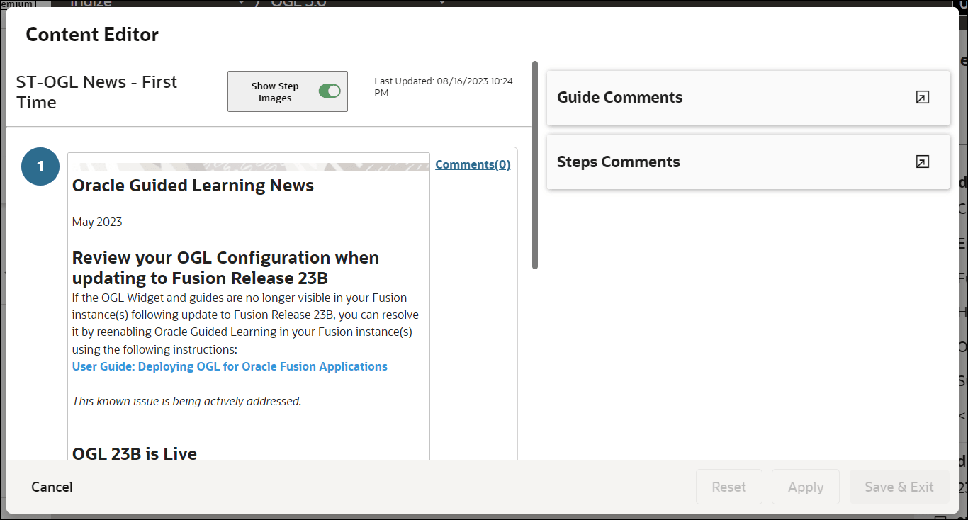
- Open the content editor of the guide that you want to
translate.
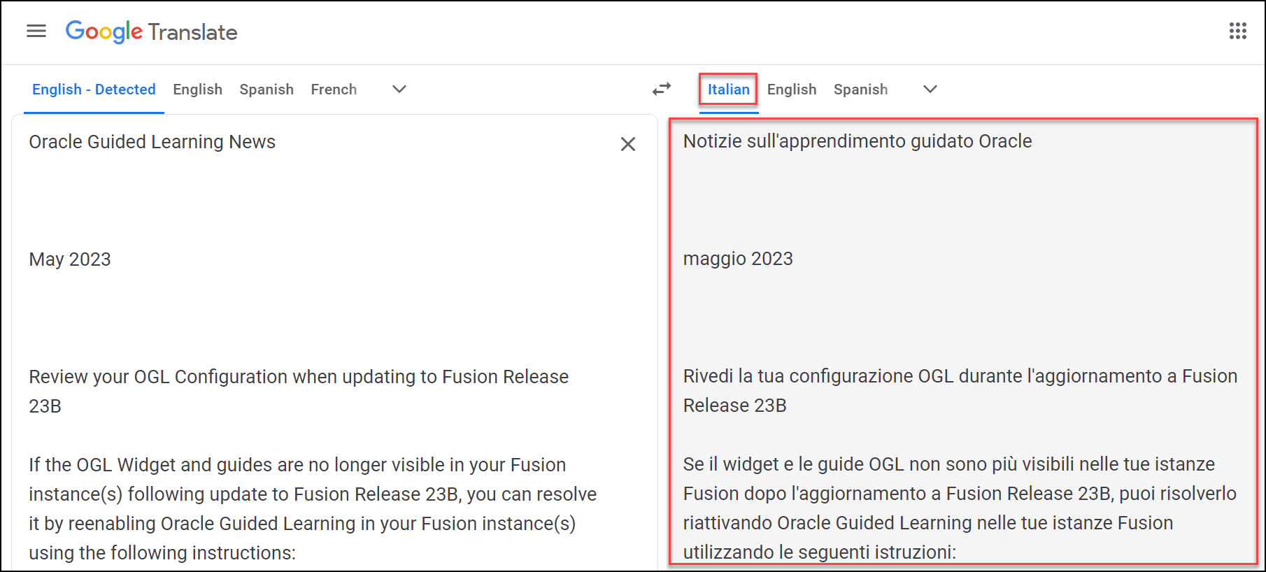
- In a new browser tab, go to Google Translate.
- Copy the contents from the content editor and paste it into the Google Translator's input column.
- Select the desired output language, and the content is
instantly translated.
- Copy the translated content from Google Translate and paste it back into
the content editor of the guide.
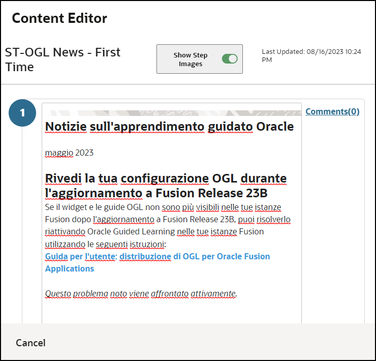
- Select Apply and then Save & Exit to save the
changes.
Now the content is manually translated. You can also update the guide title manually to the desired language.
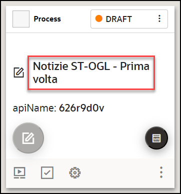
- Open the content editor of the guide that you want to
translate.
WARNING:
Deleting an OGL item from the alternate language folder will delete all copies of the OGL item. You can restore the OGL item by recovering it from the Archive folder.Understanding the relationship between the default OGL item and its alternate language copies
The OGL items in the default language are the primary data files where critical information relating to the OGL items is stored. An OGL item in an alternate language cannot exist without an OGL item in the default language.
Legend:
| Information Stored | Default Language OGL item (i.e. English) | Alternate Language 1 OGL item (i.e. Dutch) | Alternate Language 2 OGL item (i.e. French) |
|---|---|---|---|
| Display Settings, Activation Settings, and Advanced Settings (incl. Selectors) | |||
| OGL item Name | |||
| OGL item Step Text | |||
| Number of Steps | |||
| Step Sequence | |||
| OGL item Status | |||
| apiName | |||
| OGL item Property: Products | |||
| OGL item Property: Modules | |||
| OGL item Property: Sticky Guide | |||
| OGL item Property: Managed Guide | |||
| OGL item Property: Labels | |||
| OGL item Property: OGL item Type | |||
| OGL item Property: Descriptions (Keywords) | |||
| OGL item Activation Conditions: Role | |||
| OGL item Activation Conditions: Time | |||
| OGL item Activation Conditions: URL (incl. Autosegmentation) | |||
| OGL item Activation Conditions: All other (assuming the condition can be localized) | |||
| Editing Steps in the Default Language for Multilingual OGL item: Adding a step | |||
| Editing Steps in the Default Language for Multilingual OGL item: Deleting a step | |||
| Editing Steps in the Default Language for Multilingual OGL item: Text change |
Note:
- Inherits the default language text(not auto-translated), needs to be updated using Content Editor in the relevant alternate language.
- Deletes the step in all copies of the OGL item.
- Text changes to existing steps are not auto-translated, needs to be updated Content Editor.
Important:
Creating a new OGL item in the default language does not automatically create the alternate language copies of the OGL item.Manual or External Translation
- Arabic
- Chinese - Simplified
- Chinese - Traditional
- Croatian
- Czech
- Danish
- Dutch
- Finnish
- French - Canada
- French - France
- German
- Greek
- Hebrew
- Hungarian
- Italian
- Japanese
- Korean
- Norwegian
- Polish
- Portuguese - Brazil
- Portuguese - Portugal
- Romanian
- Russian
- Slovak
- Slovenian
- Spanish - Worldwide
- Swedish
- Thai
- Turkish
- Vietnamese
Translating the Guides Using Machine Translation
To manually translate guides, you will need to first export the OGL properties files of the guides you wish to translate, then use an external translation service or manually translate the guide contents. Once translations are completed, you will need to generate a ZIP file of the translated guides, then import it back to OGL. The Translations function in OGL allows you to manage the exporting/importing of the properties files for manual translation.
Note:
- The best practice is to have the content ready and signed off in the Generic Language (English) before submitting the machine translation.
- Guides will only be tested in the default language. The client is responsible for testing the foreign-translated content (only for Managed Service clients).
This section will guide you on how to translate your guides using machine translation.
To translate:
Step 1: Export the OGL content from the Generic Language folder (English folder).
Note:
By default, OGL guides are in English. If you are using an APP ID without translated guides, you will only have a generic folder including all the English guides. As soon as a translation is completed, folders with the translated content in other languages will be created.- From the OGL console left navigation pane, select Settings
> Translations.
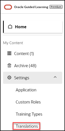
The Translations modal is displayed.
- Select Export.
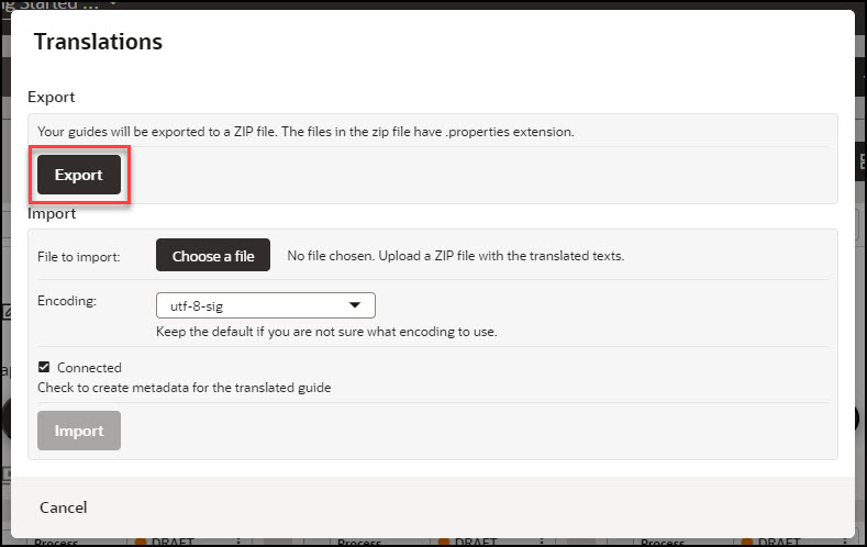
A ZIP file containing your guides is sent to your email address.
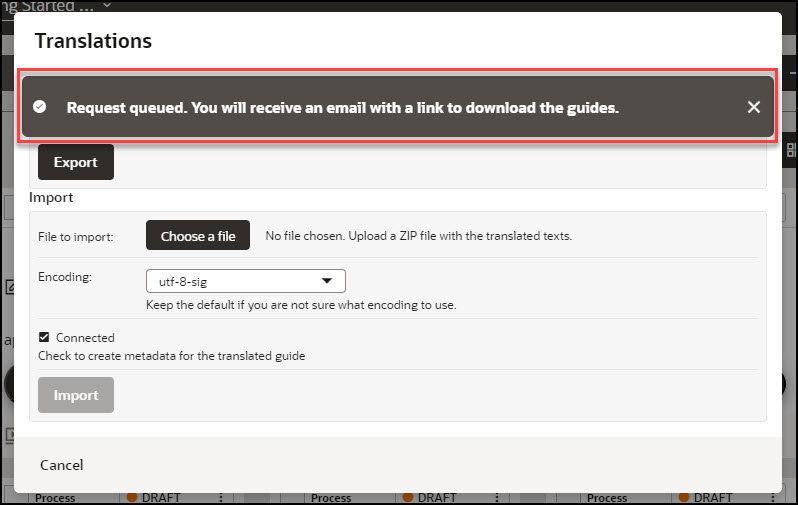
- Look for the email from Oracle Guided Learning containing
the link to your translation export file and select Download.
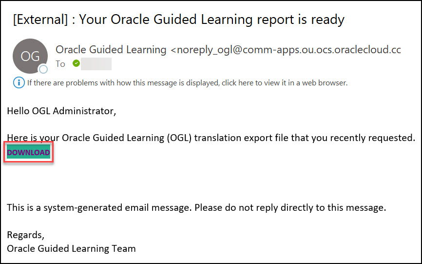
The browser now downloads the ZIP file.
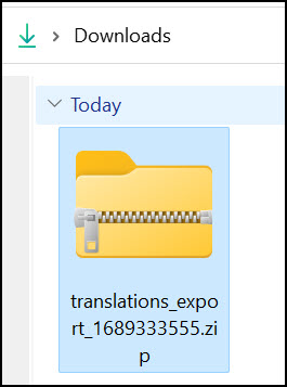
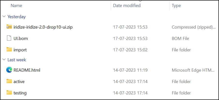
- Navigate to your Downloads folder in the local drive
and unzip/extract the downloaded file.
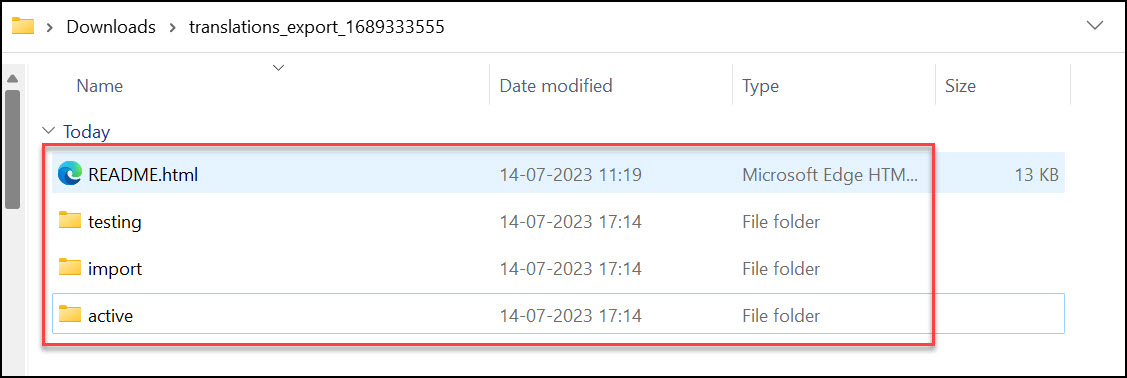
After extracting the folder, you will notice three subfolders named Active, Testing, and Import and a README.html file.
Note:
Active:
This folder contains the guides with status as published in the OGL dashboard from different languages/ default languages.
Testing:
This folder contains the guides with status as a draft in the OGL dashboard from different languages/ default languages.
Import:
This folder is used to import the translated content to the OGL dashboard in different languages.
Readme:
This is an HTML file that gives insights into export and import.
- Select Export.
- Navigate to the "testing" folder within the extracted folders.

- Go to the subfolder named "--".
Note:
“--” is the default name for generic folders.You can see the list of existing guides in the English language, identified by their API IDs.
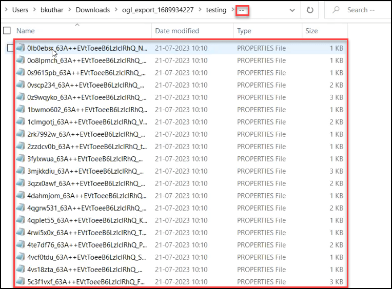
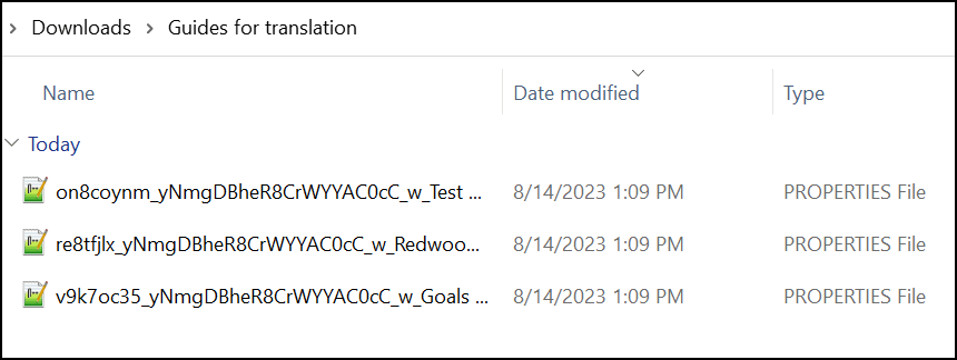
- Select the guides you want to translate, copy and paste them to a
new folder.
Tip:
- Use the API names of the guides to identify the exact guides you want to translate.
- Consider renaming the new folder to make it easier to identify.
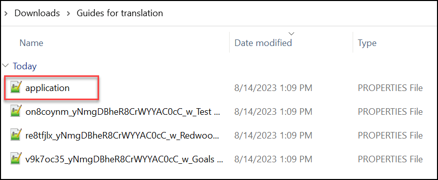
- Copy and paste the application PROPERTIES File (.properties) from
the testing folder to the newly created folder.The application PROPERTIES File
contains all the basic setups like Next, Back, Done,
Help, etc.
Step 2: Import the translated guides to OGL.
- Open the downloaded machine translated Zip file & keep it ready for
copying.
(In the following example, we have retrieved the translated content in Czech.)

- Navigate to the folder where you first downloaded the ZIP file from the OGL
Dashboard.
- Open the import folder and create a new folder. Name the folder with the
language code for which you translated.
Tip:
To import French guides, the folder should be named "fr," while for Czech, it should be named "cz," and so on.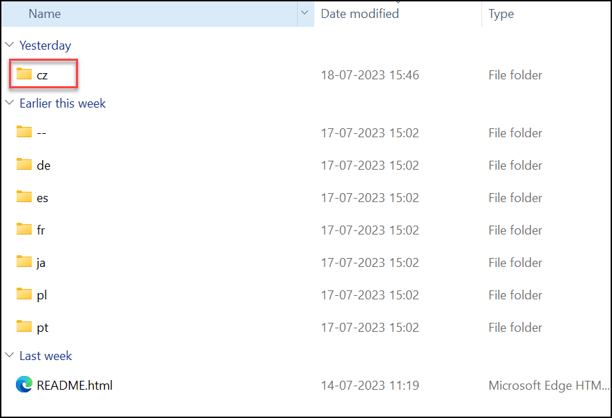
- Copy and paste the translated content to the specific language folder.

- Compress/Zip the import folder alone.

- Navigate to the OGL dashboard.
- Go to Settings > Translations.
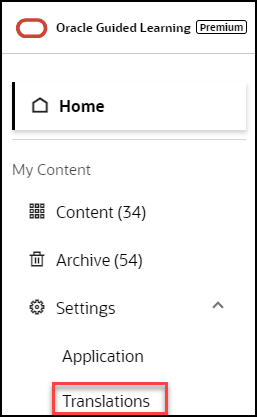
The Translations modal window is displayed now.
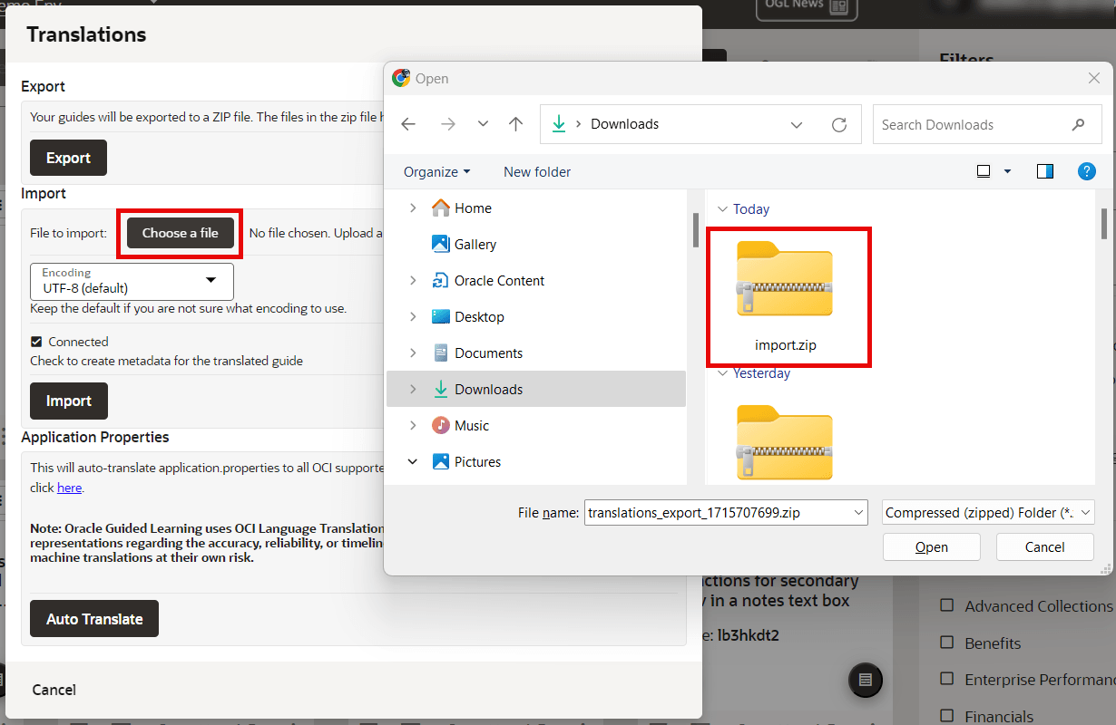
- Under the Import section, select Choose a file
andchoose the file named"import.ZIP".
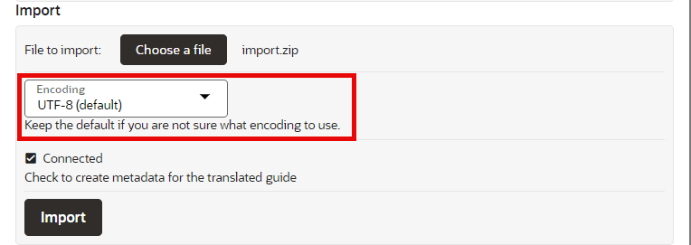
- Set the encoding to utf-8-sig.
- Check in the Connected checkbox.
(If this option is not checked, any additional modification cannot be made in the guide.)
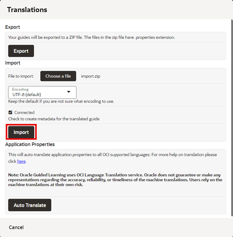
- Select the Import button.
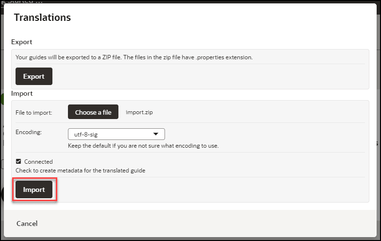
The translated content is now imported.
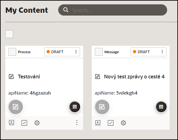
- Verify all the translated guides are available in the respective language
folders.
- On the OGL console, select Contents.
- Select the GENERIC LANGUAGE dropdown and choose the desired
language.
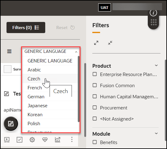
The translated guides are now displayed.
- Launch any guide in the Fusion Application by changing the language in
the Application login screen.
(Normally, the guide will progress similarly to the default language guide. If the translation guide does not progress like the default language guide, follow the steps in the troubleshooting tips.)
Using the Multi Language Widget
A user may choose to select an alternative language available on the OGL widget. Here is an easy way to do this:
- Open the Guided Learning widget.

- At the bottom-left of the open widget, click the Language
Selection icon (
 ) then select the desired language from the menu.
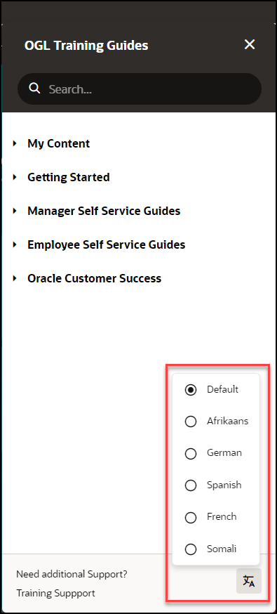
All guides available in the selected language will now display in the widget. For example, if you selected Dutch from the available languages, all Dutch guides will now display in the widget.
Once you sign out of the Fusion application and sign back in, the widget language will default to the language you have previously chosen.
Note:
If a user does not manually select a language from the OGL Language Menu, OGL defaults to the Fusion application language for the session.User Management
Once your OGL account is created, you can add new users with different permission levels. The new users can create, publish, delete guides, edit content, view analytics, etc. We recommend you follow the Least Privilege principle when granting permissions to new OGL users, especially the permission to publish guides.
You can set up multiple types of users depending on the level of access you want each user to have. Each user is identified by their name, email address, and the permissions assigned to them.
Introduction to OGL Roles
Before you set up users in OGL, you should understand the roles and permissions that you can assign to a user.
Note:
The roles discussed below only apply to the OGL Console and are not related to the application roles.Roles & Permissions
Viewer: Executive sponsors are the common target audience for this role which only requires the ability to see what guides exist and view the Analytics Dashboard.
| Permission | Detail |
|---|---|
| Preview a guide |
|
| View Analytics |
|
Editor: The Editor role addresses users who only need to work with the copy/text in the guides and messages to end-users. This allows writers to be able to get into the system and provide content without exposing them to publishing and other mission-critical capabilities.
| Permission | Detail |
|---|---|
| Access Content Editor |
|
| Manage Messages |
|
Developer: This role enables admins who should be working with the detailed features within individual guides, while not opening up system-wide settings that would affect all Editors and Developers.
| Permission | Detail |
|---|---|
| Edit Guides |
|
| Create Guides |
|
| Delete Guides |
|
| Publish Guides |
|
| Edit Managed Guides |
|
Owner: Within each organization, there should only be 2-3 people with this level of access. The permissions included in this role enable the admin to make changes to the system that will affect every user and guide therein.
| Permission | Detail |
|---|---|
| Manage Users |
|
| Manage Help Widget Settings |
|
| Manage Display Groups |
|
| Manage Roles |
|
| Manage Pages |
|
| Manage Products & Modules |
|
| Manage Training Types |
|
| Manage Themes |
|
| Change application settings |
|
| Create Managed Guides |
|
| Manage Comments |
|
| Reset end-user usage data |
|
| Manage Cloud Configuration |
|
| Manage Oracle Content |
|
| Batch Update Guides |
|
Assigning Roles and Permissions
You can assign all of the permissions within a role to a user, or assign specific permissions. Depending on your approach, the role icons will change so you can quickly see which roles and permissions a user has:
![]() = ALL of the permissions within the OGL role are assigned to the
user.
= ALL of the permissions within the OGL role are assigned to the
user.
![]() = SOME of the permissions within the OGL role are assigned to the
user.
= SOME of the permissions within the OGL role are assigned to the
user.
![]() = NONE of the permissions within the OGL role are assigned to the
user.
= NONE of the permissions within the OGL role are assigned to the
user.
- To revoke all user permissions for a particular OGL role simply
click on
 or
or  to make it
- To assign all user permissions for a particular OGL role simply
click on
 to make it
- To assign some user permissions for a particular OGL role simply
click on
 , then proceed to assign/revoke the required permissions
Adding Users
Note:
Only the identified client-side OGL Admins have the access to add additional users to the account.Use the user's email address to add them to the OGL.
To add users:
- On your OGL console's navigation menu, select Settings >
User Management.
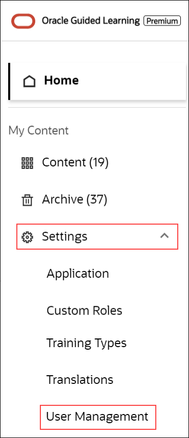
The User Management modal window appears.
- Select the Add Users button.

 Enter the new user's email address in the Email field,
 assign the user permissions, then
  select Save..

Note:
See the above "Assigning Roles and Permissions" section to learn more.- Select Close (X) to exit the User Management modal window.
Removing Users
To remove Users:
- Navigate to the User Management modal window.
- Check in the checkbox at the beginning of the line that lists the
user you want to remove. Once checked in, the Delete button appears.

- Select the Delete button.
The user is now removed from OGL.
Exporting the OGL User Matrix
You can export the OGL user matrix in ".xlsx" format with a single click/selection.
- Navigate to the User Management modal window.
- Select the Export button (
 ) to download the user matrix.

The browser now downloads the .xlsx file.
