Project Level Benchmarks
Use the Project Level Benchmarks dashboard to view safety metrics for a specific project.
The dashboard displays key data to help you view how your project is performing against predefined safety benchmarks. You can use this dashboard to:
- See how your project is comparing against predefined safety benchmarks.
- View the following metrics for your project: WOR, SOR, IFR, and AIS. For more information, see About Benchmark Metrics.
- View recommended actions based on project performance.
- View the data driving the metric results both in aggregate and over time.

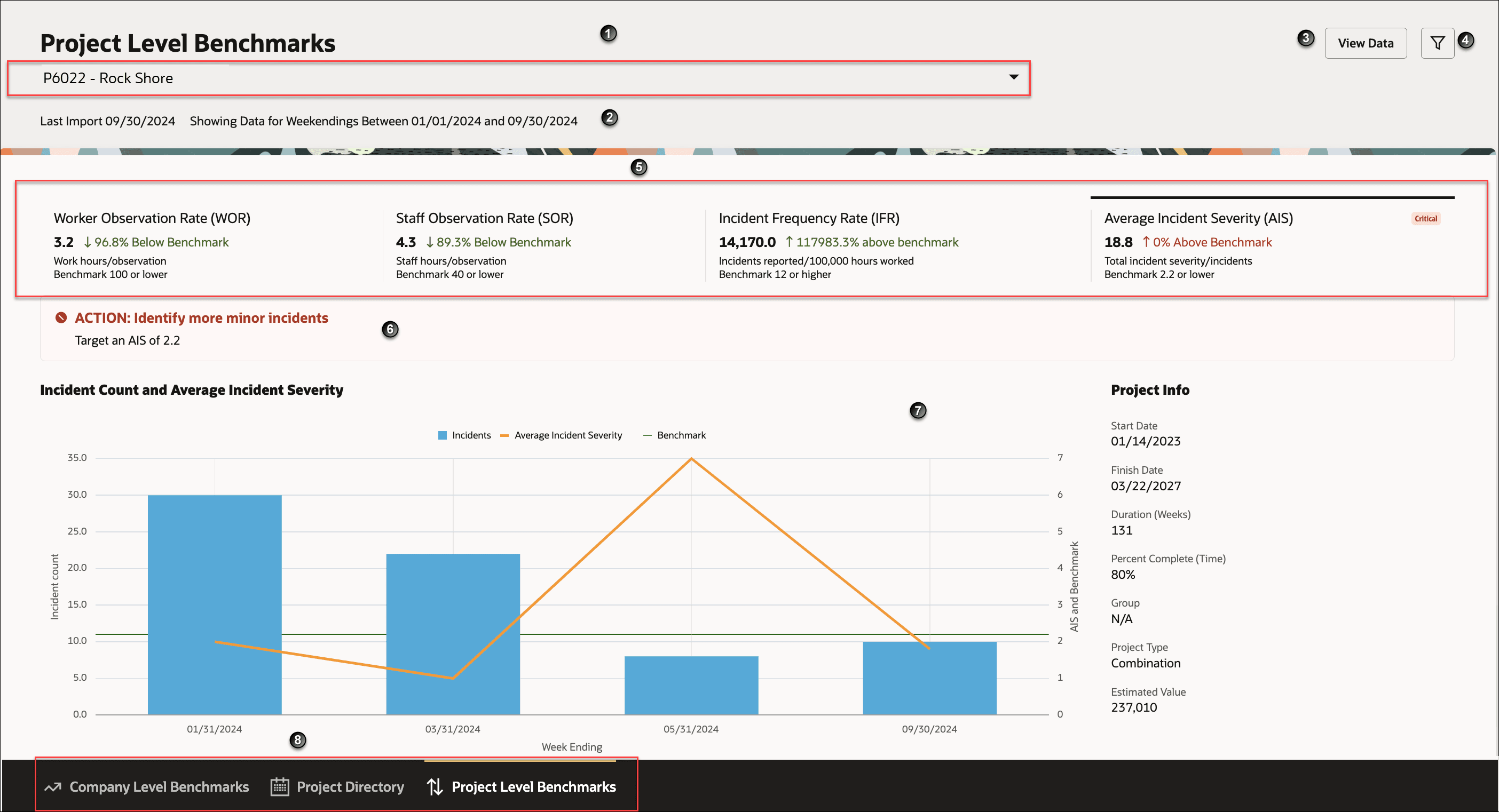
The following screen elements are displayed on the Project Level Benchmarks dashboard:
| Screen Elements | Description |
|---|---|
| 1 | Project drop-down list. Displays all the project you can access. The projects are sorted in alphabetically order. Use the drop-down to select your project. |
| 2 | Displays the time the data was imported. |
| 3 |
View Data button. Select to view the data used to generate the dashboard. The following metrics are displayed in the dialog box:
|
| 4 | Filter icon. Select to filter on date range. The options include: Latest Import, All Time, Last Week, Month to Date, Quarter to Date, and Year to Date. |
| 5 |
Metrics Tiles. Each tile displays the following information:
For a description of the metrics, see About Benchmark Metrics. |
| 6 | Displays recommend actions if your project metrics are either above or below the benchmark threshold. |
| 7 | Displays an interactive graph to view metrics over the time period and compares it against predefined benchmark values. |
| 8 | Tabs to navigate to the Company Level Benchmark, Project Details, and Project Level Benchmarks pages. |
How to use the dashboard
- From the Project drop-down list, select a project.
- View the high-level metrics displayed on the Metrics Tiles.
- From the Metrics Tiles, select a metric to view the graph for the selected metric. For example, when you select the Work Observation Rate WOR tile, the graph for the WOR metric is displayed. It shows the week ending, WOR values, benchmark values, and the observation count.
- Hover over the graphic to view the data for a specific time period.
- View the recommended actions under the Metrics Tiles.
- View the data used to generate the graph. Click the View Data button.