Energy Costs View
The Energy Costs view of the Data Browser displays how much a customer was billed for energy use, based on historical bill amounts. Customers can view energy costs for each bill over a 13-month period. Daily and subdaily views are also available if there is enough data.
Requirements
Same as listed in Data Browser. Additional data and cloud service requirements may apply depending on the types of insights (such as rate plan insights or peak time rebates) that the utility chooses to display. See the feature descriptions and User Experience Variations below for details.
User Experience
The Energy Costs view displays how much a customer was billed for energy use over time. This section describes the user experience for customers who have billing data and daily AMI data.
Fuel Menu
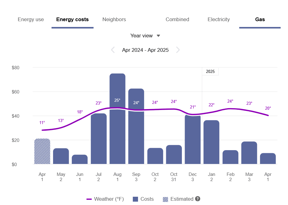
The fuel menu allows customers to select which fuel to view data for. By default, electricity is shown. An additional gas menu only appears for dual fuel customers.
A Combined view can be displayed, which combines electric and gas costs into a single number using a price-weighted index. When the Combined view is enabled, the data point tooltips also display combined totals.
Time Menu
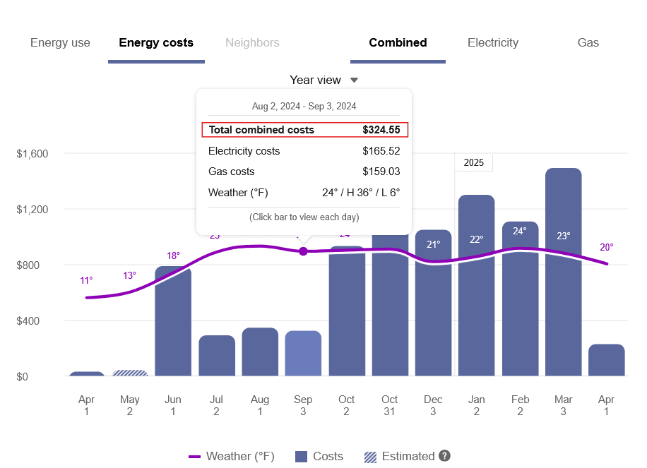
Depending on what data is available, the Energy Costs view presents different kinds of trends and insights at varying levels of granularity over time:
- Year view: Energy cost by each bill period in a year. Monthly, bi-monthly, and quarterly bills are supported.
- Bill view: Energy cost by each day in a bill period. AMI data is required for this view.
- Day view: Energy costs by each hour of a day (or another subdaily interval such as quarter of an hour). AMI data is required for this view.
There are also forward and backward buttons that customers can select to display contiguous blocks of time. In the Year view, for example, clicking the forward or backward button displays contiguous 13-month blocks of time for customers on monthly billing.
Bar Graph
The bar graph uses a vertical axis (Y-axis) to show the cost, and a horizontal axis (X-axis) to show the time period. The bars use the "You" color, which is blue by default and commonly changed to the utility's brand color. See General Display Rules for details on how the graph behaves and how the data visualization can change depending on the selected view.
Weather Data
A line graph representing the average temperature during each time period is overlaid on the bar graph. This allows customers to see how their usage relates to local weather patterns. The weather data is based on data from the airport weather station closest to the location of the customer. See Weather Data for details on how weather data is retrieved.
Cost Insights Bar
For each fuel type available in the Energy Costs view, a bar is displayed beneath the graph to show additional cost insights. This bar is available for single fuel and dual fuel customers and displays only in the Year and Bill views.
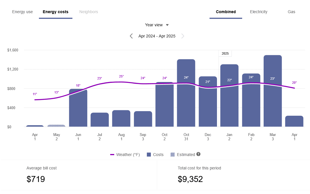
Year View: The bar displays the average bill cost and total annual cost for the selected year. If the year is not yet complete, the average bill and total cost-to-date is shown. The bar can also include an insight about how the customer's energy use equates to miles driven, if applicable.
In the example below, the year is complete, and the customer is using the Combined view.
Bill View: The bar displays the customer's average daily cost and total bill cost for the selected bill. If the bill period is not yet complete, then the daily average and cost to date is shown, and a link is displayed to take the customer to the Smart Dashboard, which includes a bill forecast. The bar can also include an insight about how the customer's energy use equates to miles driven, if applicable.
Carbon Emissions / Miles Driven Insight: The cost insights bar can include an insight explaining how the customer's energy use equates to carbon emissions and miles driven. This information allows customers to understand their energy use in more practical, familiar terms. The insight is followed by a link to the US Environmental Protection Agency's greenhouse gas equivalencies calculator.
Note:
The carbon emissions insight is disabled by default since it depends on data from the US Environmental Protection Agency. It is therefore only available to utilities in the US. It can be enabled for US utilities upon request.Tooltips
Tooltips are displayed when customers interact with a data point on the graph. See Energy Tooltips for details on what the tooltips may include.
For AMI customers, a message is displayed at the bottom of tooltips for data points for each bill. This messaging acts as a tip for how a customer can quickly view hourly or sub-hourly data for a given bill.
Customers can also view data points for energy costs that have not yet been included on a bill. By default, up to 30 days of in-progress billing data can be displayed to a customer, which can be configured to align with the length of a customer's billing cycle. See Virtual Bills for details.
Legend
A legend below the graph defines the elements displayed in the graph. If applicable, the legend includes an indicator for estimated bills.
Disclaimer
Disclaimer messages can be added to the Energy Costs view that are specific to the view. For example, if applicable, a disclaimer message can explain that the amounts shown do not include taxes and other fees. The disclaimer message can also include links to other resources where customers can find more information.
User Experience Variations
Multiple Accounts and Service Points
If a customer has multiple accounts and service points, a drop-down list is displayed above the graph allowing customers to choose one and view data related to it. See Multiple Billing Accounts, Premises, Service Agreements, and Service Points for details.
One-Day Bill Period
In some cases, customers may see a one-day bill period. This can occur when a customer is on their first day of the bill period, and Oracle Utilities Opower has received interval usage data for that day but has not yet received billing data for the bill period's end date. When this happens, a single bar is displayed in the Bill view, centered on the graph, for the single day. The weather data line graph is disabled.
Peak Time Rebates Experience
Customers who participate in a Peak Time Rebates program can view information about credits earned during a peak event. This information can be viewed in the Bill or Day views.
Bill View: An icon displays above the days when a customer had an opportunity to receive a peak time rebate. You can click on the icon to view the tooltip, which displays the amount of any credits earned.
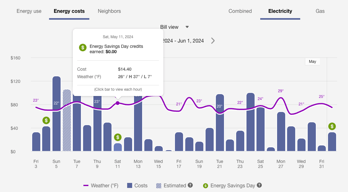
Day View: An icon displays above the hours when a customer had an opportunity to receive a peak time rebate. You can click on the icon to display a tooltip with details about that hour. Additionally, you can see any credits earned during that day below the graph.
Requirements:
- The Peak Time Rebates cloud service must be purchased.
- Peak time rebates data (such as the day and time of the peak event, as well as rebate amounts) is required.
- Daily or subdaily AMI data is required.
Rates Experience
Rates or cost information be displayed in the daily and subdaily views of the Energy Costs view. Different types of rate plans are supported. The Rates Engagement cloud service must be purchased and rates rates must be modeled. Contact Your Delivery Team for more information.
Tiered Rate Plans
Note:
The Data Browser can display a maximum of four rate tiers. 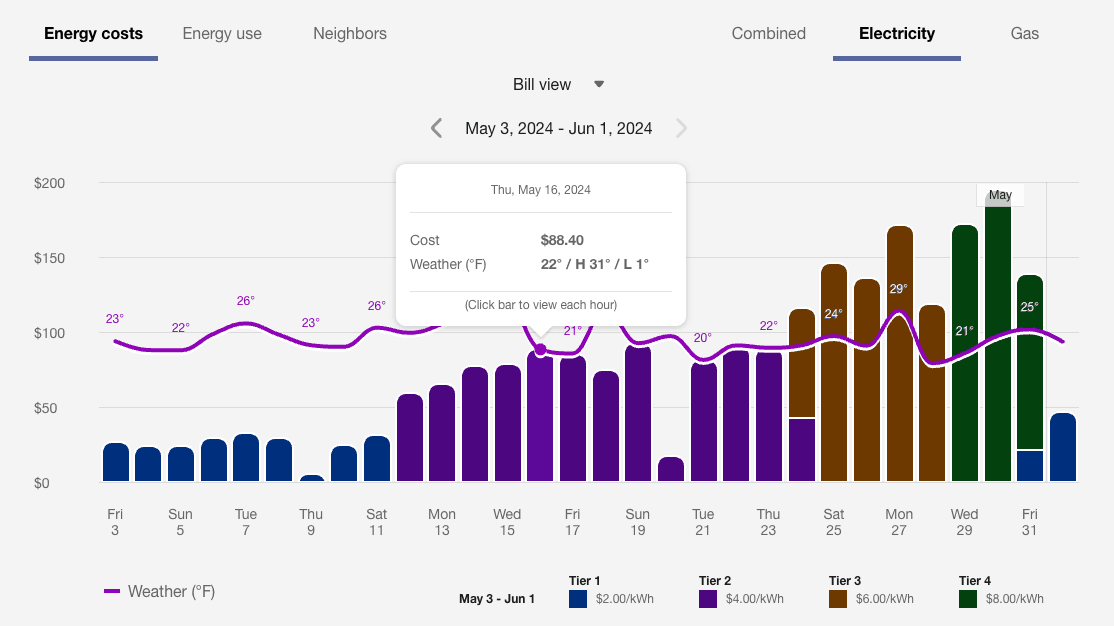
The legend in this case only displays tiers that are found in the chart. For example, the legend shows a rate plan that includes three tiers. But the third tier may be hidden from the legend if data is only available for two tiers.
The legend can account for the prices that are displayed for each tier. For a given tier, if a customer is charged multiple different prices on the graph, the tier is listed as a price range in the legend.
Time of Use Plans
In a Time of Use plan, the cost of energy depends on the time of day and how the utility defines "on-peak" versus "off-peak" hours. For example, peak hours for a utility can be defined as weekdays between 1:00 PM to 7:00 PM from May through September. The example below uses a tiered rate plan in addition to a Time of Use rate plan.
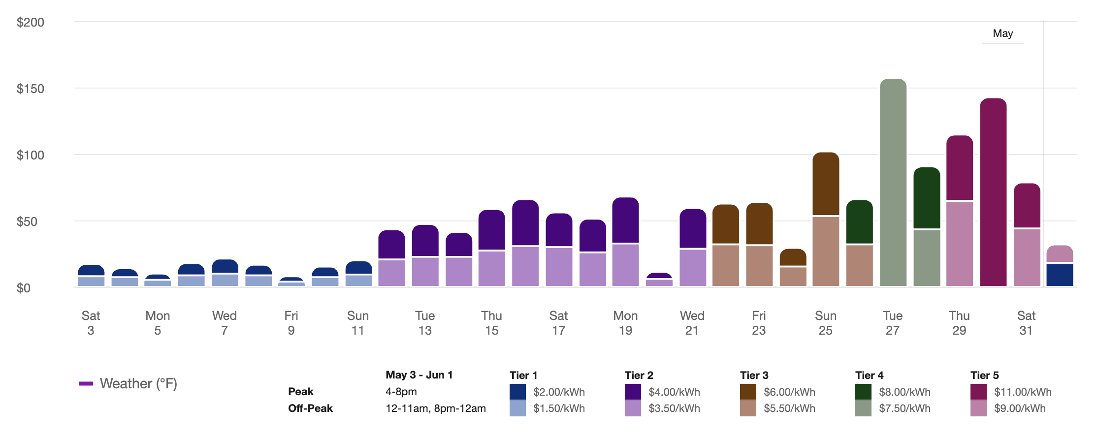
The legend shows pricing for different tiers and peak periods. All the available rate tiers are displayed regardless of which tiers have data represented on the graph.
For customers with both Net Energy Metering (that is, solar power) and Time of Use plans, the display on the Bill view is simplified. For each day that includes a time-of-use period with negative cost, a net positive or net negative energy use is displayed for the entire day and removes the distinction between the different time-of-use periods.
Peak Days
In rate plans that use peak day events, energy costs more money during peak days due to higher demand. The peak day event pricing is listed in the graph legend and a customer's energy costs or use for each event are depicted in the graph.
Rates Not Modeled
For customers who have AMI data but do not yet have their rate plan modeled in the system, there is not enough information to determine specific costs at a level more granular than the bill. In this case, the Data Browser will show an error message in the Bill or Day View for costs.
Solar Customers
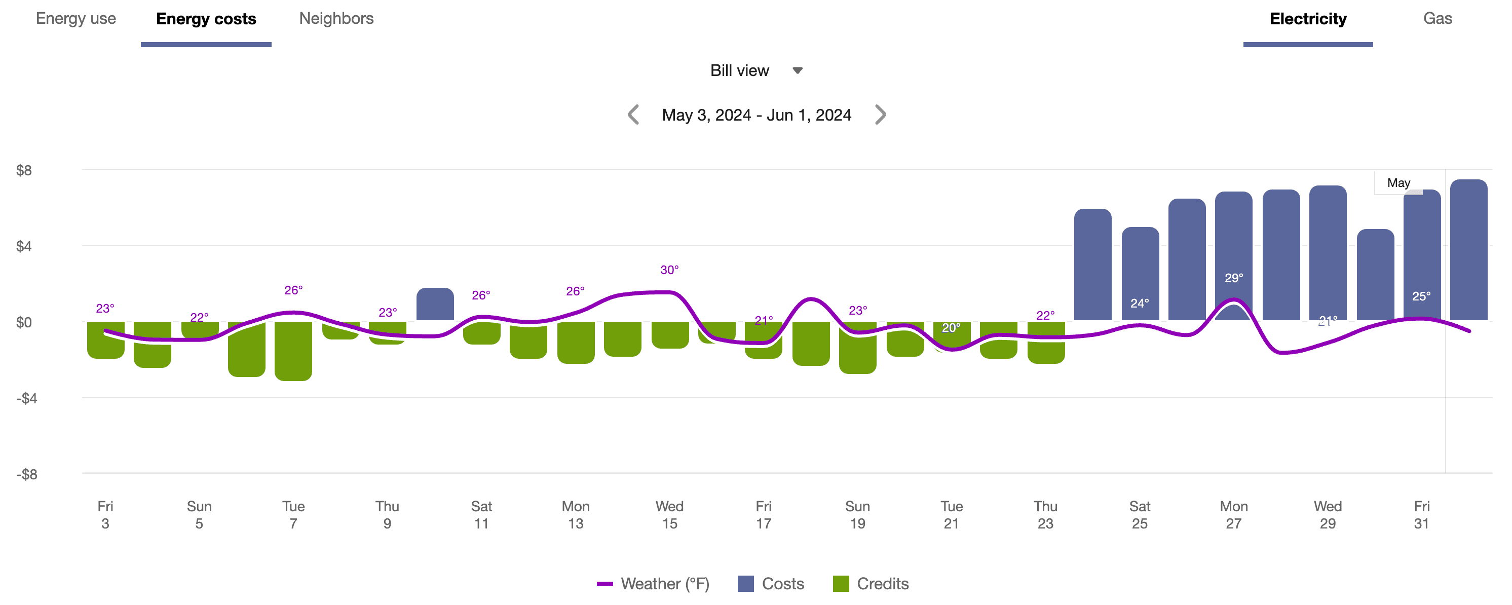
If a customer has solar power and generates more energy than they consume, the Energy Costs view will show the customer's energy use as a credit. The example below shows short green bars for negative values. Additionally, a tooltip denotes the negative cost value. This default experience can be configured to display in different ways. Utilities must coordinate with their Delivery Team to determine which display to use.

Additional solar insights and messaging can be displayed if the utility has purchased the Oracle Utilities Opower Distributed Energy Resources cloud service. See Solar Features on the Data Browser for more information.
Year-over-Year View
Depending on your utility’s setup and configuration, the Data Browser time menu may contain an additional year-over-year view that allows customers to compare energy usage or costs for the past 12 months against the same period from the previous year. With this side-by-side comparison, customers can identify patterns, assess progress on savings, and understand fluctuations in energy use or cost. The view is available for gas and electricity fuels in the Energy Use and Energy Costs tabs.
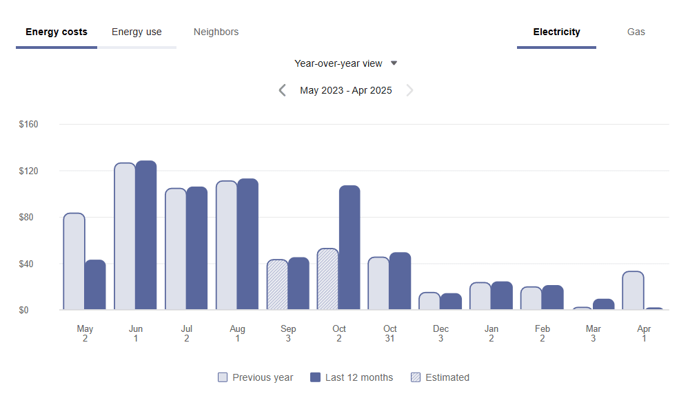
When the year-over-year view is selected, the main graph displays grouped bars for each month over a 12-month period. Each grouping compares the cost for the past 12 months (darker bar) to the same month from the previous year (lighter bar). A legend at the bottom of the chart clarifies what the bars mean.
The year-over-year view is also available if the Combined fuel tab is enabled in the year view of the Data Browser. Customers can go to the Energy Costs or Energy Use view, select Combined, and select the year-over-year option. An aggregated comparison of costs or usage is displayed for electric and gas service agreements in each bill period. (For aggregated usage, the unit of measure is expressed in “Units”, since it is a combination of gas and electricity usage.) The tooltip that displays on hover expands to show a full breakdown of electricity and gas costs that make up each month’s total.
Estimated Reads: The graph highlights estimated reads using visual and textual indicators. When an estimated bill appears for either the past 12 months or the previous year, a message is shown in the tooltip and the corresponding bar uses a stripe pattern. The legend displays an "Estimated" entry only if at least one estimated read exists. When estimated reads are present for both periods, the tooltip and legend clearly distinguish between them using matching color schemes and styles.
Navigating through Time: When the year-over-year view loads, it uses the current date to determine the current month and displays the most recent 12 months of data. Forward navigation to future dates is disabled since no data would be available for display. Users can navigate backward to earlier data if it is available, and navigate forward again. The legend at the bottom, labeling the bars as “Previous year” and “Past 12 months,” only appears when the most current data is being shown.
Requirements: Customers must be billed monthly, and at least one bill is required for the year-over-year view to display any data. If no data is available, an error message is shown. The ideal state is to have 24 months of billed usage data for a complete year-over-year view.
Limitations:
- Bi-monthly or quarterly bills are not supported.
- To keep the year-over-year view simple and easy to read, weather data is not displayed.
- The year-over-year view is not available for solar customers. Solar customers can be provided with the Compare to Last Year View available through the Distributed Energy Resources Customer Engagement cloud service, which must be purchased separately.