Get Started
Oracle Utilities Opower Analytics Visualization enables utilities to explore customer data and create custom data extracts and visualizations related to the Opower program. It includes rich pre-built analytical subject areas, visualizations, and workbooks that allow you to derive strategic insights from your data. For example, you can identify customer demographic trends and view digital engagement metrics related to customers who receive Oracle Utilities Opower products. See Perform Common Tasks for more information about how to use the application to support your business goals.
On this page:
Audience and Scope
This guide describes the Analytics Visualization application for the Opower program, and provides basic procedures for using it. The content is intended for consumers and creators of workbooks and data visualizations using Opower Analytics Visualization. The content also covers administration tasks, such as adding users to the application.
For information on Analytics Visualization for Oracle Utilities enterprise applications (such as the Customer Cloud Service or Meter Solution Cloud Service), see the Oracle Utilities Analytics Visualization cloud service documentation.
Note: While the data within Opower Analytics Visualization is unique to the Opower program, the application itself is built on Oracle Analytics Server technology. Some references in this guide therefore lead to the Oracle Analytics Server online help.
Subject Areas
One of the key benefits of Opower Analytics Visualization is that it comes with predefined subject areas that are specific to the Opower program. A subject area is a logical grouping of data that can be analyzed in a manner that reflects the structure of your business. For more information, see Subject Areas Out of the Box.
Measures, Attributes, and Dimensions
There are three common components within Opower Analytics Visualization subject areas: measures, attributes, and dimensions. Measures and attributes are data elements that you use to build your visualizations. Dimensions are simply categories or folders that contain attributes.
You can think of a measure as a "numerator" with a quantitative number that can be divided or filtered by an attribute. Conversely, an attribute is a "denominator" that can divide or filter a measure. Or you can think of a measure as a quantity for the y-axis of a graph, and an attribute as a value used on the x-axis of a graph. Both elements are used to dissect and analyze your data in different ways.
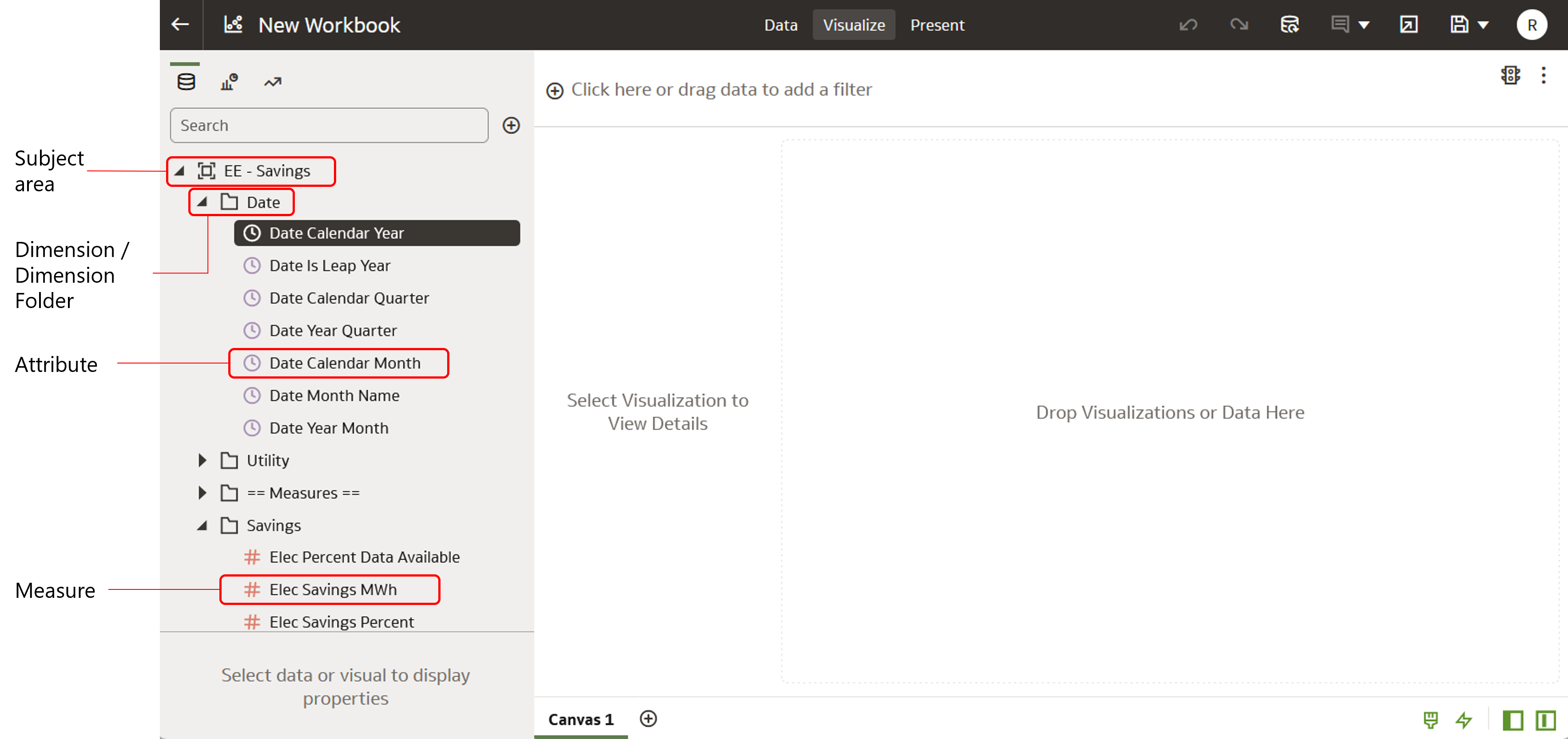
See the examples below for more information about how you can use attributes and measures together to create visualizations.
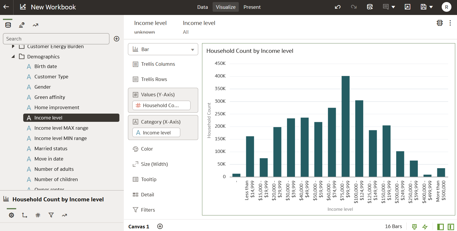
Example 1: Households by Income Level
One common measure in Opower Analytics Visualization is household count, which can be found in the Household - Count of Customers subject area. Let's say you want to know the number of households in your service area that have a certain income level. You would want to filter the number of households in your service territory into income level groupings.
To do this, you would navigate to the Household - Count of Customer subject area. Then you would select Household Count as your measure, and select Income Level (available in the Demographics dimension folder) as your attribute, and drag both to the canvas. See the screenshot below for how this might look in the user interface. Notice that Household Count is on the y-axis and Income Level is on the x-axis.
Example 2: Total Usage by Appliance (Electric Heating)
Another measure you can filter on is the Total Usage measure available in the Appliance - Usage Insights subject area. For example, let's say you want to know the total energy usage of a single appliance, such as electric heating.
In this case, you would navigate to the Appliance - Usage Insights subject area. Then you would select Total Usage as your measure, and select Appliance as your attribute, and drag both to the canvas. You would then need to right-click the Appliance attribute and create a filter to only include Electric Heating. See the screenshot below for an example of how this might look.
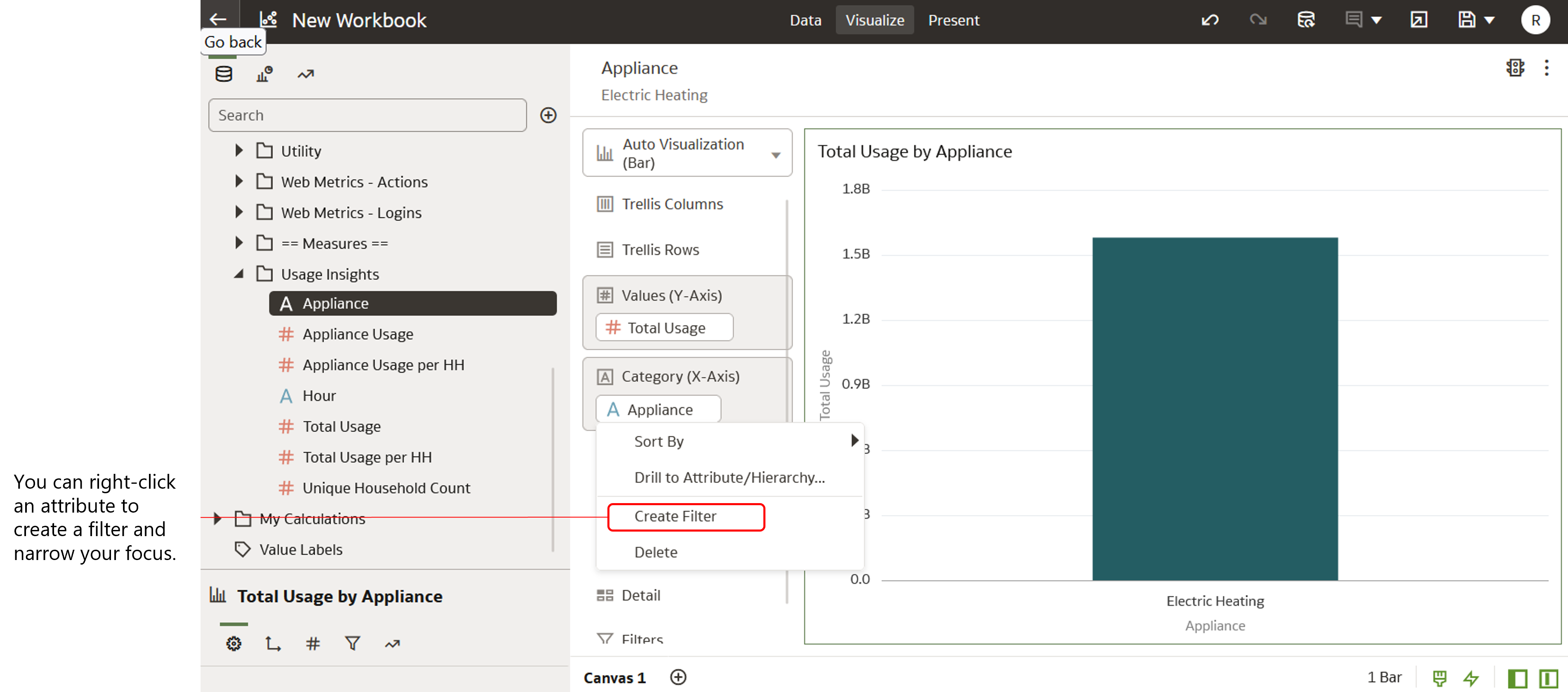
Note about Attributes Filtering Attributes
Note that an attribute cannot be used to filter another attribute. For example, let's say you wanted to create a x-y axis bar graph with two attributes: Site Sections and Income Level. This would be a nonsensical filter because site sections are just names for different sections of a website, and income level groupings are just names for different categories of income. Neither of these attributes has a quantity, and so there would be no numerical value to show.
Terminology
There are several terms in the Analytics Visualization documentation that might be unfamiliar to you as you learn about the application. Review the information below to gain a better understanding of these terms and the concepts behind them.
An attribute is an individual data element within a dimension or dimension folder within a subject area. Often, an attribute describes a business entity. See Measures, Attributes, and Dimensions for more information about how attributes work.
Calculation
A calculation is a predefined SQL query that can be dragged and dropped onto a canvas to create visualizations for key areas of your business operations.
Canvas
A canvas is a page within a workbook that contains one or more visualizations.
Data Panel
The Data Panel is a side menu that displays in Analytics Visualization. From the Data Panel, you can select data elements and visualization options when creating a canvas.
Dataset
A dataset defines the structure of usable data that can be leveraged in a workbook. There are a few different types of datasets:
- Subject areas that are constructed within a logical model
- Data sets based on a direct connection to a source (such as a database)
- Data sets from an imported file (such as a spreadsheet
A dimension is a category or folder that contains individual attributes. For example, in the Web Pageviews subject area, there is a dimension folder called Demographics. Within this folder are attributes such as Birth Date, Customer Type, and Gender.
A measure is an individual data element that is typically a calculated value, such as an energy usage amount or a unique customer count. For example, you could use measures to determine the amount of AMI energy use of an appliance (such as a clothes washer or dishwasher) over a selected period of time. See Measures, Attributes, and Dimensions for more information about how measures work.
Subject Area
A subject area is a logical grouping of data that can be analyzed in a manner that reflects the structure of your business. A subject area consists of one or more dimension folders (which contain attributes) and a folder containing measures.
Visualization
Visualizations are graphical displays that help you to analyze your data in a productive and meaningful way.
Visualization Type
A visualization type refers to the type of graphic you want to create in your canvas, such as a pie chart, bar chart, or tree map.
Workbook
A workbook is a grouping of canvases which can include data from one or more subject areas.