Hourly Breakdown Module
The Hourly Breakdown feature displays the hourly use for a customer's highest use day from the previous week. It allows customers to notice trends in their usage according to the time of day, which helps them identify ways they can save energy. Dual fuel versions of the communication include graphs for both electric and gas use.
User Experience
The module has these components:
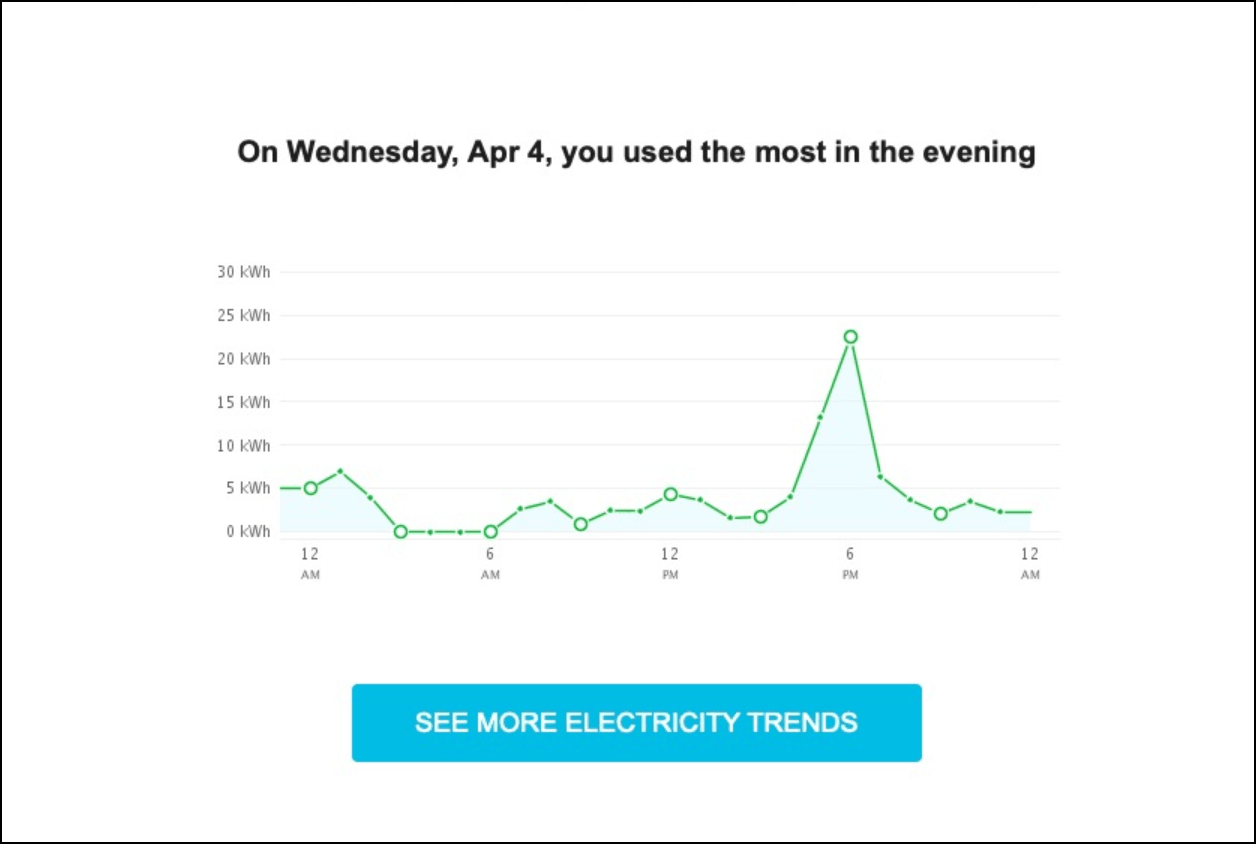
Insight Statement: An insight statement at the top of the module indicates the hours of the customer's highest usage day during which they used the most energy.
Line Chart: The Hourly Breakdown displays a line chart showing a customer's usage throughout the day for the day that they used the most energy. This makes it easy for the customer to compare their highest hourly usage to their lowest, to notice patterns in their usage, and to begin to form habits to change these usage patterns. The line chart plots hourly usage over a 24 hour period, starting and ending with 12 AM. The chart is depicted with large points every six hours, and smaller points every two hours. The smaller points always represent two hour intervals, even if sub-hourly AMI reads are available for a customer.
This chart gives customers a visual representation of the times of day that they use the most energy, and makes it easy for them to compare their highest hourly usage to their lowest. By making this information clear to the customer, it becomes easier for them to notice patterns in their usage, and enables them to begin to form habits to change these usage patterns.
See More Trends Button: Clicking this link takes customers to the Data Browser in the Oracle Utilities Opower web portal. If the customer is not signed in to the web portal, they are prompted to either sign in to their account or register if they have not previously done so.
This image provides an example of the module:
