8.2.5 Data Quality Visualizations
The Data Quality Visualization provides critical insights into data quality issues detected after executing Data Quality (DQ) rules within the DFCS solution. The DFCS solution runs predefined DQ rules and publishes the results in interactive dashboards. The dashboards present a comprehensive view of error records associated with specific entities, helping users identify data inconsistencies.
To access DQ dashboards, follow the below path:
Data Quality Dashboard > Catalog > Shared folders > Data Quality Visualizations > Data Quality.
This section provides information on the Data Quality results for Data Visualization reports.
To access the Data Quality for Data Visualization Reports in DFCS, complete the following steps:
- On the Home page, click Catalog, and under the Shared Folders tab, select Data Quality Visualization and then select data Quality Reports to view the details of the Data Quality results.
- Data Quality Results for Data Visualization Reports page
You can navigate among the following canvases in the Data Visualization report:
- Data Quality Registry
- Data Quality Summary
- Data Quality Executions
- Data Quality Results
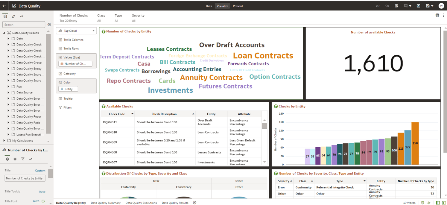
Figure 8-106 Data Quality Registry
 Controls and Filters
- Hover over any entity in the word cloud to view a tooltip showing:
- Number of Checks
- Entity Name
- Number of Checks – Filter data by the number of checks.
- Class – Apply filters based on data class (e.g., contracts, accounts).
- Type – Filter checks by type (e.g., financial instruments).
- Severity – Filter by severity level of issues.
- Click the three dots (menu icon) in the top-right corner of the chart area.
- Hover over Sort By to reveal options:
- Number of Checks →
- Low to High
- High to Low
- None
- Entity → Sort alphabetically
- Number of Checks →
- From the same menu (three dots), hover over Edit.
- Click Copy Data to copy the dataset underlying the visualization
for external use (e.g., Excel, analysis tools).
From the menu, go to Export, then select your preferred method:
- File – Download the chart/data as a file (likely CSV or image).
- Print – Send the visualization directly to a printer.
- Slack – Share directly to Slack (if integrated).
- Drill to Attribute / Hierarchy
- Select Drill to Attribute/Hierarchy.
- In the pop-up panel, choose from available Attributes or Hierarchies.
- Date – View checks across time.
- Data Quality Check – Get detailed check names.
- Data Quality Check Severity – Break down checks by severity (e.g., High, Medium, Low).
- Data Quality Check Type – See types of checks (e.g., Consistency, Completeness).
- Data Quality Group – Group-level analysis.
- Data Quality Entity – Deeper entity-specific
view.
Note:
Use the Search bar to quickly locate specific attributes. - Filter Values: Choose specific values to include.
- Clear All Filter Selections: Unchecks all selected filters.
- Remove All Filters: Resets the dashboard to its unfiltered state.
- Create Expression Filter: Create custom logic filters using expressions.
- Auto-Apply Filters: Toggle whether filters apply changes instantly or only after confirming.
- Reset Column Sizes: Restores column widths to default in table views.
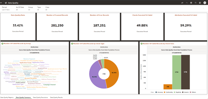
Figure 8-107 Data Quality Summary

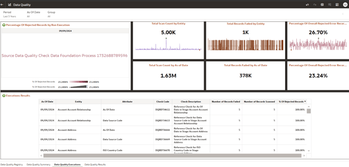
Figure 8-108 Data Quality Execution

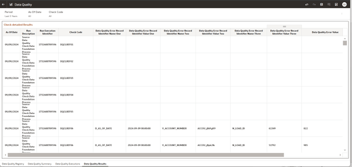
Figure 8-109 Data Quality Results
