Mobile Handheld Page Templates with Full Width Check Detail Area
-
HHT Full Width Check Detail and Simple Button Grid
-
HHT Full Width Check Detail and Tabbed Button Grid
Handheld devices configured with these templates have a check detail are that expands the width of the screen. Servers can see items on the check detail without changing the page, enhancing the overall usability and resulting in faster service.
HHT Full Width Check Detail and Simple Button Grid
The width settings for all areas in this template default to 272 and cannot be changed.
Figure 26-6 HHT Full Width Check Detail and Simple Button Grid
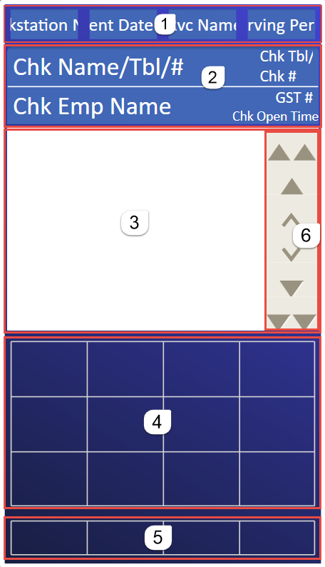
The following table describes the areas called out in the image.
Table 26-7 HHT Full Width Check Detail and Simple Button Grid
| Callout Number | Area | Description |
|---|---|---|
|
1 |
Status Bar |
The default height is 30 and can be changed. Increasing or decreasing the height affects the height of the large content area. You can remove this area from the template. Elements:
|
|
2 |
Check Detail Header |
This appears with the Check Detail area and shows the following
information:
|
|
3 |
Check Detail |
The default height is 250 and can be changed. Increasing or decreasing the height affects the height of the large content area. You can remove this area from the template. |
|
4 |
Large Content Area |
You can change the size of this area by making the other areas larger or smaller. The grid defaults to 4 columns and 3 rows, but you can change it. |
|
5 |
Bottom Content Area |
The default height is 40 and can be changed. Increasing or decreasing the height affects the height of the large content area. You can remove this area from the template. The grid defaults to 4 columns and 1 row, but you can change it. |
|
6 |
Scroll Bar |
This does not appear on the POS handheld device. The check detail is scrollable using gestures. |
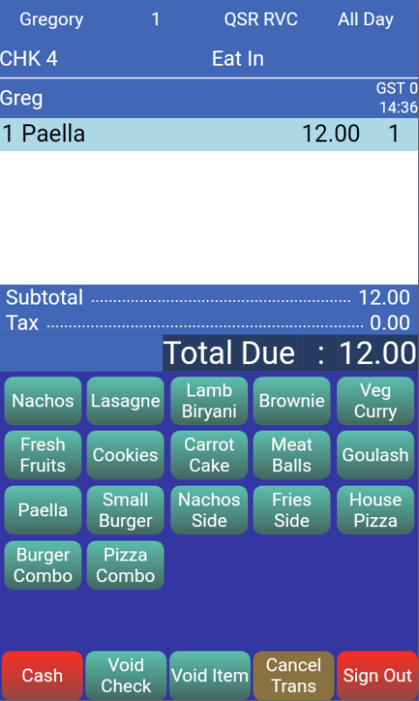
The following figure shows an example of the HHT full width check detail and simple button grid template as it appears on the POS handheld device.
Figure 26-7 Full Width Check Detail and Simple Button Grid on POS
HHT Full Width Check Detail and Tabbed Button Grid
The width settings for all areas in this template cannot be changed. The width settings for most areas in this template default to 272, except for the navigation bar, which is 268.
Figure 26-8 HHT Full Width Check Detail and Tabbed Button Grid
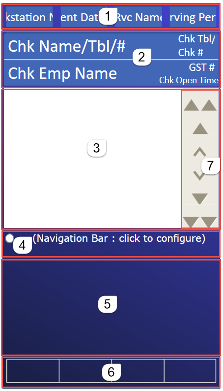
The following table describes the areas called out in the image.
Table 26-8 HHT Full Width Check Detail and Tabbed Button Grid
| Callout Number | Area | Description |
|---|---|---|
|
1 |
Status Bar |
The default height is 30 and can be changed. Increasing or decreasing the height affects the height of the large content area. You can remove this area from the template. Elements:
|
|
2 |
Check Detail Header |
This appears with the Check Detail area and shows the following
information:
|
|
3 |
Check Detail |
The default height is 250 and can be changed. Increasing or decreasing the height affects the height of the large content area. You can remove this area from the template. |
|
4 |
Navigation Bar |
The default height is 40 and can be changed. Increasing or decreasing the height affects the height of the large content area. |
|
5 |
Large Content Area |
You can change the size of this area by making the other areas larger or smaller. The grid defaults to 4 columns and 3 rows, but you can change it. |
|
6 |
Bottom Content Area |
The default height is 40 and can be changed. Increasing or decreasing the height affects the height of the large content area. You can remove this area from the template. The grid defaults to 4 columns and 1 row, but you can change it. |
|
7 |
Scroll Bar |
This does not appear on the POS handheld device. The check detail is scrollable using gestures. |
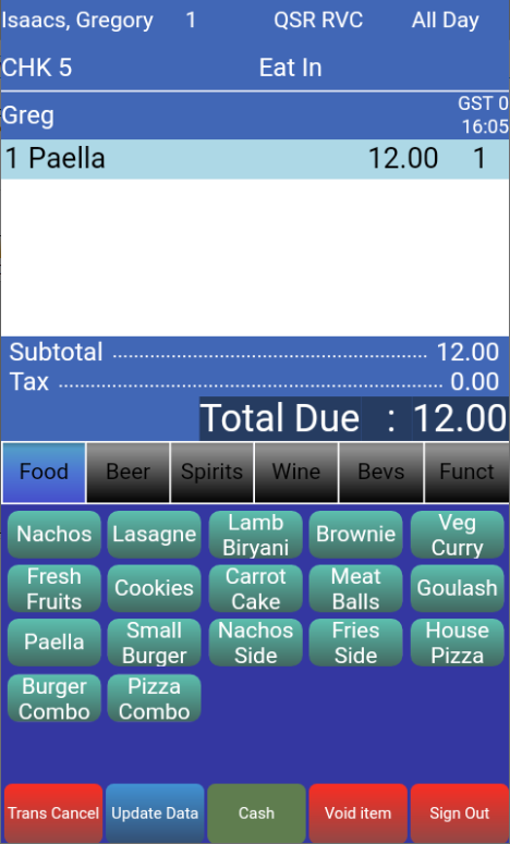
The following figure shows an example of the HHT full width check detail and tabbed button grid template as it appears on the POS handheld device.
Figure 26-9 Full Width Check Detail and Tabbed Button Grid on POS
Scrollable Check Detail on POS Device
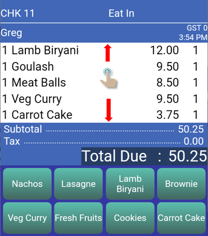
You can use gestures to scroll the check detail vertically to see other items on the check. The check detail header and footer remain visible while scrolling.
Figure 26-10 Scrollable Check Detail on POS
Parent topic: Workstation Touchscreen Pages