Participant Breakdown charts
The Participant Breakdown pie charts provide at-a-glance insights into the populations that you're monitoring. Each pie chart corresponds to a filter on the left.

Any filters that you select apply to all dashboard pages.
| Chart | Description |
|---|---|
|
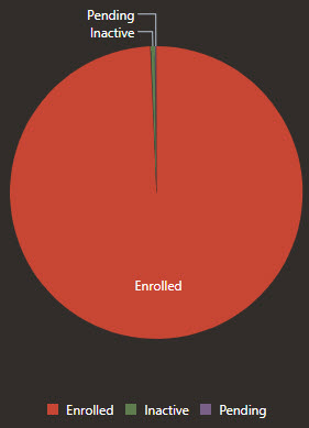
Status |
The Status pie chart shows the proportion of participants who meet your filtering criteria and who have each status.
|
|
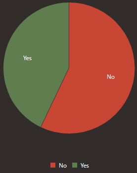
Healthworkers |
The Healthworkers pie chart shows the proportion of participants who meet your filtering criteria and who are healthcare workers.
|
|
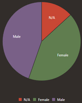
Sex at Birth |
The Sex pie chart shows the proportion of participants who meet your filtering criteria and who are of each sex.
|
|
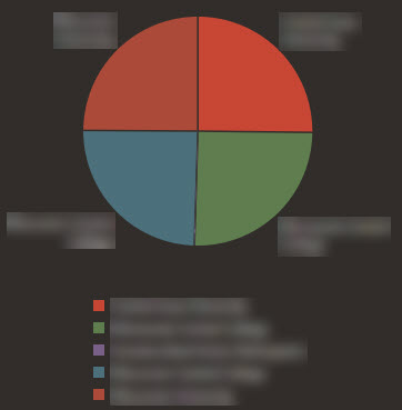
Entity |
The Entity pie chart shows the proportion of participants who meet your filtering criteria and who are associated with each entity.
|
|
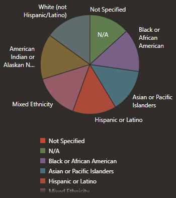
Ethnicities |
The Ethnicities pie chart shows the proportion of participants who meet your filtering criteria and who are of each ethnicity.
|
|
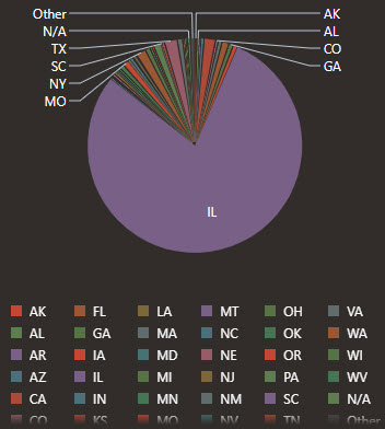
States |
The States pie chart shows the proportion of participants who meet your filtering criteria and who live in each state.
|
|
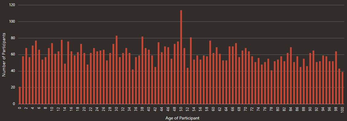
Age Histogram |
The Age Histogram chart helps you understand the ages of all your participants who meet your filtering criteria.
|
Parent topic: Dashboard charts
