Map Dashboard charts
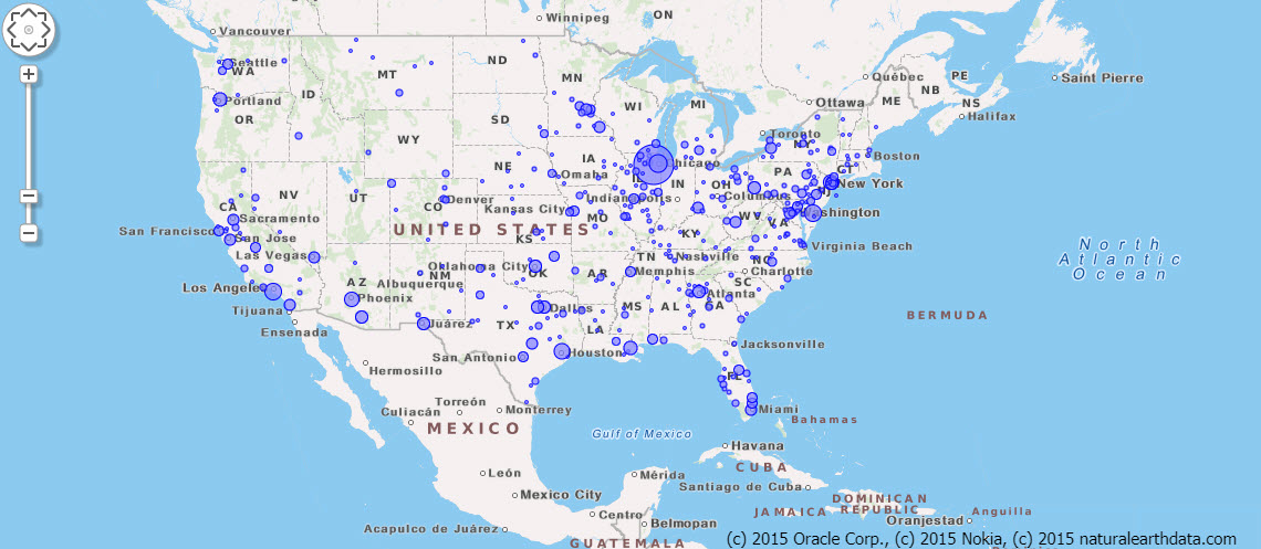
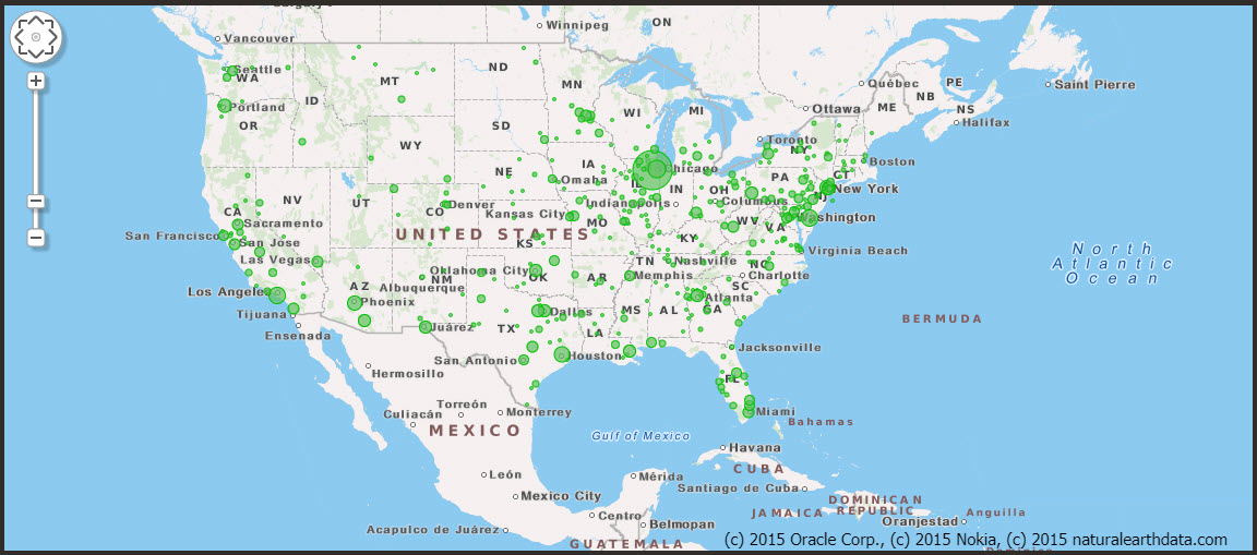
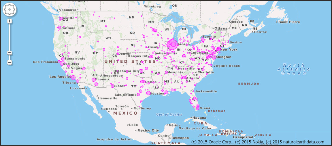
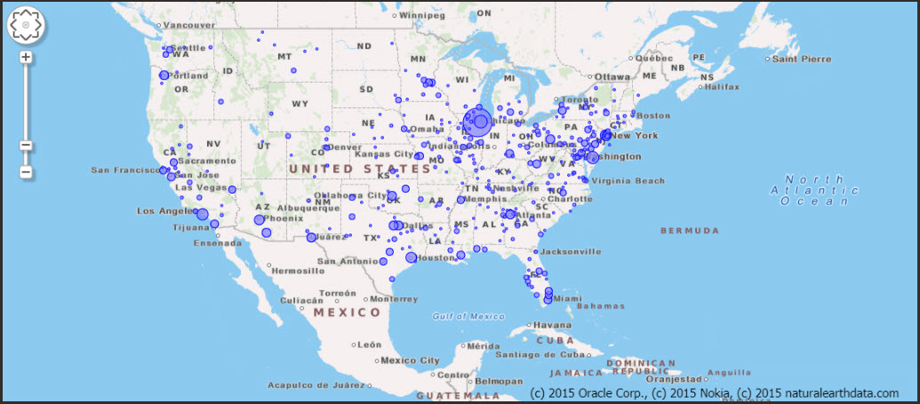
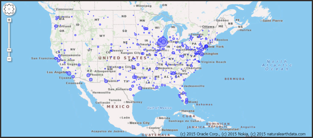
The Map Dashboard charts show you the locations of your participants as well as their test results and symptoms, all on map-based charts. The charts are on a logarithmic scale and are aggregated by county.

Any filters that you select apply to all dashboard pages.
| Chart | Description |
|---|---|
|
Invited Active Engagement |
The Invited, Active, and Engagement charts help you understand where your participants live. A circle that is proportional to the number of participants appears over every county in which participants live. Point to a circle to the see the county name and the number of participants. You see only the data that meets the requirements that you specified in the filters. These charts offer map-based versions (with participants grouped by county) of the time series charts on the Main Dashboard. Each chart shows different information:
|
|
Self-Reported Test Results Test Vendor Results |
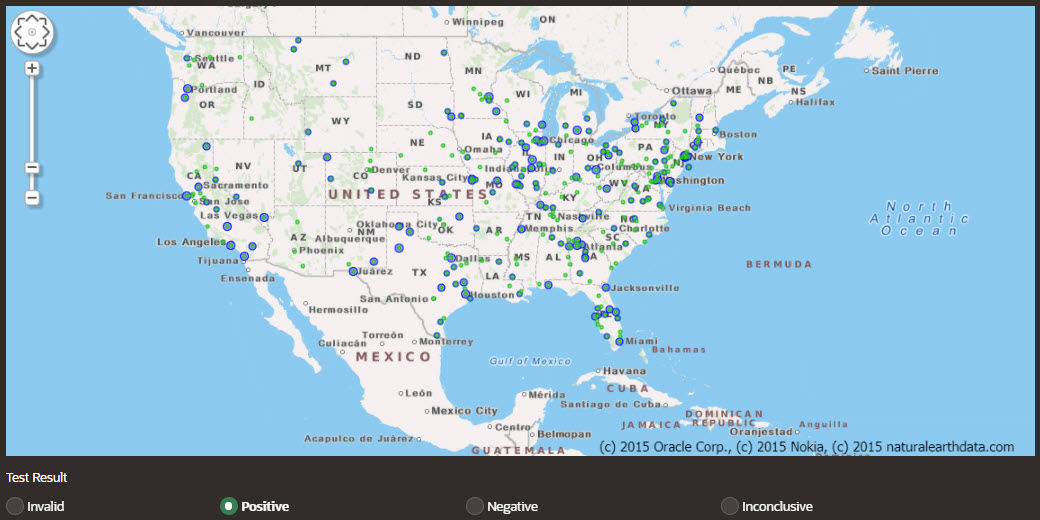
The Self-Reported Test Results chart and the Test Vendor Results chart show the geographical distribution of positive, negative, invalid, and inconclusive test results that either participants or vendors reported. You see only the data that meets the requirements that you specified in the filters. Each blue circle represents the total number of
self-reported tests or vendor-reported in the county. A
different color circle appears in front of the blue circle,
depending on the test result that you select below the
chart:
|
|
Any Symptom |
The Any Symptom chart helps you understand the geographical concentration of participants who reported at least one COVID-19 symptom. You see only the data that meets the requirements that you specified in the filters. This chart, along with the other geographical symptom charts, is useful for tracking symptoms over time and for identifying early warning signs of outbreaks. For example, if you see a sudden spike in fevers over a short period of time, this information can inform your communication, planning, and testing strategies. A time series form of this chart is available on the Main Dashboard page.
|
|
Any Symptom from List |
The Any Symptom from List chart helps you understand the geographical concentration of participants who reported at least one symptom from a list that you curate. You select the symptoms from a list below the chart. Participants who experienced at least one of the symptoms are included in the chart. You see only the data that meets the requirements that you specified in the filters. A time series form of this chart is available on the Main Dashboard page.
|
|
All Symptoms from List |
The All Symptoms from List chart helps you understand the geographical concentration of participants who reported the specific combination of symptoms that you select. You select the combination of symptoms below the chart. Only participants who experienced all the symptoms are included in the chart. You see only the data that meets the requirements that you specified in the filters. Note: Only participants who experienced every single symptom that you select appear in the chart. To see participants who experienced any single symptom from a list, use the Any Symptom from List chart.A time series form of this chart is available on the Main Dashboard page.
|
Parent topic: Dashboard charts
