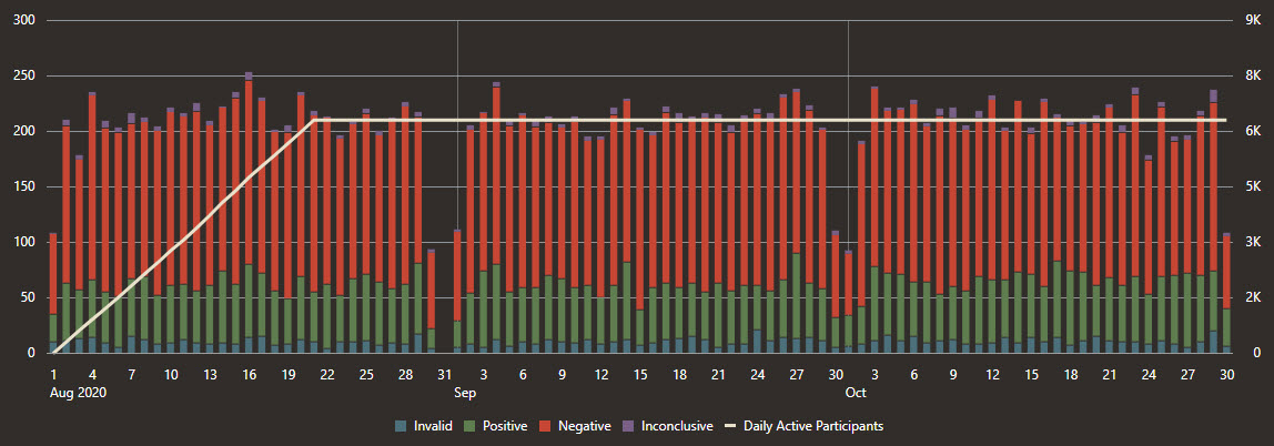
Testing Dashboard charts
The Testing Dashboard contains time series charts that help you understand testing information, including volume of tests, test types, and test results.

Any filters that you select apply to all dashboard pages.
| Chart | Description |
|---|---|
|
Testing Overview |
|
|
Test Results |
The Test Results charts, available below both Vendor Tests and Self Reported Tests, offer a quick look at participants' test results. These charts help you understand how testing is going, including seeing the number of tests that vendors are providing. You see only the data that meets the requirements that you specified in the filters. On both charts, vertical bar lines, which correspond with the left Y-axis, appear for each day or week (you decide the time period using the filters) in which participants either received or reported a test result. Bar lines have color coding for each type of result: green for positive, red for negative, and purple for inconclusive. For self reported test results, you can select one or more check boxes below the chart to see only the results for specific test types. The white line, which corresponds with the right Y-axis, shows the number of active participants at a given time. In addition to seeing test results, these charts can help you track how tests are going, including identifying the general testing rate and the testing rate within specific populations.
|
|
Test Types |
The Test Types charts, available below both Vendor Tests and Self Reported Tests, offer a quick look at the test results that vendors reported. You see only the data that meets the requirements that you specified in the filters. On both charts, vertical bar lines, which correspond to the left Y-axis, appear for each day or week (you decide the time period using the filters) in which vendors reported test results for a participant. The bar lines are color coded for each type of test. The white line, which corresponds to the right Y-axis, shows the number of active number of participants at a given time.
|
Parent topic: Dashboard charts

