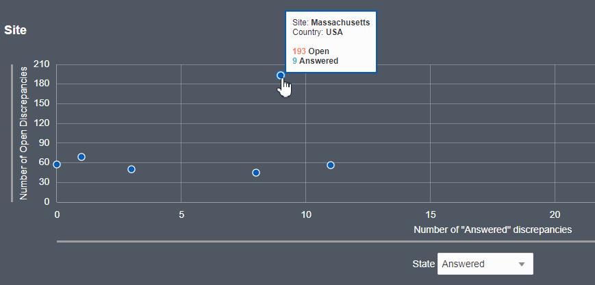
Discrepancies by Site graph
Each plot in the scatter chart on the dashboard is a different site within the study. The y-axis always represents the number of open discrepancies but the x-axis can display any of the different states, depending on which status you choose from the drop down menu below the chart.
The default filter of the Site graph is "Answered" but you can use the "State" drop down menu located below the graph to display discrepancies by Cancelled, Candidate, and Closed.
The Site scatter chart is zoomable - you can place your cursor over the graph and use your mouse wheel to zoom in and out on the data plots. If you are using a tablet or mobile device, you can use the "pinch" and "expand" gestures to change the scope of the graph.
Clicking on any of the plots within the chart takes you to the Discrepancies interface where the corresponding filters have already been applied. For example, the filters applied after clicking a plot may include Site = "Boston" and Discrepancy State = Open, Answered.
Parent topic: Use the Discrepancy Dashboard
