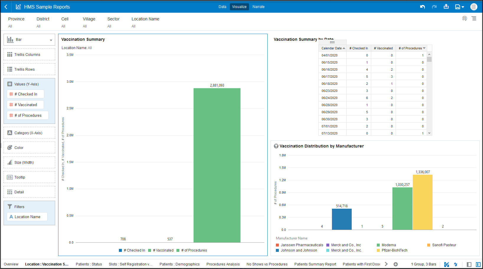
Sample report: Vaccination summary
Oracle Analytics contains example reports so you can see how you can visualize Oracle Health Immunization Management data. For example, you may want to create a report that summarizes data with a combination of bar charts and tables.
After accessing the sample reports from a Shared Folder, you can select the different tabs from the bottom row to review different types of data. The following report shows a single bar graph with details on the number of vaccinated patients. You can select the items in the legend to see the number checked in and processed. You can also hover over the bar chart to see the number of procedures.
If you select the Calendar Date from the Vaccination Summary by Date table, you can toggle the dates from latest to earliest or earliest to latest.
Note:
Oracle Analytics does not save any changes you make to the view. After you close the report, it reverts back to the original sample data view.
Parent topic: Sample Reports