View the portfolio data graphs

As a user with access to all trials, you can view the portfolio trial data for all ongoing trials in four graph formats: Trials by Status (bar graph), Trials by Phase (pie graph), Trials by Therapeutic Area (bar graph), or Enrollment by Region (bar graph).

To view the portfolio data for all ongoing trials in graph format:
  1. Open the Portfolio Health overview. The data graphs appear at the bottom right of the overview and are highlighted in the following example:
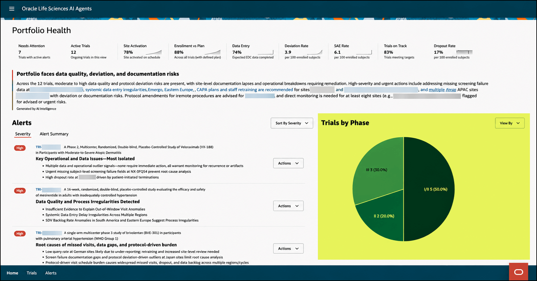
    Portfolio Health overview - Portfolio data graphs highlighted

  2. In the View By drop-down menu, select the format of the data you want to view:
    • Status—Opens the Trials by Status bar graph that shows the number of Active and In Progress trials.
    • Phase—Opens the Trials by Phase pie graph that shows the percentage of trials in each clinical trial phase (I to IV and unknown).
    • Therapeutic Area—Opens the Trials by Therapeutic Area bar graph that shows the number of trials by therapeutic area (for example, Cardiology/Vascular Diseases, Dermatology, and Endocrinology).
    • Region—Opens the Enrollment by Region bar graph that shows the number of enrollments by country.
    Each graph format includes a timestamp.
  3. Hover over the graph to display statistic details.