Management reports
We migrated the standard Management reports (Account Metrics, Cycle Times, etc.) to Oracle Analytics Cloud and made report-level updates.
Account Metrics
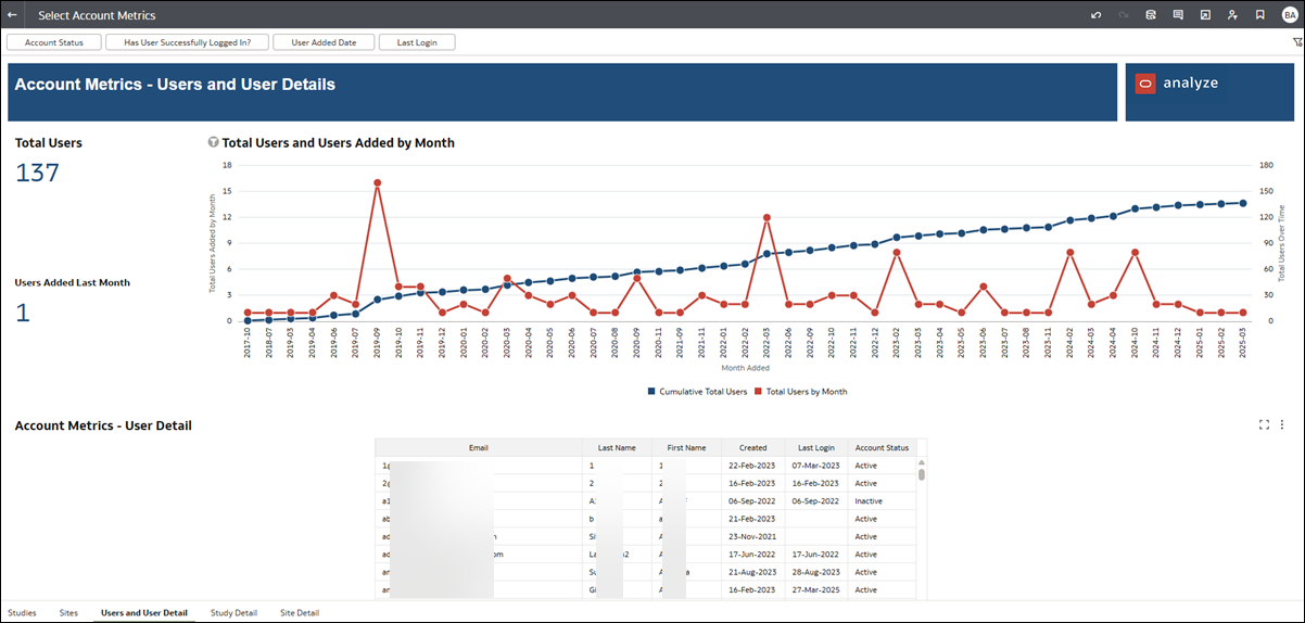
In the Account Metrics report migration, we streamlined all worksheet titles by eliminating the “Account Metrics” segment from each sheet’s title. For instance, the “Account Metrics – Sites” sheet is now simply the “Sites” sheet. As noted above, you’ll find worksheet tabs at the bottom of the workbook.
We also updated this report as follows:
Studies Dashboard
The "Show Studies Broken Down By" filter's placement changed as a result of the report migration. Instead of adding this filter to those that run along the top of the worksheet, we positioned it immediately below the graph it controls. Also, this filter is now called "Slice Data By."
We also changed the title of the worksheet's bottom bar graph visualization (previously Studies by Sponsor/Country/Year). The bar graph is now labeled "Studies by Data Slice."
Sites Dashboard
The Sites Dashboard includes the same data as before, but the format has changed. Now, this dashboard has a single, two-line graph that shows count by month and the running total for site breakdowns. You can change the graph’s site breakdown metric by choosing another breakdown from the drop-down menu at the upper left.
Total numeric site counts for Finalized CDA, Completed Feasibility, and Final Acceptance are shown above the graph. These counts aren’t affected by changing Sites Broken Down By value in the drop-down but are affected if you make changes to the main filtering criteria at the top of the worksheet. Note that the count labels have also been updated with each now showing preceding "Count of..." text.
Users Dashboard
The Users Dashboard is now combined with the User Details Dashboard, and we’ve retitled the worksheet to “Users and Users Detail.” The top data and visualization include data from the Users Dashboard, while the tabular User Detail information is at the bottom of the worksheet. The migration did not make any changes to the User Detail information or columns.
The Users and Users Detail worksheet has the following minor functional differences:
- The Include Users Who Have Never Logged In? filter is now labeled Has User Successfully Logged In?.
- You can now specify a date or date range and filter by Last Login.
- We removed the Recent Users Added By Month visualization.
- The Total Users visualization is now combined with the Users Added Running Total visualization. The combined visualization, titled Total Users and Users Added Running Total, shows the cumulative users over time and users added for each month. Hover over any point in the line graphs to see additional details. You'll also see Total Users and Users Added Last Month to the left of the visualization.
The Account Metrics report's Study Detail sheet has no functional differences after migration. The Site Detail sheet has a minor column name change from "Specialty" to "Specialties," and there are no other differences for this worksheet. Please note, we deprecated the User Detail worksheet as the information now exists in the combined Users and User Detail worksheet.

Cycle Times
The Cycle Times report had the following changes after migration to Oracle Analytics Cloud:
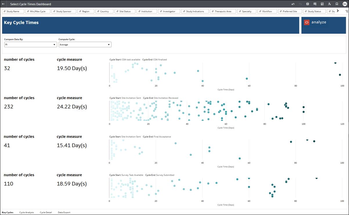
- Min/Max Cycle filters that were previously available on the Key Cycles and Cycle Analysis worksheets have been relocated to the filters at the top for all worksheets. The Min/Max Cycle filter is to the right of the Study Name filter on all sheets.
- Box-and-Whisker plot charts in the Key Cycles and Cycle Analysis worksheets have been replaced with horizontal boxplots.
- Tooltips in the Key Cycles and Cycle Analysis worksheets no longer support drill-down to cycle details in the Cycle Detail worksheet.
- The Key Cycles worksheet no longer supports choosing a day, week, or month Unit of Measure. The unit for the time difference is now days.
- On the Cycle Analysis worksheet, we removed the Sort Table By filter as redundant functionality. Instead, you can sort the table at the bottom of the worksheet by clicking the arrows in any column heading.
- Previously, on the Cycle Analysis worksheet, the filter value selected for Cycle End could not also be selected as the value for Cycle Start and vice versa. After migration to Oracle Analytics Cloud, the report allow users to choose the same Cycle Start and Cycle End values but it should be avoided since it is not a valid use case.

Resource Allocation
Migration of the Resource Allocation report resulted in the following updates:
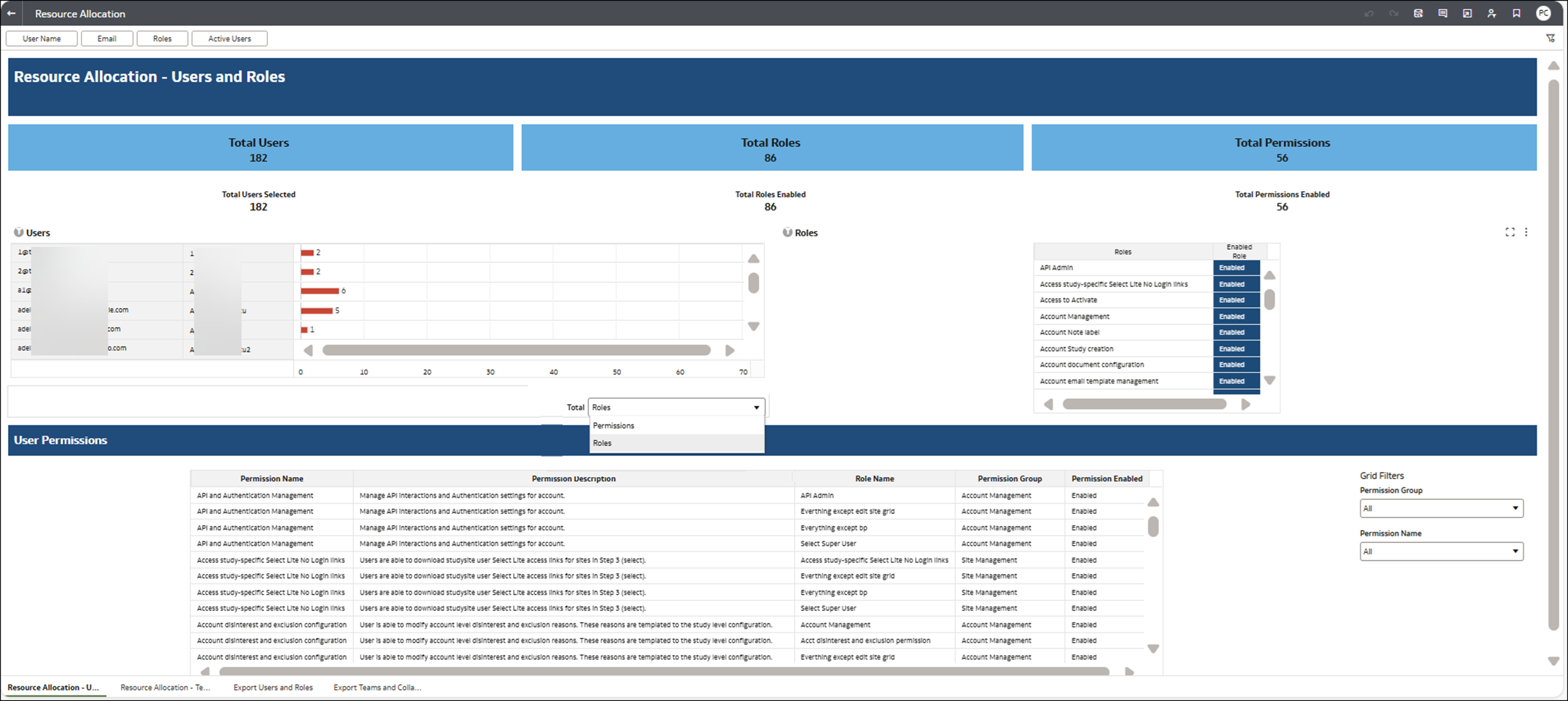
- The report no longer filters out users without any roles or teams assigned.
- Due to redundant functionality, we removed the hover text on roles and permissions enabled.
- In the migrated report, selection filtering is disabled because it does not work in the same way in Tableau. Selecting a user/permission/role/team will not filter the visuals. Instead, report users can do the same filtering using the filters at the top of the worksheet.
- Selecting specific records now applies filtering to the entire worksheet. KPI/count titles are now User/Users Selected, Role/Roles Enabled, and Permission/Permissions Enabled.
- We updated the report to filter out permissions that are not enabled and account user roles. With this update, we removed filters that are no longer relevant:
- Resource Allocation – Users and Roles worksheet
- Filter Disabled Permissions
- Filter Users with No Permissions
- Filter Unused Roles
- Resource Allocation – Teams and Collaboration worksheet
- Users w/No Permissions
- Disabled Permissions
- Resource Allocation – Users and Roles worksheet

Site User Engagement
The Site User Engagement report has several improvements after migration to Oracle Analytics Cloud.
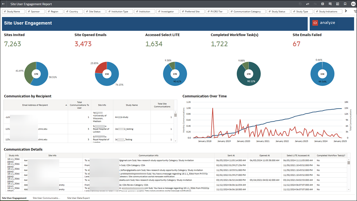
On the Site User Engagement worksheet, we changed the Key Performance Indicator bar graphs at the top of the sheet to better represent percentages with donut charts. Hover over a chart section to view details.
We also modified the table at the center of the Site User Engagement worksheet to remove the drop-down control that filtered communications by the study, country, and Oracle Site SelectLITE user. The drop-down filter is no longer supported. The table now has a Communication by Recipient title, and it represents total communication only to Site Select LITE users. Additionally, the table now aggregates data by the communication recipient’s email address rather than the user site email address. To reflect this change, we modified two column headers:
- Select LITE User is now Email Address of Recipient
- Total Communications is now Total Communications To User
Previously, the Email Data Export worksheet’s PI first name column included a combination of the Study Name, Sponsor, Protocol Number, and PI First Name. After migration, the worksheet has separate columns for each of these fields.
The Site User Data Export worksheet did not have any updates, and it functions as it did previously.

Parent topic: What's new for Oracle Site Select users