2 AP Cloud Service Dashboard
The Dashboard is a graphical user interface that provides an at-glance view of Key performance indicators of a business. As soon as the planner logs in to the application, the planner is welcomed by the dashboard that briefs the user about the health of the business, KPIs, and key items for each product category. The dashboard gives you key statistics at your fingertips. You can use the dashboard to quickly analyze the health of the business, make note of your top ranked and low ranked items, review any alerts, and launch into the affected workbooks directly to investigate the alert scenarios and resolve the alerts.
Different KPIs are important for different planners and are based on the product a planner is working on. If planner A wants to review trends by Gross Margin, planner B would want to review trends by Sell Thru and so on. Hence, the flexibility to select the required metrics is given to the planner before the planner's online day ends so that the overnight batch picks up the parameters set by the user to realign the dashboard to begin the next online day.
The planner is expected to set the KPIs to review the dashboard in the Planning Administration -> Product Setup -> Dashboard Parameters view.
The dashboard is laid out in three sections:
Tiles
Tiles are displayed across the top of the screen and contain the measures/metric data. The drop-down lists, displayed above the tiles, control the profile of tiles and segment of data represented in the tiles (and the chart below).
The arrow beneath a tile indicates what is displayed in the chart area in more detail. Clicking on a different tile will refresh the data in the chart area below and put the arrow under the clicked tile.
There are various styles of tiles-variance and informational:
-
Variance
A variance tile shows the divergence of value between one metric with two other related metrics.
-
Informational
An informational tile displays the existing measure data.
Figure 2-1 Variance Tiles
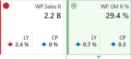
The color and icon of a tile give a visual indicator of the state or health of the metrics in the tile. In **INTERNAL XREF ERROR**, WP Sales R displays a problem icon (red octagon) because the working plan sales value is 2.4% below Last Year sales. An informational tile is always blue indicating no problem, because it is simply showing data, not a comparison.
Adding a New Tile
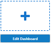
To add a new tile from a predefined pool, click Add on the right-hand side of the tile carousel (some scrolling may be required). This brings up a dialog showing all the available metric tiles. Select the desired tile and then click Ok. The tile is added to your tile carousel.
Figure 2-2 Add New Measure Tile
Changing the Tile Order
To change the order in which tiles are displayed, click Edit Dashboard located beneath Add located to the far right of the tile carousel. Each tile now shows a drag bar at the bottom of the tile. Drag the tile to the place you want it on the carousel and drop it.
Figure 2-3 Change Tile Order

Charts
Selecting a tile displays detailed information in the chart area for the measures contained in the tile. The information is presented with time on the horizontal axis and the measure value on the vertical axis.
The drop-down lists, displayed above the tiles, control the profile of tiles and segment of data represented in the tiles and, therefore, the chart area.
The arrow beneath a tile indicates what is displayed in the chart area in more detail. Clicking a different tile refreshes the data in the chart area below and puts the arrow under the clicked tile.
Time Horizon and Scale
The time horizon used to calculate the metric of each tile can be changed either in the drop-down list selection above the tiles or by dragging the time horizon window at the bottom of the chart.
Figure 2-5 Time Horizon Window

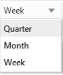
The scale of the horizontal axis (the calendar) can drastically change the shape of the data. You can change the scale of the chart to get more detail or to smooth fluctuations and more easily spot trends. To do this, select the time scale from the drop-down list at the top right corner of the chart.
Figure 2-6 Time Scale
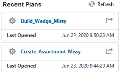
Recent Plans
Recent Plans is a list of the most recently built plan segments. Choose a segment from the Recent Plan section in the top right of the screen to open the workspace without having to rebuild the segment using the selection wizards. Click Refresh to update the list with the most recent plans.
Figure 2-7 Recent Plans
Dashboard Profiles
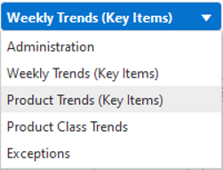
The dashboard also contains a list of dashboard profiles. A dashboard profile groups the metrics, or Key Performance Indicators (KPIs), specific to a business role and business purpose.
Figure 2-8 Dashboard Profiles in AP Cloud Service
Administrator Dashboard
The administrator dashboard profile is common to all RPAS Cloud Edition applications.
Weekly Trends (Key Items) Dashboard
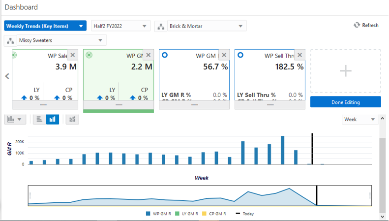
The Weekly Trends for Key Item' shows the graphical view of the key In-season metrics by calendar. It will list the High performing and Low performing n number of items where the number of items for each subclass is a configurable value with an upper limit. The trends are shown for pre-determined metrics Sales U/R, Gross Margin, Gross Margin %, and Sell Thru %.
Figure 2-9 Weekly Trends (Key Items) Dashboard
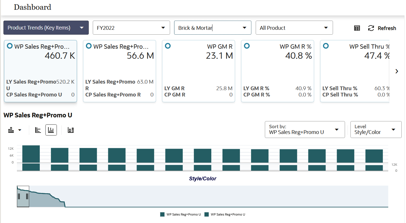
Product Trends (Key Items) Dashboard
The Product Trends (Key Items) Dashboard is an In-season dashboard that shows the information of products sorted by the selected metric for the pre-determined calendar period. The planner can review the item ranks for the n number of items for any of the Week to Date, Month to Date, and Year to Date metrics. The number of items to be viewed on the dashboard is a configurable value.
Figure 2-10 Product Trends (Key Items) Dashboard
Product Class Trends
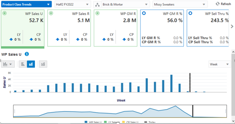
The Product Class Trends Dashboard is an In-season dashboard that provides true total value of class. This view enables the planner to review the true performance of the products at the class level and higher. The metrics provided here are Sell Thru %, Gross Margin, and Sales U/R along with the respective periods, locations, and products.
Figure 2-11 Product Class Trends Dashboard
Exception Dashboards
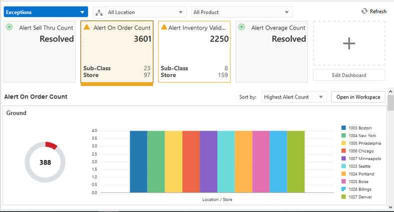
The Exception Dashboard shows the exceptions if any, for the High and Low performing items listed in the dashboard. Alerts are provided for various business conditions. The alert hit counts are broken down by product and location. Charts are displayed below a chosen alert for the top five alerted products (either departments or subclasses). This helps you understand what your working priorities should be. The Exception Dashboard shows the exceptions for inventory count, immediate need count, future need count, sell thru count, and so on.
Click Open in Workspace to open a plan and start the alert navigation mode within the workspace and bring you to the first alerted position and views associated with the alerted measure.
Figure 2-12 Exception Dashboard
