2 AP Cloud Service Dashboard
The Dashboard is a graphical user interface that provides an at-glance view of Key performance indicators of a business. As soon as you log in to the application, you are welcomed by the dashboard that briefs you about the health of the business, KPIs, and key items for each product category. The dashboard provides key statistics at your fingertips. You can use the dashboard to quickly analyze the health of the business, make note of your top-ranked and low-ranked items, review any alerts, and launch the affected workbooks directly to investigate the alert scenarios and resolve the alerts.
Different KPIs are important for different planners and are based on the product you are working on. If planner A wants to review trends by Gross Margin, planner B would want to review trends by Sell Thru and so on. Hence, the flexibility to select the required metrics is given to you before your online day ends so that the overnight batch picks up the parameters set to realign the dashboard to begin the next online day.
You are expected to set the KPIs to review the dashboard from the Dashboard Parameters view that is available from Assortment Services and then Planning Services.
The dashboard is laid out in these three sections:
Tiles
Tiles are displayed across the top of the screen and contain the measures/metric data. Located above the tiles, drop-down lists control the profile of tiles and segment of data represented in the tiles and the following chart.
The arrow beneath a tile indicates what is displayed in the chart area in more detail. Clicking on a different tile will refresh the data in the chart area below and put the arrow under the clicked tile.
There are various styles of tiles-variance and informational:
-
Variance
A variance tile shows the divergence of value between one metric with two other related metrics.
-
Informational
An informational tile displays the existing measure data.
Figure 2-1 Variance Tiles
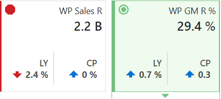
The color and icon of a tile give a visual indicator of the state or health of the metrics in the tile. In Figure 2-1, WP Sales R displays a problem icon (red octagon) because the working plan sales value is 2.4% below Last Year sales. An informational tile is always blue indicating no problem, because it is simply showing data, not a comparison.
Adding a New Tile
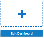
To add a new tile from a predefined pool, click Add on the right-hand side of the tile carousel (some scrolling may be required). This brings up a dialog showing all the available metric tiles. Select the desired tile and then click Ok. The tile is added to the tile carousel.
Figure 2-2 Add New Measure Tile
Charts
Selecting a tile displays detailed information in the chart area for the measures contained in the tile. The information is presented with time on the horizontal axis and the measure value on the vertical axis.
The drop-down lists, displayed above the tiles, control the profile of tiles and segment of data represented in the tiles and, therefore, the chart area.
The arrow beneath a tile indicates what is displayed in the chart area in more detail. Clicking a different tile refreshes the data in the chart area below and puts the arrow under the clicked tile.
Time Horizon and Scale
The time horizon used to calculate the metric of each tile can be changed either in the drop-down list selection above the tiles or by dragging the time horizon window at the bottom of the chart.
Figure 2-5 Time Horizon Window

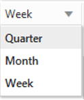
The scale of the horizontal axis (the calendar) can drastically change the shape of the data. You can change the scale of the chart to get more detail or to smooth fluctuations and more easily spot trends. To do this, select the time scale from the drop-down list at the top right corner of the chart.
Figure 2-6 Time Scale
Recent Plans
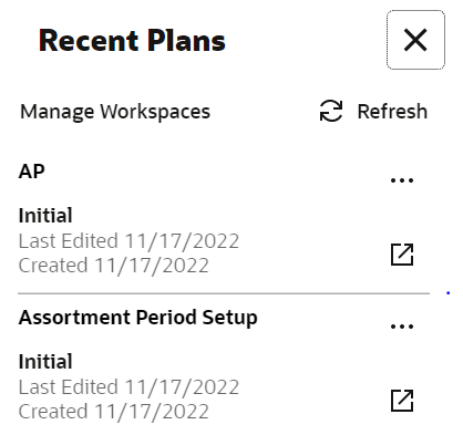
Recent Plans is a list of the most recently built plan segments. Choose a segment from the Recent Plan section in the top right of the screen to open the workspace without having to rebuild the segment using the selection wizards. Click Refresh to update the list with the most recent plans.
Figure 2-7 Recent Plans
Dashboard Profiles
The Dashboard Profiles view includes a list of dashboard profiles, which group metrics or Key Performance Indicators (KPIs) relevant to specific business roles and objectives. In Assortment Planning Cloud Services, the available dashboard profiles is the Administration Dashboard. This profile is common across all RPAS Cloud Edition applications and provides administrative insights and controls. Assortment Fit Dashboard Displays a summary and graphical view of KPIs such as:
-
AF Wp Sales U
-
AF Wp Sales R
-
AF Cp Sales U
-
AF Cp Sales R
Item Flow Dashboard Presents graphical views of KPIs including:
-
IF Wp Sales U
-
IF Wp Sales R
-
IF Cp Sales U
-
IF Cp Sales R
Each dashboard profile helps users focus on the performance indicators most relevant to their planning tasks and business goals.

