TOU Trends Module
This module is used in High Bill Alert (HBA) emails for customers on time-of-use plans. The module shows customers what portion of their energy use occurs during on-peak periods, provides details about the cost of energy use during peak periods, displays usage charts for weekdays and weekends, and encourages them to shift their energy usage to off-peak hours.
Note:
-
This section describes only the TOU Trends module and does not cover additional modules that are delivered within the High Bill Alert AMI Email communication. See the Oracle Utilities Opower Proactive Alerts Cloud Service Product Overview for more information about the other modules.
User Experience
This section describes the user experience for the TOU Trends module.
The module contains these elements:
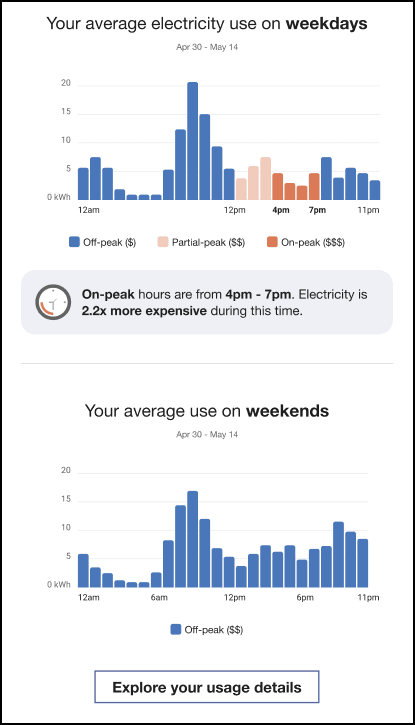
Module Header: The header tells the reader that this module provides information about their average use this week. For example, "Your average electricity use on weekdays".
Weekday Bar Chart: The chart depicts the average weekday electricity spending during each hour of the day. The different peak periods are color coded, and described in the legend below the chart, to enable readers to easily identify when they are spending the most on electricity. Above the chart, the date range used for the chart is displayed. The legend includes dollar sign indicators next to each period name and labels below each item to identify high, medium, and low-cost periods.
Insight Statement: This statement explains how much more expensive energy is during peak hours compared to off-peak hours. The cost ratio is calculated by comparing the highest cost period to the lowest cost period. For example, the statement might say, "On-peak hours are from 4pm - 7pm. Electricity is 2.2x more expensive during this time."
Weekend Chart Title: The title of the second chart informs the user that the data is related to their average weekend energy spending.
Weekend Bar Chart: The chart depicts the average weekend electricity spending during each hour of the day. Utilities typically do not have peak periods on weekends, therefore, this chart is typically shown in a single color with the date range above the chart, and a legend below. The legend includes dollar sign indicators next to each period name and labels below each item to identify high, medium, and low-cost periods. The data helps readers understand when they are spending on electricity on the weekends.
Explore Your Usage Details button: Clicking this button takes customers to a specified site with additional information. The utility customer can configure this button to direct the customer to a site of their choosing. If available, the button should direct customers to the Data Browser in the Digital Self Service - Energy Management Web Portal. The customer is then prompted to sign in to their account, or to register an account if they have not previously done so.
This image shows an example of the module:
User Experience Variations
This section discusses the user experience variations in the TOU Trends module.
Usage Variations
The usage version of the module varies from the cost version as follows:
Weekday Bar Chart: The chart depicts the average weekday electricity usage during each hour of the day. The different peak periods are color coded, and described in the legend below the chart, to enable readers to easily identify when they are using the most electricity.
Weekend Bar Chart: The chart depicts the average weekend electricity usage during each hour of the day. Utilities typically do not have peak periods on weekends, therefore, this chart is typically shown in a single color with a legend below. The data helps readers understand when they are using energy on the weekends.
Tiered TOU Plans
For tiered TOU plans, the module varies in the following way:
Insight Statement: This statement explains how much more expensive energy is during peak hours compared to off-peak hours. The tier with the highest cost ratio is used when calculating the price ratio in the statement, which might say, "On-peak hours are from 4pm - 7pm. Electricity is up to 2.2x more expensive during this time."
TOU Hours the Same on Weekdays and Weekends
If TOU hours are the same during weekdays and weekends, only one chart is included in the module. The chart encompasses both weekdays and weekend days, and the date range reflects the full date range.
The header is changed as follows for cost variations:
- Header for Cost Variations: "Your average hourly cost"
- Header for Usage Variations: "Your average hourly usage"
Holiday Variation
When a holiday is included in the time period, the module is updated as follows for cost variations:
Chart titles: "Your average <weekend or weekday> and holiday spending"
The module is updated as follows for usage variations:
Chart titles: "Your average <weekend or weekday> and holiday usage"