Add a Forecast to a Visualization
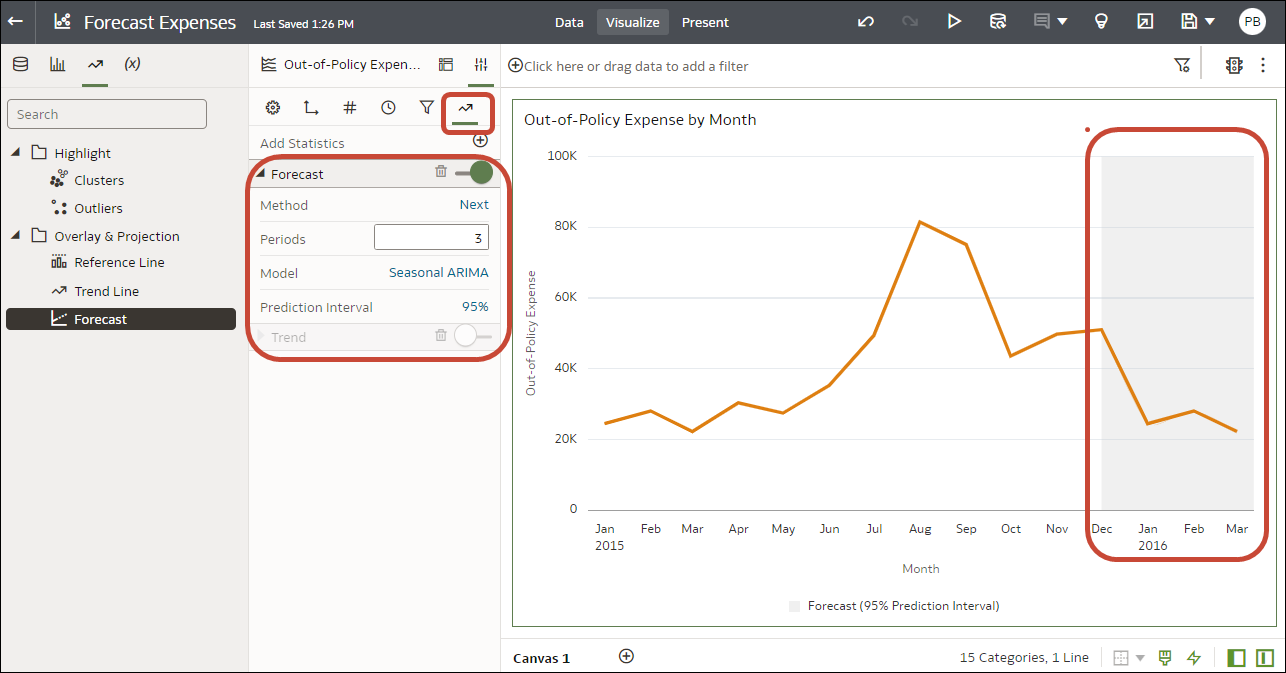
Add forecasts to your workbooks based on Auto-Regressive Integrated Moving Average (ARIMA), Seasonal ARIMA, Exponential Triple Smoothing (ETS), or Prophet. For example, you might want to forecast summer temperatures based on data from previous summers.
Before you can use analytic functions in visualizations, you must do the following:
-
Install DVML.
On Windows go to Start, browse to and expand your system's Oracle folder, and click Install DVML.
On Mac, go to Applications and click Oracle Analytics Desktop Configure Python.
-
Create a workbook or visualization that you can apply one or more analytic functions to.
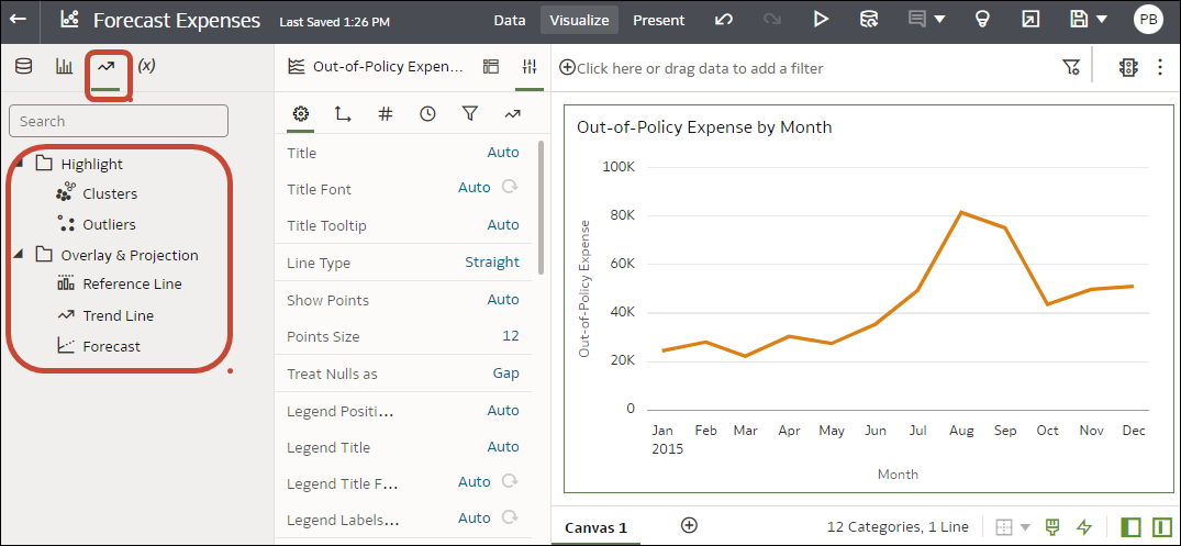
Before you start, make sure that you have the required data in your visualization for the type of analytics you want to add. For a forecast, you need a time dimension and a measure. For example, you might have Week as a time dimension and Amount of rainfall (in millimetres) as the measure. If you don't have the required data columns in your visualization, when you click Forecast in the Analytics pane, you see this message: "This visualization does not support Forecast".

